So the American magazine Traditional Home has teamed up with Lonny creators, Michelle Adams and Patrick Cline to bring out the newest in a flurry of online shelter magazines.
I have to admit something. I really don’t like the name they came up with. Trad Home sounds like what Kentucky Fried Chicken tried doing to get the cool kids into the door by changing the name to KFC. Stop trying so desperately to be cool, Lonny. We love you. The word ‘Traditional’ isn’t as scary as you may think. Honestly and truly, you and god-rest-its-soul Domino have provided me more inspiration than any other shelter magazine ever and I’ve stolen been inspired by so many ideas you’ve presented, it’s untrue. So what’s with Trad? I pronounce ‘traditional’ like ‘tru-di’-shu-nul’ so am I supposed to call you ‘Trud’? Or shall I pronounce it ‘Trad’ which just sounds like the name of someone in a daytime soap… Either way, I’m uncomfortable by the name. I really just felt that needed to be said.
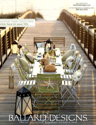
Now that we’ve gotten that little niggle out of the way, I do have to say that the magazine, at 347 pages, is a pretty hefty issue filled with lots of juicy inspiration. Ok, so there are plenty of advertisements in the first 100 or so pages but they are generally so beautiful that despite the fact that I can’t buy the products either due to location or due to price, I don’t mind looking at them.
Otherwise, you’ll find some fantastic interiors with a nod to gorgeous metallics and mirrored finishes…
And absolutely succulent tufted pieces that just make a room that bit more opulent…
That gorgeous peacock blue I keep seeing made a few appearances as well…
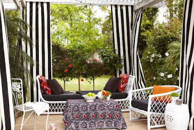
I kept noticing a proliferation of black and white stripe as well, particularly in outdoor spaces. Is that because since I put the black and white stripe tablecloth in my dining room, I’m more aware of it? Or does there just seem to be an explosion at the moment?
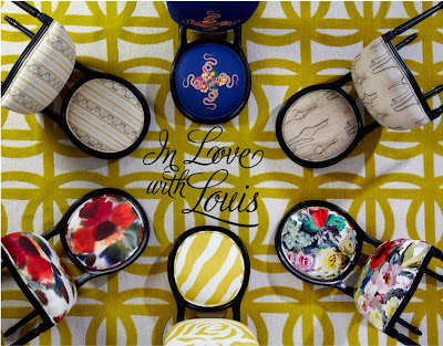
I also enjoyed their feature showing 6 different designers reinterpret the Louis XVI chair.
My favourite, probably not surprisingly, was by Martyn Lawrence-Bullard. There’s that black and white stripe again with a gorgeous modern mustard animal print. Be still my beating heart.
So if you haven’t already poured over this gorgeous new mag and you have a wonton lust for a goodly mix of traditional and modern interiors (preferably in the same room), go and check it out.
How do you feel about Trad Home? Any particular favourite features? Anything you’d change? Sound off in the comments…
All images from Trad Home.










I TOTALLY agree with you. Trad Home sounds …ugh…I don't even know what it sounds like. A cross between a Builders' Merchants and an advert for modern houses. And even that doesn't do it justice! But the content does look so lush!<br /><br />Sarahx
HA! don't forget plenty of folks around here would pronounce it TRAAAYYYYYY-AAAAAAAADDDDD. i never liked the term "trad mom" either, have you heard that? tryin to make her sound all rad. i subscribe to Traditional Home, and it's been feeling over the hill to me for a while so i'm not surprised they were feeling a need for coolness.<br /><br />love that shot of the louis!!<br
Since I feel like I've been permission to be not so nice, how about T-RAD – A Blatant Attempt To Attract The Young & Hip? Love the photos though, so it doesn't really matter to me what they call it.
you so made me laugh with the 'trud' vs 'trad' pronunciation quandry. The abbreviated title is just questionable, I'd have to agree. Don't feel that comfortable saying it inside my own head.<br /><br />But…of course, as long as the content is fresh and imaginative, not such a deal breaker. :)
Haha, I'm with you about the name! You put it so well :) <br /><br />Love all the inspiration in the magazine and my favourite feature was the Louis Chairs, although there was plenty of other things I was ogling over like you've shown. Definitely love tradITIONAL styles interpreted in a modern setting: timeless and classic and gorgeous. <br /><br />Hope you're having a lovely week,
That peacock blue is stunning! Great review!<br />Rachie xo
like all the inspiration at your post although there was plenty of other things I was ogling over like you've shown. Definitely love traditional styles interpreted in a modern setting of your home and gardening