Well unless you have been living in a cave, you’ve probably heard the news that Pantone has announced it’s 2012 colour of the year as Tangerine Tango, a luscious tomatoe-y reddy orange which is warm and rich and bright.
No matter how you feel about Pantone’s choice or whether or not you would adopt it into your own decor, there’s not much doubt that we’ll be seeing it in homewares and fashion much more over the next year or two.
Whilst it was never a conscious decision, implementing a bit of orangey-red into my dining room just seemed to happen naturally and organically. As the gallery wall grew, this was the colour that seemed to ‘pop’ out more than the others and I’ve sort of gone with it.
The one thing I love about the gallery wall is how it keeps changing every time I add a new piece. Over Christmas, I was able to purchase a print for W which reflected his interests but kept to my colour scheme! Well, can’t argue with that, can you?
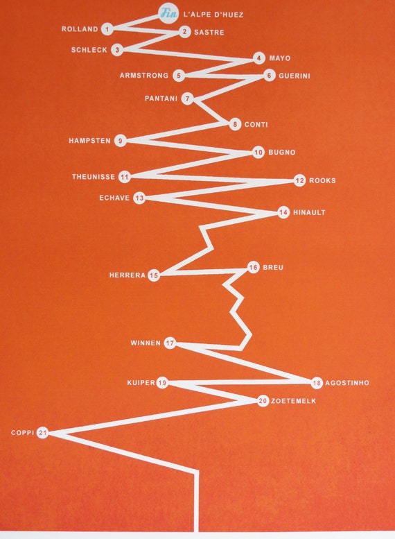
The print is a limited edition by Etsy seller The Handmade Cyclist and depicts a stylistic view of L’Alpe d’Huez… the most legendary of all Tour De France climbs, with twenty-one hairpin bends snaking their agonising way to the summit. At each of it’s hairpin bends, a champion’s name who mastered the climb.
If you aren’t a fan of the Tour de France, this is probably meaningless but to my relief, W, who is a massive fan (with this part being his absolute favourite, even taking holidays from work to watch it live), loved it. Yay!
As you can see from the picture above, the reddy orange colour is also reflected in the Martini & Rossi and Cadbury’s Cocoa antique signs and in my little matches holder near the door as well as the fresh flowers that I try to always keep in the room (a little gift to myself!).
So now that you’ve seen how I’m using my version of Tangerine Tango in my own home, how about we look at some other examples of ways to incorporate the latest big colour trend?
This bedroom uses it to fantastic effect, playing off the navy blue, black and white. It’s been in my inspiration files for ages and ages!
| Domino via Pinterest |
How beautifully do these curtains play up the height of the room? And that chandelier! Oh my god, I love it. Sophisticated and yet the bright colours says it doesn’t take itself too seriously.
| via the peak of tres chic |
The other side of the spectrum and gearing more towards the orange family rather than the red is this fantastically over the top living room in tangerine, turquoise (Pantone’s 2010 Colour of the Year if you recall), white and gold. Oh if this room was a pool of Jello, I would so jump in.
| via Coco + Kelley |
And just one more because I am in love with this door…
| via Say Yes to Hoboken |
I have to say, one of the the nicest thing about using this colour in the dining room is that it’s all in the accessories and changing it up would be fairly easy. And really, that’s where trends are best adapted I think – in small doses. Unless of course, you absolutely love it, in which case, who cares what the trends say – just go for it. Which is kinda what I did in the dining room so I’m not going to be changing it anytime soon!
Here’s a few accessories that might dress up your abode in the same colour scheme…
The Girl By Jules Canvas Print is from Rockett St George is mesmerising… There’s just something quietly unsettling about her that I love.
Also from Rockett St George is this antiqued wood sign – it would look fabulous in a kitchen (or bedroom oooh la la)!
From Aria, this amazing lampshade is just all kinds of wonderful.
Check out this console table as well – I have no idea where you might buy one but is it not absolutely fabulous with the pale turquoise and white stripes and that amazing inlay mirror?
So what do you think? Will you be using Tangerine Tango in your home?


THIS IS WHERE THE MAGIC HAPPENS. so uncool in an MTV Cribs cliche kinda way from the 90s that it's perfect in 2012. i def have issues with orange but paired with the turquoise! ahhhh!<br /><br />smiles.<br /><br />michele
Of course you're ahead of the trend, you're awesome like that! And I agree with your comment on my blog, it seems a natural progression from coral. <br /><br />Love the Tour de France print addition to your arty wall and ooh, the Girl by Jules is mesmerising. Fabulous images showing tangerine tango, love them all! <br /><br />So glad it's the weekend, a happy one to you, lovely!<br />
Blue and orange is my favourite colour combination so this post is right up my street! I must admit that I never really thought of using tangerine in my home until I read this post, and now it's all I can think about… off to do a little online browsing for the perfect orange object for my bedroom!
Oooh, I love the way you mix up your dining room. You're so good at keeping it all fresh and new.<br /><br />The orange looks FAB against the grey. Mmm….<br /><br />Sarahx
Loving this colour! I'm having coral for the wedding so I'll try and throw in some tangerine too!<br />Rachie xo