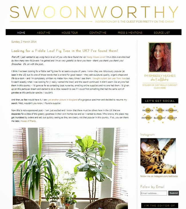
I just thought I’d pop in today in case you were wondering what the heck is going on around here. Yes, you’re in the right place, I’ve just given the blog a new look. Again.
I think as this is my little stomping grounds on the interwebs, I treat it a bit like my home. Sometimes, you just get bored looking at the same things all the time and a refresh is entirely necessary.
(Also, don’t you love how Meisha matches my blog look in the little instagram pic below? Leopard-print is most definitely a neutral, I don’t care what anyone says.)
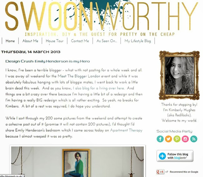
Only a year ago, it looked like this… (oh dear)
But I made a few changes over the last year, tweaking and updating the look and up until just recently, this is what the logo looked like (in case you needed reminding)…
Despite all the little changes I’d made over the last year, I still felt that I needed to scrap the old logo and the old look and start fresh. And I think the new look is exactly that: fresh, clean and classic (at least that’s the look I was going for!). Obviously I couldn’t leave my ‘blinging’ tendencies alone so the gold was, of course, always going to stay… The little arrow is just for fun ;)
I am loving the combination of black, white and gold and so I’ve splashed around a bit of black too.
There is still some tweaking to do so apologies if something is a little wonky or isn’t working quite right at the moment – I’m not a designer and have very little experience with HTML except for googling things and trying them out so your patience is appreciated – I’m getting there! I’ll probably continue to tweak it in the coming weeks to sort out any weirdness…
Anyway, I hope you like it. Do you feel the need to change your blog like you do your home? And what do you think of the new look?













Love it!!! Very you. :)
Thank you my dear – it felt more 'me' but who knows what 'me' will feel like next week… forever changing my mind ;) xx
NAILED IT. Gold and leopard print kitteh. Black and white. Yep. <br /><br />I'm the exact same. I'm almost constantly tweaking my blog here and there. It's never ending really. (Okay, loserish detail, I have a secret page on my blog full of its aesthetic changes. Because did I mention, I'm a loser? – http://www.hydrangeagirl.com/p/aesthetics.html)
Hahaha! That's AMAZING and now I feel like a loser for not thinking of doing that! I always make changes and THEN remember that I didn't do a screen shot. Pfft. xxx
So pretty!
Thank you! :) xx
Love the new look and I just have to say that I am one of those who found you through YHL's blog. I am totally thinking of going dark grey or black with camel and gold in one of my spare bedrooms after I saw your bedroom walls. So bold and beautiful and wow does it make the gold pop!
Ahh so pleased you found me! Oh yes, that combo is divine – do it!! ;) xx
Check you out … you will have updated your blog look several times before I ever get around to changing mine. Once I decided not to change the name from "I'm Busy Procrastinating" to "Analytical Decorator" last year, I also didn't go through with the design changes I had been toying with. And your changes continue to be more and more pared down. You're going to
Love it – very you! And Meisha co-ordinates perfectly. What a clever Kitty.<br /><br />I'm afraid I fall into the very lazy (and not overly technical) when it comes to my blog look. I like to pretend it's my content that counts. ;-)
I actually quite enjoy it – it's like giving a room a refresh in my home! I spend a lot of time on my own site (naturally) so figure it might as well reflect my tastes ;) xx
Simple and classic with a splash of gold and, erm, leopard print. Actually, I love it ;-) xo
Yay! Thank you darling! :) xxx
Perfection. BTW, I have a cuddly kid who doesn't like cake.
Haha! I'll have his cake then ;) xxx
Your header is great! Did you create it straight from Blogger, or do you design it in Photoshop first? The metallic gold is different than other sites and so reflective of your style.
It was created in Photoshop :)