You may remember me mentioning recently that I’d finally found a new table for the dining room. While the heavy T style table had served me well for many years, it felt too heavy and too wide for the room. I wanted something brighter and lighter for the space. And something I could easy get out from behind without having to do a small acrobatics routine.
After much anticipation, my new table from Joss & Main has arrived. And I love it.
However, when I had moved the chairs out to dismantle the old table and put the new one in it’s place, I realised how battered my woven rug really was. Those little bits of cotton are fair game for kitties with claws who like to pull and pull and pull on it! And so it was looking a bit worse for wear. I couldn’t put my new fresh table on such a crappy rug, could I? No, it would be a crime against lovely new tables everywhere.
And then I realised I had a perfectly good new rug, also from Joss & Main, wrapped up in the 2nd bedroom waiting for the office remodel… you know where this is going, right? Of course you do. I’m like an open book.
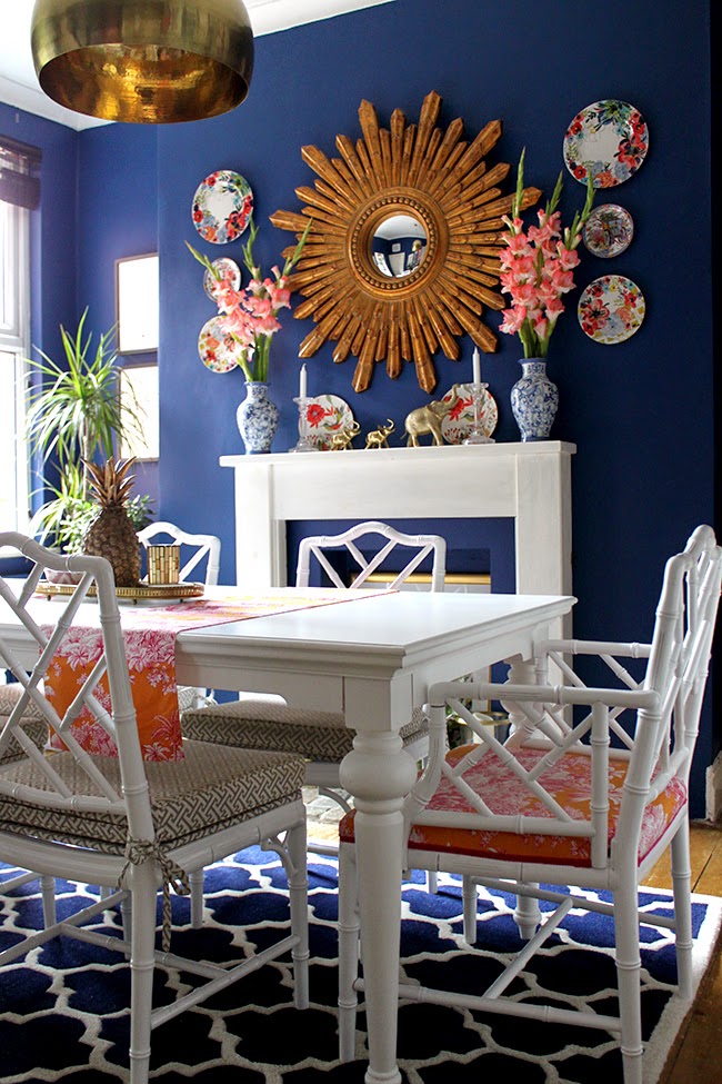
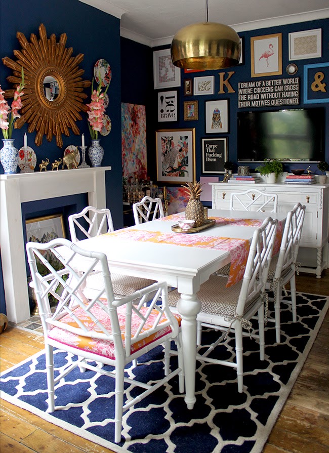
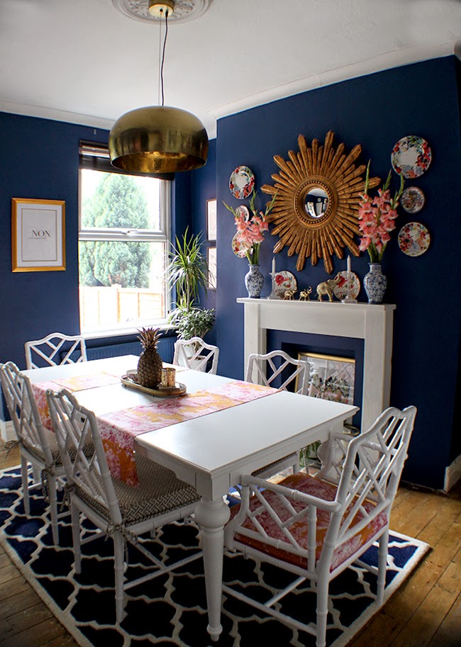
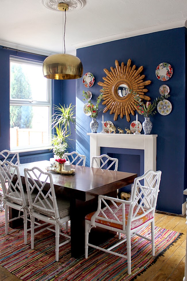
Okay now, before you say anything, I know it’s a bit too small for the room. But goodness, the pattern play and the colours work so incredibly well that I’m going to ignore that slight faux pas in styling.
I may actually get a larger jute rug to sit beneath it to make it work. Or I may move this back into the guest bedroom when it’s finally done and purchase a larger one for in here. I don’t know. Don’t rush me on these decisions. For now, it’s staying, interior design rules be dammed. They can’t hold me down, I’m a rebel.
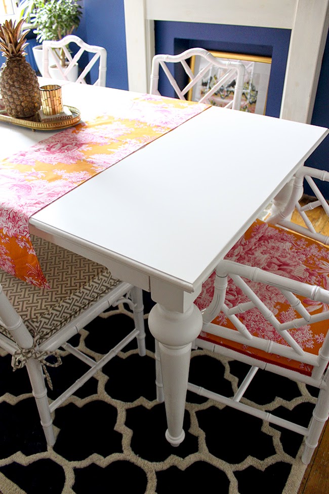
The table however, works rather perfectly. I love the soft matt finish and curvy legs with the Chippendale chairs. The whole room just feels so much fresher and crisper. Who doesn’t love the combination of navy blue and white? No one. That’s who.
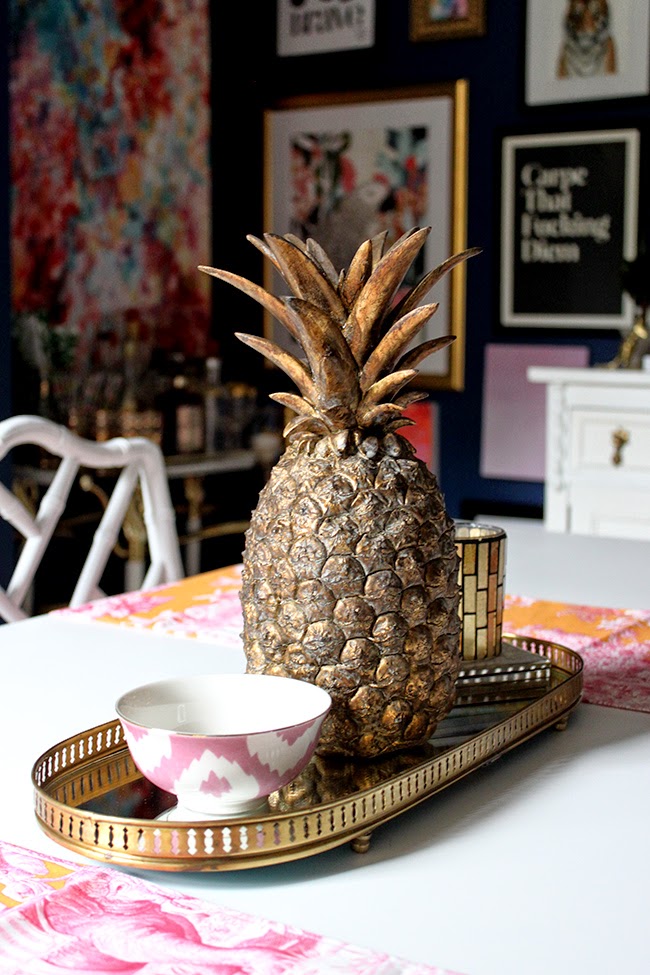
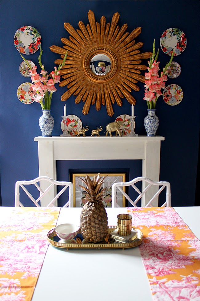
Speaking of new additions, how cute is my gold pineapple? The lovely Antonia at Rose & Grey sent it to me as a little gift which I thought was rather perfect (she knows me so well!). I love how it looks like a proper pineapple. I have no idea what it’s made out of but I sort of want to cut it up and put it in a salad and eat it. I won’t, mind you. But the urge is there.
You’ll also see in the picture below, the framed Sarah & Bendrix print I talked about on Friday on the far wall next to the window. We added a simple wooden blind (it’s been naked for a while and I raised it up to get as much light in here as possible whilst taking pictures but it’s not always hiked up that high!) and I’m considering adding another pelmet in here (the DIY for the one in my dressing room coming soon, they are dead easy to make). You can also see I moved my black & white prints to the alcove. I never had anything hung there before but it seems to bring a balance to the room.
Those stunning gladiolis were actually bought for me by Wayne. I shared them on Instagram but they are just so gorgeous (and so inexpensive!) that I’m sharing them again.
I went a little mental with the picture taking…
But every time I walk into the room now, I have to smile. I don’t even hate the grey/white pattern on the side chairs as much any more although I do want to replace them at some point!
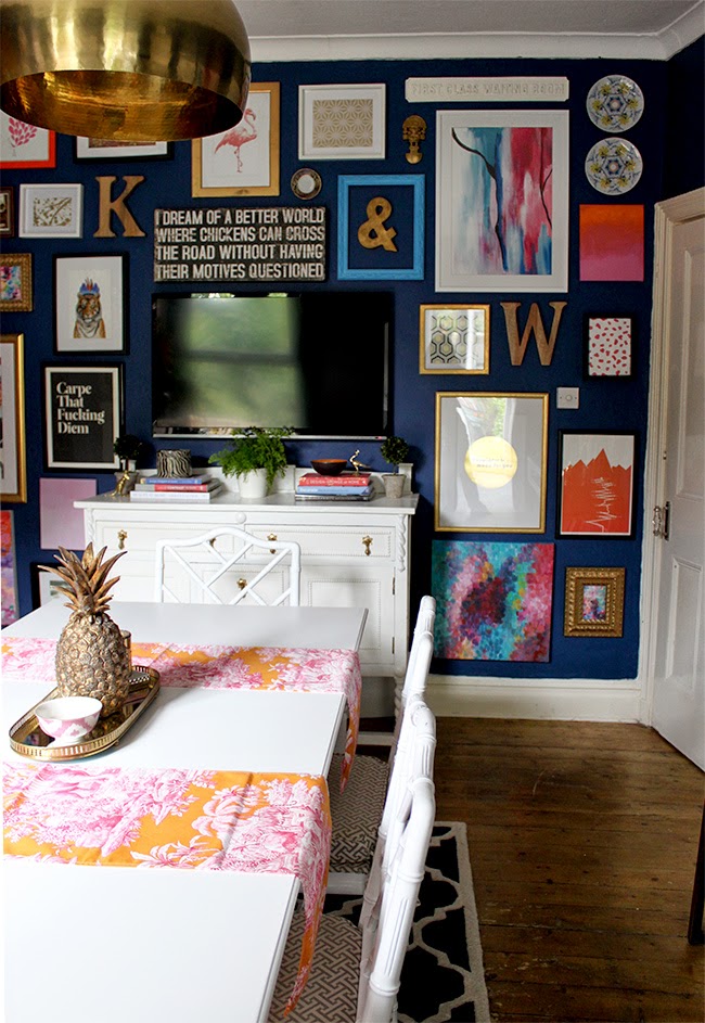
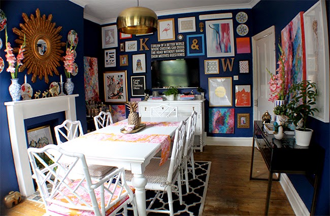
If you need a reminder, here’s what it looked like not too long ago…
And now…
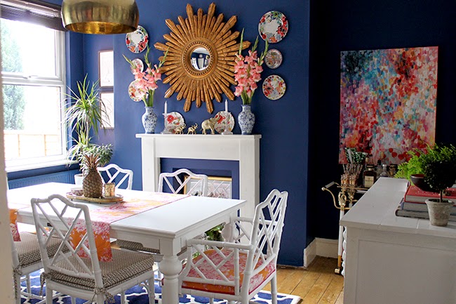
Finally, my really shitty wide angle lens comes in to share much more of the room. It’s weird seeing it like this but it gives you a good idea of the whole space – kind of like real estate pictures, no? And the room actually looks bigger here (It’s just 3.45 metres x 4.15 metres or 11ft 4in x 13ft 7in so not huge). Maybe not pinnable but informative!
Anyway, what do you think of the new additions? Would a white table be your thing?











ooh yes! good choice! the pattern and color are meant for that space!
I actually can't look directly at your pictures out of sheer fear they will burn my eyeballs because THAT RUG WAS SO MADE FOR YOUR DINING ROOM and that table? Oh man it's too legit to quit.<br /><br />Not that your dining room looked bad before, but the after pictures are marvelous. It's so grown-up, co-ordinated, sophisticated. Ace. <br /><br />xx A<br /><br />p.s. Your blind comment
AHAHAHAA!! I freaking love that film!! (I often quote her when I try to cheer up anyone, 'Positive! Positive! Positive!") ;) Thanks chick! xxx
Rug is perfect + I've had my eye on the Piaf quote print for a while…Looks gorg in the room xx Your Mantle is a lesson in symmetry Ms. Swoon��
I've never thought about getting a white table and it looks really cool , and that rug looks like it was made for that room, lol I can'f wait to see how you dress it for Christmas ( oops I'm I allowed to mention that word yet) xxx
That new table is so perfect for the space! I loved your dining room before, but seeing the two in comparison, replacing the table was such a good move!
Those are some seriously sexy legs- your table is one hot piece of erm… furniture. xxx
Hahaha!! Thanks for the lolz my dear! ;) xxx
Adore the new table and the rug too. So pretty and so you.
Hey Kimberly!! How are you doing? Long time no speaky, I've been missing your house posts during my time away from Blogland!! LOVING this new look, both the table and the rug (and the pineapple, amazing!) – and I still can't get over what an amazing job you did with those chairs, that Manuel Canovas fabric is still the bee's knees. Hope you have a fab week ahead!
The rug's pattern and colour are perfect with your new table. The only problem though may be that the edge of the rug gets caught under the chair legs as you pull the chairs in at the ends. If this gets annoying then I suggest going with exactly the same rug in a bigger size as you couldn't find a more perfect rug if you tried.
This is what I'm thinking! I'm going to see how it goes for now ;) Thank you! xxx
Love the new rug!
smashing table my dear. and i think the rug works well!
Looking beautiful!
Do you know what color paint this room is? I LOVE this room and actually your entire place!!1
Hi Gracie,<br /><br />Thank you lovely!! Yes, it's Dulux Wildwater 1, I really love it :) <br /><br />xxx
I loved your gallery wall and will mostly definitely miss it, but I know that change is a necessary and inevitable part of the journey. I LOVED your gallery wall and hope that it will return. However, the new change is still attractive, but I felt personally that the room was a more striking one with the gallery wall. Your version was expertly executed and invoked interest visually that added to the overall beauty of your home.