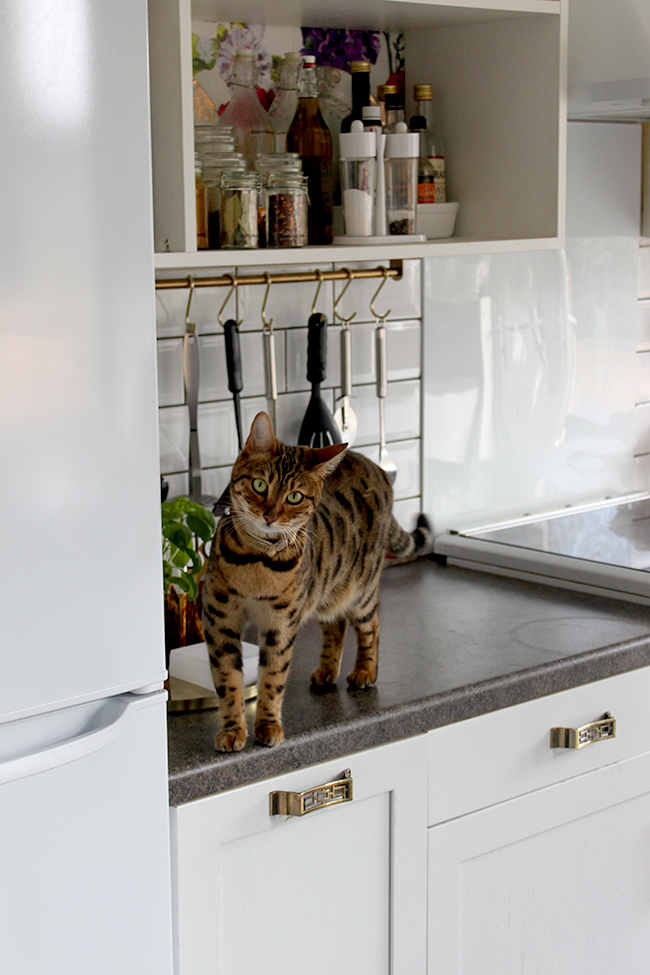
This is a hella long post and for that I’ll apologise. You see, as I’ve said in my 2015 goals post, my kitchen has been neglected for quite some time and so the list of things to do is just getting ridiculously long – but you’ll be happy that some decisions have been made. BOOM. So here’s where we are in the proceedings… (aside from fighting Meisha whilst taking pictures to STAY OFF THE COUNTERTOPS. Gah.)
As promised on Monday, we finally replaced the stainless steel cookerhood* and splashback. Once we went white with all of our appliances, the stainless steel just wasn’t working for me any more and then one day last week, I’d realised I’d had enough.
I went on my trusty old employer AO’s website, ordered this rather lovely Hotpoint number and it was delivered with no fuss the following day. (And, if you are wondering, nope, I didn’t get it free nor did I get a discount and despite the fact that I’m no longer in their employ besides being a contributor, I just think they are a good company for appliances – and that’s saying something right? My honest unsolicited opinion and recommendation right there.)
Here’s what it looked like installed (and with the old splashback removed, obvs)…
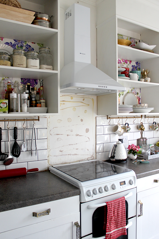
As for the backsplash, that was another matter entirely. I had initially been considering getting it brass plated. And then I thought about covering it with brass sheet. Both these options were pretty expensive and then I considered getting it sprayed in gold paint… But when we pulled it off the wall and I realised something. That the white wall hidden underneath (despite being covered in glue) kind of worked – I mean, not in the state it was in clearly – but I did like the lightness it brought to the kitchen.
And so I did a few mockups on Photoshop to see if I could make a decision. And both Wayne and I agreed that it would look best if the subway tile just continued across that wall. It wasn’t just the cheapest option, it also made sense visually. Here’s my really shitty mockup but hopefully you get the idea!
So this is what we intend to do (more tiling work – whoop! /sarcasm/).
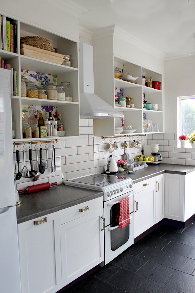
However… knowing that we won’t be able to do the tiling work in this room for a little while (at least until we make a bit more headway on the guest bedroom/office remodel), we decided to take the stainless steel splash back and paint it white. Wayne took it to work and sprayed it with car paint (it actually took two attempts to get the exact white of the appliances) but et voilà!
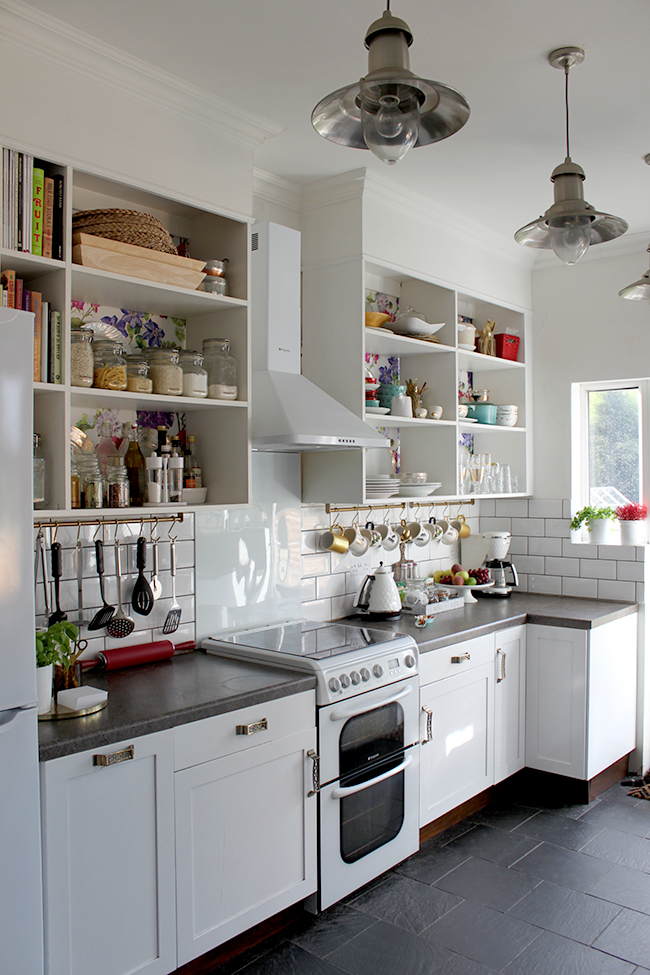
At least for now, it looks a lot better and matches with the cooker hood and cooker so it’ll do for the time being until we can get the tiling done.
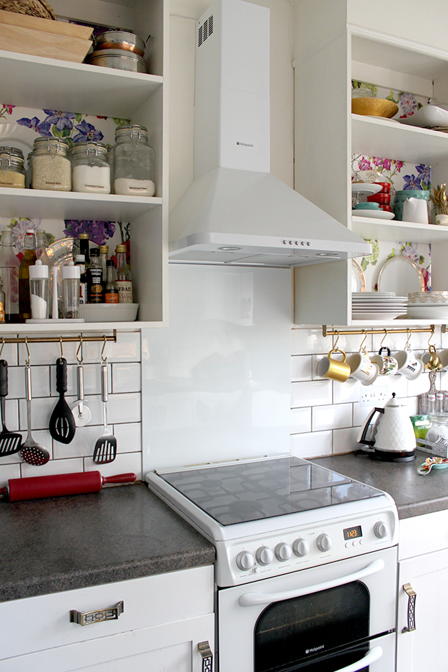
For those of you wondering about grease and cooking splatters, our cooker has a glass cover that lifts up when you use the hob* so the secondary splash back is a bit unnecessary – thus the reason I want to just continue the tiles – uninterrupted – behind it.
*Translation for my North American brethren: cooker= oven / cooker hood = extractor / hob = stove (I have always loved how literal the English are in their language. Isn’t ‘cooker’ just a really cute word?)
Here’s a little before and after action because you know how much I like those…
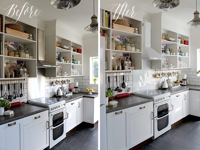
I know it’s a little difficult to tell on the splashback as there’s a glare on the stainless steel in the image on the left but it’s certainly brighter, right?
So, aside from eventually tiling behind the cooker and finally getting around to ridding myself of the stainless steel cooker hood/splash back situation (hurrah!), what else do I have planned that I haven’t yet mentioned?
Oh yes, the countertops. Goodness, this has been going for a VERY long time. Long ago, it was going to be butcherblock and then I decided I really loved the look of Cararra Marble so alternatives were considered both in quartz and quartzite and then it morphed back into just REALLY wanting Cararra Marble but considering a Formica laminate look-alike. And ya know what? After all of that indecision, I still want that f*cking marble.
BUT.
I have to remember something – we will not be in this house forever. And marble is a massive investment for us. And it’s not even all that practical (although I decided I was willing to live with the inevitable scratching and etching that came with it). If I could afford it, I’ll be honest – I would do it in a heartbeat. But we have other projects in the house to get to and I fear we’d be saving for another year before I’d even see Carrara in this kitchen. And then how long would I get to enjoy that beautiful marble before we moved out? *sigh* You understand why I’ve been paralysed with indecision all this time, right?
So it’s come down to this: I’ve decided that at a risk of only a few hundred pounds, it’s worth trying out the Formica marble look-alike. Yep, I’m going to replace laminate with laminate. I know, that’s crazy right? But from what I’ve seen, it looks good, it’s cheap, it’s hard-wearing and to tell you the truth, the laminate we have now is fine – I just don’t like the colour/pattern and I want something lighter.
Here’s what the formica option looks like from My Old Country House:
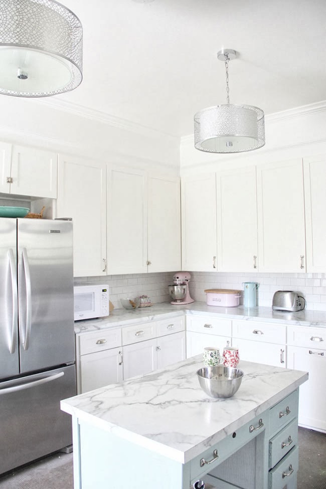
Looks pretty good, no? And if I REALLY hate it once it’s installed? Well, I can probably live with it for a few years until we finally move into our forever home and then I’ll get my marble worktops in there (if I still love them – who knows, I might be sick of the look by then). So there ya have it. Decision made.
The second big decision? I decided I want to repaint the lower cabinets. The white paint has held up remarkably well but I’m loving the look of these two-tone kitchens I’m seeing and well, I have a guy who can get them professionally spray painted for me for pretty cheap (thank you Wayne, I will never stop appreciating the work you do). If I didn’t have a boyfriend that sprayed cars for a living, I probably wouldn’t bother but I might as well take advantage of it, right? It’s okay if you hate me right now, I understand.
I want to go with a dark blue to tie into the dining room and really join those spaces. I think the contrast of the light countertops and the dark cabinets with the brass handles is going to look rather delicious.
My inspiration…
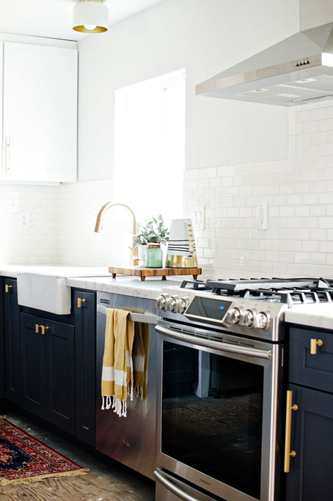
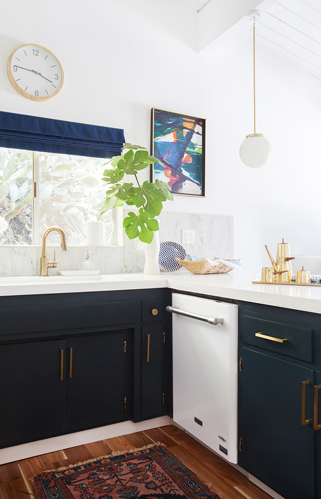
YUM. Also, Emily Henderson’s kitchen (that 2nd picture) is just so good. I’m totally stealing so much of what she’s done (including the brass trim as I mentioned the other day) and ya know what? I don’t care. It’s so beautiful and bright and accessible. I want it.
And here’s my little mockup of what my kitchen will look like after (nearly) all the changes I want to make (excuse the fact that my Photoshop skills aren’t fantastic and I’m too lazy to take the time to make this perfect):
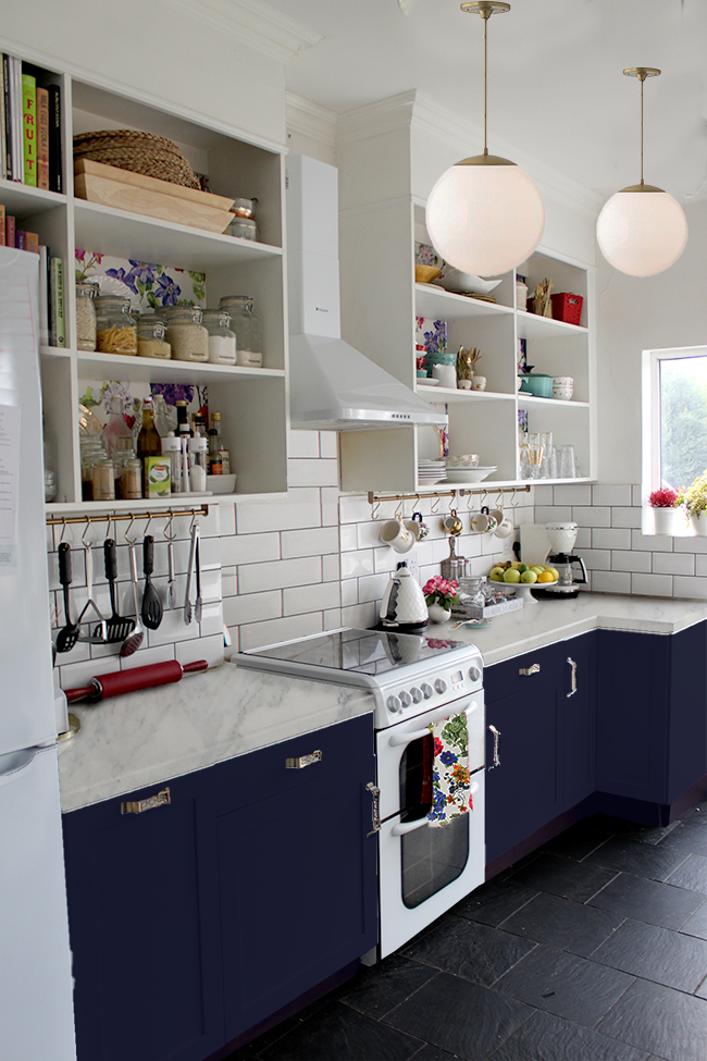
So here’s the big mega-long list of things that need to be addressed in the kitchen to get to that mockup that I’ve (mostly) covered in my last three posts:
- install tile across back of cooker
- in the weird ’empty space’ next to cabinets on opposite side, continue tile from cupboard down wall
- “retrofit” brass trim around tiles
- raise cabinets by approximately 2cm
- replace toe kicks that are too short and refit so that Meisha can’t mess with them
- replace stainless steel lighting with something in brass
- replace roller blind with wood blind and create pelmet
- replace wall clock
- hang shelf with hooks for hanging pots/pans
- new artwork
- replace worktops with marble look Formica laminate
- repaint lower cabinets navy blue
- replace black microwave with white one
- get some pretty new teatowels
Oh shit, see, when I write it all out I think HOW ARE WE GOING TO DO THIS ALL THIS YEAR? But hell, once the guest bedroom/office is done, the kitchen is bumping straight up that list. Shit gonna go down.
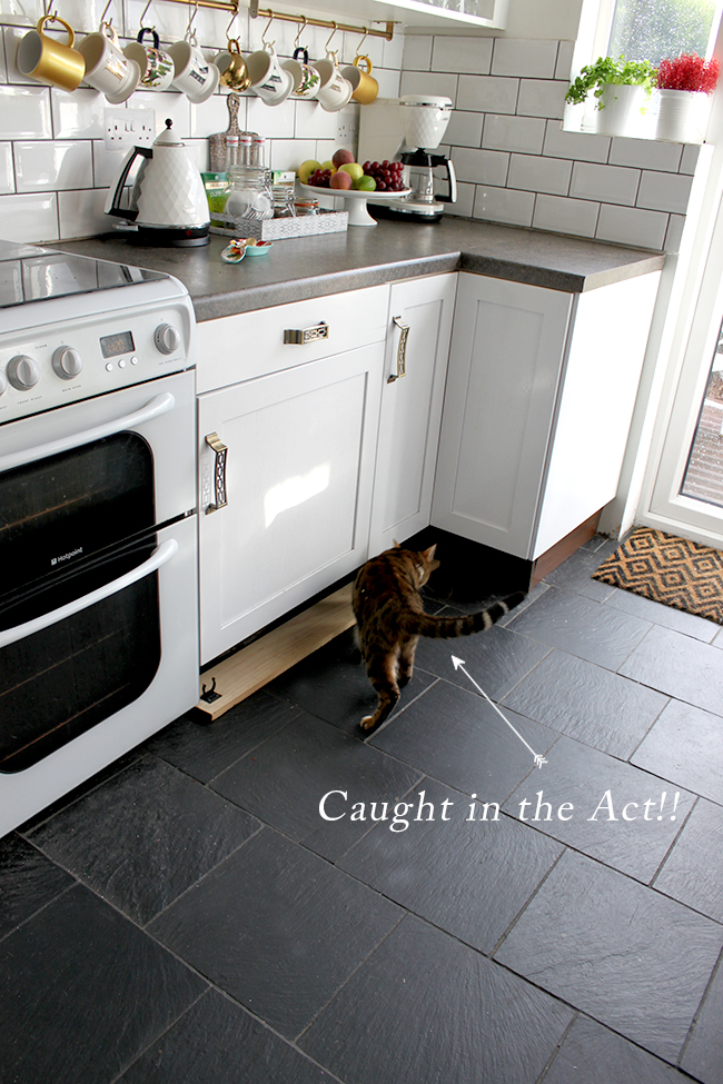
Also, I just needed to share this – I promise I wasn’t lying when I said that Meisha has a habit of pulling out the toekicks… (sigh)
So what do you think of the new cookerhood/spashback situation going on? And what do you think of the rest of my plans to get this kitchen a bit more swoon worthy?
Inspiration images: Brittany Makes / Emily Henderson (all others my own)












I used the laminate marble in my kitchen and it is great. Obvs not as good as the real thing but with a long list of projects to tackle and a not large enough pot of funds, it works fine. I bought the bushboard prima brand calacutta. If you google it you can see lots of images of this in kitchens.
Can’t wait to see your finished kitchen. I really enjoy reading your blog. I’m a fellow American married to a Brit and I especially enjoy following your blog for the American slant you seem to be giving your English house.
Thanks!
Is it an American slant? I hadn’t realised – just thought it was Kimberley’s amazing glam, creative touch! :-)
I’d be interested to know what elements you think make it American? (Genuinely curious, not being mean – conscious comments like this can come off wrong online!)
Also, laminate ‘marble’ may be EXACTLY what I need in my own kitchen. I was dreaming of butchers block worktops and white cabinets, but then I’ve bought a house which comes with some absolutely stunning solid wood cabinets that I can’t bring myself to paint, but the idea of solid white worktops doesn’t do it for me, and of course, I love marble! I used to live in Tuscany and occasionally would go to Carrara just to look at the beautiful slabs lined up in the merchant’s yards! Sadly no money to ever buy though. Why is beautiful sometimes so expensive?!
Ha! Anna, you’d be surprised how often I hear that I have a very ‘American’ looking home ;) I’m definitely influenced by American trends but I suppose I try to give it my own uniquely British twist ;)
Wood cabinets with a marble-look-alike laminate sounds like a gorgeous combination – and I wish I knew why all the pretty is so mucho expensive… us ‘normos’ would like a bit of that action too thankyouverymuch ;)
xxx
Oh it’s always good to hear from someone else who has tried it and liked it! That’s the brand I’m looking at as well and yes, there has been LOTS of googling on this one lol What put me off initially is the shiny ‘radiance’ finish on it – does that bother you? I’d love to hear your thoughts!
So nice to meet a fellow Yank with a British OH! Thanks for commenting! xxx
you have plans, girl! I wish you (and Wayne) a lot of patience. Mostly Wayne. lol
Just one thing: On your mockup with the dark blue cabinets it looks quite dark with all the black (?) tiles. A nice rug would be perfect to brighten it all up, don´t you think?
Although I must say I have my prejudices when it comes to rugs in the kitchen. But it just looks SO nice! Who cares about all the greasy stains and stumblings into sharp knives, am I right? :-D
Poor Wayne, honestly, I don’t know how he puts up with it! lol (ok, to be fair, there’s a lot of eye rolling that goes on in my house) ;)
And I might actually go with white toekicks to break up the ‘dark’, haven’t decided that just yet! But YES a rug is definitely under consideration, the hell with practicalities! LOL! They do look lovely xxx
Love the new white range hood love. Also you know Im all about that two toned cabinet life!! I went white and gray in our last kitchen and now white and black in our current kitchen reno. I just love the look and I honestly think its the new classic. Plus it lets you really play with color in a super low commitment kinda way. Love Brittany’s kitchen, seriously its so so good. Also Im playing devils advocate here and saying you should totally go back to your butcherblock option. First of all Im biased, obvisoulsy. And second of all I just think they go such a long way toward the warmth and coziness of your kitchen space. I love them paired with two toned cabinets. And please don’t hate me for saying this, but the thing I love the mostest about your kitchen is the eclectic, intentional, “I actually use and love this space everyday” look and feel it exudes. I just love that your kitchen is one IN a million, not one OF a million. I like Emily’s kitchen, but I love yours more. I think the marble look is beautiful, but if you don’t plan to commit to this house long term and you know its not forever I say don’t even fake the funk with the faux. Save that element for your forever space maybe and embrace this lovely kitchen for the warmth and beauty you’ve already got going on. Im on #teambutcher here. Plus its super duper affordable. Thoughts? Am I being overly opinionated? On another note, Im loving all the other plans youve got conjured. And I love that you call it a splashback!
AGHHH STOP FILLING MY HEAD WOMAN!! LOL! I’m joking really and no you aren’t being opinionated – I f*cking love it! “don’t fake the funk with the faux” gave me the lols ;) Ok, I’m gonna do a couple more mockups with butcherblock although I’m warning you now, it probably won’t happen ;) But for the sake of research and exhausting all options and because I trust your judgement I shall try it! :D Thank you my dear!
Also what do you call a splashback? I’ve been here for 13+ years and I’ve forgotten my American English! lol xxx
hahah! I totally love your warning. Its like my backsplash (aka splashback;)) situation…the most popular vote is for the colored subway tile, but I just cant quite let go of the thought of patterned tile. the heart wants what it wants for sure. Also why exactly do they add the u in color and favorite, and why do they replace the z with an s like with apologize? Inquiring minds (or maybe just my nosy mind) wanna know. Smooches.
Absolutely loving the mock-up of the new look – you are so lucky that you can get things professionally spray-painted! (I do hate you a little for that!) ;)
I’m really into navy/deep blue lately – I think it’s such a great colour that works so beautifully with other colours – it seems to bring out the best in the colours around it. It has the effect black has, of making colours pop, but with a bit more richness and warmth, I love it.
In your mock-up, you can see that the navy cupboards seem to enhance the colours in the wallpaper in your top cupboards. I am most definitely in favour of this idea!
I think the marble laminate is a good plan, bearing budget in mind (oh, what we could do if money was no object!). These days you can get very good quality laminate, and I think the lightness of the marble-effect against the dark lower cupboards is going to look perfect (well, you can see how great it looks in the mock-up!)
I’ll stop gushing now!
Maria x
Aww thanks my dear! So pleased you like the plans and agree, the laminate that is out today is miles better quality than that of years ago. And I’ve heard very good things about this one! Fingers crossed, eh? ;) xxx
OK…first of all I really love and admire your ballsy sense of style and love pretty much everything you do even if I wouldn’t necessarily be brave enough to do those things myself (and wasn’t renting!). However, I think the dark lower cabinets and the light countertop are fighting with the floor. Personally, I think keeping the cabinets as is and changing the laminate countertop to a dark countertop but of better quality would really tie it all together. OK…perhaps not so ‘exciting’ and ‘adventurous’ design wise, but you have a lot of other lovely touches going on here that make the kitchen unique and very much in keeping with the rest of your house in terms of style. Also, I currently live with a light laminate countertop and it shows absolutely everything (hello curry stains!). I love the idea of the brass tile trim though!
Ahh thanks for the input Valerie! Maybe it’s just that we’ve had the dark tops/white bottoms for so long, I’m just looking for a change now ;) I may end up hating the laminate but let’s hope not – I’m keeping my fingers firmly crossed (although we do make curry – hmm!) ;) xxx
Hey, Thanks for the shout out! You will NOT be sorry you got the Faux Marble laminate! Super excited to be included alongside Emily Henderson! Good Luck and cannot wait to see the finished product …if you have any trouble getting your countertops the way you like them let me know..I am on a first name basis with my guys at Formica! xo
Oh you’re so welcome, your kitchen looks amazing with those worktops, it’s hard to believe that’s laminate! Aww and thank you so much, that’s so kind of you! xxx
SHUT THE FRONT DOOR. Oh heavens above. Your kitchen is going to be a designers wet dream. Meaning, I’m going to have some incredibly inappropriate dreams about your kitchen tonight. Damn girl, dat backsplash gonna be so goood. In case that wasn’t clear.
And that faux marble formica (fauxmica?). I hate my life so much right now.
xxxxx A
LOL! Fauxmica – love it!! Now no inappropriate thoughts about my kitchen – it’s pure and white, can’t have you adulterating it… geesh ;) xxx
I’m so glad you’re painting the lower cabinets, I was worried with the white counters and white units and white walls it was just all going to get a bit… white!
I do also agree, as someone said above, that the cabinets as is would look great with a dark worktop, but I really like the two tone plan. Have you thought about bringing some more wood accents in? It’s probably just my personal taste taking over but I love the combination of rich colour, white marble and dark wood, it just looks so luxurious!
I actually am, Sam! Good thinking Batman ;) I’m planning on dark wooden blinds at the window and I’ve got my eye on a rather lovely dark wood clock as well – gonna get me some warmth in here! Stay tuned! xxx
It looks fabulous! And I just adore the plans you have for the kitchen! That white marble Formica is part of my kitchen plan too for all the reasons you listed :) Have you seen the kitchen from Restless Arrow? (http://www.restlessarrow.com/2014/09/30/white-dream-kitchen-5k-budget/) She used it as well and it just looks perfect! I’m sold!
Oh wow, I hadn’t seen that one! See how GOOD it looks?! Amazing! Thank you for sharing that one and good luck to us both then – hope this stuff looks as nice in person as it does in pictures! xxx
Thank you so much!!! I LOVE the laminate on that beautiful blue island you shared!
OH! I just love your final mock up there! I have heard that the marble lam is a great alternative if you don’t want to invest. I haven’t seen it in person but if that image is any indication that would be a great alternative. Brittany’s kitchen is so freaking gorg and I love the dark lower cab trend. That looks so good in your space! xoxo
Yay! So pleased you like it! Ya know, everything I’ve seen makes that laminate look pretty freaking great – And yes Brittany’s kitchen is just stunning, absolutely love it! Fingers crossed it all works out to plan ;) xxx
Thank you so much!!! I LOVE the laminate on that beautiful blue island you shared!
Hi, Duran.
I want a help from you. I have got my kitchen pained with light pink color. now I am confused that what type of and what color of splashback is suitable for my kitchen. do you have any idea?