*blinks* *stretches* *yawns*
Oh! Hey look at that! It’s January and I’m back!! I hope you all had a fabulous Christmas and New Year if you partake in the festivities or a nice break if you don’t! My Christmas was really lovely – we spent it with Wayne’s family and enjoyed a fabulous turkey dinner with all the fixings, perfectly prepared by my amazing boyfriend, loud dramatic renditions of ‘Frozen’ with my nieces, paper hats, fairy lights and a good time had by all. New Year’s Eve was a little more down key than planned as I got struck down by illness but well, there’s always next year to party, right? Right.
So! Shall we address the rather stylish elephant in the room? Oh yes, you might have noticed that it’s looking a little different around these parts – yes, while everyone else was luxuriating in time off from work, guzzling eggnog and stuffing their faces with mince pies, I was working on a new design for my blog… whilst also guzzling eggnog and stuffing my face with mince pies. Don’t judge me.
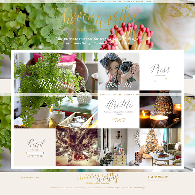
If you are having a look at this on your phone or via a reader, then please please do click on over to the main site – I would love for you to really get to see all the pretty nifty changes around here.
I decided that I would use my break wisely – moving my entire site from Blogger to WordPress and creating a brand new look for Swoon Worthy… Something I probably should have done about 3 years ago but worried I lacked the skills to take on myself. In fact, I had resigned myself to hiring a designer but after much deliberation I realised that I’m so particular about things that if I really wanted this to happen within a very short time frame, I would need to just bite the bullet and do it myself. And ya know what? It was a hell of a learning curve, sure, but was it impossible? Of course not. So here she is, the result of many many hours of researching and a horrifying number of hours applying that knowledge to this little space.
So what’s changed?
My logo: Okay, so if you’ve been with me here for any length of time, you will know that I change my logo like it’s Beyonce in concert, so it’s hardly surprising that with a new design came the desire to give my logo a little makeover. I really love the look of calligraphy so decided to purchase a new font and go to town.
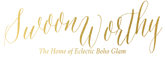
My strapline: Now despite always changing my logo, I haven’t changed my strapline for about 4 years. But after lots of consideration, I realised something. That my style is my USP (Unique Selling Point if you aren’t familiar with corny Marketing acronyms) and my style is the thing that most people remember about me (and the thing I’m interviewed about most). So, “Inspiration, DIY and the Quest for Pretty on the Cheap” has now become “The Home of Eclectic Boho Glam”. Does that mean this blog is changing it’s quest for pretty on the cheap or that I won’t be talking about DIY anymore? Absolutely not – the content isn’t going anywhere, just the packaging it’s wrapped in!
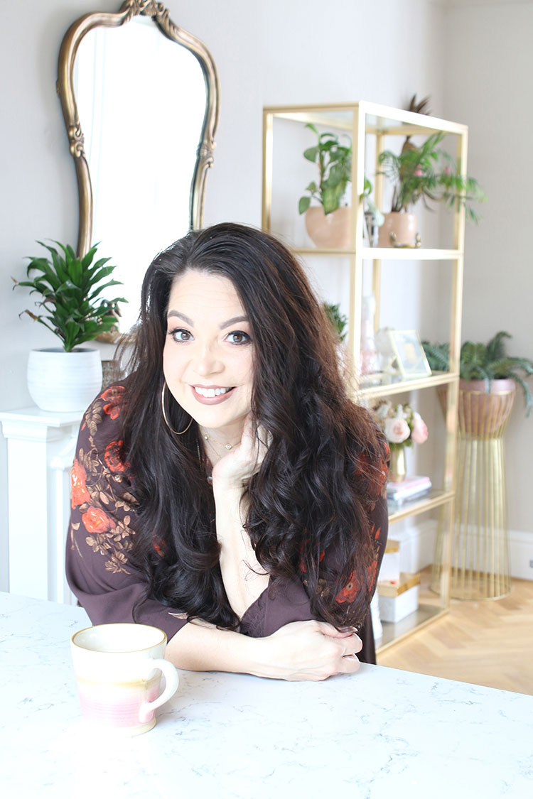
My Home Page: I now have a proper static ‘home page’ which allows you to find content pretty easily while wrapped up in some pretty pictures – so you can jump straight into my home tour (which is now multiple galleries, much easier to click through rather than a ridiculously long single post and much easier for me to keep up to date) or you can click on my smiling head to read a little bit about me. Or you can check out all of my How To’s in one place. Or, of course, you can just click on any of the last 3 posts shown in the bottom row to read the blog (they are in chronological order). Lots of options! This also allows me to showcase content outside of just the blog – not just for the freelance work I’m doing now but also because I have some pretty cool stuff planned this year so stay tuned for that.
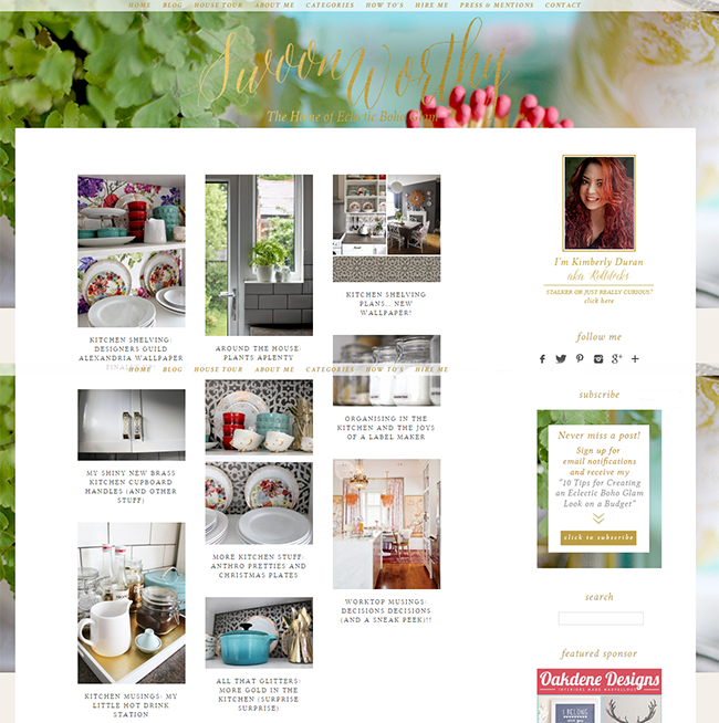
The Menu: There’s also a top floating drop down menu which allows to get where you want to go no matter where on the site you are – so if you want to just look at the posts about, say, the kitchen, you can do that by hovering over Categories > My Home > Kitchen and when clicked, you’ll be greeted with a lovely grid of posts with images, allowing you to find just the thing you are searching for. It’s so much simpler than what I’d had on Blogger.
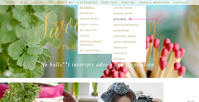
(Apologies for the ‘double menu’ in the middle of some of my screen shots – I couldn’t for the life of me get a screen shot without it happening and obviously it won’t look like this when you view it on your own screen.)
Sneak Peeks: Once you are within a single post, you can hover your mouse on the left or right margins of the screen and you’ll get a little peek of the posts that are older or newer around it. Give it a try now, it’s pretty cool.
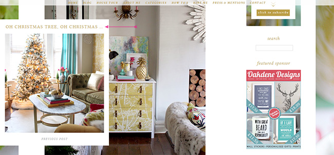
Free Goodies for Subscribers: Also, I am giving you a little incentive to sign up for my email notifications – I put a little PDF together on my Ten Tips to Get an Eclectic Boho Glam Look on a Budget and if you sign up, you get it free. Just for being so cool. So there’s that. Go on and click on the link in my sidebar for free swoony goodness and to get a little email reminder every time I post new content here. I promise I won’t spam you or anything. For my current subscribers, don’t worry, I’ll be sending this out to you all very soon.
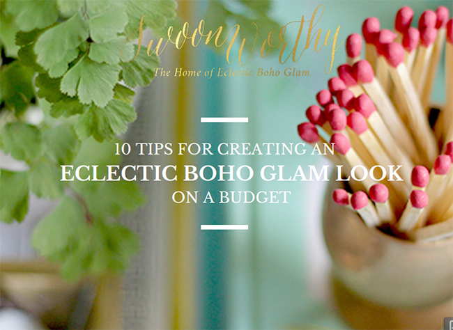
I think the thing I like best, however, is that I feel like this design is really ME. Everything I read about designing a blog said your blog should reflect your content – it should be indicative of what your blog is all about. And I think this does – and I hope you do too.
Bear in mind, there are still a few little buggy things going on – for instance, on some of my older posts, no image is pulling through to those category pages. It’s just something I’m working through fixing as I go. I also am well aware that there was about a year where many of my ‘inspiration’ photos broke. Apart from practically rewriting those particular posts for the entire year, unfortunately, there’s not much I can do so apologies for that. There are also a few links that need updating and I’m trying to get those fixed as quickly as I can. So there are a lot of things I’m working through slowly but it all takes time.
Of course, if you have any questions or see something that’s not quite right, there’s a little contact form *points up to the menu* that you can drop me a line on or leave a comment below and I’ll do my best to sort it out!
Otherwise, I hope you love the new look as much as I do! I’d love to hear what you think!
If you need a reminder of what the old blog looked like, you can see a screenshot here – (click on the image to view full size).
If you’re curious, I used Prophoto to edit my design – it was worth every penny and their support staff is brilliant. Also, if you click that link, you’ll get a $10 discount (and I get a $7 referral fee). Win win. I also used the Velvet theme by Dawn Alderman. I was not paid to switch over nor did I receive anything in return for that plug, I just think it’s a brilliant way to design a site and I’m a happy customer.








OMGEEEEE! I love the new look (I love your old look too)….It looks so FRESH. So happy for you!
-Jess
Thank you Jess! Mwah! xx
Looks lovely! I like the description eclectic boho glam. I love your style, so colourful and interesting. Looking forward to seeing what you have for us in 2015.
Thank you Aimee! So pleased you like it! xx
I love the look of your new website. I find it a little difficult to read though, the writing is quite small and the font style/size a wee bit of an effort to me to get through!? Content ia fantastic as always though! :D xx
Thanks for the feedback Christine! I’m going to see what I can do to change that and make it a little easier to read! xox
I’ve increased the size of the font, hope that’s a bit better? Thanks so much for your feedback, it really does help :) xx
Hi Kimberly, no prob. Yes, it is definitely easier to read now. :) xx
The new website looks really pretty, but the colour/size of the font makes it a struggle to read (I am slightly myopic and use reading glasses to read tiny instructions on the back of food packets, but this is the only website I have needed them for). The comments under the blog posts are impossible because they are so faint. I love your site though – onwards and upwards!
Thanks for the feedback Angela – agree the comments are ridiculously small, will see what I can do to make it a bit more legible! :) xxx
I’ve increased the size of the fonts and made them a little darker in the comment section – hope that helps! And thanks so much for the feedback, very helpful :) xxx
I am a new subscriber to your site – really enjoy the interior photos and hints and tips. Doing my very old house up at the moment (slowly!) so am loving looking at your site. Fab xxx
Hi Heidi! Thanks so much for subscribing and welcome! Hope you find some ideas and good luck :) xx
Wahey!! Lookin’ good, lady! :)
Thanks so much Suzzy! xxx
Woohoo!!! It looks fabulous and definitely very boho-glam. God, you’re so much more glam than me! ;-) Looks like time well spent, well done you xo
Ha! I think we’d established long ago that I’m much more glam! LOL! Thanks darling – mwah! xxx
Ooooh fancy! Your new look is great(well, the site’s new look, you are ALWAYS lovely!)! I am very envious, I’ve been trying to come up with a new look for my site for quite some time now, and now I am wondering if I shouldn’t just let your homepage inspire me.
And now excuse me, I have to plow through all the galleries and drool :)
P.S.: Happy new year, and big hugs! xxx
Thanks darling! Happy New Year! xxx
Love the new site design. But I am still having trouble with the light blue print.
Hi Connie, so sorry to hear your having issues! In which areas? The comments? xx
WOW! Looking SOOOO good! Really great job. The site really reflects the content & your interior style :)
Congratulations & happy new year!
Thanks hun! Happy New Year! xxx
Off topic, but could you tell me how to get Maidenhead ferns to flourish like yours do? I’m generally pretty good with plants but really struggle with these, and I love them so.
Your redesign looks great :)
Thank you! I’ll be honest, I go through a lot of Maidenhair ferns because I struggle to keep them alive as well (good thing they are only a few pounds each). However I have learned that they like a lot of indirect sunlight and they hate drafts. I also water them about every 8-10 days or so which seems to make them last a bit longer.
Other than that, however, it’s really just a guessing game and I can’t always keep them alive! I tend to go to Homebase because they do 3 for £10 deals on them and so I just replace all the dying ones at one time! LOL!
Well I’ve got to say it’s a relief to hear that its not only me that sneakily replaces the dead ones! Thank you for the quick answer I’m going to try your tips and see if it helps :)
Haha! No it’s definitely not just you! Good luck ;) xx
Your new design looks fab!! What a great start to 2015 :) Happy New Year Kimberly!
Cheers!! Happy New Year to you as well :) xxx
Oooh very nice! Good use of a Xmas break I’d say :)
Thanks so much Andrew! :) Hope you had a good Christmas & New Year! x
Finally had the chance to take a good look at this – and I LOVE your new look site! It really reflects your style and is so lovely to gaze upon! It looks very professional too.
Funny thing about your new font for ‘Swoonworthy’ – it almost seems familiar, as though it’s always been like that, in that it’s just so right and fitting for you, if you know what I mean.
Looking forward to carrying on reading!
Maria xx
Aww thanks so much hunny! I love your comment about the new font, so pleased you feel it’s such a good fit! I love it too :) xxx
Oh mine eyes, Kimberly. You absolute wizard. I call that a Christmas holiday well spent!!! (although I experienced some minor seizures when I rebranded my page such as having to own both domain names and redirecting them within an inch of their lives, so I have a very minor idea how time consuming and head wrecking it can be).
Oh she is a smooth and sassy beaut. And so YOU!!! I am over the moon for you Kimberly, and the swishy side photo thingy-ma-bob on your house tour – SHUT UP. I think my head would explode trying to rig something like that up.
I bow at your boho genius. Can’t wait to creep more xx
LOL! Thanks so much my dear! It was definitely a labour of love – so pleased you like it! xxx
I don’t think I could love the new look any more. SO gorgeous!
Thanks so much darling! xx
Love the new website!
Can I ask a random question, one cat lady to another…Do you let your cats outside and if so, how do you keep them safe?
Thanks Laura! I’ll answer your question via email ;) xx
Great job Kimberly, your front page looks stunning! It might look a little busy in the beginning but it reflects your style and personality. My only suggestion would be to swap your “Home tour” with “About me”, that way your picture will be bigger and anyone new to your website would notice immediately who you are:)
Hi Kimberley, I am a bit of a font addict and love the look of your logo. I was given a book about calligraphy and fonts for Christmas, I’d love to add the font you bought for Swoonworthy to my collection. I have 663 fonts already but this really speaks to me. Please could you tell me what it is? Thank you.
Wow, that’s a hell of a collection of fonts!! Of course, it’s called Asterism by Great Lakes Lettering :) HTH!! xx