So yesterday, I spent a little time refreshing my living room for Spring. I was itching for something different and on Monday, I’ll share the results of my little faffing session. Here’s a sneak peek…
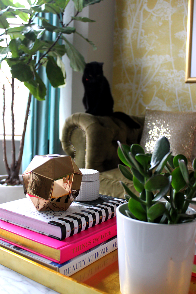
One of the things that changes the most frequently in my home is my coffee table vignette. It’s the one thing I can do that doesn’t cost me any money but gives me a lot of satisfaction – so books are swapped out, flowers and plants come and go and trickets and objects are frequently swapped for something different.
But before I show you my own, I thought we can have a look at some really pretty coffee table vignettes and figure out why they look so good.
It took me a while to figure out how to get a pleasing vignette but aside from a lot of trial and error, there are some basic tips that are always good to keep in mind. So let’s get started, shall we?
Tip #1: Vary the height of your objects
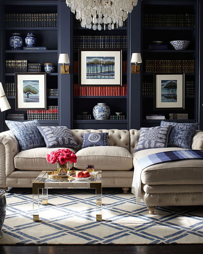
You should always have at least one item that is taller than the rest. You want both vertical and horizontal interest at varying heights on your table so that your eye is drawn around the items rather than your eye falling on a flat line. Use stacks of books and boxes to build up the height.
Tip #2 – Split your table into quadrants or threes
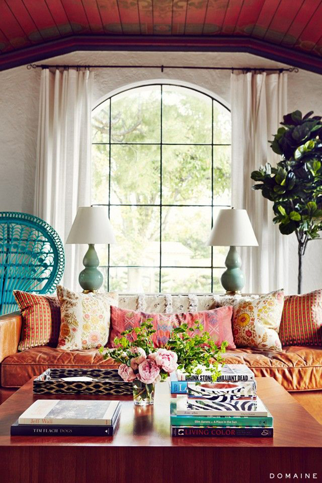
Stacks of books or trays helps break up the vignette creating easily accessible ‘nuggets’ of inspiration and having some empty areas gives your eye a place to rest, items to breath as well as a place to set your cup of tea!
Tip #3 – Always include some kind of life on your table
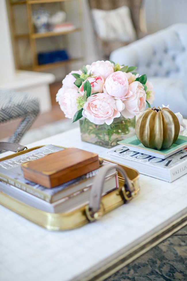
A vase of flowers or a potted plant will add energy, colour, texture and life to your vignette. You really can’t ignore this one and you’ll see it repeated in nearly every great vignette out there.
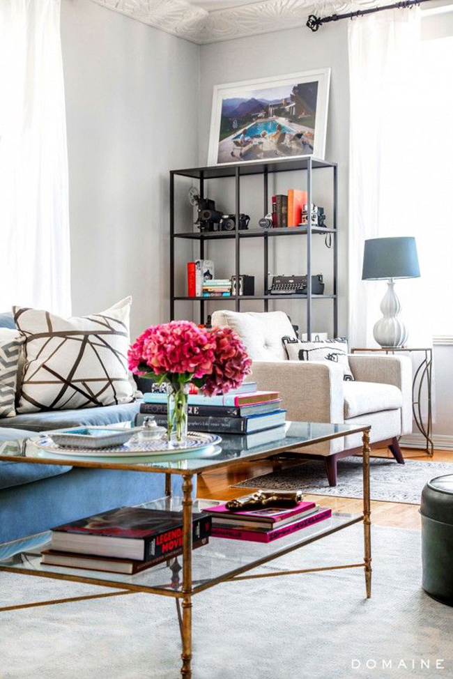
Tip #4 – Always include something a little quirky or ‘off’
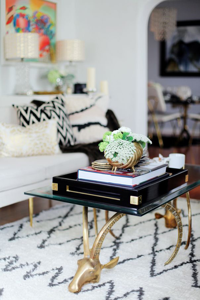
I think this really just adds personality to a table and keeps it from looking a bit too formal. My favourites are things like little brass animals or unusual trinket bowls but you might want to use things like vintage paintbrushes, an ornate magnifying glass or your grandmother’s jewellery. Whatever it is, it should be a reflection of your own uniqueness and history.
Tip #5 – Include a variety of shapes and textures
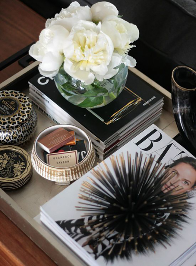
Round, square, rectangular – they all play nicely together and create some interest. Adding a structural object (like that amazing brass urchin above) looks great too. Be sure to contrast textures as well – glass with stone, leather with ceramic, smooth with rough, shiny with matt – you get the idea. Variety is the spice of life and the spice of your vignette too.
Tip #6: Keep your colour palette consistent with your room
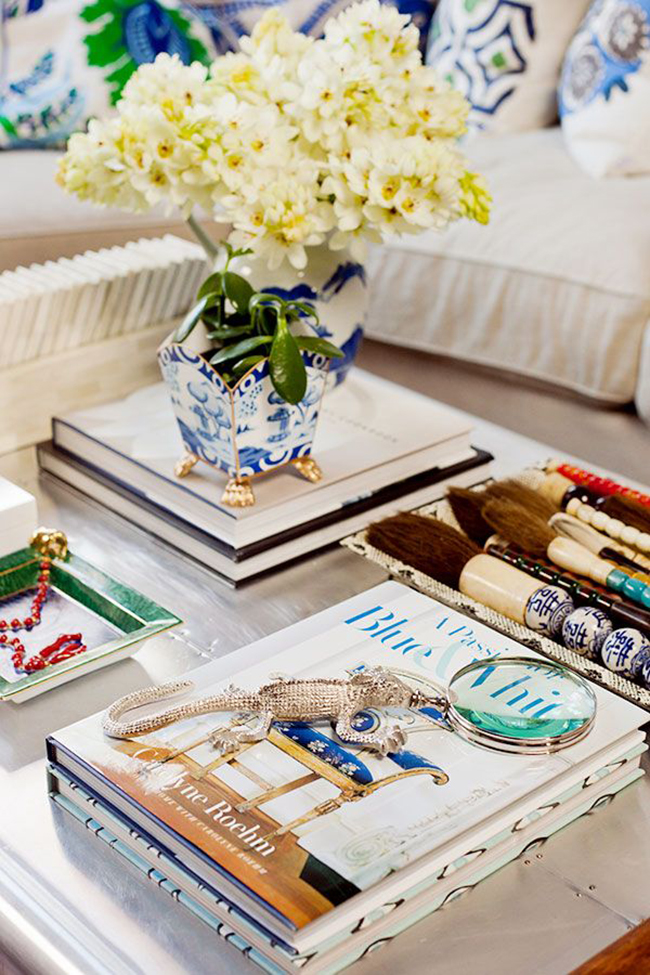
So if you have blue cushions on the sofa, bring in a bit of blue on the table. If you have touches of brass and copper in your room, bring those metallics into your vignette. You don’t want to have objects that jar with the rest of the space nor do you want your vignette to necessarily steal the show. It should be consistent in terms of styling with the rest of the room.
Tip #7: Go all tray chic.
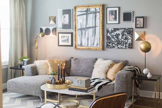
Yes, trays are your friends in any vignette. They corral your smaller objects and accessories and make them look more purposeful.
Tip #8: Books are also your friends
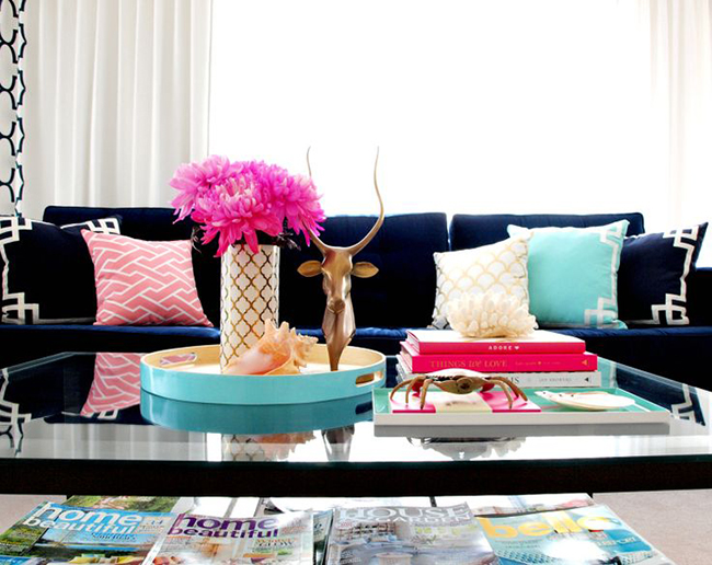
Stack them up for height, place an objet d’art on top and BOOM. You’ve got a fabulous vignette. Want to know which books are my favourites for display? Check out my post here.
So those are some of my top tips for creating a great coffee table vignette. The most important thing, however, is that it should reflect your personality and your own distinct style.
How do you style your coffee table? Tell me what’s on yours and I’ll share mine and the rest of my living room on Monday!
Image sources: 1 and 2 my own / Horchow / Domaine / Pink Peonies / Domaine / The Glitter Guide / Erika Brechtel / Waiting On Martha / Design Daredevil / Luxe Addition



I love all these examples :) I am itching to change mine up to. Can’t wait to see what your faffing has changed :) I am getting a new sofa which is prompting me to want to change everything…again. Domino effect. Have a fab weekend! xoxo
Is it really weird that I’m TOTALLY excited about your new sofa? Hmm. #stalkermuch xxx
I LOVE that brass tray in tip #3! (And the flowers) Covet covet, x
I know, right?! Those buckles on the side with the leather straps.. dear god. I wish I could figure out a way to DIY it lol xx
These are such good examples Kim. Table vignettes can be tricky, but youre right. Its all about trial and error. Cant wait to see yours.
love them all and I’m obsessed with my coffee table but unfortunately the hubby and kids can’t leave it alone
I could imagine with kids it’d be difficult and even with the OH, I am always putting it back together! lol I have nearly everything on a big tray so it makes it easier to just move things in one go if necessary ;)
xx
I really like how all those coffee tables look like. There is just one small problem (at least for me). When you staffed your table with objects there is no place for a tea!
I’ve got a big coffee table, so I’ve got plenty of space to play with, but I always find myself moving things away to have more room for my tea, cake or snack. No matter how pretty I style it, my table is ruined in the same day.
LOL! Yes, I can totally understand that – I always leave enough room around mine to set a cuppa tea but we don’t eat in our living room much so I suppose there’s no need to make room for a plate ;) I do use a big tray though so if needs to be moved, it can be done in pretty much one go and then placed back when we’re done – you could try that instead? xxx
I’m in the middle of living room redecoration, so yes I’ll think about some nice, simple and pretty (of course) solution for my coffee table. Thanks for tips:)
I love switching things up on my coffee table. I have the exact one you do. I have a gold tray with a green Kate spade book, 2 small porcelain bust, antlers, candle, and a vase with fresh flowers.
Oooh coffee table buddies!! :D That sounds gorgeous, I love ALL THOSE THINGS :) xxx
I always wanted to style my coffee table with fresh flowers and my decor books but at the moment it’s dominated by homeworks, puzzles, snacks, breadcrumbs and Nintendo DS, which I keep putting away. Somehow after school it keeps reappearing! Btw is that kalanchoe on your table?x
LOL! Yep, I can imagine with kids, it’d be so much more difficult – it’s hard enough with just having Wayne! ;) The plant is a just a jade plant, hardy little succulents they are and they get quite big. Mine is still a baby ;) xxx