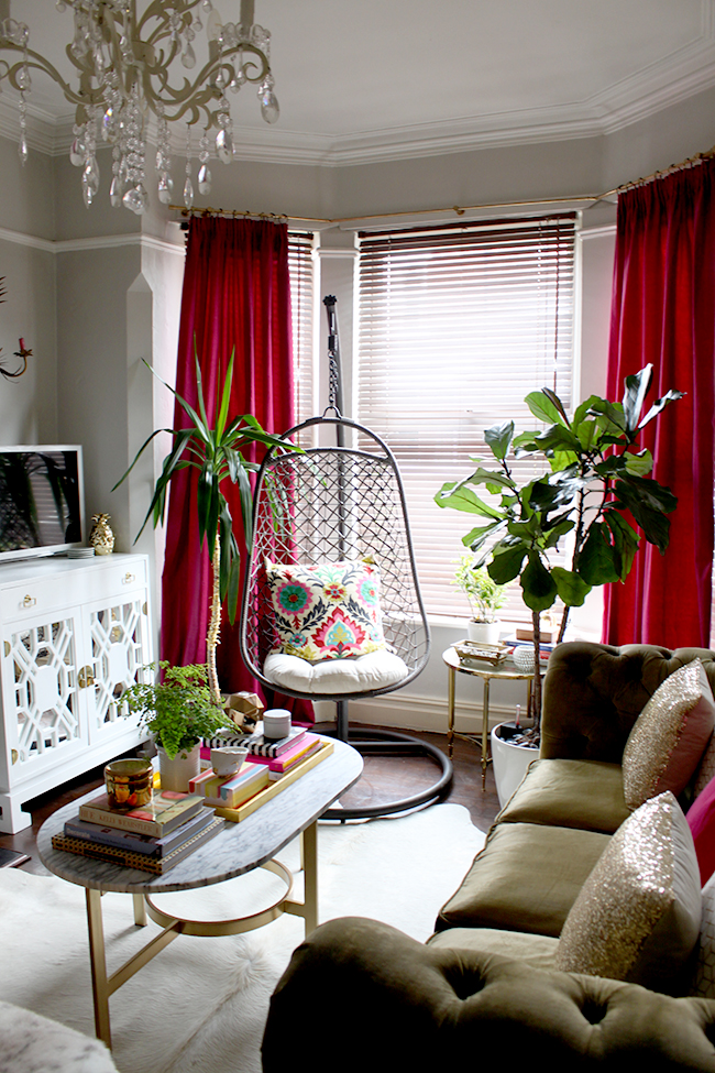
It started with a simple Spring refresh in my living room. I was kind of ‘over’ all the turquoise in the room and I wanted to pare back and add a few more plants to give the space a bit of a different feel for the new season. Then about a week later, I decided to replace the turquoise curtains with a deep berry colour and suddenly the room started taking on a new look. The following week, I came across the work of Sian Zeng who creates the most deliciously beautiful illustrated wallpaper and I thought, ‘I must have it! If I do not have that wallpaper I surely shall die!’ Yes, I’m being overly dramatic but it did elevate quite quickly.
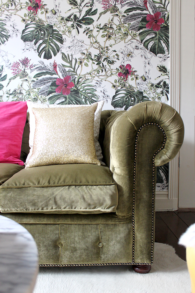
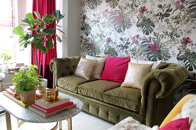
Fast forward another week and my living room really does have a whole new look. The bizarre thing is, I haven’t actually done a whole lot. It was really just a few key pieces (the curtains, the wallpaper) that changed the direction but wow, I can’t even tell you how much I love it. And this wasn’t even planned – it just sort of… well… happened.
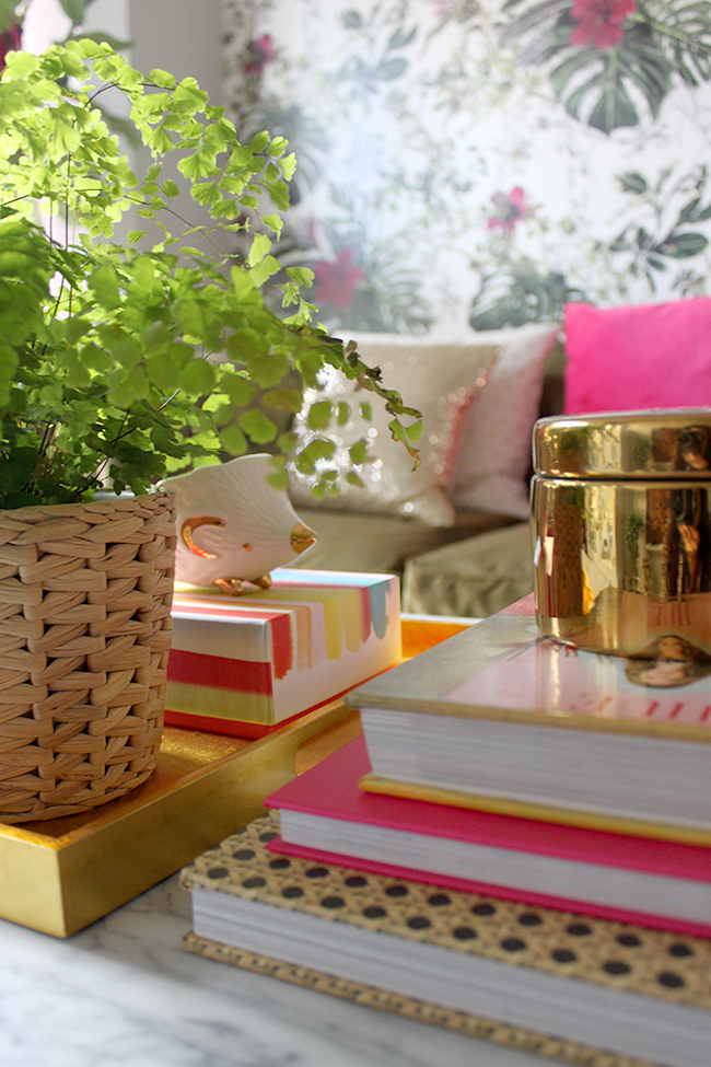
So for those of you who guessed when I asked which wallpaper you thought I might use, that it would be the Summer Tropical Bloom paper, you were correct (I don’t think there were very many of you to be fair so it’s nice that I’m not as predictable as I thought!). Have a look at that incredible detail! And the little beetles and bugs on the branches! (the picture below is from the wall itself so that’s why there’s some variation in the light where there was a reflection from the window)
I don’t think I’ve been this in love with a wallpaper in a very long time.
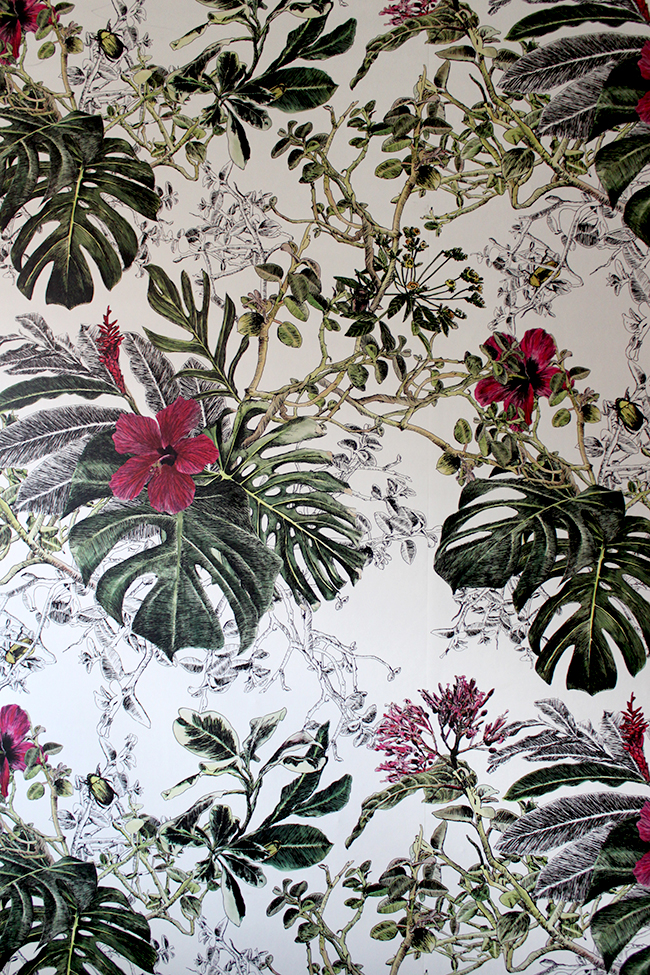
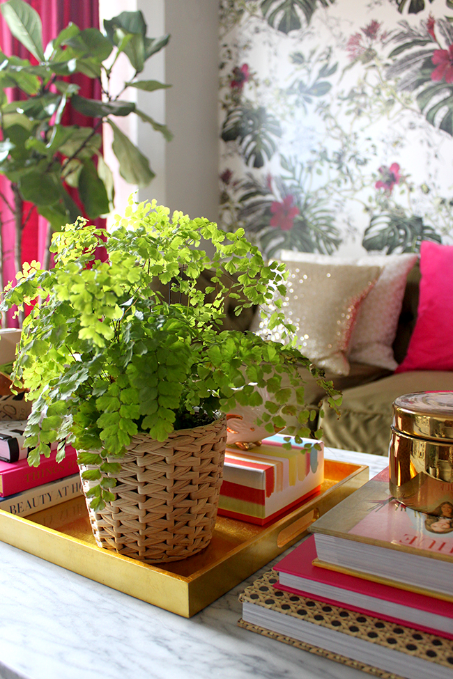
The deep greens tie in with all the plants in here, the olives of the branches match perfectly with the olive velvet of the sofa and of course, those beautiful blooms in shades that vary from pale pink to fuchsia to maroon tie in perfectly with the curtains. There are even little dashes of yellows that pick up some of the golds and yellows in the room. I couldn’t have designed a more perfect paper if I’d tried.
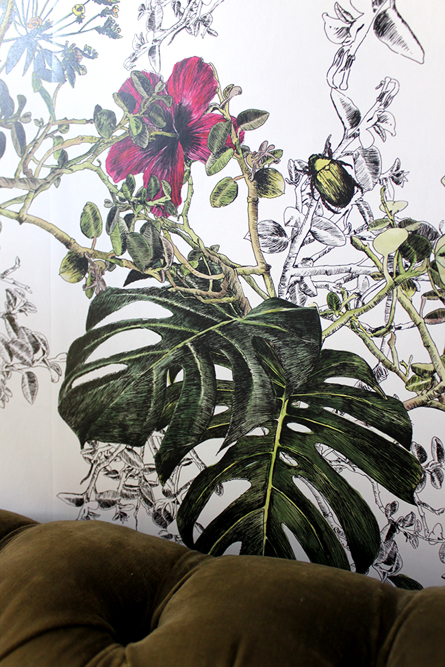
I know I’m waxing lyrical about a change in wallpaper but it amazes me how only small changes can make such a dramatic difference to a room.
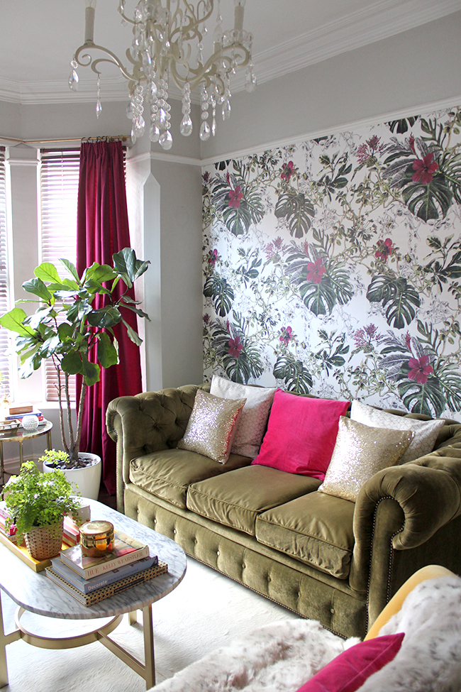
The funny thing is that I feel like I’ve also repainted the room (I haven’t, it’s been this colour grey for the last 5 years) and I feel like I got a new sofa! Suddenly everything feels like it’s in a different context and the room feels fresh and new again. I think the olive green against the previous yellow paper made it blend in a bit and I treated it like a neutral – but now, it shines and I’ve fallen in love with my sofa all over again.
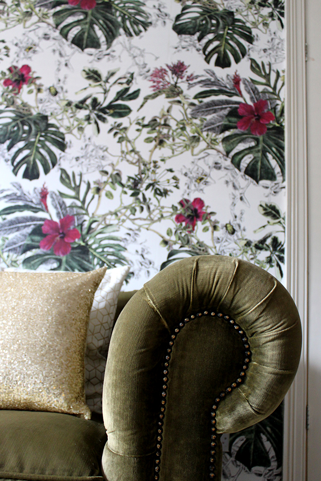
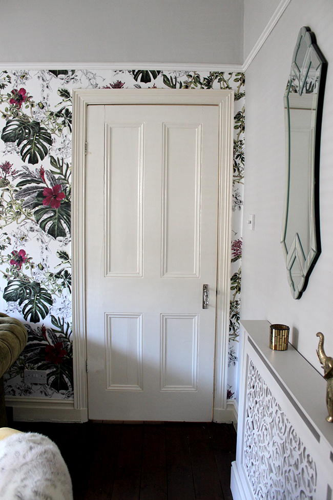
The wallpaper itself is not what you might consider inexpensive but you do get what you pay for here. It’s incredibly high quality and it’s paste-the-wall so there is minimal fuss hanging it. It’s weighty and strong and comes in extra wide widths so you have a lot of flexibility hanging it. I hung this myself over the course of a few hours and it was probably the easiest hanging job I’ve ever done (and as it’s just one wall, I only needed one roll). So the quality shines through and in my mind, it’s worth the additional expense.
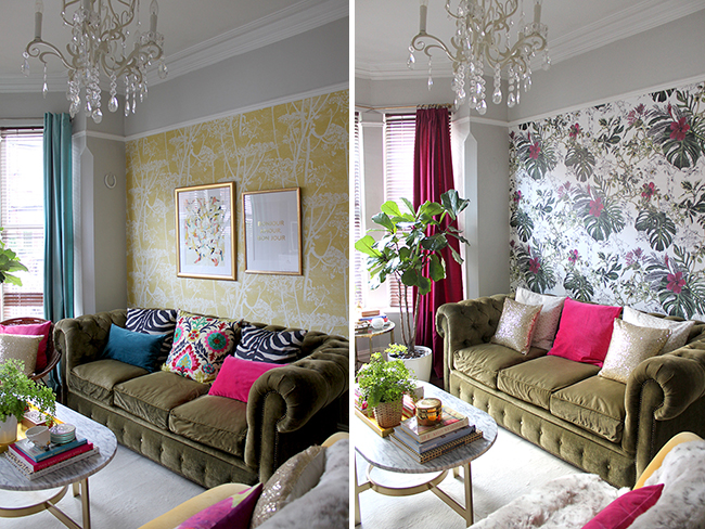
I hesitate to call this a ‘before and after’ because there was nothing particularly wrong with the ‘before’ – I just fancied a change and well, a change is what I got. But for comparison sake, here’s what it looked like just a short time ago and here’s what it looks like now.
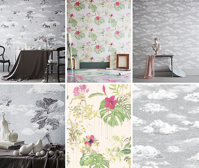
Summer Tropical Bloom is actually part of a series of wallpapers Sian designed called ‘Seasons’ – I love the other papers as well, each detailed so beautifully with a real hand drawn and painterly approach. The artistic skill is really quite staggering.
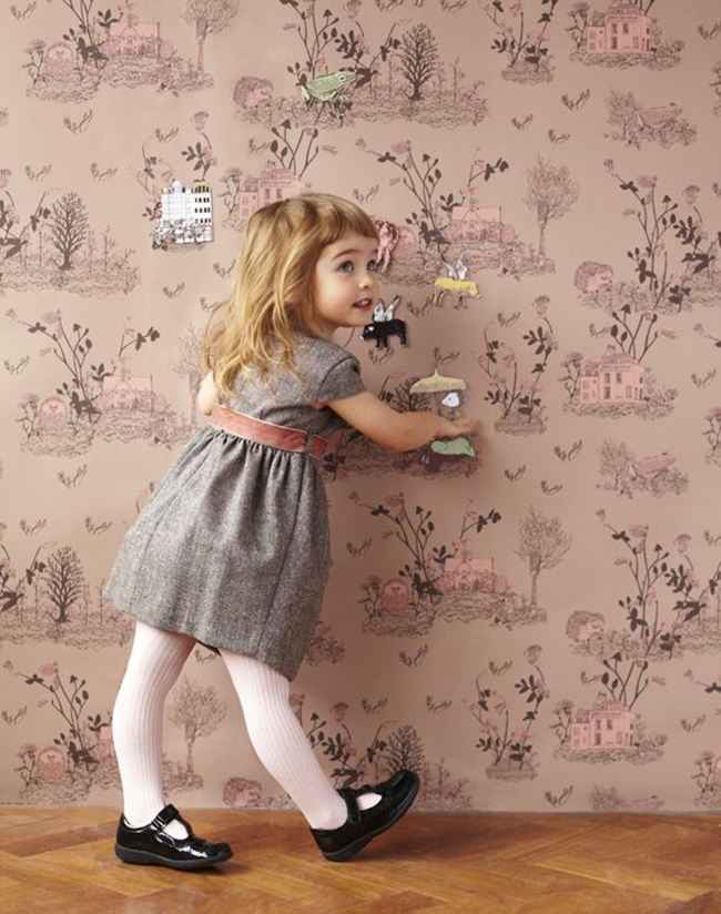
She also designs children’s wallpaper that are equally beautiful, whimsical and a little bit magical! She carries this same line as either a normal paper or as a magnetic one, allowing kids to create their own imaginative scenes with magnets.
Now you want to hear the best part? Sian Zeng is offering an exclusive discount to Swoon Worthy readers!
Just enter the code swoonworthy at checkout
to receive 15% off your order
until 31st May 2015 at Sian Zeng
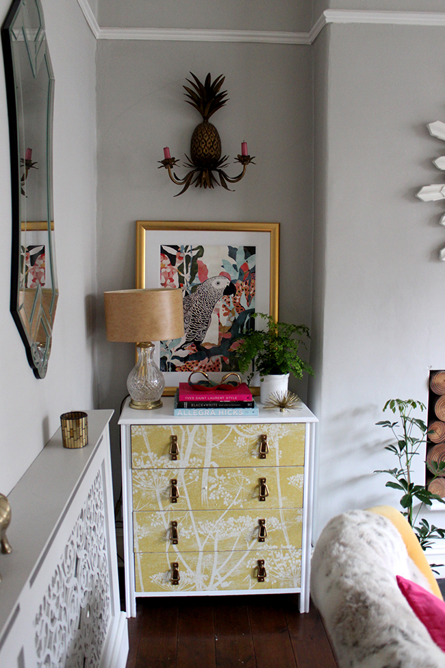
Getting back to my own living room, the only thing now is the ‘decorating domino effect’ – I need to paper the small chest of drawers as the yellow wallpaper no longer really works that well (how many times can I make over that chest? I think this will be makeover number four or five now) so stay tuned for that. Eventually I want to replace it with something wood and vintage but I have other priorities right now with the ORC so that’s going to have to wait!
My hoop chairs will be coming back in here soon as well!
And I need some new artwork in here. I have SO many prints around the house but there just isn’t anything in the right size that works particularly well. So I’m on the hunt for something a little different that picks up the shades of pinks and greens.
I’m also thinking that a David Hick’s La Fiorentina cushion would work very nicely in here (Hollie, are you listening? Yep, probably ordering another cushion from you!)
 So what do you think about the new wallpaper? Have you ever changed something small and it had a snowball effect on the rest of the room? Are you planning to use wallpaper in your home soon? Do tell!
Disclaimer: I received a discount from Sian Zeng for my review but I actually approached them directly about this collaboration – I truly fell in love with this paper! So all images and words (except for the Seasons and Woodland wallpaper images) are my own. Thanks for supporting the businesses that support Swoon Worthy!



Love, love, love it! The room looks completely transformed and the colours are, well, not too colourful ;-) Stunning paper and a really lovely fresh look. xo
It looks stunning, it’s amazing what a difference a few small changes makes.
love it! it’s so fresh and beautiful and works perfectly with everything you have in that space.
Oh, I love it! It is the perfect paper for that space. I feel like you live in a fab green space in there now. What a lovely place to curl up and I love how it was just a few changes that gave you a whole new look. xo
Yes, I’m listening! As soon as I saw the first wallpaper image, I was already thinking about pillows aka cushions! In addition to the La Fiorentina, I just added a gold metallic snakeskin that I’m so excited about, but haven’t even had a chance to make up a sample pillow cover to photograph yet!
I never would have guessed you would change out the wallpaper in your living room. I couldn’t think of where else it would be going other than your office. What a surprise! I love the change, and in my opinion it helps elevate your sofa to look more luxe! When I think of wallpapering, I always think about cost in addition to the labor, but just one roll made a huge impact here and your room is a great example that it’s worth the small investment.
You had me at “gold metallic snakeskin” (!!) I love it too, it’s really elevated the whole space, really happy with it! I need to get the ORC done first and then I’m placing an order ;) xxx
Na, that looks fab!
Now you just need a new plant. May I suggest this: http://en.wikipedia.org/wiki/Monstera_deliciosa ;-)
I had such a plant earlier and it has a very special characteristic. I don´t know how but it collects water on the leaves that appear in little drops on the ends. It looks as if the plant was crying. In Hungarian they also call it “palm tree of tears”. Well, that sounds a bit sad but actually it´s quite awesome! :-)
have a sunny day!
I was actually thinking of getting one of those plants in here inspired by the wallpaper! Definitely on the wish list ;) xxx
Looks fabulous Kimberly. :-)
Gorgeous! I had never before thought about pairing olive + raspberry, but your new curtains and this wallpaper have me in love with that color combo! It’s crazy how just a few changes can make such a huge difference!
Ha! I knewwwwww this was the one you picked. It looked awesome friend. Love it with the sofa and new window panels!
Love the new look…I have to confess I actually did think you’d go for this one…although you like leopard print, I didn’t think you’d use that one, and this seemed the obvious choice to tie in with the curtains…love the delicious monster leaves depicted on the wallpaper and the beetles and bugs…a great makeover.
What a huge transformation and probably a lot less faff than getting your paint brush out! It looks lovely x
OHMYGODITSSOBEAUTIFUL!! I’m seriously swooning here, Kimberly. It’s like that wallpaper was made for you. So stunning. Your living room is completely renewed and elevated and yes, your sofa looks so different against this new backdrop!
You know that uplifting tune that play on TV design shows when they reveal the final design? Yeah, that was playing in my head as I read through this post, revelling in the astounding transformation that your small changes have made.
I had come across Sian Zeng’s magnetic kids’ wallpapers a while back and fell in love with her work. It’s so amazing you now have one of her amazing wallpapers in your home! LOVE LOVE LOVE!
Total perfection!!! This wallpaper makes me giddy. It’s so so pretty.
This just looks amazing! Seeing the detail on that wallpaper, it’s even more beautiful than I thought – it truly is a work of art!
The room is looking stunning!
Maria xx
I liked your room before and I like it now! I would say that before the decor was more hippie and now it’s more colour coordinated and calm. The wallpaper is truly beautiful!
It’s amazing how you’ve only changed 2 items in your living room and it looks so incredibly different. This is why I love interior design. It’s so flexible, versatile and always evolving.
Loving the new wallpaper and how it looks in your livingroom,I love Sian’s work, she is super talented. This design suits your style to perfection, well done on the revamp of your space!