First off, thanks so much for all the comments on my post on Wednesday. I knew you guys would have opinions on this topic and I was so pleased to hear from so many with different takes on whether the gallery wall is falling out of favour (or just the ones we see that aren’t done well!). I suppose after all that, I still think there is room for them when they are done well and with panache – I just didn’t really think the one in my dining room was one of them – so therein lies my frustration with it.
Forget what it looked like before? Check it out here.
After that great discussion (which obviously is still going on so if you haven’t weighed in, please do!), on Thursday morning, I got up, took one look at my gallery wall and without a single plan for what was going to replace it, I took the whole thing down. I know, I’m impulsive what can I say.
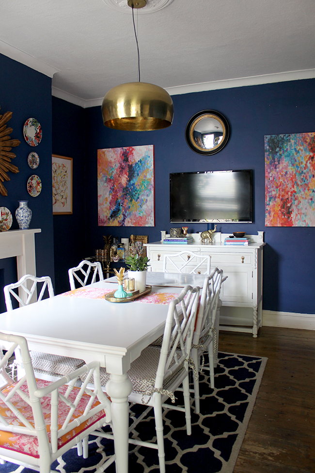
Obviously, I had to figure out what to put back up on the wall because a totally blank wall with just a TV wasn’t going to do either. So I figured I’d just use what I had already in the room, swap out a few things and give the whole space a little ‘breathing room’.
So what you are seeing here is totally NOT the intended ‘finished product’. Not even remotely. I mean, there’s crap on the table – a puzzle we’re working on that’s covered so the cats don’t steal and eat the pieces. (Yes, a PUZZLE. So retro, aren’t we?! ;)) and I don’t even have any flowers at the moment and there are a bunch of boxes under the console (new lighting for the kitchen! whoop!). So yeah, this is a ‘where we are right now’ sort of update. Also? We SO need to do the floors in here, it’s embarrassing.
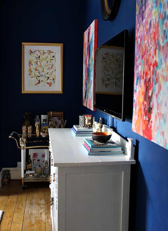
I also still want to move the TV off the wall (probably to the wall where the smaller black console is). I’m also considering replacing the sideboard with something else (something longer and lower and maybe wood?) and what’s actually going to end up here after we do all that is really anyone’s guess.
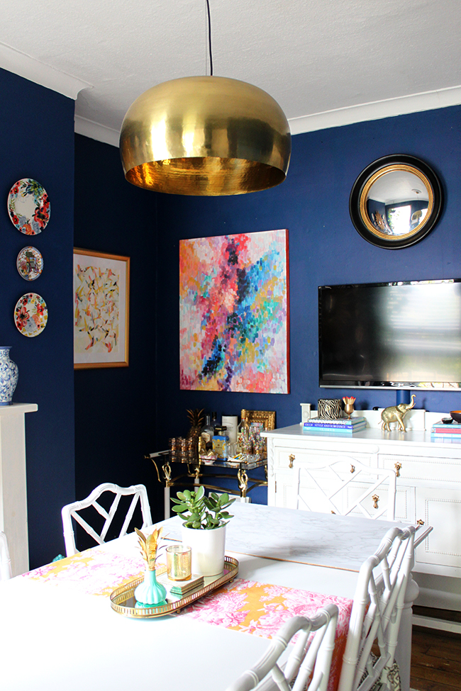
For now, I used my own large DIY abstracts to frame the TV and I ‘borrowed’ the mirror from my office as a bit of a place holder for now. I also moved the bar cart from in the alcove to alongside the sideboard although you can see in my pictures, I’ve done it both ways. I also finally hung the large photographic beach scene that’s been in my hallway for ages over the console table. Notice the lovely hole marks left behind from moving around art. Ahh yes, EVERYTHING needs to be patched and painted. It looks like the room has been in a war. #keepingitreal
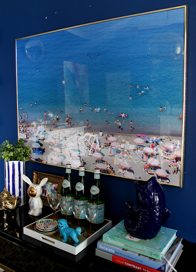
I’m not crazy about it or anything but it’s sort of one of those ‘this will do for now’ sort of looks. It’s all trial and error this decorating lark, right? So this is a first try.
Obviously we have other projects on the go right now so I can’t really go spending on new furniture or new art or anything like that. Everything you see is ‘filler’ until I make a decision. I just knew I couldn’t look at the gallery wall anymore. Crazy, no? I did love it at one time, I really did.
Oh and as I said, not sure about the location of the bar cart – I’ve done it both ways, can’t decide. What do you think?
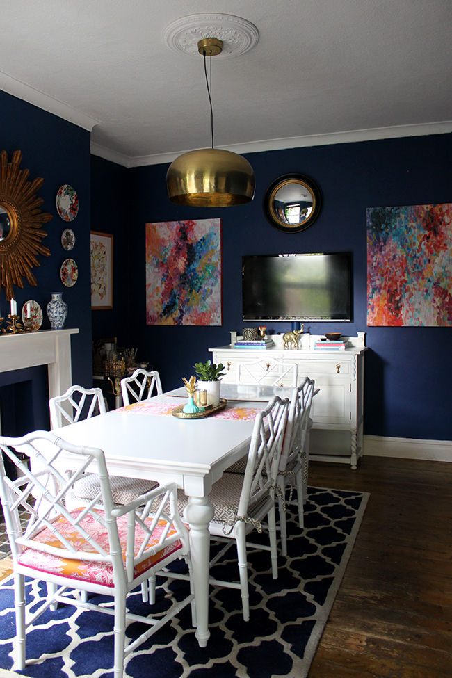
Anyway, the whole process was kind of like shaking off an old relationship that you know is going no where. It just felt good to let it go. Ahhhh.
Genuinely, it’s WEIRD seeing the dining room like this (and if you agree it looks a bit weird, it’s cool, seriously, I know it does – a work in progress!). I’m not used to it yet and it does actually feel really empty without the gallery wall. BUT saying all that, I’m excited because the room is evolving and where it’s going to lead to… well, I guess we’ll just have to wait and see!












Looks amazeballs…. it soooo much better too! More sophisticated as well….Mabrouk from Beirut!
Thanks so much Debbi! Sending hugs all the way to Beirut! :) xxx
Looks amazeballs!! So much more sophisticated and grown up too, lol….Mabrouk from Beirut!!
I think the bar cart looks best on the same wall as the sideboard. The room looks great, I would definitely move the TV somewhere else if you have room.
Definitely going to move the TV – it’s just wires and things that need to be moved so it’s a bigger job unfortunately – hahaha! In time though, it’s very much in the plans ;) xxx
I love your style and your use of color! I follow your blog from Chicago and am currently visiting family in Bury. I too got rid of my gallery wall. It suddenly seemed too busy. I went with a large painting and am enjoying the “lightness” of it all. Thank you for a beautiful source of inspiration!
Oh wow, Bury is not that far from me! Isn’t it funny how much lighter the space looks when you take the gallery wall down?! The room feels bigger to me as well :) Hope you have a lovely visit! xxx
I love this! I agree that it is so much more sophisticated and classic than the gallery wall! I almost like the bar cart in the nook because it gives your console room to breath…and maybe I’m wrong, but I might even edit out the smaller picture in that corner and put a vase with some taller flowers in it on the cart. It might be that there are too many things hanging on the walls in that area? I don’t know! I’m always playing around with my wall art too!
Ahh thank you Jordan! Yep, I’m definitely still playing around with all of it so no idea if that smaller picture in the alcove will stay ;) At the moment, the bar cart is back in the alcove – once I decide what’s happening on the “TV wall”, it might move again, who knows! ;) xxx
I like! It does look like, and the mirror keeps it balanced. Looking forward to seeing where you take it! Also, I like the bar cart next to the white table where you can see it’s loveliness a little more.
It’s funny because when I move the bar cart next to the console you can see it better when you are in the room but as you enter the room, you can’t see it at all! So at that point, it looks better in the alcove – gah! Maybe I need two bar carts! LOL! (not really, I mean we like a drink but that would be a bit OTT ;) ) Who knows where it will all end up! xxx
Love it even for temporary. I think the bar cart needs to stay in the alcove for now. It throws off the symmetry of the wall that you have going on. Besides, that little alcove looks too bare and dark without it and the smaller artwork needed something to give it more substance. Can’t wait to see what ends up in this room but I really could live with this for awhile. :-)
Thanks so much Kim! At the moment, it’s in the alcove for exactly those reasons – and yep, I’m going to live with it like this for a bit but at some point, it’s gonna need to change again ;) Stay tuned! xxx
Oh my gosh! I can’t believe you did it! I really like the direction you’re going in there. I believe that when you take some things away, you allow what’s left to shine.
Since your dining table and mantle are white and bright, a wood console would help ground and bring warmth to the room. Fingers crossed a well-priced vintage burlwood beauty comes knocking at your door!
Oh, and my opinion on the bar cart is that for symmetry, it should stay in the nook.
Totally agree with everything you say ;) It actually felt THERAPEUTIC to take it down! LOL! The room feels so much better now :) God I wish I could get a burlwood console – gah! It would be so nice in the space… and for now, the bar cart is back in the alcove so we’re singing from the same hymn sheet my dear ;) xxx
I love this, so much less busy looking and very sophisticated! Bar cart in the corner!
Aww thanks Jessica! Agree the room really needed the refresh ;) And for now, the bar cart is back in the corner! (who knows how long it will stay there lol) xxx
I think this is beautiful, very lovely. I WISH my dining space looked this gorgeous!
http://beautifuldreamerami.blogspot.com/2015/05/dinner-for-two.html
Oh your dining room table solution is great! Very clever to put a little shelf on it to make it more intimate :) And I love your Anthro tablewear!! :D xxx
You are staying true to yourself and that is just one of the many reasons I love you and your rock hard style. Keep it up sister! And you have a partner in your hole patching process, I’m working on dozens of holes around the house myself. Ahhh, plaster, you bring me such joy!
Aww thanks darling! And Wayne doesn’t touch that sort of thing believe it or not – patching and painting walls is my job around here lol For now, I’m ignoring them!! Hahaha xxx
Hiya Kimberly, yes i do like it, it will just take time getting used to it being like that (says her that doesn’t live there lol ) but it really does show your painting off and i think the bar cart looks good were it is xxx
Aww thanks darling! I’m slowly getting used to it and at least it feels like the room can breathe again ;) xxx
In the alcove lol (sorry about that) lol xxx
It looks pretty finished to me! But, I totally get it. In a stylist’s mind, things are never “finished.” My husband can’t understand that concept though (my ongoing struggle). I didn’t get a chance to comment on your last post about the gallery wall, but I have never done a gallery wall and have recently been considering doing one in my LR– in particular, I think I need a gallery wall above my sofa where I want to hang a 20 x 30 magazine-inspired family photo. The size of the family photo is not big enough to hang alone on the wall, so I thought about hanging sconces on each side (which is still an option) but a gallery wall done right might be more interesting. Your post really made me think (still thinking;)!
Ahh glad it got you thinking! It got me thinking as well ;) I obviously still have a gallery in my office and I have a small one above my chest of drawers in the bedroom so clearly, I’m not ‘over’ them totally yet ;) I think I was just REALLY over it in here – felt good to let the room breathe again ;) xxx
I like this much more than your gallery wall. The room can breathe and it’s more cohesive and sophisticated. I like the drinks trolley up against the other wall because the white cabinet is centred and you’ve got some symmetry going on with the two pieces of art work on either side of the TV, having another piece of furniture up against one side only throws it off symmetry. And I do love that beach photo – stunning!
Thanks so much Sharon! Yep, totally feels like the room has space to breathe again :) And for now, the barcart is back in the alcove for exactly the reasons you mentioned! xxx
Love the beach pic! Have to say somehow the wall looms more ‘grown up’ bit not exactly sure why. Fascinating to see real rooms evolving not just the finished article, is inspiring!
Totally agree, Heather! I feel like the room looks a bit more grown up too! It felt really good to get rid of the gallery, therapeutic somehow lol xxx
Love the change! In my opinion, rooms should always be evolving. It’s fine to say, wow, love this, done for now…..but that is going to change down the line. And the best way to always truly “see” you stuff is to put it in a new place. I’m totally into rearranging things on a regular basis. Because of my house layout the furniture doesn’t change much, but everything else changes on a regular basis. Change is good. Keeps out brains working and that’s a good thing!
Can’t wait to see how you change this room and what new homes the stuff from the gallery wall will find.
Oh, and I really can’t decide from the pics where I like the bar cart best…..
Totally agree Lynne! I feel a room stagnates after a while if it’s left the same too long – things are always changing around here as well! ;) xxx
You always add such fabulous character to any space. I like it.
Aww thanks so much Marty! xxx
Beautiful and definitely less overwhelming. Those are your own paintings, right? GORGEOUS!!! I prefer bar cart on the other wall for symmetry. But seriously…what I like most about this post is that you’re in to jigsaws!! Sooooo relaxing…
Thanks so much Valerie – and yes, those are my paintings! :D The bar cart for now is back in the alcove for that exact reason but who knows how long it will stay there lol – And yes, we were working on it last night!! Hahaha We are sooo old ;) xxx
I love what you’ve done in your dining room. I don’t know if gallery walls are going the way of the buggy whip and I really don’t think anyone should care. What’s important is your opinion. If you want a gallery wall, hang it. If you don’t want one, take it down. After all, it’s your home and if it makes you happy, DO IT!
Yay! Totally agree Kay – gotta do what you feel is right for your own home and your own tastes! It felt ‘wrong’ in here so I’m happy I took it down but I still have one in the office and I still have a small one above the dresser in my bedroom – so it’s really about context, don’t you think? ;) xxx
I loooove it!! I love the abstract art. It brings in new fresh colours. It’s bold and colourful. Just great. I would move the cart to the fireplace wall. But that’s just a personal opinion. Overall it doesn’t look so cluttered and busy. The TV wall I mean. It actually looks bigger!!xx
Thanks so much Karolina! The paintings have always been in this room but I feel like they get to shine a little now ;) And the bar cart is back in the alcove for now but who knows for how long lol xxx
I loved your gallery wall and will mostly definitely miss it, but I know that change is a necessary and inevitable part of the journey, but I hope your gallery wall returns. However, the new change is still attractive, but I felt personally that the room was a more striking one with the gallery wall. Your version was expertly executed and invoked interest visually that added to the overall beauty of your home. Anyway, I enjoy seeing what you are up to decoratively here on your gorgeous blog! Keep up the creativity.
Aww thanks so much Jacqueline – I know there were people who really liked it and would be sorry to see it go! But yes, I think a home should evolve and we hope (!!) it’s for the better so stay tuned – it’s certainly not done at this point so perhaps you’ll still love the end result – how ever it ends up! :) xxx
I loved your gallery wall more and will mostly definitely miss it, but I know that change is a necessary and inevitable part of the decorating journey. However, the new change is still attractive, but I felt personally that the room was a more striking one with the gallery wall. Your version was expertly executed and invoked interest visually that added to the overall beauty of your home. It’s always a treat to see what you have been up to decoratively, so keep up the creativity!
OH, I vote for a wood tone buffet :) I think it would look fab with against your chairs. I am struggling too with our dining area…I can’t wait to see what you end up doing because it’s always fab and maybe it will inspire me to get my rear in gear! xo
This looks great. I know it’s controversial, but I’ve always been a bit against the gallery wall. Not yours, but gallery walls in general. When they first started to become popular I hated them – and thought they just looked cluttered. But as time has gone on I have grown to like them, and when they’re done well, they can be amazing actually.
Yours I did always like (and I’m not just being a creep!) – I think it’s because you had lovely pictures amongst it that I really liked, and the colours and patterns were all great. Also that chicken sign made me laugh every time!
But I’m loving the new look – and I can’t wait to see it develop!
Maria xx