If you’ve been following my blog for even a short while, you’ve probably noticed that I can’t really leave a room alone for too long before I want to switch it up and try something new. If you’ve been following my blog for a few years, then you’ll know I have always done the same with my website. I think of Swoon Worthy as my little virtual home on the internet and as it’s grown and changed, I’ve tried to adapt and refresh it to keep up with those changes. The thing is, unlike home design where trends stick around for at least a few years, web design and the digital sphere is a rapidly changing beast.
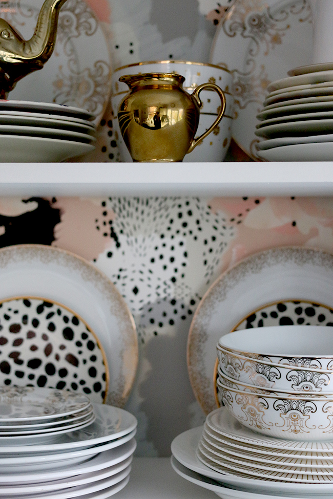
One moment, you feel like your site has all the newest bells and whistles and the next, you realise you are being quickly left behind by whatever the latest new looks and usability features are. I look back at my site and logo designs from even 3 or 4 years ago and I cringe in the same way I might view a home that hasn’t been redecorated since 1991.
Now, I have always taken on my own web design – mostly because I’m a cheapskate and I thought I could do it myself. The current design as you see here today was created over the Christmas and New Year period in 2014. I spent over 100 hours moving my blog from Blogger to WordPress and creating a fresh new look for the entire space. While I can mess around with a bit of HTML code, I’m absolutely no expert and the learning curve was tremendously steep for me. Every step of the way had to be researched thoroughly – I read countless articles online, watched so many tutorials and when things got really tough, I had to call on the limited assistance from the support teams of my host, my domain provider, the company I purchased the template from – the list goes on.
Suffice it to say, I ended up with a site I liked but that had limitations, mostly due to my own lack of knowledge and expertise. Over the last two years, those limitations have started to get to me. There are things about my blog that I’m not crazy about. I know sometimes it’s difficult to get around or to know where the latest post is. When you first come on to the homepage, it’s difficult to tell it’s even a blog. It’s pretty, yes, but there are some serious usability issues with it and I knew, after 6 years of going it alone, it was time to seek out the help of a professional.
Enter Becky Lord Design.
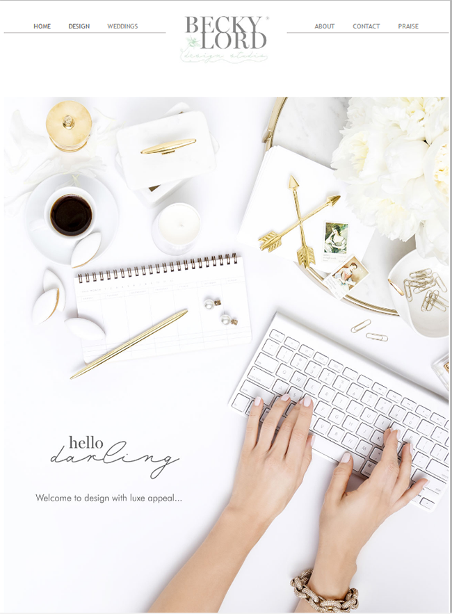
Becky Lord Design Website – gorgeous right??
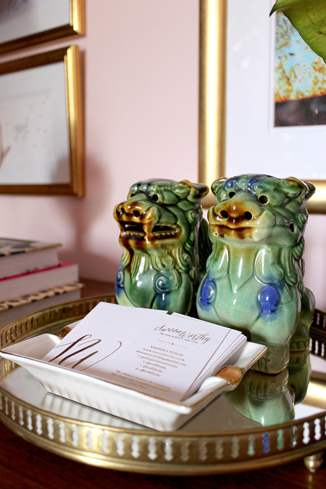
I’ve known Becky Lord (well, virtually) for a couple of years now. She designed my business cards for me (as seen in the picture of my office above) and I’ve always been a fan of her incredible talent and beautiful feminine and sassy designs. So when it came time to find the right person for the job, I knew she was the only one I could trust to hand over my baby.
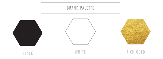
There’s been so much involved in the process behind the scenes and Becky is incredibly thorough in terms of getting to know what I want, my likes, my dislikes and how I like to be represented by my brand.
![]()
Despite the fact that she ‘knows’ Swoon Worthy, it has really been a fun process digging deep and considering all the elements that really make my blog and my brand ME. We’ve gone through so many iterations of the logo, the icon, the patterns, the business card design and now we’re on to the website design itself.
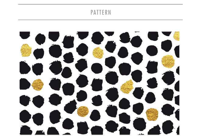
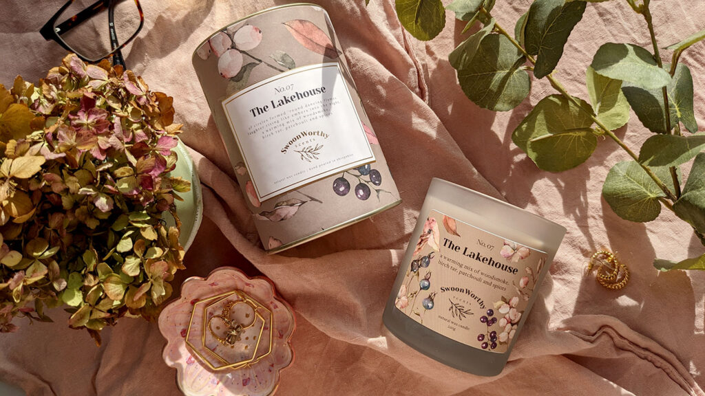
Today, I wanted to share a few of the new elements in terms of the branding that you’ll be seeing here on Swoon Worthy in the next few weeks. We’ve set a launch date of early December and I am super excited to introduce a brand new look. I hope you like it too!
Of course, there may be a few days when things are a little off kilter here or something isn’t quite right and I’ll have a little bit of downtime as well as we move all the content over to the new design so I will apologise now for any inconvenience. We’re going to try to minimise the downtime ‘during construction’ as much as possible so I really appreciate your patience as we work through all of it!
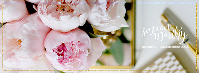
I’m so excited to enter this new phase of Swoon Worthy. As my home has evolved, so have I – as a person, as a blogger, as a business woman, as every other label I can give myself. So it makes sense for the site to continue to grow and evolve as well. I know sometimes change is a bit of a pain and we get comfortable when things stay the same. But fear not, it’ll still be the same content, just in pretty new packaging!
So what do you think of the new logo and branding details? Have you ever had a rebrand of your blog or business? Any tips? I’d love to hear from you!








Gorgeous design !! I can’t wait to see it all come together.
FIY your current site is gorgeous and I’m in awe of your skills :)
Aww thank you so much Marie! I know a lot of people have told me they really love the current site but for newbies on my blog, it’s a bit of a headache – ack! So a simpler (but no less stylish!) design is necessary ;) But thank you anyway! That’s so nice of you xx
Wow…looks fab! Becky definitely has your style sorted :-) I love the new sneak peek of colours but I might miss the pink…unless there’s a little bit hidden in there somewhere :-) … I’m hoping there is a search function on the new website as you have so many wonderful ideas and sources of inspiration that I want to tap into but forget when I read them!
Aww thank you Kath – she definitely does! It’s funny you should say that – we’ve been talking about adding a bit of colour shot through the site here and there so wait and see ;) There will be a more obvious search option too (in fact, there’s one on the current site but it gets a bit lost on my sidebar) to make it much easier to find content! But thanks for the feedback, lets me know this is the right decision! xx
Oooooh, I’m loving those inspiration elements! I can’t wait to see the new design!
Thank you Brynne! I’m totally excited too! xx
Love the little sneak peeks Kimberly! Can’t wait to see the new site!
Thanks Amanda! Can’t wait for the new look myself ;) xx
I love the logo, it looks really cool?. Its all going to look good Kimberly xxx
Aww cheers Pauline! I’m super excited, I feel like Becky really ‘gets me’ which makes me feel a lot less nervous :D xxx
Gorgeous! Can’t wait to see it! Love that is “looks like you” :)
It really does feel like ‘me’ so I’m super excited too! Yay! xxx
I love it all – very fresh and very you. :)
Can I ask a silly question – is WordPress really so much better than Blogger? I know everyone switches, but I’m not really sure why. Obviously I’m still on Blogger but I’m about to rebrand my whole site and wondering whether it’s worth switching in the process. I’d love to know your thoughts if you have time xx
Not at all a silly question and one that bloggers everywhere always ponder ;) While it was painful to move over, I think it was worth it. WordPress gives you a lot more scope for the design and you own your own content. With Blogger, essentially Google has total control over your content which I never felt comfortable with. You’ll also have access to a lot of the plug ins that are just not available with Blogger. Plus, Google hasn’t continued to invest in the platform over the last few years. So I feel like it doesn’t have the support structure in place that WP does. For me, I feel like it was a good move but it’s a totally personal decision really.
Here’s a post on some of the pros and cons of each. Bear in mind, it’s a WP site so take it with a pinch of salt but as someone who has used both, I had to agree with pretty much everything they said!
http://www.wpbeginner.com/opinion/wordpress-vs-blogger-which-one-is-better-pros-and-cons/
Hope that helps a bit anyway! ;) xx
This is awesome, thank you so much! xx
Wow, the new design is so glamorous and so you!
I look forward to see the new Swoon Worthy <3
I've been thinking of redesigning my whole blog for a while now because as you said we evolve and our blogs have to evolve too… But I need to find the time to do it :(
I didn't know Becky Lord and just had a look at her website and I LOVE it! Thanks for sharing ;)
Loving the new plans, looks fabulush and so VERY you!
Wow this is so exciting, Kimberly! I actually thought your blog was very modern and fresh currently… shows what I know, ha! Looking forward to the new look, it’ll be absolutely fab I’m sure! xx