I am not much a rule follower. You may be surprised to know that when I was younger, my family were very religious. I was brought up in an environment where there were rules for just about everything – who I was allowed to be friends with, what kind of clothes I could wear, what language I used, how to be submissive, what I was told to believe, how to treat others who didn’t believe what you were meant to and a huge long list of things I was under no circumstance allowed to do.
It’s not something I ever talk about on the blog (after all, religion can be a very touchy subject and I’m not here to tell you what belief system you should live by – that’s entirely up to you) but it clearly affected me deeply and when I finally decided to leave, it was as if someone had let go of a tightly coiled spring. In my early 20’s, I left the religion and well, I went a bit crazy, breaking every single rule I’d been brought up with (mostly – I mean, I wasn’t smoking crack and trying to figure out where to bury bodies but you know what I mean.)
I’d be lying if I said I didn’t enjoy that time of my life. Oh, I screwed up plenty, don’t get me wrong – and I did things that I now look back on in shock and wonder at how I managed to get out of that period relatively unscathed. But living with a ridiculous amount of rules and then living completely without them, in growing up, I realised that there needed to be a balance. Having a few (self-imposed) boundaries were not such a bad thing in living what I considered personally to be a relatively ‘good’ life.
So after all that, how in the hell is this related to design exactly? The truth is, there are plenty of ‘rules’ in design. I used to think I had to follow all of them in order have an attractive home. Later, as I gained more confidence, I quite enjoyed breaking them with reckless abandon. And finally, I have realised that a balance of the two was actually better. I got to write my own ‘rule book’ for design that worked best for me. Just like I did for my life in general.
While I would never tell you which rules you should live design by, there are a few that I know I do all the time and they’ve made for a better, more inviting mix in my home. So that’s what I’m sharing with you today. Should they be your rules too? Well, that’s up to you.
Design Rules: #1 Always include items from different eras in a room
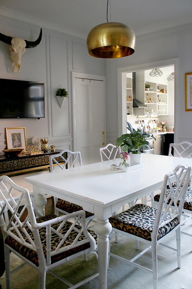
I’ve said this before and I’ll say it again because I think it’s just so damned important to design. When you choose the elements of your design, don’t stick to one era – whether that’s mid-century or 2017 – because your room will either look like a time capsule or it will be out of date within the next 4 years or so. If you mix and match from different eras throughout the room, you’ll end up with a pleasing mix of styles that won’t easily date.
Want more tips? My post on How to Create Eclectic Style in Your Home covers this topic in a little more detail.
Design Rules: #2 Always add a bit of black
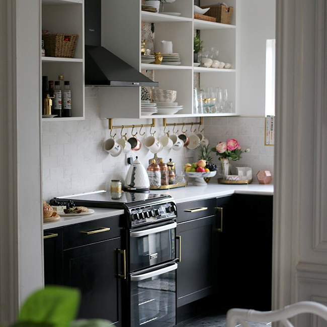
There’s a reason why black is a classic that never ever EVER dates. It’s the LBD or the leather jacket of design as much as it is in fashion. Almost every single room can benefit from a touch of black to ground the space, to make it look a little cooler, to balance colour or pattern or styles. I have used black in every single room in my home and I probably always will.
Design Rules: #3 Always add a warm metallic
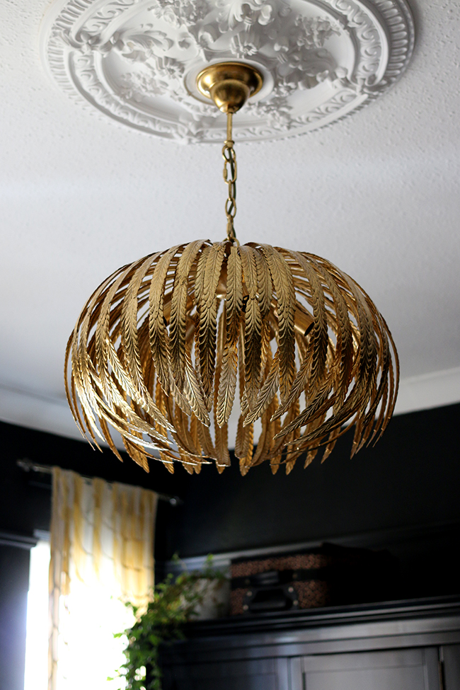
Now, my love of gold is no secret. I’ve loved it for years now and always add a touch of it in every single room. I’m a fan of copper and rose gold as well for similar reasons (although personally, I think gold has more staying power) but metallics in these shades warm up a room, add a reflective quality to bounce around the light and work beautifully alongside almost every other material out there. You don’t have to go ‘full Liberache’ to make it work. Just a small touch of it somewhere in the space is enough.
Design Rules: #4 Mix and match textures and finishes
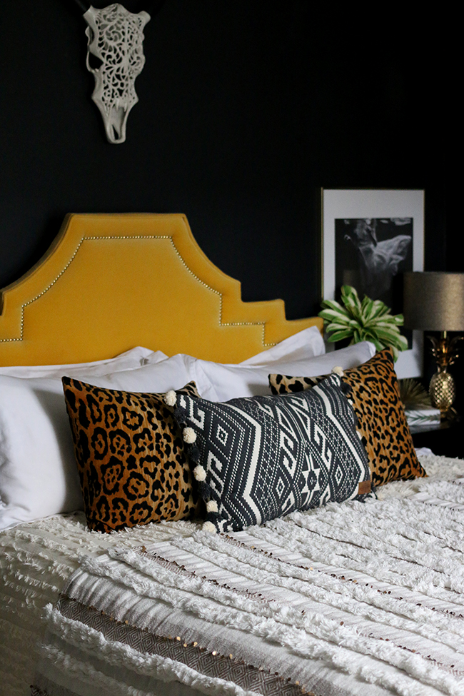
If you want an inviting space, you have got to mix and match. I’m not necessarily talking about pattern mixing (although I do love doing this as well) but with regard to the materials that are used in your room. If you have something smooth and solid like stone, pull in something soft and tactile like faux fur or velvet. Including a leather chair? Maybe mix it up with knitted or wool fabric. Contrast that gorgeous glass table with a warm and matt ceramic as well. Do you see where I’m going with this? Bring in one material and then bring in it’s opposite as well. The textures will contrast with one another and the resulting mix will give you a room that begs to be touched and enjoyed.
Design Rules: #5 Consider the natural light
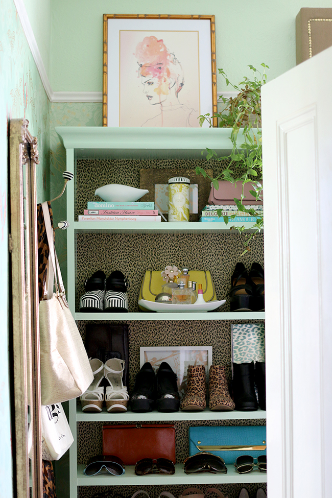
This is such an important factor when designing any space and it’s so often overlooked. The truth is, if you have a lovely large well-lit room with tons of natural light pouring in, the world is your oyster (and also, I’m probably going to be jealous and/or want to move in). You can get away with a lot of different looks and colours because everything just looks better in natural light.
However, if you are working with a room that has low ceilings, is North or East facing (in the Northern hemisphere) and doesn’t get a lot of natural light, you are going to have to work around that and find ways to either make the room look brighter using a myriad of tricks (see my post here on 10 Ways to Make a Dark Room Brighter) or you might want to just give in to it and go with a darker palette (see my flowchart Should I Paint My Room a Dark Colour?). Whatever you do, don’t ignore both the quantity and quality of light your space gets.
Design Rules: #6 Consider how the room will be used
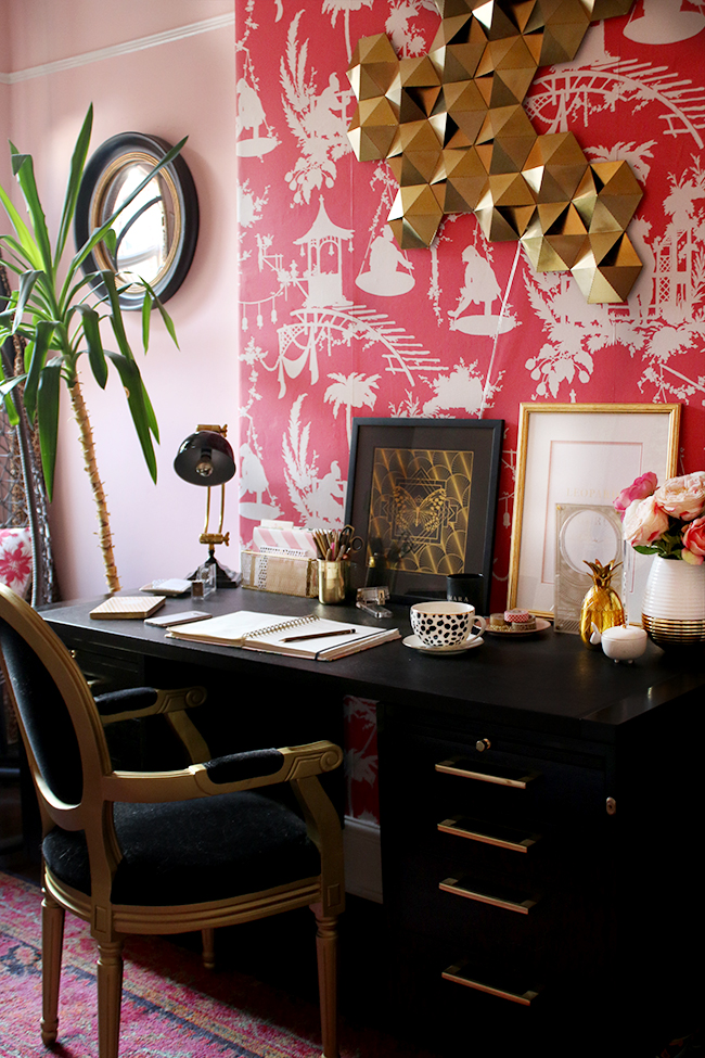
Listen, none of us live in a magazine. Even the houses you see in magazines are styled to perfection, things are removed that don’t quite fit and there’s probably a shit tonne of mess going on behind the camera. We have to be able to LIVE in our houses and this may mean dealing with pets or children, considering how you will hide the 27 different game consoles your other half loves (that might just be me there) or realising you have a formal dining room that never gets used.
We don’t have a dedicated guest bedroom in our house despite having no children and having a 3 bedroom home (the second bedroom is my office, the 3rd is my dressing room). And while it would be lovely to have a guest room or second bedroom to show off on the blog, it’s just not the way we live and we don’t have enough guests sleeping over to justify it. The house isn’t huge so we have made sure that every single space we have is utilised on an everyday basis.
When decorating your house – is it practical to have a second formal dining room if what’s really needed is a dedicated play space for the kids? Do you really want a living room that’s so formal, you don’t actually want anyone to go in there for fear it might get messed up? Think carefully and pay attention to how you use the space you have. If a room is going virtually untouched, that’s probably because it doesn’t actually work for your life and how you live.
Design Rules: #7 Add some plants or life
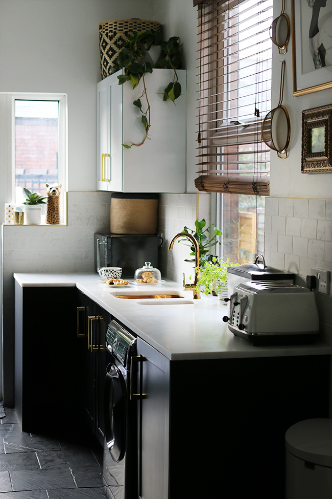
There is no better way to add life to a room than with a few green plants. They make a room look lived in and loved and well, finished. It’s the added touch that can be used anywhere and in every single space. I know it’s a huge trend now and I got on that one as soon as I saw it appearing in some of my favourite design websites and magazines because it was love at first sight for me. So I don’t exactly have what I would consider to be a ‘green thumb’ just yet and I still lose a few every single year over the winter months. But they don’t have to be expensive and they just add so much to a space. If you are really afraid your plants won’t survive, consider mixing real with faux. I do it all the time! (Check out my post on Making Faux Plants Look More Expensive.)
Design Rules: #8 Throw in a bit of weird
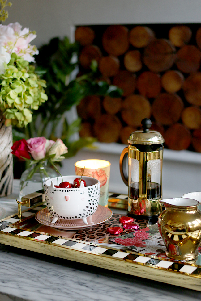
I’m not always comfortable in spaces that I feel take themselves too seriously. I don’t take myself very seriously, let’s be honest here, so why shouldn’t my rooms reflect that too? I love throwing at least one thing into a space that would border on a bit odd or weird or just unexpected. It adds personality to a room, makes it look more relaxed and certainly adds a touch of whimsy. The last thing I want is for people to feel like my home is too formal so adding that bit of the unexpected adds a layer of comfort to the scenery. Something that says, ‘it’s okay to be yourself here’.
Design Rules: #9 Add a splurge
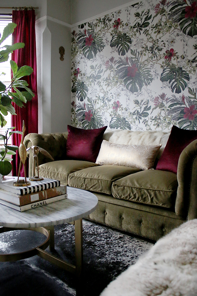
I talked about splurge pieces in my post How to Mix High End and Low End in Your Home and so I won’t go into too much detail here but it’s definitely a design rule I now live by. Add at least one thing that’s considered a splurge by your standards – something vintage, bespoke, custom or higher-end. It will go far to elevate the entire look of a room, even if half the stuff is mass-produced and low cost. It works, trust me on that one.
So those are the design rules that I swear by. What about you? Are there things you absolutely always do when you decorate? Have you ever thought about imposing any on yourself or are you a total rule-breaker?



These are such great basic rules, I totally agree with all of them, and though I never consciously think about them, I tend to follow them too. Nice to have them all written down in such a helpful and considered way though!
Re the using the space as you need it, totally agree. We have just decided instead of extending slightly for a new kitchen (which was going to prove insanely expensive due to earthworks because of us being on the side of a hill), we are going to make the (unused) dining room into a kitchen diner that will work much better for us. Yes we won’t have a formal dining room anymore, but when we have sit-down meals with friends so rarely, who cares? And we’ll still have a table the same size in the kitchen, they’re just going to be able to see the chaos of my cooking…wait, maybe I haven’t thought this through! :-)
And so glad it’s not just me fighting consoles and controllers – they are the bane of my life! At least the dogs put their toys away! :-) x
Amen! Totally on board with all of these.
You’ve written this so well! It sounds like we had similar childhoods. It takes a strong free-thinking person to break away from all that – so glad you did!
I agree with all your design rules and love the way you’ve laid them out. I have one more – where a room has curtains they must be floor length (just a bit above the floor so they don’t drag unless going for that luxurious puddling look). Can’t bear short curtains ending in the middle of wall, they look so stupid to me 😆 (really more of a pet peeve than a design rule as such).
Yup, agree with and follow all of these apart from black which actually I steer clear of other than some monochrome patterned things in my spare room. Texture is the one I need to work on more, but it’s always good to have something to strive for right?!
Having read this post, I never realised that there are certain things that I do eg how I put a room together, and I agree with Meera about the curtains. Isn’t it funny when somebody makes you think, and you’re sat there reading a post thinking ” I do that, yep I do that as well ”
Dame good post Kimberly, I enjoyed reading it, and it rang many a bell xxx
YES!! The rules are perfect for good design!
Loved these suggestions! Especially the idea of adding some black to ground the space – where did you come across that tip? As a colour-lover I naturally steer away from black (with interiors, clothes, everything really!) and sometimes it results in a bit of a chaotic look! ¯\_(ツ)_/¯ Rx
Well done for breaking out and finding your own way! Great rules, I couldn’t agree more – I always think add a dash of black and white too, it’s like a little spice (you nearly always do this anyway I think!) Hx
Knowing how improving a space can make a marked difference to how you feel about yourself these ten imaginings ( I hate the word rules) are invaluable to both the novice and the pro. I am a pensioner on a very strict budget and have just gotten the decorating bug ( it could not have come at a worse time… drat) and instinctively have decorated as per imaginings. Its lovely to have them written down however, none of us are infallible. I love the generousity you share your knowledge with and frankly think you should be knighted or something for leading the blind out of the wilderness into the bespoke light.
I love your enthusiasm, self deprecating humour and adventure. Cheers from down under It s great to know I am not the only nutter in the crowd……..
Oh Carolynne, you’ve made my day with this comment! I’m so pleased you found the post helpful and I think it’s fantastic that you’re decorating to your own ‘imaginings’ (must remember that word). I find even on a tight budget, you can still have a gorgeous home – you just need to be a little more creative, right? Best of luck with it and thank you again for your lovely words! Definitely not the only nutter ;) Hugs from the UK xx
I love the last one “throw in a bit of weird” just brilliant! I clicked over from Not Dressed as Lamb & boy do I love your writing lady. So glad Catherine recommended your blog – I’ll be back ;-)