The first thing I want to talk about in this post is wallpaper. Man, it’s hard picking it out. I love the transformative power that pattern plays when introduced on such a huge scale in a room… however being painfully aware of it’s permanence (save for scraping it all off, not something I want to have to revisit for at least another 5 years), the pressure mounts for picking out something ‘perfect’ that I’ll love for a long time.
(Pardon my pointing out, that paragraph contained a particular proliferation of p alliteration, plainly not on purpose.)
 |
| via |
As it goes, I think I have changed my mind on the wallpaper for the dressing room no less than 5 times since we moved in. That may not be a good sign (shhh don’t tell W) but for the wow factor, it’s definitely worth the challenge of finding The One.
| Baby needs some background noise!! |
It all started way back in 2009, before we even moved into our house. I was inspired by Viv from Ish and Chi who framed this Sanderson Finches wallpaper in frames above her headboard.
As I remained very much in love with yellow when we moved in (I still love yellow, of course, I just also like to change my mind a lot), my original plan was to use this lovely yellow and blue finches wallpaper for the dressing room.
Then, about a year ago, when my love of gold kicked in, I decided to forgo the finches option in favour of something a little more glamorous and so my plans changed to include this turquoise and metallic gold wallpaper on two facing walls of the dressing room…
| via |
…along with this metallic gold geometric pattern on the other two.
| via |
I still love these papers (in fact, the samples are framed and hanging in my living room at the moment!) but the more I thought about it, the more I feared that deep turquoise would make the room too dark. So that plan was nixed. Ho-hum.
Then, over the last month or so, I’ve been desperately trying to decide on something else, something new, that wouldn’t be too dark and would be sufficiently girlie for my room.
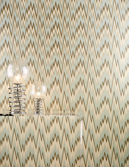
I fell in love with this dressing room by Mary McDonald and the Osborne & Little Volte-Face flame stitch pattern paper that adorned the walls… Sigh.
| via |
Seriously, how could anyone NOT fall in love with that room? I excitedly ordered a sample but when I received it, I knew that the creamy beige colour in the pattern just wasn’t right for me. I was in love with the flame stitch pattern but not with the colours and the minty blue just didn’t sit right with the turquoise dresser.
 |
| via |
Thennnn I came across this Nina Campbell wallpaper in my travels.
| via |
Here it is in situ at the DC Design House 2011 dressing room…
| via |
It was perfect! So bright and cheerful and look at the beautiful colours! And that grate pattern behind in grey! Oh yes yes yes!
…Until I got the sample in the post and realised the background was not white but more like cream and what read on my screen as grey was really more of a beige colour. Disappointed is not the word. Back to the drawing board.
But wait! In my wisdom, I had ordered another sample at the same time. And when I saw it, I immediately thought, ‘Ooooh that’s pretty…’ and then straight after that, ‘I don’t remember ordering a mint paper?’ In fact, looking back at the screen images on the site I’d ordered it from, it actually looked turquoise. It wasn’t in person – it was most definitely mint green with metallic gold accents. But I sort of loved it. And the more I looked at it, the more I fell in love.
Did you notice it in this picture I posted the other day? :)
I liked the paper but I wondered… Could it work with a pale turquoise dresser? Turquoise and mint? Does that work?? I rushed upstairs to the dressing room and placed it against the pale turquoise of the chest of drawers. The tones were identical but the colours were just different enough to keep things interesting. I started doing a little bit of ‘research’ (read that: Pinterest and Google Images got a hammering) and found all sorts of beautiful images with this colour combination. See how nice mint, turquoise, pink and even a touch of yellow play together?
| via 10rooms |
And so my wallpaper was chosen. This, my darlings, is Osborne & Little’s Grove Garden and I feel in my heart of hearts that it will transform the room. I love it so much and I think the combination of minty green, turquoise, pink and gold will pull the room from ‘pretty good’ to SHAZZAM.
| via |
Below, you can see what it looks like in someone’s actual home. It’s a little bit dark as it’s shown here but as you can see from the pics taken in my dressing room, its paler than it is reading in this particular image.
Nonetheless… isn’t it pretty?? It’s actually the only room I could find online which used this paper in this colourway – so it’s obviously not entirely popular which is always a good thing.
Trailblazing, that’s me. *coughcough*
It is, however, £54 per roll and I’ll need at least 4 rolls, if not 5, so it’ll be a bit before I can order it. The joys of being on a budget.
So, that’s the wallpaper sorted! What else am I hoping to add?
Well, I’ve decided the lighting needs updating.
This one just looks a bit sad, is way too small for the room and I can’t seem to get it to hang straight which annoys me. And I’m not a massive fan of pendants unless they are big and rather special. This one is pretty but it’s not right for this room.
So I showed on the blog previously, I’m thinking of this chandelier…
| via |
But I’m still undecided about it because although I want something a bit over the top, I’m not sure if it will clash with the mirror? Should I get something in gold? It also comes in baby pink so that’s another consideration although this version is a bit more expensive.
| via |
The problem is my budget is TINY for this room and I need an inexpensive option – like an under £100 option. It doesn’t leave a lot in the way of over the top lighting.
I’m also considering this rug, surprisingly from Littlewoods (I know, I was shocked as well). I think the colours will work well with the wallpaper and I love the touch of black. Every room needs a touch of black, right?
 |
| via Littlewoods |
I also need to do something about this situation…
Those little painted benches just aren’t working for me anymore. I’m considering a couple different options there.
The main obstacle is that I can’t have anything too wide as it’ll stick too far out into the room. I’ve been keeping my eye out for a wee little desk or something to stick in that space but can’t seem to find anything. I also don’t want to fully block the radiator with, say, another shelving unit, because it can get cold in this room on winter mornings!
So one of the ideas floating around my head entails installing a shelf on brackets just between the window and the radiator which would run the full length between the shelves and then using a piece of light opaque fabric to create a gathered skirt in front of it (split in the middle) and then put a small stool in front of it for seating. I could then place a small mirror on the shelf to create a little vanity unit.
Kinda like this but slightly narrower if you can’t picture what I’m trying to explain very badly:
| via |
I like the idea because there’s hidden storage as well as display space and the gathered skirt is quite feminine. The only issue I have with this is that the shelf will have to sit between the space above the radiator and below the window sill – it’s higher than where the average vanity would sit so a normal height chair wouldn’t work, I’d have to get a stool or something.
Otherwise, perhaps a little window seat could work but the rad would still ultimately be on ‘show’ with that option which I’m not entirely crazy about. Hmmm. I suppose I could paint it the same minty green as the background of the paper to make it ‘blend in’ a bit more… As you can see, I’m not entirely sure what to do there.
Maybe you might have some ideas for this strange space under the window? If so, please share! I love getting your ideas.
I’m also thinking about putting more shelving above the clothing rail now that the wall is reinforced properly again. I had tried putting up shelves long ago there because there’s quite a bit of unused space but the shelves fell right out of the wall because the plaster was in such poor condition. So I may have to try again now.
Eventually, I’d love to replace the wall mirror with a big fabulous leaning mirror. But it’s a low priority at the moment as the one I have on the wall is perfectly functional, it’s just not terribly exciting and these mirrors are mucho expensive. One for the far future, perhaps.
So, what do you think of my plans for the room? Any wallpaper dilemmas of your own? Are you falling for mint, turquoise and pink too lately or is there another colour combination that you love? Any ideas for a strange space between two shelving units?











Right, this is what I think for what it's worth. Love the wallpaper,it's cracking,glam without being too over the top and I like birds although I hate them (am scared of them) in real life.<br /> The chandelier worries me a bit, only because I'd be worried that you might get fed up with the pink before you get fed up with the wallpaper. And if pink chandeliers suddenly become old hat
fabulous choices and i love how you have chronicled the journey to the right wallpaper to keep it real. loving the idea of a small custom vanity with storage. that one gets my vote.<br /><br />what a beautiful rug!<br /><br />you are going to enjoy the h out of this room<br /><br />smiles.<br /><br />michele
My friend has that chandelier in white in her kitchen and it looks fabulous, I say go for it. If you ever tire of it you can change it, it's not like you're tied into a contract with it for however many years. <br />Beautiful room.
I think you should take a leaf out of my book head for ebay or a charity shop have a look for some old chandelier fittings they dont have to look great as you can paint it and add as many crystals and extra pieces on I picked up one for £2 the ones that are second hand seem to look more expensive and rare finds! "We like rare" the wallpaper is lovely stick with what you a drawn too its
I am still completely in love with your mirror. It's so eye-catching and original…<br /><br />And I have now lusted after every single pair of your shoes visible in the Billy bookshelves! Worrying!!<br /><br />Sarahx
Love all your ideas. Can't believe how the wallpaper search ended up, I absolutely love your final pick ( I hate flamestitch but since I spent the 80's in a stupor from clubbing I don't know why, maybe repressed memories, lol ) and although I think the pink (either one) chandelier is glam I'm afraid the love might wear off too soon for the price. EBay search at least at first. I&
Your home is looking gorgeous! I'm extremely jealous of your dressing room! I have to admit that I'm a little bit of a commitment-phobe when it comes to wallpaper but I love your final choice! Hope you're doing well!<br /><br />Sara
I LOVE that O&L wallpaper! I saw it at my supplier's a few months ago and thought how lovely it would be to get a chance to use, it is so pretty!! Great choice for your dressing room, my lovely :) <br /><br />I'd probably leave the pink chandelier for now – after you've put the wallpaper up and got the rug, you may get a better feeling of what sort of ceiling light will work. Or
Absolutely love the wallpaper. And the baby pink chandelier. <br />I would put something to sit on in front of the radiator. A velvet buttoned stool or ottoman maybe? A deep pink would be nice. You could always have a little cover made for the rad. Would create a handy shelf too for some pretty accessories.<br />Can't wait to see it finished.<br /><br />Carole xx
The room is coming along well. I don't envy all the pain you went through to get it this far! Love the idea of wallpaper in a room where you can do something girly that W doesn't have to approve. I liked that The Mr. and I had separate closets at our old house! <br /><br />I've been thinking about putting wallpaper in our powder room, which guests would see, but I never use that
You are making good progress my friend. That Nina Campbell wallpaper is the bees knees. And would look uber fab with that pink shandy!! Love your floor length mirror btw. :) xo
I love your plan so much more than anyone has ever loved a plan-that-is-not-yet-a-room. I had fallen pretty hard for that nina campbell wallpaper as i was reading, the one that's actually beige? (BUMMER) But the one you chose is just gorgeous. Dying to see this stuff all together!