So recently I was asked for some decorating help from a friend and workmate, Becky, who has just moved into her first proper flat out of University with her mate Liz. Both girls are single and in their early 20’s and they want a liveable space with a casual vibe and one where they can easily have a few friends around for drinks. Becky is the type of girl who feels more at home at a festival than at a fancy dinner party – a total indie chick, she’s cool and quirky with a good sense of humour and best of all, she always shares her coolest music finds with me!
Understandably, Becky wasn’t entirely sure how to tackle the large expanse of an open plan kitchen/living room and with a few pieces that came with her semi-furnished flat, she wanted to get some ideas on how to achieve a look that reflected both her and her friend’s style without spending a ridiculous amount of money. They intend to stay a while – at least a year or two – and naturally, they want it to feel like home.
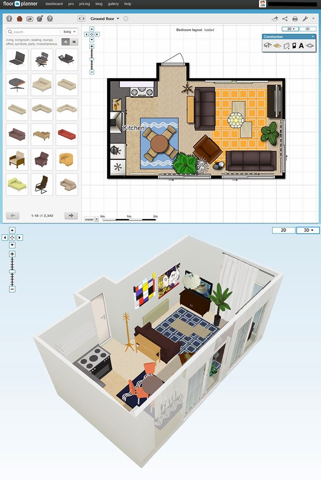
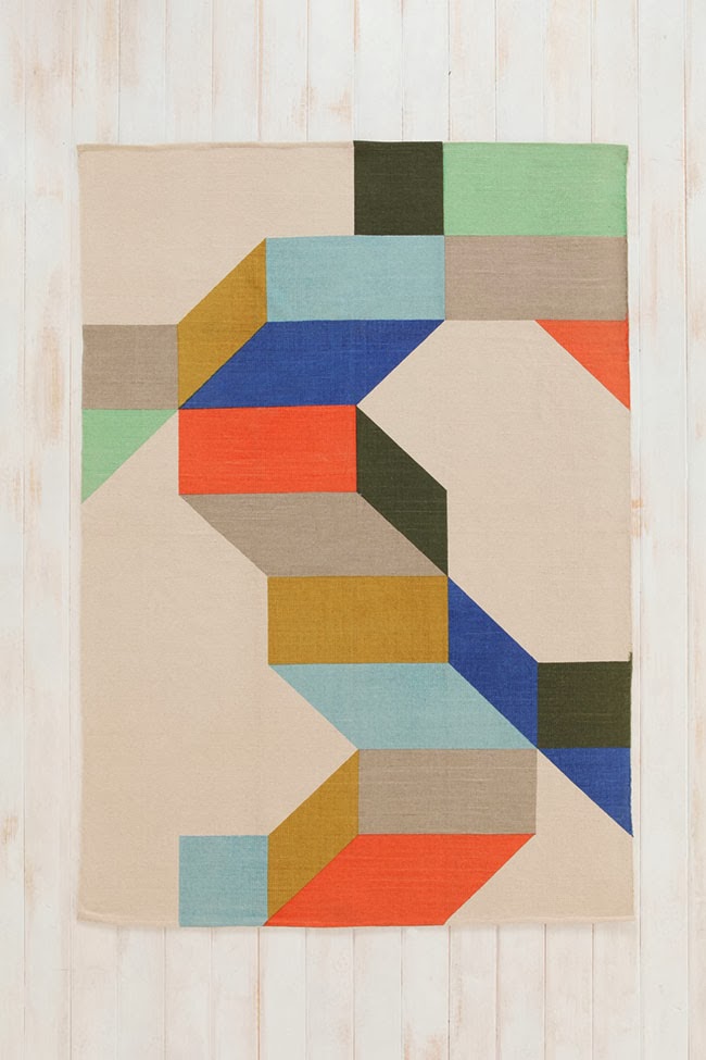
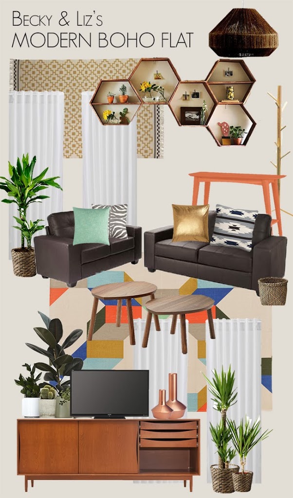
I suggested dividing up the space visually. In the living area by using two inexpensive rugs butted up against each other – alone they are just 5′ x 7′ so far too small but by using two sat next to each other, we would be creating a much larger 7′ x 10′ rug (hello, budget solution! Doing this was much cheaper than buying one really large rug.) Using a small console table against the back of one of the sofas with some baskets beneath would create a sort of entrance area as you walk in the door along with a coat rack (something the space lacked) as well as giving them somewhere to throw post or their keys. Another rug of a different but complimentary style would then delineate the dining area.
I then used this rug as a springboard to put some moodboards together to ensure that the style I’d interpreted for Becky and her friend was something they both liked.
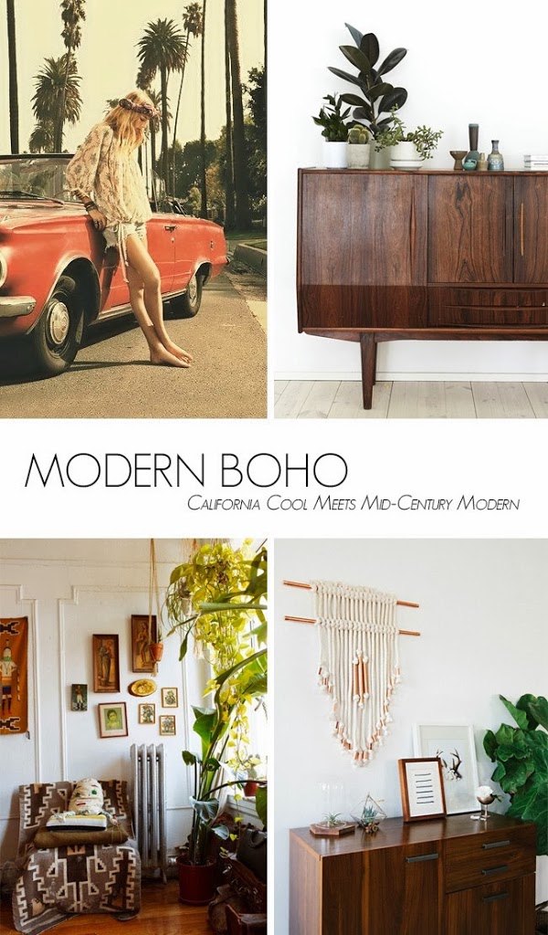
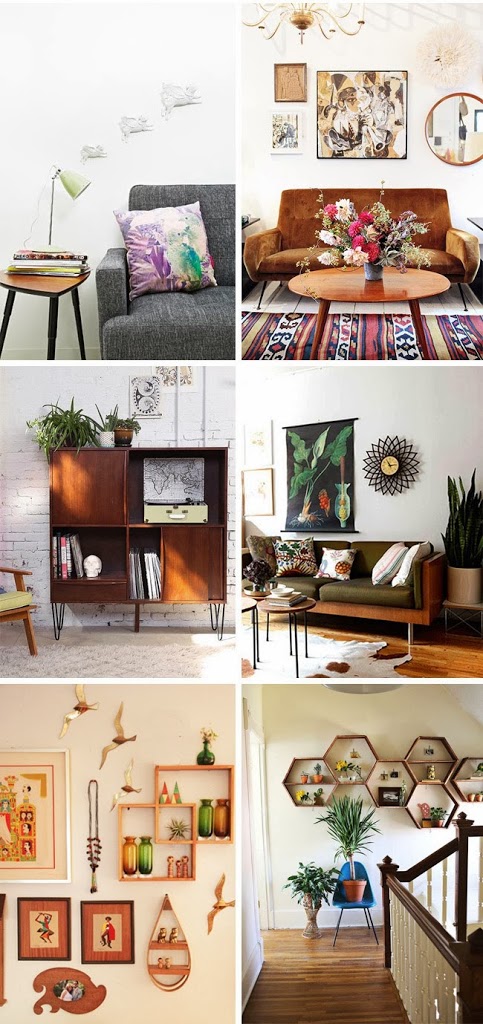
I noticed a lot of Becky’s pins had a casual boho feel and there was a lot of vintage style furnishings. I decided to combine two different looks – Boho and Mid Century Modern. It’s a mix of a hippy/California vibe (lots of textures and textiles, layers, plants, very casual, lots of vintage and hand crafted elements) mixed with Mid Century modern (unfussy lines, skinny peg legs and warm colours). I think the styles work really well together without being too hippy-ish (which Boho can sometimes be) or too stark (which MCM can be) when used on their own. It’s just a very casual, comfortable look that doesn’t take huge amounts of cash – just a bit of creativity – to emulate.
I suggested leaving the sideboard natural but painting the little console table that will sit behind the sofa in a fun colour like peach or mint to tie in with the rug in the living room. The hex shelves are DIY but we’ve found some off-the-shelf in other colours if making them isn’t an option. Even though the flat has vertical blinds, I suggested hanging inexpensive Ikea curtains above the 3 sets of sliding doors in breezy white to soften the look.
I’m on the lookout for some colourful throws as well to soften the big sofas and I’d also like to tie in a bit more copper to give it a little more shine but this is a good start anyway. We’re also talking about creating a gallery wall on the largest wall that would extend to wrap around behind the television. Oh and we all totally want to squeeze in a bar area somewhere in here!
I’ll have to let you know how we get on with the project – this is real life with real budgets so it’ll take time to complete! And we still need to address the kitchen area. But happily, so far, both really liked the look and are very excited to get started! Hopefully, I’ll have more to share with you on this project so stay tuned…
So… what do you think of the modern boho look?
Image credits 1st moodboard: 1 / 2 / 3 / 4 / 5 / 6 / 7 / 8 / 9 / 10 via Pinterest
Products in 2nd moodboard: via my Pinterest board












love what you chose for them. using 2 smaller rugs is such a smart cost-effective idea. then if/when they move, the rugs can easily transition into other spaces. also love the idea of having that table behind the sofa for a drop spot. and you've reminded me I need to get a coat rack. our living room closet is so far from the front door and tiny!<br />– jackie @ <a href="http://
I've been looking at your Pinterest board and thinking whoever 'Becky' was her flat was going to look awesome! It's a great look and I love that rug.
i think it's awesome when it's curated by you.<br /><br />michele
Looks fab Kimberly, I love it! Those honeycomb shelving units are fun, and the copper accents are always my cup of tea! Fab inspo pics too. I look forward to seeing how the space ends up looking!
Nice! I recently photographed a home with the same style combo. I haven't published it yet though. They had a lot of vintage Dansih design combined with colorful rugs and a hippie vibe.
Your approach is fantastic and your interpretation of their style seems spot on! So many people have to work with tight budgets and it's lovely to see how your ideas are fabulous and chic yet inexpensive – my kind of creative decorating :) Looking forward to seeing how this comes along, I know it'll be gorgeous! xx
Can you tell me the name / brand of the neutral geometric rug with the navy border on the final mood board? Thanks!
Hi Candice,
It’s actually from IKEA :) http://www.swoonworthy.org/2014/01/designing-modern-boho-space-for-couple.html/#comments
Beautiful rug and a great buy – it’s more of a maize yellow with a black border!
Hope that helps,
Kimberly xx
Whoops!! Wrong link!
http://www.ikea.com/gb/en/catalog/products/50168285/
There ya go lol
xxx