We all know that I’m a colour-loving OTT gal. However, after I took down the Christmas decorations, it was as though my home sighed with relief, no longer heaving under the weight of so much decor, so much excess. It felt blissfully pared back (I know, MY home feeling pared back – ok, so it’s not exactly Scandinavian but hear me out here)…
The crazy buzz of Christmas preparations lasted for a full 6 weeks for me and while I love it, I was really looking forward to the relaxation and quiet that comes in that week between Christmas and New Year. And it was blissfully relaxing – with no work pressures, a bit of time off blogging, I felt like I had time to think and plan and of course, give my home a good clean and clear out.
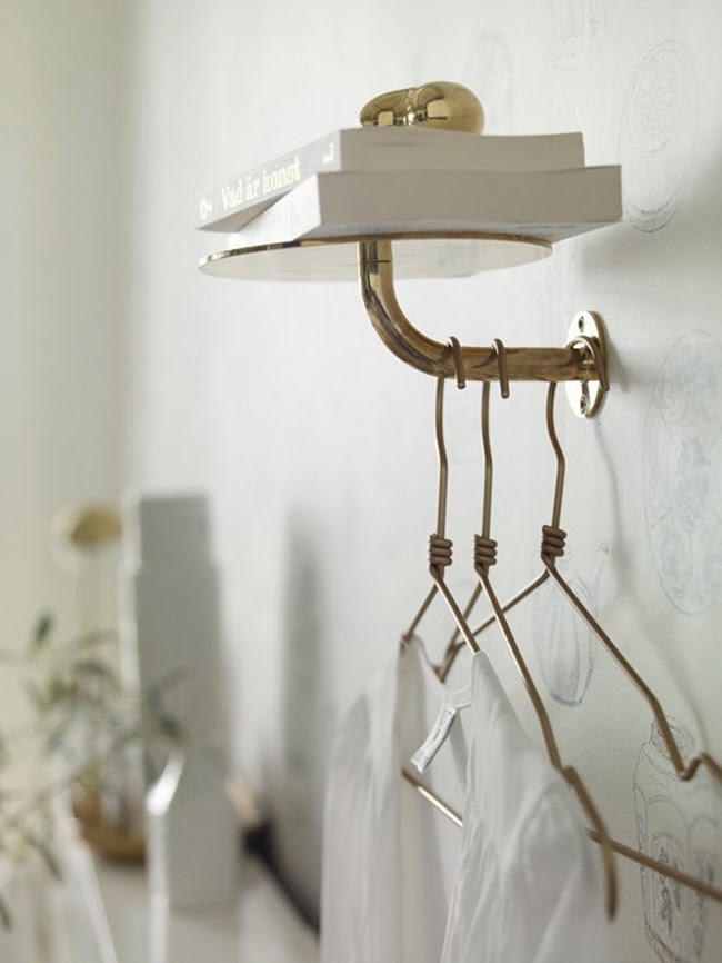
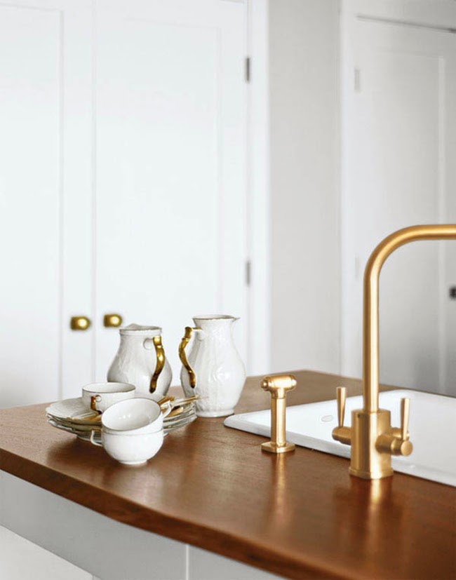
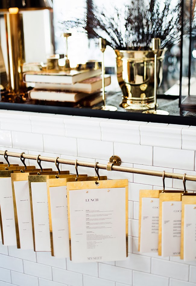
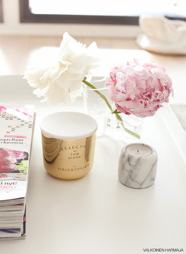
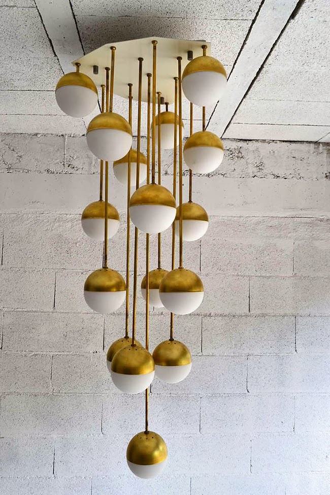
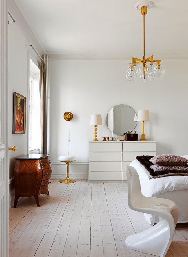
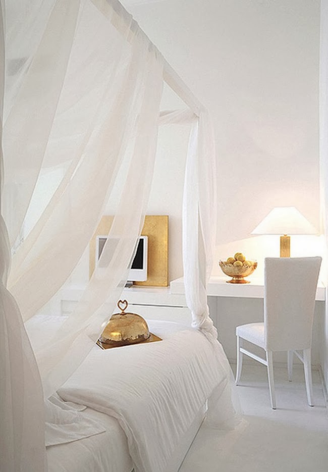
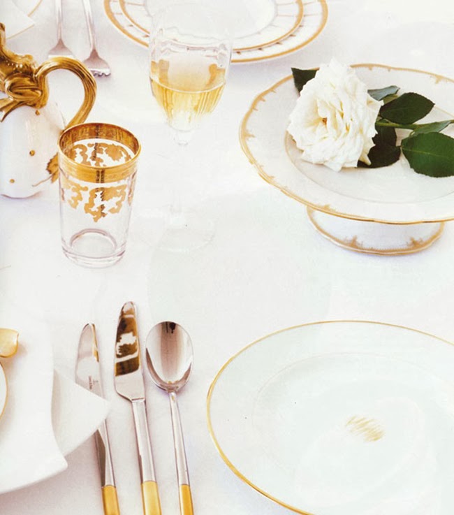
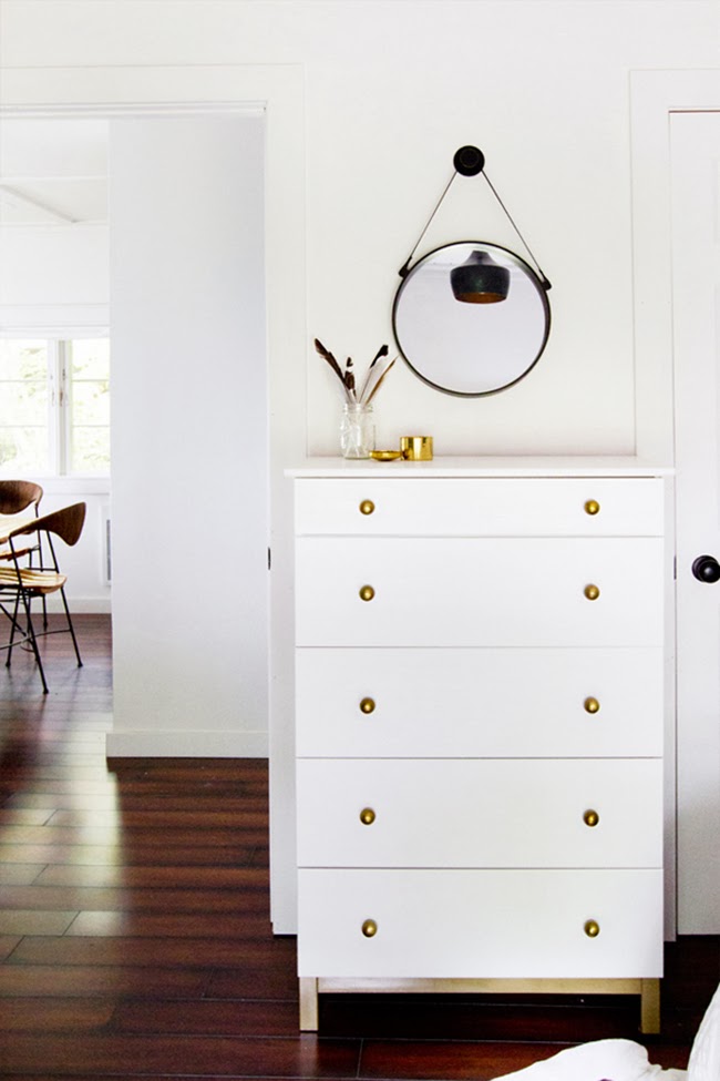
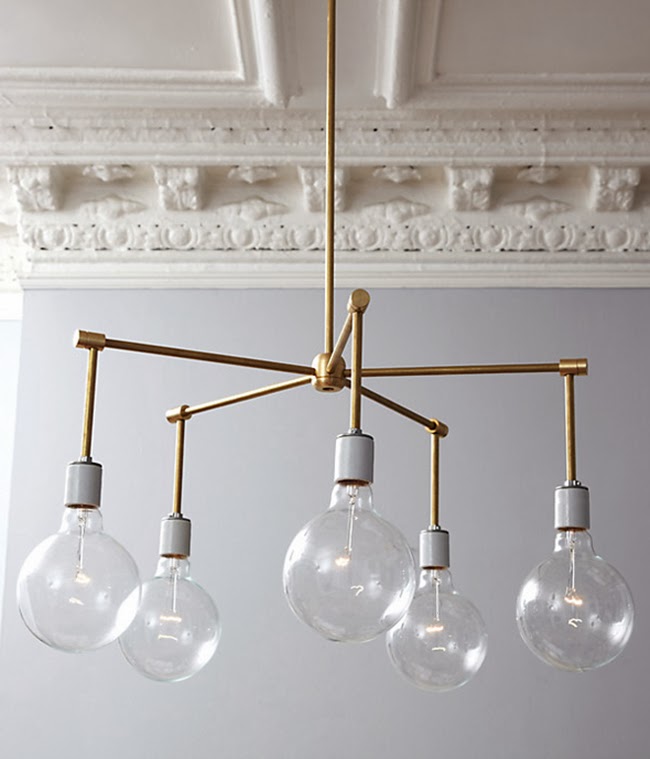
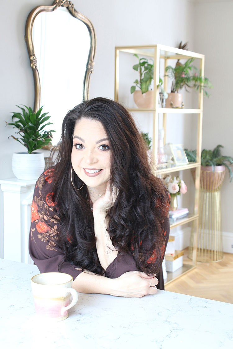
Maybe it’s because of this feeling of shaking off the excesses of the Christmas period, I’ve found myself drawn to the simplicity and sophistication of pure blissful white with gold accents. It’s so grey and dark in January that the combination especially appeals to me – calming but a little glam at the same time. Because hey, if there’s any time we need a bit of clean and sparkle, it’s January.
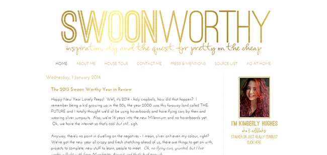
You may have noticed that part of this clean up was in my design here at Swoon Worthy – this need to simplify goes further, I suppose, than just interiors and the clear, uncluttered look feels balanced and right at this time of year. (Obviously, if you are viewing this email from a reader, email or a mobile, you’ll need to check it out on a desktop!)
One of the things I’ve done is remove that annoying Blogger top nav menu (why did I not realise you could do that?!), cleaned up my profile introduction and changed my flavicon to a simple gold and white design.
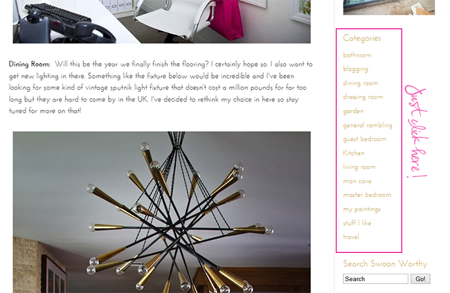
I’ve also finally labelled all my posts (yep, all 400+ of ’em – quite a task!) into simpler categories. This way, if you only wanted to see my posts on the living room or just the garden, it’s a lot easier for you to find the content you’re looking for quickly. In time, I want to include some drop down menus at the top for even more simplicity but until I can figure out how to do that, this will have to do! This also means my ‘You May Also Like’ suggestions make a lot more sense.
See? Simplicity!
In honour of this simplified look, I figured I’d pull a post together showcasing some dreamy interiors in this quietly sophisticated colour scheme…
Are you ready to be transported? Well, then let’s begin…
Obviously, I’m a total maximalist and could never in a million years pull this look off in my interiors… but already I’m feeling a little calmer, a little more free of clutter and ready to set the new year alight. Ahhhhh…. that’s better.
Do you feel it too?
Interior image credits: 1 / 2 / 3 / 4 / 5 / 6 / 7 / 8 / 9. All others my own.










Whatever you do, don't paint over your bedroom walls though! I dream of one day convincing my bf our bedroom could pull off black! (of course it's your house so do whatever but still :-P)
Haha! Don't worry, Sam, I have no intention of changing the paint colour in my bedroom – at least not anytime soon ;) xxx
I know the feeling of wanting a serene space after the Christmas decorations have been put away. <br />Love your new white and gold blog look! xxx
Loving white & gold, I've recently done my bathroom white & black but want a couple of gold prints, not word inspiring ones, do you have any suggestions?<br /><br />Kelly
Hmmm I had a bit of a search but like you said, so many seem to have words in them. Perhaps it's the nature of gold foil printing? Why not pick up a metallic gold paint and create your own? ;) xxx
Love the new Swoon Worthy look and easier navigation – great work! I really need to sort out my blog look/structure – just never seems to move up the list of priorities!!
I never seem to find the time either – I just do little bits and pieces as and when I get the chance but it's like deep cleaning your house… such a drag to do but when it's done, you think, 'Ooooh I love it – now why didn't I just do that sooner!!' haha xxx
pared down and simple? hmmmmm. nahhhhh. i love the white and gold inspiration images and your blog's new look!<br /><br />michele
I know, that's just never gonna happen is it!! ;) xxx
The new design looks very lovely – I'm also really crushing on the white/gold colour scheme. One teeny note, you have an absolutely positioned div sitting on top of one of your navigation items (the one to your AO blog), making it inaccessible… (it's the div cap-left)
Thanks for letting me know Laurie! Which browser/device are you using? I've viewed it in Firefox, Chrome and IE and I can't seem to see the issue! :-/ xxx
Hi Kimberly, I'm using Chrome on a Mac. Here's a screenshot of the div sitting over your menu: http://grab.by/tugU Hope that helps! :)
Thank you! I will send it to my tecchie friend and see if he can sort it for me because I'm not even remotely sure how to fix it! :) x
I'm not really sure the function of this element, since it's empty, but this CSS in your stylesheet (or wherever your styles are, it's been ages since I've used Blogger) will fix it:<br />.main-cap-top {<br />position: relative;<br />display: none;<br />}<br /><br />:D
Thank you!! Let me know if that worked :) x
That did it. Yay! :)
Aww thank you for your help, you're a star :) xxx
White and gold does feel so fresh and clean. Loving your simpler blog design, btw. Very classy. Good on you for labeling all your posts. One of these days I'll do that. I've been trying to get better at labeling posts and photos but I seem to always forget.