I am so excited to finally be sharing the fireplace remodel in the dining room with you. It’s taken us a good few weekends to get this done but I have to say, I’m so pleased with the final look!!
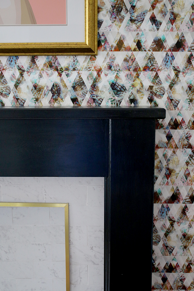
It took longer than we’d planned as we hit a few snags along the way and the weather has been just crazy this past month. We’d actually planned on finishing it last weekend and then we had the most bizarre weather with freezing cold Arctic air blowing snow and hailstones through the country and temperatures around 2-3 degrees C. It was raining one moment, hailing the next and then the sun would come out and everything would be dry immediately. Anyway, we needed to cut tiles outside (we don’t have a garage to do this sort of thing) and using electric equipment just wasn’t going to happen with the weather like that so we got a bit delayed. This weekend, happily, was crazy warm and sunny and it felt like summer again with blue skies and blazing heat. So we took advantage and completed the work!* Hurrah!
*And yes, every time I say ‘we’ I actually mean Wayne because he did all the hard stuff, I just played assistant and project manager! Ha!
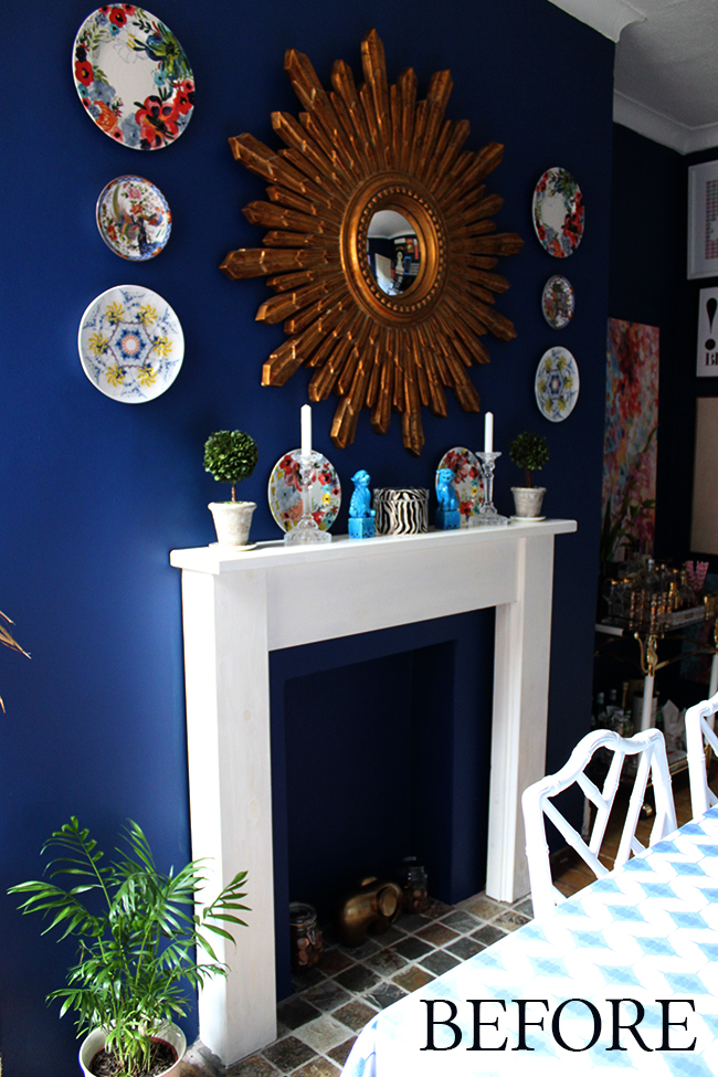
Bear in mind, this is a non-working fireplace so we just wanted to make it a feature in the space rather than just some forgotten hole in the wall as it’d initially started out. So this is what it looked like when the room was in it’s previous incarnation, taken Sept 2013. As this is the best picture I could find, it’s clear I didn’t take too many pictures of the whole thing – it wasn’t horrible but there really wasn’t much to get excited about.
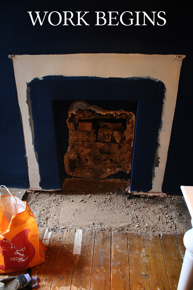
You may recall when we first started the work that we’d ripped out the back panel initially because we’d hoped to make the fireplace a little bit deeper. Alas, the hole revealed that it’d actually been bricked up to make it shallower so we abandoned that idea, knowing it would just take a bit of MDF to repair the back part we’d removed. So this is what it looked like when we started work with the surround removed and the hearth and back panel ripped out. Yikes.
We laid the new flooring all the way to the wall and filled the inside of the hearth with concrete to even the base and I painted the surround in black and of course, wallpapered. And that’s how it was left for quite a while.
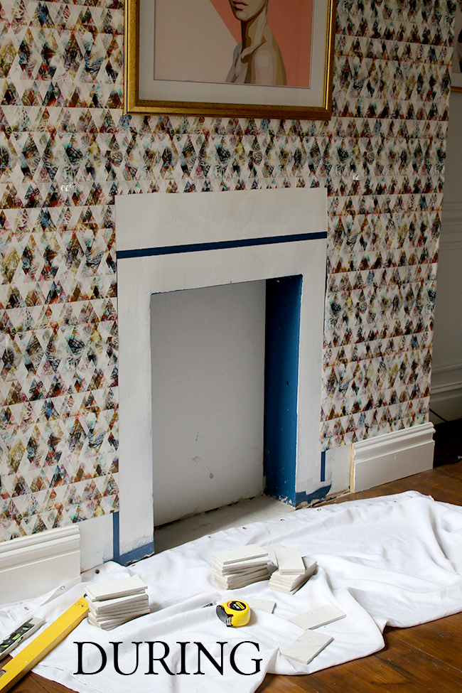
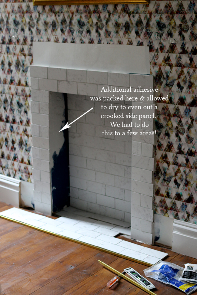
One of the issues we had – and one we repeatedly have in this old house – is that NOTHING is straight. So every single angle you see there, from the floor to the sides to just every single surface area is crooked. And that meant there was quite a lot of filling in to make the whole thing a lot more plumb so that we could tile it. Things like this slow down every project – it would have been nice to just slap on the tiles but there was a lot of prep that isn’t that pretty and just takes time. C’est la vie.
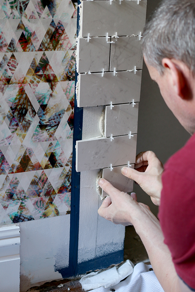
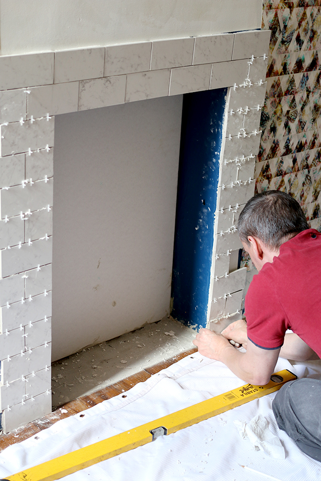
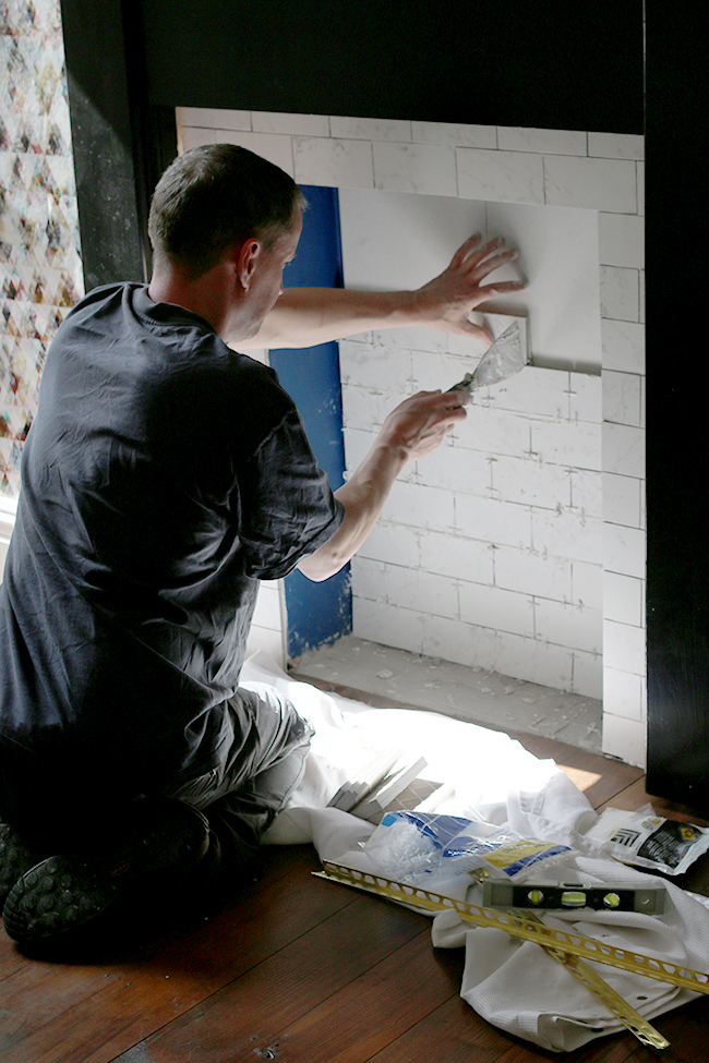
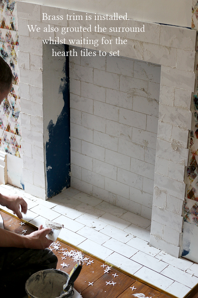
The first row is always the most difficult and as we wanted to start at the top and work our way down, we decided to use a bit of leftover trim pinned to the outside to allow the tiles to have something to rest against whilst they dried (otherwise, while the adhesive was wet, they would have just fallen due to their weight and well, gravity). This was my idea which I was pretty damn proud of and it worked a treat, allowing us to get that first row perfectly level. Go me! ;)
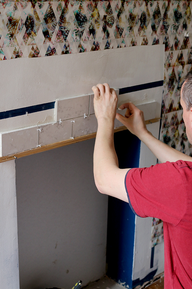
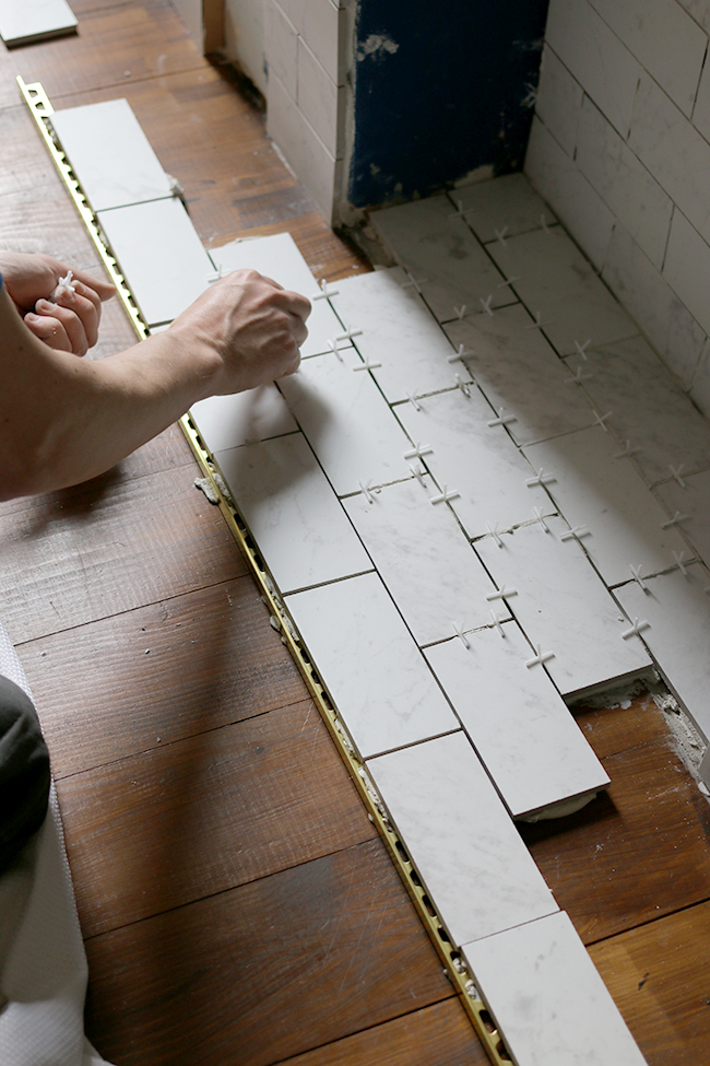
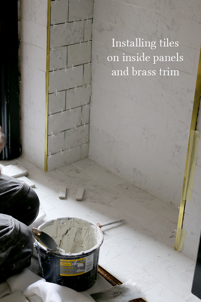
From there, we could then do the rows beneath, tapping in a few pins to support the weight of the tiles as they dried every few rows. Obviously these would be removed once the adhesive was dry enough that the tiles wouldn’t move.
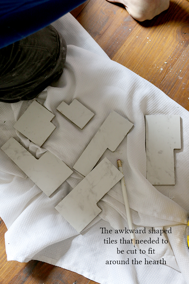
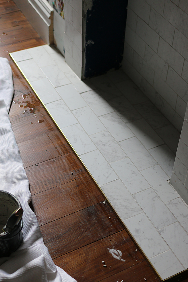
Here is a little slideshow of the whole process if you’re interested in doing something similar. The tiles are Carrara Marble effect porcelain tiles from Tile Mountain and they are just stunning. Tile Mountain also supplied their Mapei Keraquick White Fast Setting Adhesive in white which works as both adhesive as well as grout. We’ve used Mapei products from Tile Mountain for our bathroom and would highly recommend them, they are trade quality and so much better to work with than other brands.
One of the many things I’ve learned working with Tile Mountain (I write for their blog as well and do some consultancy with them) is that you can’t use ready-mixed adhesive with porcelain – because porcelain is less porous than ceramic tiles, the ready mix may not dry properly so the quick setting ones you mix with water work best. Just a little tip there!
We also used brass tile trim from here. It added such a luxurious touch to the tiles and I plan on using the same trim when we finally do the tiles in the kitchen.
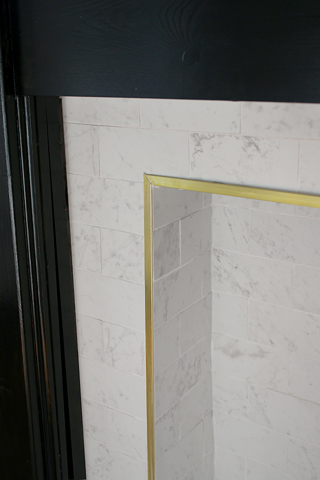
So here’s the finished look!
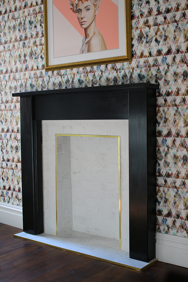
Here’s Quito modeling with the fireplace. The grout was still a little wet here – it starts off a sort of grey and then dries to a brilliant white but he looked so damn cute, I couldn’t resist sharing the picture. And you can see a little sneaky peek of the bar cart too.
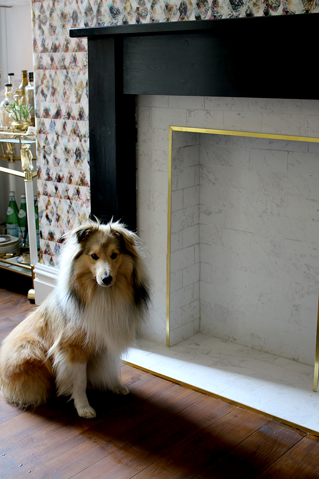
I’m so happy with it and the tiles are just so pretty. Of course, we couldn’t have a fireplace without putting something in it so while it’s a non-working one at the moment, I had the lovely folks at Imaginfires get in touch at the start of the project to see if I’d like to check out their little biofuel fireplaces. These can pretty much go anywhere and I thought it would be the perfect addition.
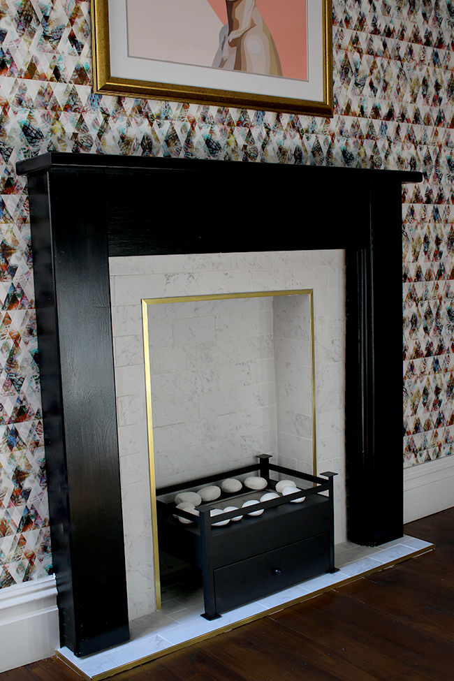
We chose the Arkle model as the size was perfect and it’s simple black contemporary design ties in nicely with the fireplace surround and other black accents in the space. We lit it for the first time last night to try it out. It took a few tries to get it to light (in the instructions that come with it, it did warn us it might as the fibres need to soak with fuel before it’s ready the first time) but once it was lit, it just looked so lovely with little yellow flames lapping around the white stones.
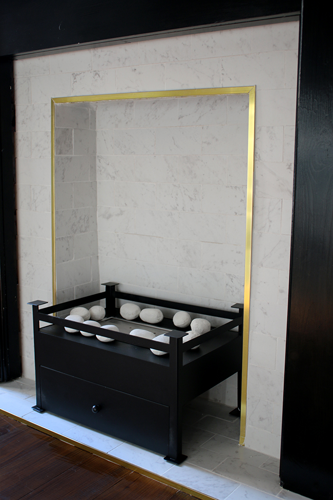
The heat output is similar to a small electric heater – about 3.5kw – which is perfect for when the temperatures can still dip at this time of year (evident in last weekend’s crazy hailstorms!). You can also control the height of the flame really easily too. Best part is that it’s currently on sale on their site for half off!! Go get a bargain while you can!
So this is the final look!
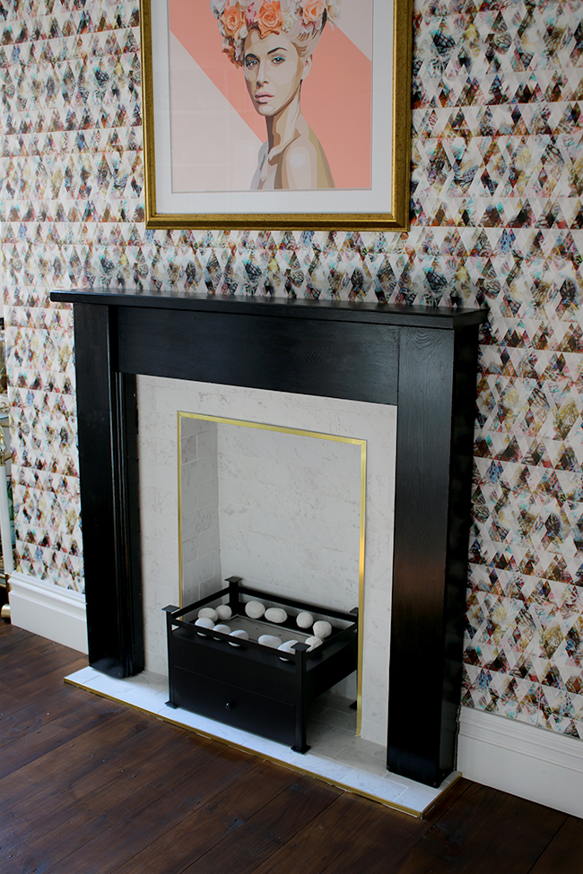
I hope to be sharing the whole reveal really soon on the blog as the room is just about done now – we still have a few small bits to take care of and then it’ll be ready for it’s debut! Whoop!
What do you think of the fireplace makeover in the meantime? I’d love to know what you think – or if you preferred the before better? Go on, the comment box awaits!
Disclaimer: This post was in collaboration with both Tile Mountain and Imaginfires who provided items free for my review. As always, all images, opinions and words are my very own. I only ever work with brands I really like and think you will too! Thanks for supporting the brands that support Swoon Worthy!












Wow! Thats stunning! I keep looking at the biofuel fireplaces for our sitting room fireplace. I need to learn to tile too! Love seeing the updates from your dinning room :)
Kimberly, I liked the before but dang girl, you did it! I love the after and the gold trim, marble, and black. Stunning!
Well worth the wait it looks stunning, that room is going to look amazing xxx
Wowsa! This looks wonderful. Nice work! Smiles, K
This looks sooo classy! Cant wait to see the reveal!
Holy balls, Kimberly. Your fireplace is actually sex. That gold edging along with the Arkle fireplace!!! So amazing. I cannot wait to see your entire dining room! xx
Looks amazeballs!!!!! Love the darker color of the mantel with the wallpaper.
Oh wow beautiful job. I love how fresh it is with that marble and gold combination. I love it..
Looks so so good and that slideshow is awesome too and a nice way to document the progress.
It looks great. What an amazing job!
xx
Great job on the fireplace. I really love the gold trim, it’s the icing on the cake. Did I mention I happen to like gold? Have a GREAT week!!!!
FAB FAB FAB! It’s looking soooo good! The brass trim with the marble-look tiles is gorgeous, esp surrounded by black. And then with that stunning wallpaper! I can see what a lot of work has gone into all this, well done to you both! xx
Wow! It was beautiful before and it’s gorgeous now!
Awesome work, I just love marble tiles and these look brilliant with the black fireplace. I wish I was as brave to go for it with the wallpaper, it looks AMAZING! Time to congratulate yourselves at the mini bar I think!
Oh this looks absolutely stunning – great job
Absolutely stunning! Can’t wait to see the rest :-)