You have no idea how excited I am to finally be sharing this room with you. And I know everyone is just gonna scroll down to the pics (because yeah, I’d be doing that too) but since early February when we started the work on this room, not one inch of the space hasn’t been in some way improved or changed. Wayne and I have replaced the flooring, ripped out the old fireplace and re-tiled it, we added all the wall panels, installed new skirting board and architrave, painted loads, changed out the door handles, reupholstered the chairs. Many things were replaced but lots of things we loved in the original space remain and we basically just updated this room to what we needed it to be – a bright, happy and welcoming space.
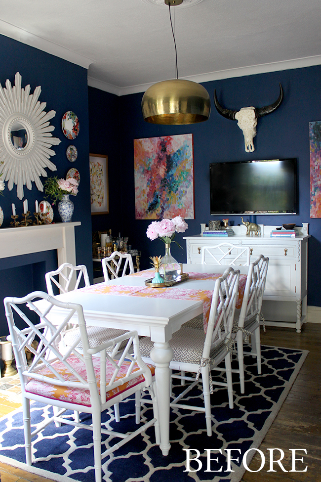
Here’s what the room used to look like. It wasn’t a horrible space by any means but after 3 years, it felt much too dark and there were plenty of elements that I’d outgrown. I wanted to start with a fresh slate with a pale backdrop, finally tackle the floors that had been bothering me since we moved in 5 years ago, move the TV, improve the fireplace and flex my design muscles a little bit! You can read more about why I decided to go light here.
After many weeks of hard work, here’s what the space looks like now…
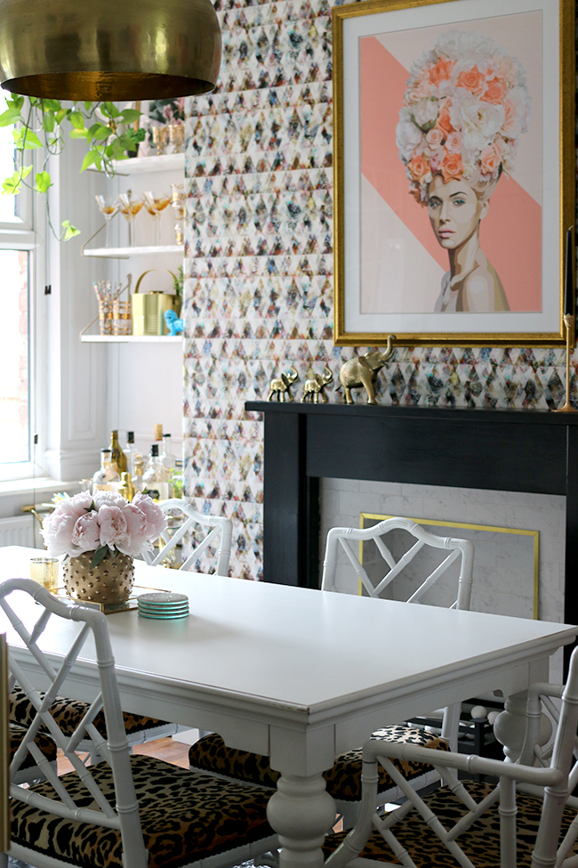
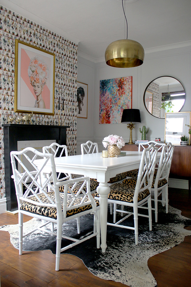
I really wanted to give the room a touch of femininity, but not in a ‘soft and fluffy’ way if that makes sense. I wanted it to have a bit of sex appeal, to give the room some harder edges too and I think mixing quite a lot of black into the space grounds all the softer details. I didn’t really stick to a specific color scheme although pinks are a repeating theme, there are a lot of brighter colours mixed in as well.
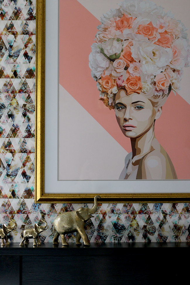
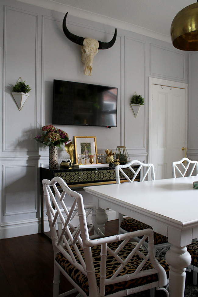
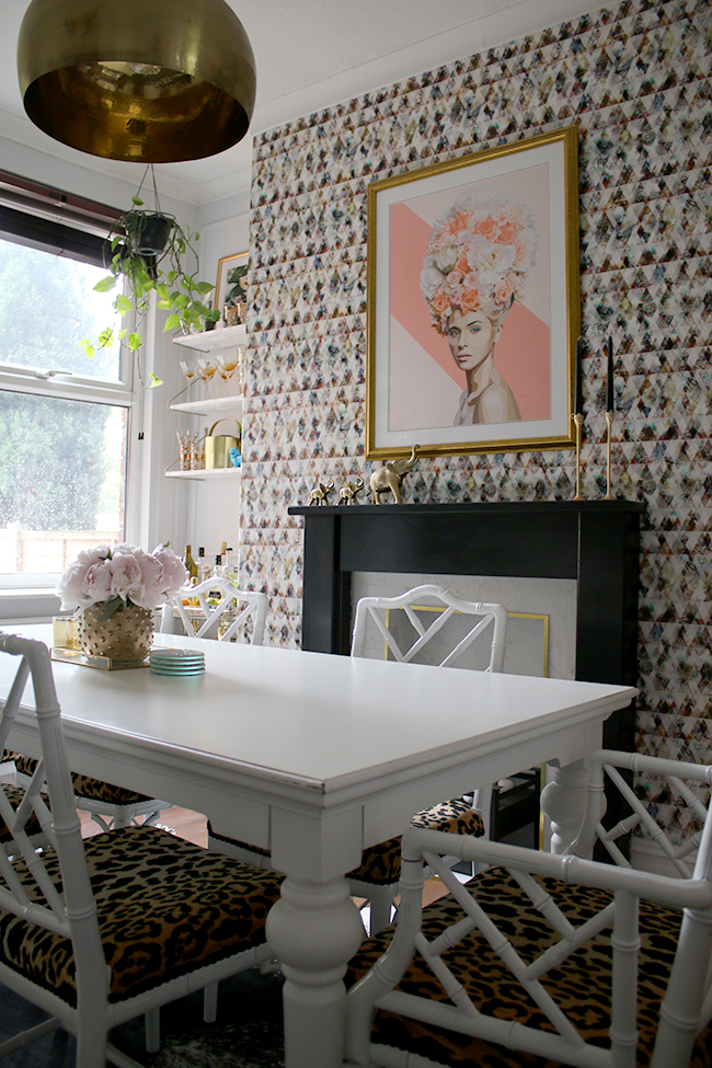
The wall panels we added are probably one of my favourite features. It makes the room look so much grander than it did before and adding those architectural elements created much more of a finished space and emphasised the age and character of the house. I kind of want to add them to every room now!
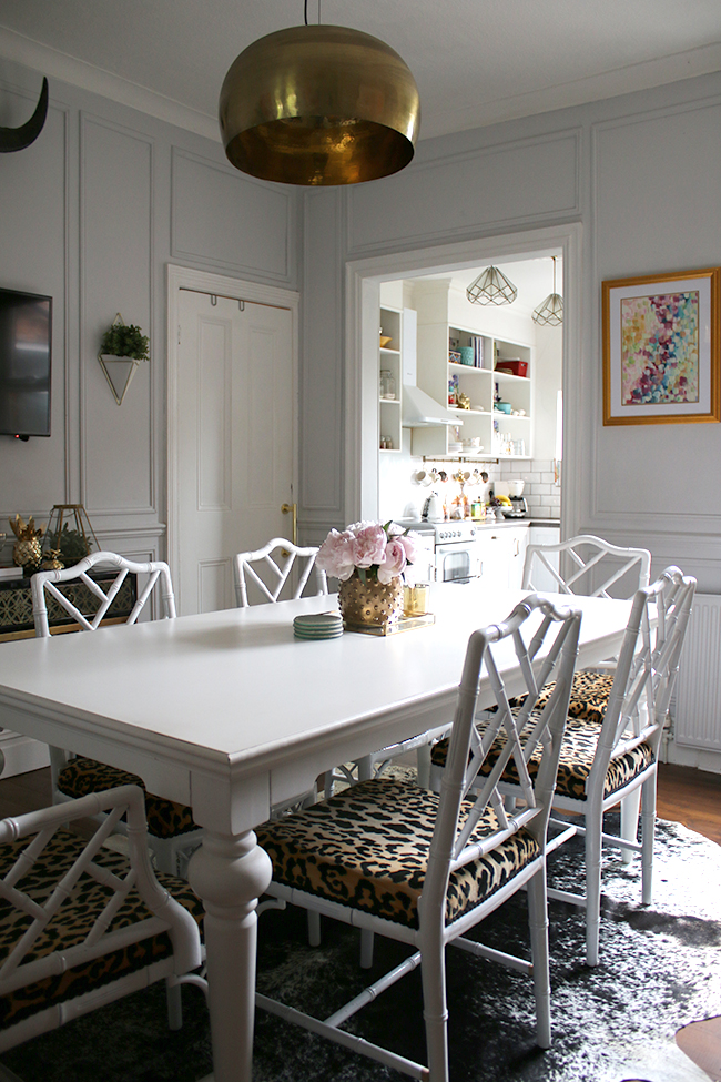
Of course, no room could possibly be ‘me’ without a huge dollop of gold. I know it’s super trendy right now but if you go ahead and look through the 5+ years of archives (okay, not really, that would be crazy, just trust me on this one), you’ll know it’s been my favourite metallic for a very long time. It just adds so much warmth and glamour to a space. I can’t see me ever getting ‘over it’.
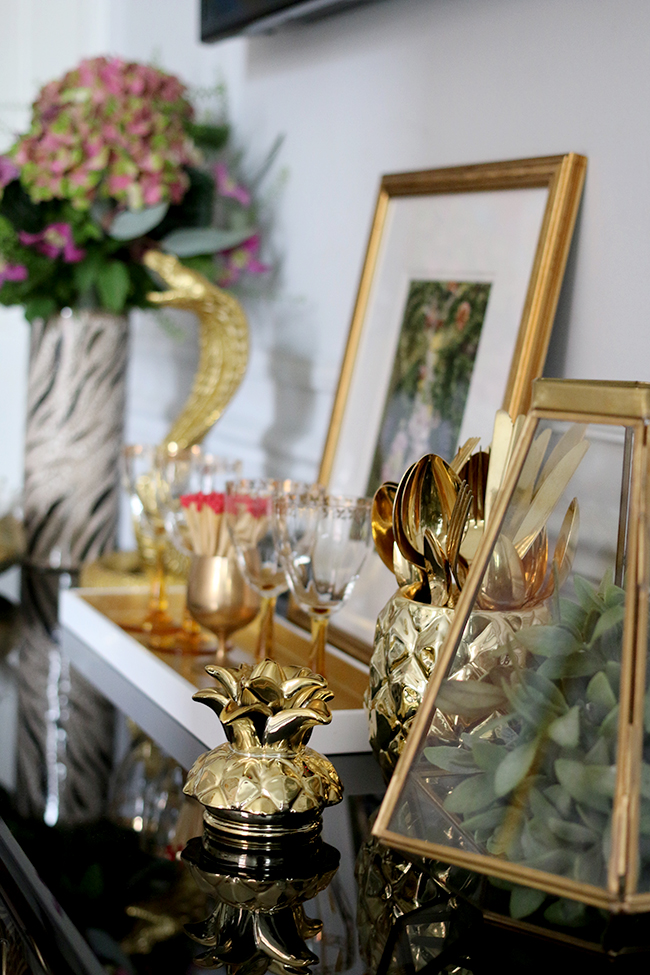
Here’s the view as you walk into the room from the hallway. It makes me happy every time I step into the space now.
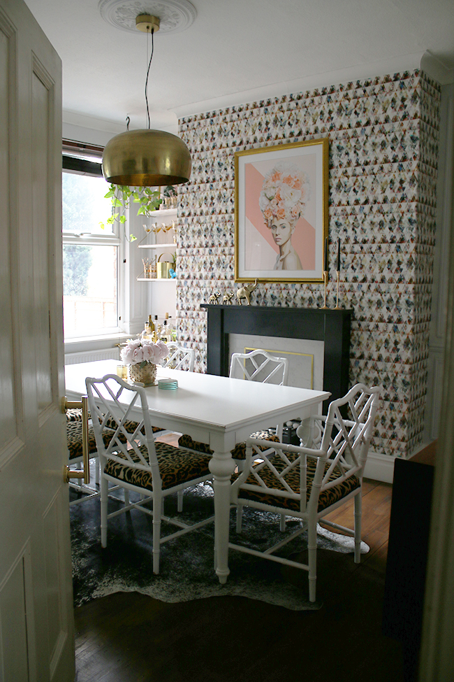
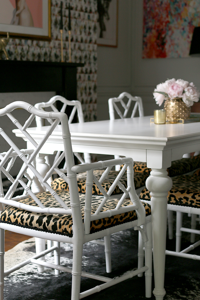
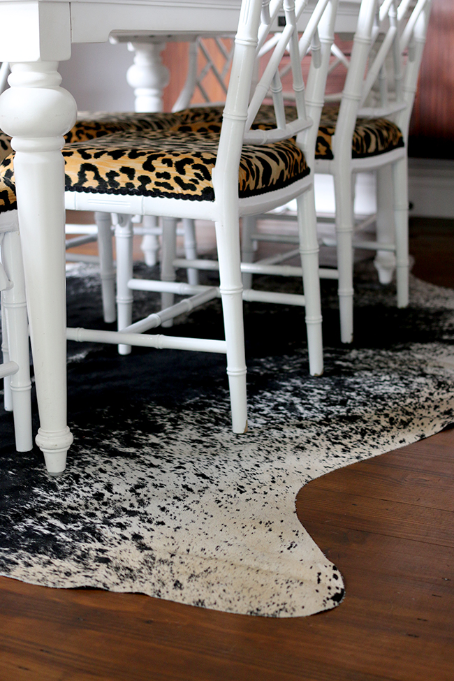
I am realising as I write this that I have a LOT of favourite elements. Those chairs. Okay, yeah, Pablo (our black cat) likes to sleep on that one at the end and so I’m constantly hoovering it and using the ‘rubber glove’ trick to keep it from being covered in cat hair but otherwise, I absolutely love the look of them. (You can read some of my tips on keeping your home clean with pets here if you’re curious.)
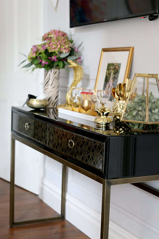
I kept that black console table we had as it works so well in that spot and we changed out the television above for a slimmer model. I’ve talked about why we have a TV in here quite a few times before so I won’t get into it on this post but moving it to this wall makes it less a feature now and I’m thrilled with it’s new location.
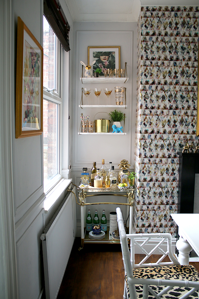
The bar cart I’ve had for years but I really wanted some shelving to show off all my vintage glassware and I love how it’s become a little station now for entertaining in this alcove by the window. And plus, I finally have shelves in this house that I can swap and change out! Shelfies! Yay!
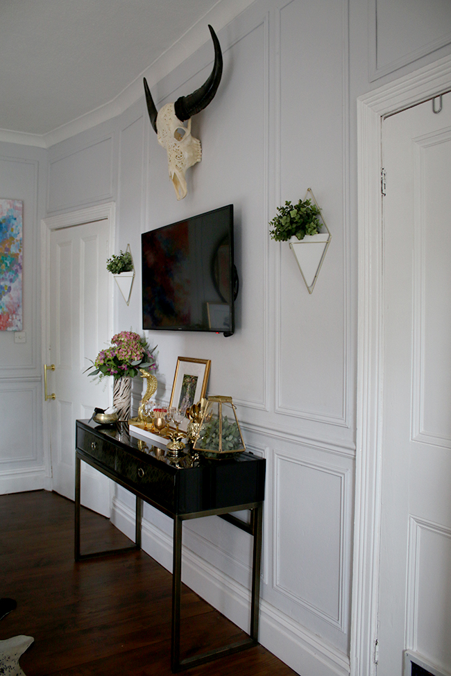
I added those little wall planters as well which bring a spot of greenery to the walls. The cow skull gives it a bit of a boho element too.
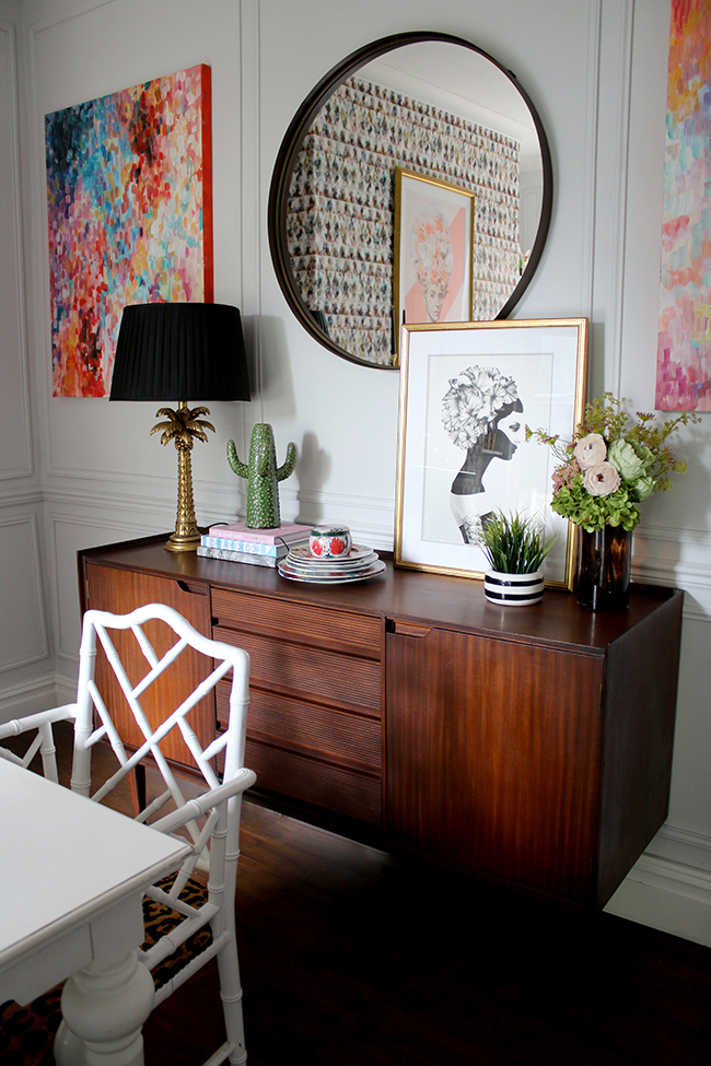
The only thing I really changed from my original design (you can see that here) is I decided to get a large round mirror above the sideboard. It breaks up all the square elements in the room and softens some of those harder edges. Should I spray paint it gold? I haven’t decided yet. I may live with the darker finish for a while before deciding.
You can read more the sideboard here. Although funny enough, Quito doesn’t need his crate anymore, the main reason I chose a shorter model! Ahh well, I still love this one!
I absolutely have to thank my sponsors on this project because without them, I doubt highly we could have ever done as much as we were able. Every one of these lovely businesses totally helped me out on this and I know I was incredibly lucky to have them on board to allow me to finally get this room finished.
The Skirting Board Shop provided us with new skirting boards, architrave around the doorway to the kitchen and the dado rails, all of which totally transformed the room with elements that looked like they should have always been there. You can read more about the process of installing those here.
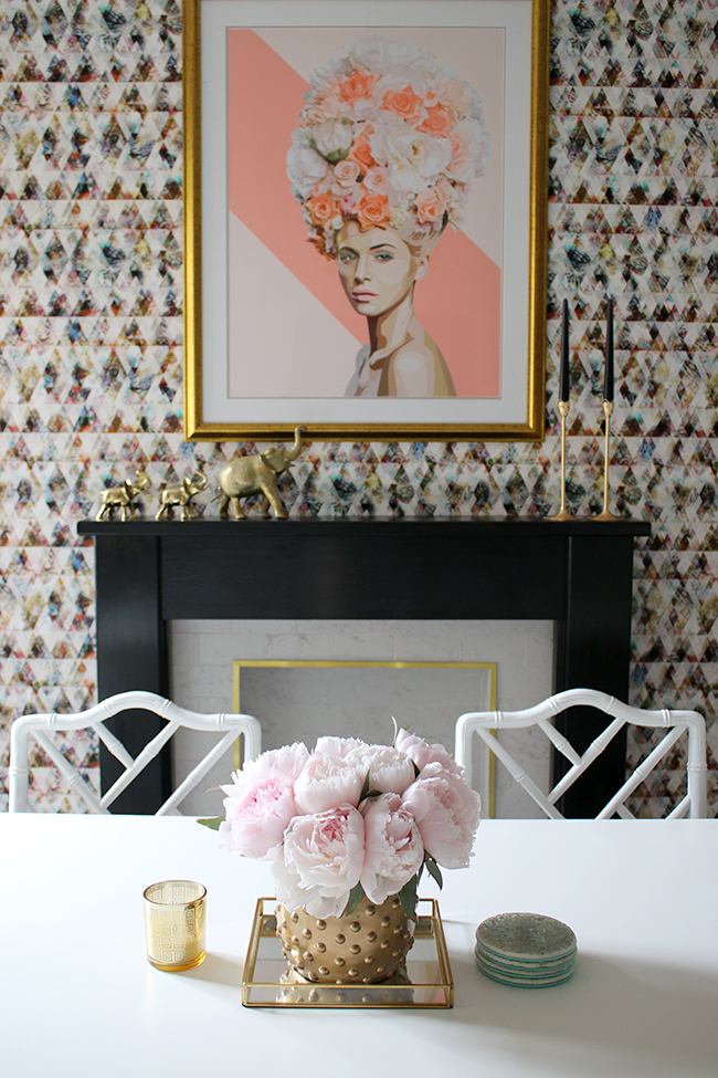
Gina Julian gifted me the beautiful limited edition print of Marie, which now looks smoulderingly upon me when I am in this room. I adore her and Gina is just the sweetest person and you should totally check out her other pieces because she’s incredibly talented. You can read more about her work here.
Eades Bespoke provided that amazing graphic wallpaper which was a breeze to put up and gave the room such a wonderful punch of colour and contrast to the more subtle walls. You can read more about putting up the wallpaper here.
Speaking of walls, Farrow and Ball provided the stunning Blackened eggshell paint for our project. This paint was an absolute joy to work with, covers like a dream and is incredibly hard-wearing. Originally a little bit of a sceptic, I’m a total convert to F&B paint now. You can check out my full review here.
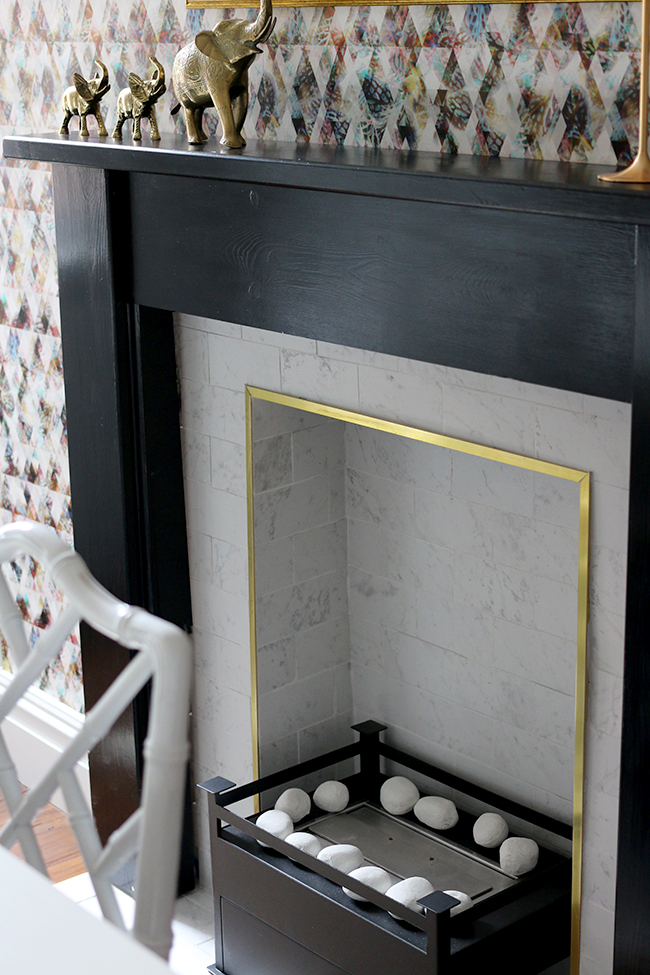
Tile Mountain provided those stunning marble effect tiles and grout for the fireplace. They look so much like real marble except they don’t etch, stain and are a breeze to keep clean. I work with these guys closely, providing blog consultancy and content for their blog which you should totally check out here. They are a great bunch and the quality of their tiles for the price is amazing.
Imaginfires provided that cute little black biofuel fireplace. As it would have been pointless to install a real fireplace in here (it would have been much too hot to sit at the dining room table, there’s simply not enough room), it was so great to have a super simple option without the hassle, perfect for those cold evenings we still get even in summer in the UK!
You can read more about the fireplace here.
And finally, that stunning cowhide rug was provided to me at a discount from Hide and Seek London. I have 2 other cowhides in my home but this one blew me away with the quality – it was exceptional. I kept joking that we got a ‘diva cow’ because there wasn’t a single mark on it (which you will always get with natural cowhide) and it’s just in the most beautiful condition. It sets off the dining room table and chairs so perfectly. Do check out Hide and Seek’s other products as well, they have some really exceptional products that are so beautiful and well made.
So a massive, massive thank you to all of my fabulous sponsors (most of which I approached personally to work with me on this and they graciously agreed) for gorgeous quality items that I loved!
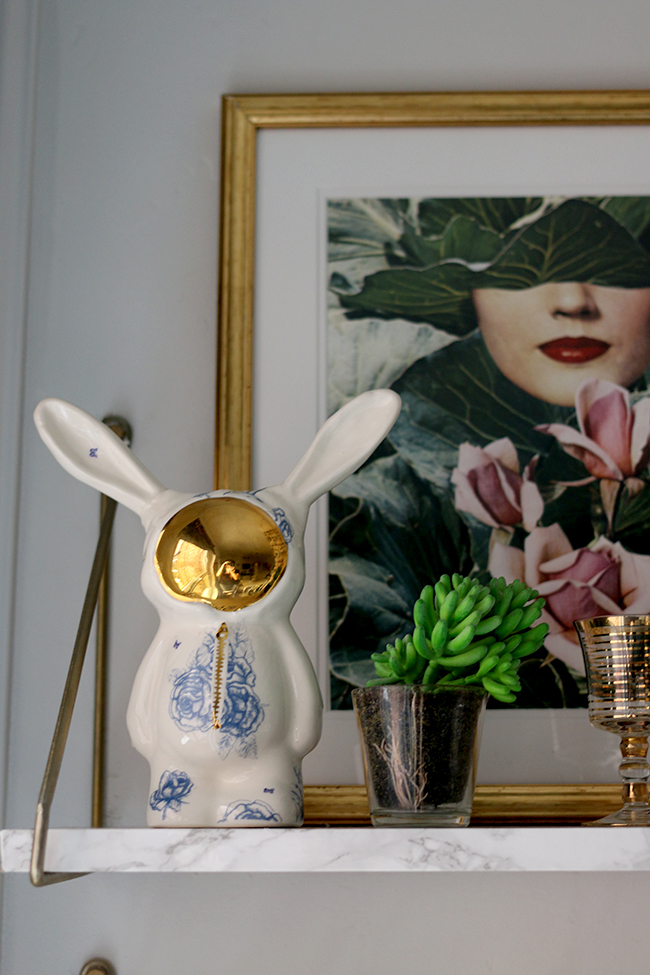
I wanted to mention as well the little faux marble shelves above the bar cart. I’m certainly not the first one to have wrapped contact paper around some standard pieces of wood to create shelves but I just love how they turned out. Plus, I have a video tutorial for you coming up soon so you can see exactly how they are done!
So that was a VERY lengthy post but I wanted to thank YOU for following along on this remodel and cheering me on the whole way! I hope it was worth the wait! I will be doing another post shortly with all the sources of everything in the space so if there’s anything you’d like to know the source for, sit tight, I’ll be sharing that really soon.
I know lots of you really loved the dark blue walls and were a bit heartbroken when I said I was changing it! But I do hope you love the new space just as much! I have to say I’m so pleased myself with the room now (Wayne loves it too!) and it’s become such a lovely bright space to spend time in. So… moment of truth… What do you think of the dining room remodel?
P.S. We’ll soon be starting on the kitchen remodel so if you fancy following along, you can click that little button just below and you’ll never miss a post!
Disclaimer: I worked with a number of different businesses on this remodel, many of whom I approached personally because I loved their products and genuinely wanted to use them in this space. I am grateful for the businesses that allow me to create fresh content on my blog and only work with businesses I really like and think you’ll like too! Thanks so much for supporting the brands that support Swoon Worthy!













I can’t even take it how much I love your chairs. I want them in the worst way. Everything looks so good!!!! The styling is perfection once again.
OOOOHHHH, it’s fabulous! So light and bright and I love the ‘faux’ panelling! I know it was a lot of work, but so, so worth it! Big pat on the back from me ;-) xo
Three cheers and a big toast it up! This looks soooo fab-tastic! Lady I love your style
Many, many congratulations on the end result Kimberly! It look absolutely wonderful. I adore the styling (if you ever want rid of that gold cobra, send it my way!) and think the room hangs together perfectly! Am very happy for you being able to peek at the room every day and have it make you smile, Jill xx
Looks great so many cute features. The flowers were worth braving the rain x
Beautiful transformation Kim. I happen to love gold and I love all the gold touches in the space. I am all for you painting the mirror gold. Enjoy your lovely space!!! Have a GREAT week!
As a long-time reader, I’ve seen every iteration of your dining room. This, of course, is the best one yet! Even though you reused several items, the room has a completely different look with the new paint and the wallpaper. The molding on the walls, while subtle, is my favorite part. It definitely adds an architectural element that makes the room more grand. Congrats on the transformation!
The panelling is beautiful – what an elegant space. You must be really pleased. I love the round mirror – I’m currently searching for something similar so will look forward to your source list post!
OMG!! That panelling looks amazing!! Like it’s always been there- and I’m loving your bar area near the window too. It all looks fab!!
What a beautiful room. It is difficult to pick one feature they all gel together so well. I see many dinner parties in your future.
xx
Kimberly, this has been worth waiting for, its beautiful, i love it. You and Wayne have done a brilliant job. I loved the dinning room before, but this is definitely something else, and im not surprised you feel happy every time you walk in to the room. There are so many things that i could gush about, but i have to say my favourite thing are your selves, that was just a stroke of pure swoonworthy definitely boho glamour on a budget. Nice one. Xxx
You’ve created a stunning focal point with the wallpapered wall & vibrant art. The shelving above your bar cart is so clever and looks fantastic. I also love that you reupholstered your chairs in leopard print. Such a great space! I hope you are enjoying it!
Everything is so good. I love the bar cart and the shelves above displaying your stem ware. I am guilty I read the first paragraph and then scrolled to look at the pictures. Everything is so good.I will have to finish reading the post after work today. Just wanted to drop a note and tell you that you guys did a excellent job. Can’t wait for the kitchen remodel series!
Grace & Peace,
Carla B.
http://carlabethany.com
I love everything! I guess my favorite part is the paneling. Just perfect and I understand you wanting it everywhere now. ? What a difference from before, I usually like dark dining rooms but am gravitating towards lighter ones now too.
Wow! It’s so different to before, and yet it’s still very you! Love it Kimberly, lots of hard work has really paid off. Go you! x
Stunning! So bright and light. Love the coral tones and gold. x
OHHHHHH! I am having a Martin Lawrence Bullard moment here…in one word “DELICIOUS!” I adore every single thing K! Really, so well done and so you :) xoxo
Really cool, much better with lighter walls and better flow to your kitchen area, beautiful ☺
Wow! I love everything about this space. There are so many little details that I had to look through the pics a few times to catch everything . I love the wallpaper and art on your fireplace wall! Oh and the little nook with your bar cart and shelves is brilliant! Great job!
I don’t which part I love best!! Amazing transformation lovely! I think the picture above the fireplace (which is amazing in itself!) and the bar cart area are just perfect. Well done to both you and Wayne, should be very proud!
Vic x
http://www.apartmentnumber4.com
Moving over to the pale side then Kimberly ? ha ! Love it especially the artwork above the fireplace. Wonderful transformation.
Oh Kimberly it is stunning! I love everything you have done. The wallpaper is out of this world. Congratulations! xx ?
Hi Kimberley, absolutely stunning redesign! I have to say my favourite part is the panelling too! I’ve been a fan of dark spaces for a long while but I do agree that the lighter paint really does give it a fresh spacious feel. When you chose that wallpaper months ago, my eyes did somersaults and I didn’t really like it, but now that it’s up I like how it balances the room and ties in with all the other elements. Good on you!
Girrrrrrrl!! All the yeses!!!! Every detail is just so good lady. It’s absolutely beautiful friend.
Well, unsurprisingly, you’ve totally smashed it! I looks every bit as glam as I knew it would, and it made me smile too! Now I’m totally going to have to come to Manchester to see it in the flesh. And steal your chairs. Xx
P.S Lucky for you the panelling is stuck to the walls or that would be at risk of being nicked my me too.
Oh, and I was a really good reader and didn’t let myself skip to the pics! I read every word. Promise. X
So worth the wait! I love it all.
The panelling, rug, sideboard, wallpaper & the floor are my favourite bits.. I like the mirror black. Your hard work is definitely visible in how the overall look is lifted and it fits with your other rooms. Oh and the fireplace is really striking too. Those tiles and edging make it very sophisticated. Well done to you both, enjoy
Ohhh Kimberly, it was sooo worth the wait! It is a BEAUTIFUL room! So much work has gone into this room and the result is breathtaking. I love every single thing. It must be such a joy to be in, it’s a joy to even just to look at the photos!
I’d leave your round mirror in black. With the black lampshade and the gold frame next to it, it looks lovely as it is in black (just my personal opinion, feel free to ignore it if you want, ha!).
Big well done to you and Wayne! xx
you did it again. I love it. I love that little black and gold unit and don’t get me started on the panelling!! Beautiful..
It is fabulous. Amazing. Beautiful. And ALLLLL of the good things! You guys did an awesome job and it really is a most elegant, happy room now. I loved your old room but definitely love this one even more. Hurrah!
Absolutely divine Kim!!!! I knew it would be! How incredibly beautiful!
Wow. I have total panel envy. (Did not know that was a thing.) I also love that you’ve been able to incorporate elements of your old scheme. You really do have a knack for timeless styling.
It’s lovely a lot of work & thought has gone into making this room superb! I think you could have gone bigger with the fireplace surround & hearth though x
Wow!! The room looks much bigger and so much grander now. Loved it before, love it even more now! (And for what it’s worth, I’d keep the mirror black.)
Great makeover Kimberly.I think the panels are really successful, you are lucky to have such high ceilings. Loving the round mirror as well. x
Hi Kimberley, I’ve been so excited to see the reveal and I wasn’t disappointed, it’s amazing! I love the wallpaper (as you know!), the picture above the fireplace compliments it so well, the chairs are gorgeous, elegant panelling and I want to steal your little elephants as they’re super cute. Well done the pair of you, no wonder you’re thrilled x
Oh my god!!!! I love this! Stunning just stunning. That wallpaper is such a fab statement, the fireplace is so glam, the artwork is gorgeous, love the wall colour you chose and the panelling is a very elegant addition. What more can I say. You have excelled yourselves (best not forget Wayne’s contribution in case he is reading this). Enjoy your gorgeous new room. It’s swoonworthy indeed.
Oh, it all looks so gorgeous!!! What a fantastic room – I bet you never want to leave it! It’s really come together perfectly – everything works so well together and it’s so glamorous and stylish! Good work Kimbo!!! Excited to see the kitchen developments too!! xx
I think it turned out great! I do have to say, I LOVE the mirror you used to have above the mantle. I vote you paint it gold and find another place for it ;)
Funny you should say that Adrienne as I do have a gold starburst mirror exactly like the white one that used to be in this room in my living room ;) You can see it here! http://www.swoonworthy.org/2015/09/blogger-stylin-home-tour-fall-2015.html/
xxx
wow wow wow!!! I’ve been dying to see this and WOW! Love it so much! That wall paper and the artwork is amazing! Divine as always my love! My how it has changed from the HHM shoot which seems like a decade ago hahaha xxxxx
It really has changed loads since then! It really does seem like forever ago ;) xx
Love. Love. Love.
Gah! It looks amazing, Kimberley! It definitely was the day for room makeover reveals, wasn’t it? I spotted at least five on Monday. LOVE your new room and how much it still feels exactly like your style even though you wanted to brighten it. Hope you love it too xx
Dear Kimberly, I LOVE this room just as much as every other one in your entire house. Every time I read your blog it reminds me of Harry Potter (I’m a bit geeky). Probably you don’t know this, but they have a room in Hogwarts which changes each time you enter it. That’s pretty much how I feel about your home as it seems like there are hundreds of different rooms which are basically redesigned every second. I admire your ability to create something so special and unique. And I am excited to see more in the future. Xx
LOVE!! So beautiful, what a triumph! Great to see you yesterday too xxxx
Oh goodness, sweet Kimberly! You’ve out-done yourself! I really wasn’t quite sure I could love your new dining room as much as the old one, but it’s absolutely stunningly fabulous! All your choices work together so perfectly and I am LOVING that wallpaper now, even though I didn’t at first! I think the moral of the story is that I will always implicitly trust your vision from now on :D Everything is so, so beautiful – I think I pinned every last image! ;)
Looks inviting and relaxing. That’s what a Dining Room should be. Great job. Luv Luv the gold touches.
Everything about this space forever and always! I’m pretty sure I’ve pinned a lot of these images after stumbling across them on Pinterest. Girl, love your style! Well done :)
Aww thank you so much lovely! Mwah! xxx
I NEEEED the source for the print on the top shelf of your bar area – ASAP! I’m dying over here!
Hahaha! All the art sources are here:
http://www.swoonworthy.org/2016/01/dining-room-remodel-choosing-statement-art.html/
It’s from Society 6 :) xx
Hi Kimberly,
A beautiful room! Can I ask what paint you used on your chairs, it has a realy nice sheen? I want to paint chairs and also want to paint them with the toughest paint possible! thanks, Emma
Wonderful piece!
hello,
is it possible to know more details about the mantle? where you bought it or where to get the marble and paints?
thanks
Hi Alex, the mantle was already in the house when we moved in but it’s just a really simple wood one and nothing particularly special. We did the tiling ourselves and all the information about what we used for the materials is in this post: https://www.swoonworthy.org/2016/05/dining-room-remodel-fireplace.html/ Hope that helps! xx