So first off, this isn’t a post about my own kitchen. As much as I’d love to rethink the entire mini-makeover we’re doing to incorporate my latest obsession, it’s unlikely to happen at this point. We’ve got the new worktops, new sinks and taps going in next week which I’m incredibly excited about and after that, we’ll be looking at repairing some of the brickwork on the outside of the house before we can carry on with giving it a new coat of paint indoors. So things are starting and I’m not about to pull the brakes on decisions that have already been made.
However, I did come across two kitchens recently, both of which incorporate the beauty of green and you can say I’ve been swayed. White kitchens are pretty much de rigueur at the moment and having had one myself for the last few years, I can attest to the fact that they feel bright and clean and fresh. We’re adding some black to ours to give it a bit of drama and tie into the dining room redesign so that should keep my need for change ALL THE TIME at bay for some time. However. HOWEVER.
Have a look at this spectacular recent kitchen design from deVOL. I’m in awe of it’s beauty and drama.
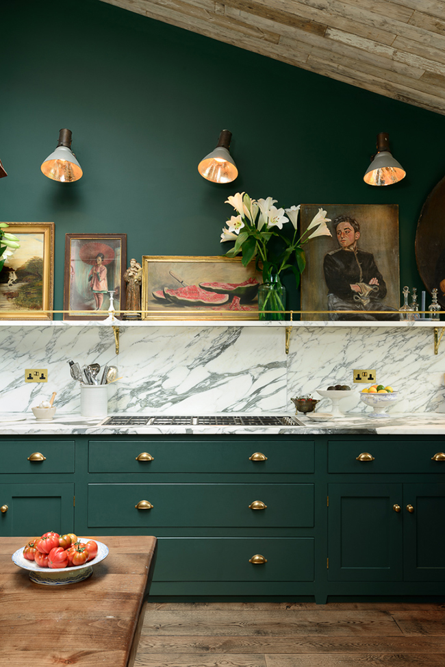
Okay, first off that marble is just killing me. Because any kitchen that incorporates quite that much marble is going to be a winner no matter what else the rest of the space looks like. But it’s that fabulous shade of emerald-meets-racing green the homeowners had specially mixed that plays off the movement in the natural materials that takes the whole thing to the next level. Or the next six levels really.
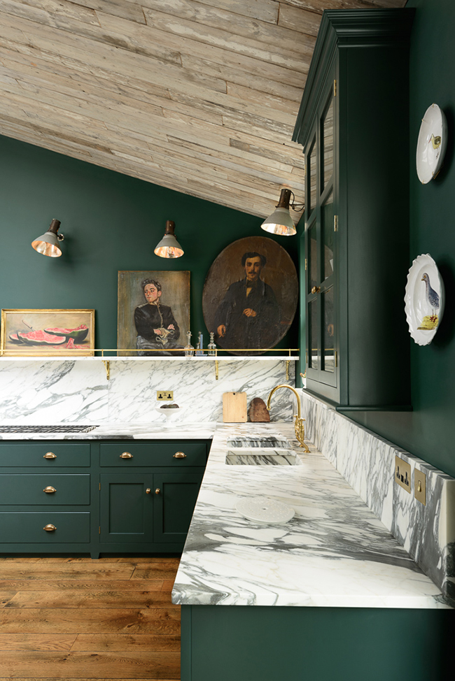
Of course, I also adore all the brass detailing. The shelving with brass railings give the space a luxe look and oil paintings give it an old world English charm. That juxtaposition between old and new KILLS ME. Of course, the unfinished wood ceiling and those beautiful floors create another interesting texture that adds so much warmth.
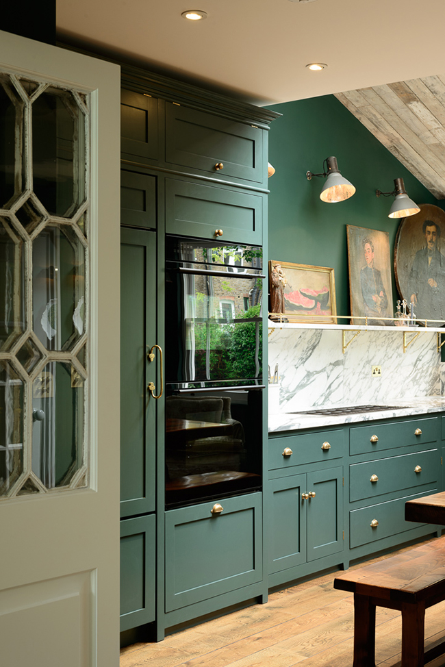
The second kitchen I wanted to share was the recent reveal by Gwen of The Makerista. Honestly, everything this woman touches is just pure understated beauty but she just knocked it out of the park with this one.
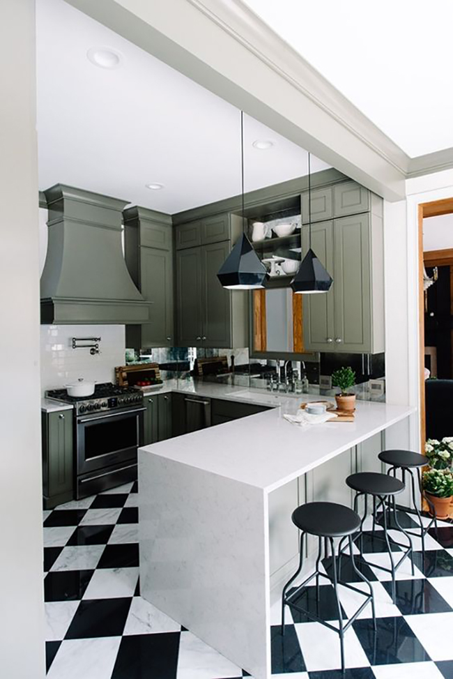
I have always loved olive green and that beautiful colour mixed with black and white make for such a striking composition. I love how she also incorporated a mirrored backsplash. I know in our home I’d never in a million years be able to keep that clean so I’m going to live vicariously through hers.
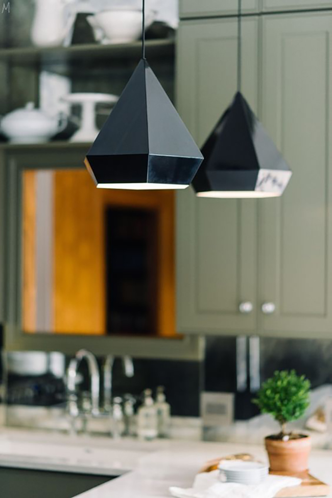
I also adore how she’s taken the more traditional features in her kitchen cabinets and played those against deliciously contemporary lighting and seating in black. And can we just take a moment to appreciate those tiles?
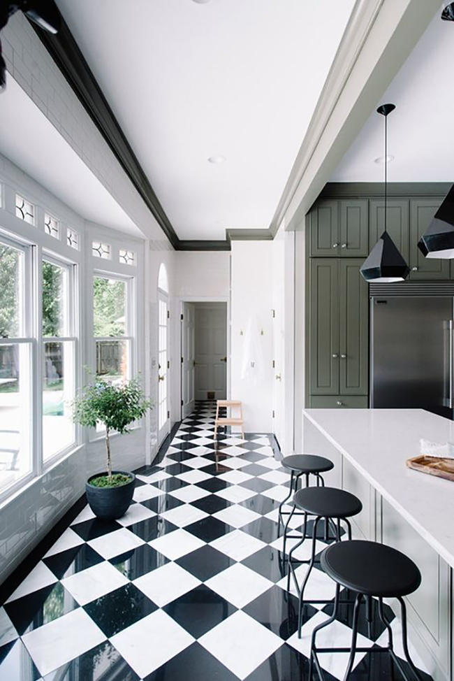
This image reminds me of the Greenbrier Hotel designed by Dorothy Draper. So so good. Do go and check out the full post on The Makerista to see all the before and afters to really appreciate just how much work has gone into this space.
Does seeing these images make you want to add a bit of green to your own kitchen? Are you as obsessed with green in your interiors as I am?











Looking at these, the thing I realise that makes them both work is the fantastic light. The first one in particularly is lit beautifully from above, and that makes the difference. I’ve always liked green, but not always got it right, and I wonder if the particular light in the north of England has anything to do with it..? It could of course just be bad paint choices by me!
I guess like every colour, you really have to pay attention to the undertones because they’ll change your colours depending upon the light! Here we get a very blue light and it makes such a difference to how paints change during the day ;) Definitely think there are shades of green that work but finding them might mean lots of testers ;) xx
I have been planning for a while to have green and black kitchen. (Not inspired by the chocolate – I promise ?.) I love those old weavers’ cottages in Spitalfields and want to have something like one of those crossed with a Dutch old Master painting vibe. Of course, I probably would just want to sit and admire it, rather than actually mess it up with my cooking! For now, I’ve just painted the existing units matt black, with glossy black tiles. Loads of ferns & ivy on the units, Persian- style rugs on the floor and a few old apple crates for shelving & (imho) it looks fab.
I love the idea of a green and black kitchen! And yours sounds fantastic :) xx
Lovely pics, so much to look at in each. They say that green is the most difficult to get right since humans are programmed to be sensitive to all shades of green. A valuable survival skill upsetting interior design ? I love that marble but i cant help thinking they will all be in a landfill in 20 years. I guess the stone doesnt mind much, but we are breaking up the ground, giving miners lung problems and destroying water. For what? The food wont be any better. Maybe a five year waiting period on counter tops could cool this frenzie, so we dont ad marble on top of the red granit that is already there…
I am not familiar with the design theory that ‘humans are programmed to be sensitive to all shades of green.’
Personally, I am not constantly aware of my surroundings when in a green room in my house. However, when walking in a heavily wooded (green) area I am constantly aware of my surroundings.
I don’t find that it is the color but the lack of visibility that makes me cautious.
We all percieve and react differently to color, but this is not an interior design theory, it has to due with the receptors in the eye, called cones, that catches the incoming light and turns it in to information for the brain to process. We have three cones, blue, green and red. The blue can see mostly blue, the green mostly green but guess what, the red can see both red and green! Also, the blue is the smallest one so of all the colors in the spectrum we can take in the least blue, and the most green. Then the brain takes these colors and start mixing them, back to somewhat the original color. So we see more off the actual green nuances. Since more receptors are open to the green light we also percieve it to be brighter than other colors. Then, a green room is not nature, but that is the reason green appears to be a tricky color to get right. Then there is the whole scinec of how wavelenghts of color change by the type of bulb you are using, or the color of your sky, but lets leave that for now,
So interesting! Thanks for your comments Louise! xx
The design of these 2 kitchens are divine!
But IMO they are both impractical for people who actually use their kitchens.
Art in the kitchen – gorgeous! Above the cook top – ruined gorgeous.
Mirrors in the kitchen – inspired and so luxe.\ but you’d be cleaning it all the time.
I think the same of open shelving too though.
I think these beautiful kitchens are for people that don’t actually cook very much, or really like to clean (or have someone to do it for them.)
My biggest indulgence is hanging pots and pans and I am forever taking them down the less frequently used ones and washing them.
You’re probably right about the art – although if you stuck to thrift shop finds, perhaps a better idea then precious oil paintings you’ve been passed down from our family ;) Although Gwen has commented down below that she finds the mirrored backsplashes quite easy to keep clean! ;) As for open shelving, I have it and I find that if you keep things on the shelves that you use frequently then it’s not too bad. The things on the top shelves need cleaning more frequently but I like the look so much I’ll take the additional work lol xxx
OH MY GOODNESS THAT FIRST KITCHEN! (That’s me shouting at my computer.) I think I need to recreate that in my home. Like, seriously. I’m ready to drop everything and get started – I need that space in my life!!! I even have a portion of angled ceiling that I could totally recreate the wood on… :D :D :D
The first is absolutely gorgeous!!! When we bought our house the counters were grey, cabinets white, walls a chalky pale green and back splash green and tan tiles. You could say that was green gone bad! Now our kitchen is all white with some light grey and I love it.
Thanks for sharing! I swear, the mirrored backsplash is SO easy to deal with. First off it’s antiqued so you don’t see the water spots very easily. And it’s so much faster to spray and windex then if there was grout lines. The only place that really gets water spots is around the faucet but I just wipe it down every few days. It was a total splurge but one of my favorite parts!
I love these two kitchens. Gwen’ s reveal post was great. Humor me while I tell you my mirrored backsplash story. In 1994 I put in a white kitchen with mirrored backsplash. Gorgeous for the decade. Fast forward 15 years and its time for a change. I take out the mirrors and surprisingly they all popped off in one piece. My husband drags them to curb. They stay in one piece! I get to thinking there must be a way to repurpose them. Make him drag them back. I set out to antique them by carefully misting them with acid. I DO NOT RECOMMEND THIS. They came out ok ish. After days of frustration husband drags them back to curb. Again they do not break! Well no one was going to touch these massive slabs of glass so they sat a couple of more days. Just enough time for me to think “wait one second here, what if I strip all the mirroring off and back paint the glass”! Bingo. Husband drags said massive slabs of glass back to backyard. Still not broken btw! They are still in my kitchen today looking fabulous. But you have to know of all my different backslashes I’ve had, the mirrored one’s were my favorite. And so easy to keep clean just like Gwen stated. So looking forward to Kimberly revealing her kitchen. When the time is here of course.
Green, in a deep forest like colour is such a tricky one to pull off but Gwen has done this well. Great post Kimberly so glad i came across this. THANK YOU
Steven
Rocky & Mojo™
Green, in a deep forest like colour is such a tricky one to pull off but Gwen has done this well. Great post Kimberly so glad i came across this. THANK YOU
Steven
Rocky & Mojo
I almost hyperventilated when I first saw deVOL’s kitchen on their Instagram, sooooo gorgeous! I’ve never seen a kitchen quite like it before! That green is just incredible, and the marble to die for! The wood and brass touches are perfect and the vintage oil paintings add so much character. Totally timeless.
Gwen’s kitchen is lovely too, an unusual colour for a kitchen but it works beautifully with the contemporary black and white.