I can hear you already: “Your next project?! You’re not even done with the kitchen yet! What the hell, Kimberly?!”
Here’s the thing you should probably know about me if you don’t already: I am always in plan mode. Even if we are in the midst of a project, in my head, I’m 8 steps ahead and already thinking about the next one. While we were working on dining room over the Spring, my mind was on the kitchen remodel. In the planning stages of the kitchen, we started work on the back deck and pergola. And now that the kitchen is underway, my mind has shifted to what will follow. As you’ve probably guessed by the title of this post, it’s “the man cave”, aka the cellar.
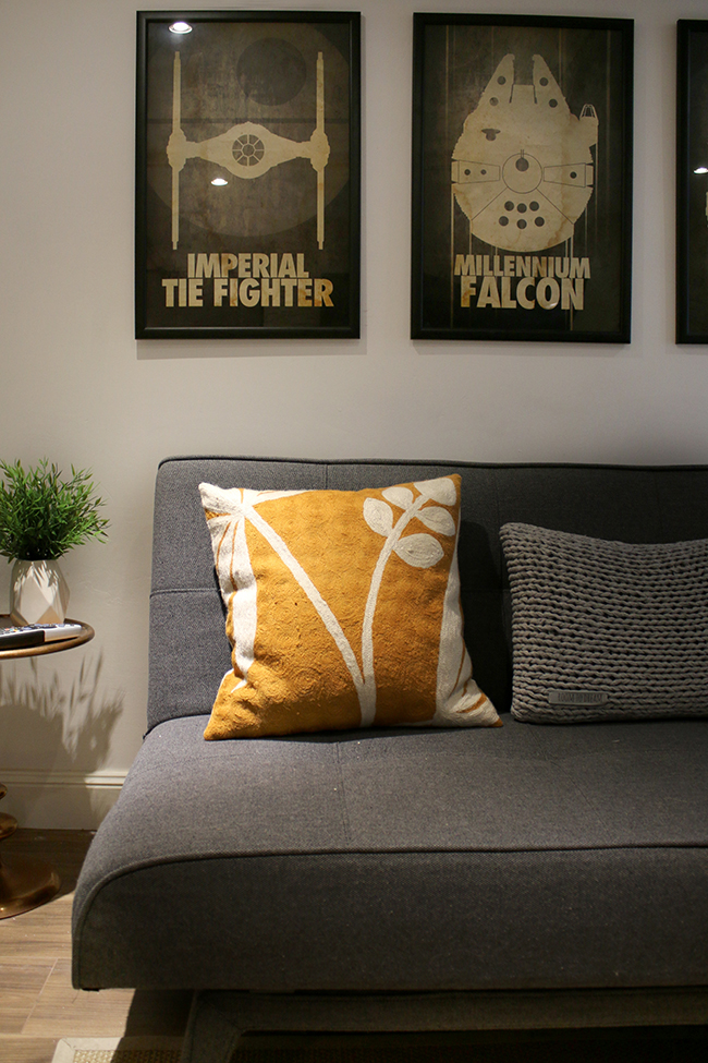
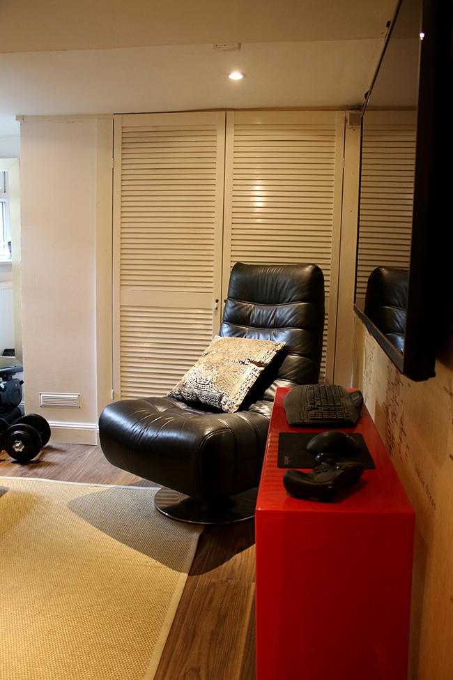
I don’t really talk much about our cellar. It’s always sort of been ‘Wayne’s domain’ and so he tinkers around down there, changing things and adding things and then I stress how big our next project is and he stops tinkering down there, leaves stuff a bit unfinished and gets on with whatever is happening in the main part of the house. To be fair, it’s always been a little neglected and never properly finished.
The last I talked about it, I’d gone away to visit friends in Dublin and he took the opportunity to rip down the dividing wall along the stairs to open up the space. Which, okay, that’s fine (it’s his space, right?*) but then he just left it like that. Hmm.
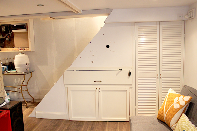
*Okay truth be told, I was all WTF?! ARE YOU INSANE? to start with and then I realised what was done was done and yeah, it did bring a bit more of an open feel into the room so eventually, I came around to his side of thinking. Aside from the fact it still pretty much looks like that.
To be fair, I’ve kept him pretty busy in the meantime so it’s been ignored while we got on with higher-priority projects. Once the kitchen is complete, however, I’m bumping up this tiny room to the top of the priority list.
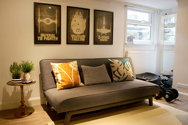
Now, when we first remodelled the cellar, going on nearly 4 years ago, I basically let him decorate it however he wanted to (MISTAKE #1). He didn’t really want too much input from me although I did encourage him to get a stylish futon so that we could use it as an extra bed for guests and he did pick out a set of three very cool limited edition Star Wars inspired prints. Since then he’s added a couple of extra prints but otherwise, the ‘design’ (I use that word very loosely) hasn’t changed much. I mean, even the cushions haven’t changed. I’ll admit, I don’t really spend much time down there because, well, it’s kind of ugly. (Sorry babe, I still love you.)
What it lacks in design, however, he’s made up for in terms of usability of the space. He added a radiator down there last year (under the window above) which significantly changed the feeling of the room in the sense that the humidity levels are controlled, it’s warm and comfortable and feels much like the rest of the house. It doesn’t feel cold or damp like a cellar at all. There’s a great big television down there which is perfect for watching films with big cinema sound. We’ve got a smaller room off this one which houses all our tools and things but he added a door last year to keep all of that out of site. The guy is good at DIY, don’t get me wrong here. He’s just not that good at design.
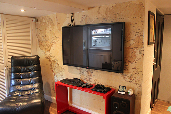
But here’s the best news. He’s basically said he wants me to design the space. He’s pretty much giving me free reign (within reason) and he’s agreed on a few things that surprised me. After all these years, it seems he finally trusts my vision which is basically a huge compliment.
In my head, it was like all…

(Side note: What do you mean you haven’t watched Community?! First season starts slow but stick with it – it finds its feet quite quickly and it’s the weirdest, funniest show. Ken Jeong is hilarious. It’s on Netflix, get cracking.)
So, over the last couple of weeks, I’ve been putting together a design plan for the space. It’s not 100% there yet but I’ll be sharing it all with you soon. I wanted the space to be a bit more masculine, to make it feel cosy and like a snug little space (because that is in fact what it is – a little hideaway area in the house that you wouldn’t necessarily even know was there).
He painted the walls white because he thought it would make the room look lighter (MISTAKE #2) – which, of course, it never did. It just ended up looking a bit grungy and bland. So as a first step, we talked about what we wanted the room to *feel* like and I directed him here:
Remember my flowchart on whether or not to paint a room dark? This is how I convinced him the space needed to go dark.
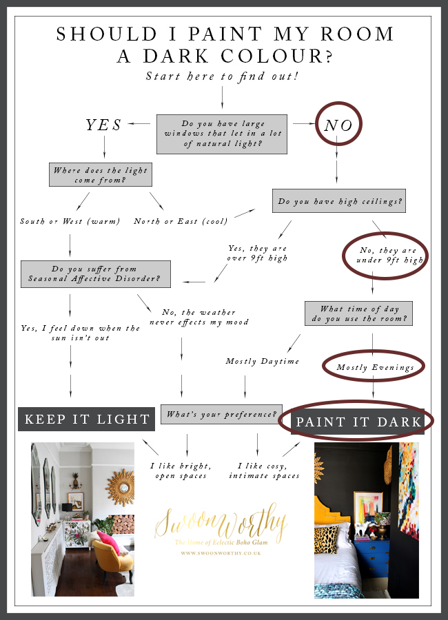
Yeah, this is a small room that’s got low light levels, low ceilings, used mostly in the evenings. We wanted the space to feel intimate and cosy and comfortable for watching films. So going dark was going to be the best way to get that intimate feeling in here.
And this is the colour that I’ve got my eye on…
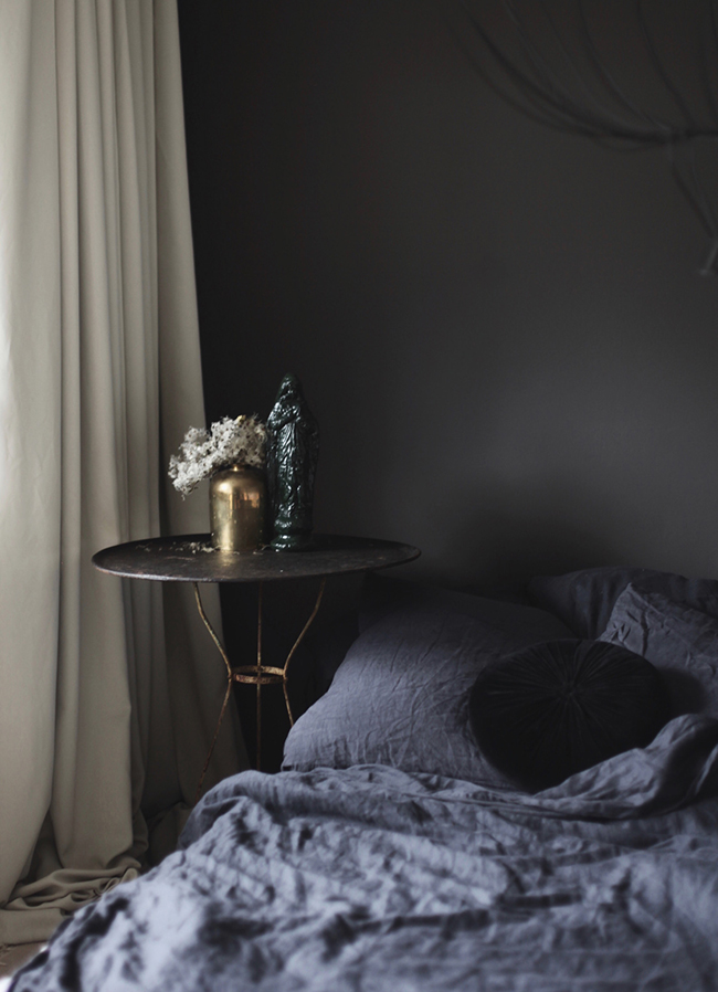
Anastasia Benko’s bedroom in Farrow & Ball Tanner’s Brown
It’s Tanner’s Brown from Farrow and Ball and it’s a delicious shade of brown with very strong red undertones.
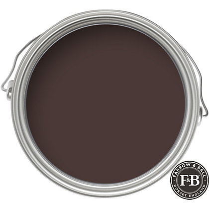
BROWN. I KNOW. What has happened to me? But this isn’t any old brown as you can see. It has richly hued undertones that change from red to purple to black depending upon the light. I still need to test it out on the walls but I’m desperately hoping it works. I’ll also be testing Brinjal (more burgundy) and possibly Pelt (more eggplant/aubergine) as well as Salon Drab (more grey/brown) as alternatives. You have no idea how relieved I was when Wayne said he really liked it. Whew.
Here’s another shot of that colour:
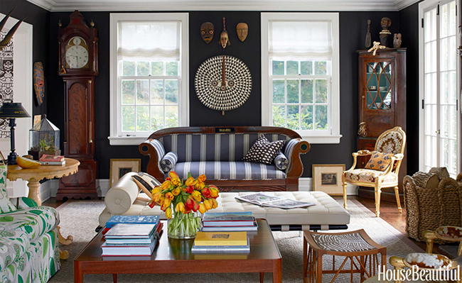
Phillip Goravan via House Beautiful
Gahhh I just love it!! *fans self* Oh and when I say it’s ALL going dark, I mean it – ceilings included.
Okay, moving on. The map mural is going as well, despite Wayne’s initial protestations. (He hates hanging wallpaper but thankfully, I quite enjoy it so he agreed once I said I would do the work! Ha!). The design was way larger than what we first thought and you can’t really see much of the map at all (MISTAKE #3) considering the whole of Europe is covered by the TV and well, it’s a rather insipid shade of beige which won’t really work with what I had in mind.
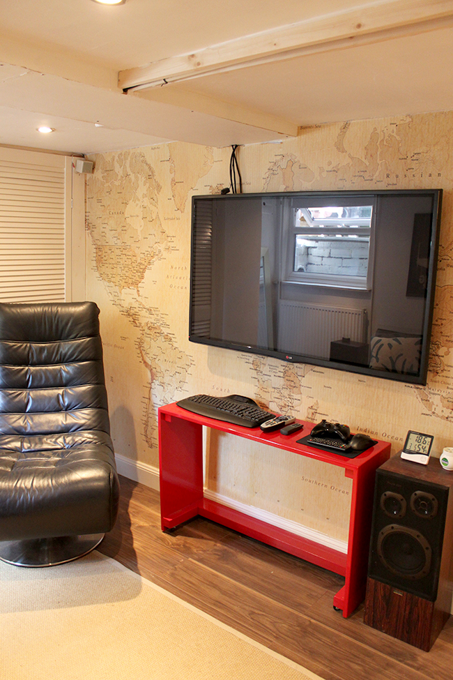
I decided to start looking for a wallpaper that had a bit of movement without being overwhelming. It needed to have a good mix of warm and cool colours along with a bit of grey to pull in the sofa and the existing artwork. At the moment, I have my eye on 17 Pattern’s Cloudbursting in Peach (you can see some of my other favourites from them in my recent post). It’s so dark and broody, exactly the kind of thing I want down here.

Aside from the colour theme, I also thought about how to make the room feel a bit more intimate and snug. I’m leaning towards a few boho/woven style items which should soften the scheme and bring in a lot of texture for a decidedly cosy narrative. Wayne also wanted some areas for display for his collections (currently in boxes all over the place) so we decided we’ll need a small cabinet to go under the TV as well as a shelving unit.
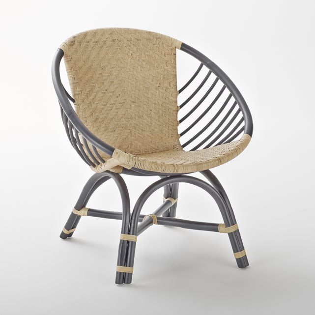
The chair I’m considering for the space.
The current black leather chair has been listed on eBay (£50 buy it now if anyone local is interested) because it takes up too much space and I wanted to find one with a smaller footprint. The one above could fit in perfectly. The copper side table will also be going (It’s lovely but doesn’t really work with the new design so I’ll probably list that on eBay too) and some of the other bits and pieces down there. We already chucked out the rug because it was so knackered.
There is still a lot to finish off before we get started on the fun part (the decorating!) – bits and pieces that just never got done or finished off, the stairwell wall repaired, the doors replaced, wires and pipes to be hidden, plastering, etc etc. So once the kitchen is done, we’ll be looking to start this project in the Autumn.
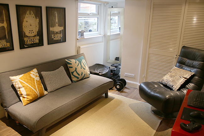
I’ll be revealing the whole design plan with you soon but I wanted to share how I go about starting off the process. I consider how I want the room to feel once it’s finished, then I consider the lighting and size of the room and then I consider the requirements – what will happen in the space? How will it be used? What kind of storage requirements are needed? I do this for every room I design. The end result could look great but if it doesn’t meet your needs, what is the point, right??
I know the kitchen is still in progress but I just couldn’t wait to share a bit about this upcoming project with you. I’m kind of excited to be working on a design that’s going to be decidedly more masculine than my normal style but I’m always up for a challenge and hopefully, we’ll end up with a space that we both enjoy.
So are you as excited as I am about our next project? Are you also a plan-way-way-ahead type person? Ever let your other half design a room? ;) Go on, the comment box awaits.










Uh! Come over to the dark side – I really, REALLY LOVE our darker bedroom…Thank you for sharing a picture of it <3 Now that we have lived with it almost all year, I know its the perfect color for winters and summers and I can't wait tot see what you will come up with! I bet, iit will be brilliant – as ALWAYS! <3
A. XO
Oh I love love your bedroom (in fact I was going to tell you it was part of my inspiration for the post but you beat me to it! Ha!) – it’s the most GLORIOUS colour! Can’t wait to use it in my home! Big kisses lovely lady xxx
LOL, that video of Community is bloody hilarious, just made me splutter on my tea!! And nothing could depict an interior obsessive’s excitement at being let lose on a room better!!!! *off to explore netflix and find completely camp programme that Kimberly recommends*
Has Wayne seen the Community GIF? Do you STILL have free reign? :D
I am so excited about this project. The Man Cave is not superugly now, but it’s a bit meh, and I LOVE ME A GOOD MAKEOVER!
You have to admit, while your kitchen is going to look amazeballs (do you have any idea how long I waited to find somewhere to actually use that word?), and your dining room is great, they both were great to begin with! So this is more like the proper transformation the internet has lead me to expect and crave. :D
I’m definitely a two-rooms-ahead type person. The garden isn’t finished, the bedroom is next on the list, but I’m also scouting for wallpaper for the kitchen…. I’ve had to learn to keep most of it in my head (or on the blog, which he doesn’t read), or I get the eye roll and the deep sigh. Well done Wayne for giving you free reign. xx
I always love your designs, and the bold way you go dark – and the reasons you do. Perfection!! I also am in the middle of a project and planning the next. Can’t wait to see more since this is also “next up” – the Misters Cave!
Love the colour Kimberly, you can’t beat a nice rich colour.
At the minute we are finishing off the kitchen, and the small hallway at the back door. I’m busy picking things up for our bedroom, as it is having a big refresh. Now our Kerri has moved out, our Sam wants her room,{then that will need doing} so I’m finding things for that, how many is that I’ve lost count lol. I don’t even want to thing about the outside, xxx.
I’m super excited for this! I love seeing small living spaces like this done up to the nines, and I’m also interested in seeing how you incorporate Wayne’s collections, since I have a lot of geeky toys and posters myself, and I’m always looking for good ways to display them without making the room look like a boy’s bedroom.
I think the idea of going dark is perfect – but I have to wonder whether that wallpaper won’t be too busy/distracting on the wall behind the TV. It might be better to go for something similar but with less contrast.
Cannot wait to see how you design this, using what you have and adding what you need. Wayne is a smart man to trust your instincts! On a side note, the one this I always need help with are the spaces few people “design” and that is the hallways and stairways that connect our house. Maybe one day you will do that :)
Ooh so excited to see this turn into a delicious dark sexy space! Still think your dark vs light flowchart is genius and amazing! xx
I love your little color deciding chart, or what ever you might call it. It’s genius. I have to finish working on our basement too. Maybe you doing your is going to give me a push ;) And I agree about Ken Jeong, he is awesome. It’s also funny that he quit being a doctor to be a comedian. I saw him in an interview at the beginning of the year and liked him even more than before.