I can’t even begin to tell you how excited I am to share our kitchen reveal with you today. We have essentially been working on our kitchen on and off for 6 years and until, well, about a week or so ago, it’s never truly been finished. The reasons for this are as long as they are boring so I won’t go into the all the whys but let’s just say, as always, it came down to time, money, indecision and simply prioritising other things.
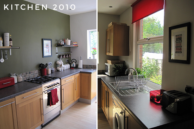
As much as I want to get into the full reveal, I want to share what our kitchen looked like when we first moved in over 6 years ago which I’d guess many of you have never seen. My second ever post shared what I’d done with the kitchen the first week we lived here – namely, a fresh coat of paint and a few new accessories. So this is the true BEFORE of our kitchen and even then I had dreams of a much prettier, new kitchen. I had no idea it would take us 6 years to get there.
We did do quite a lot of work in here about 4 or 5 years ago – we removed the false ceiling, replaced the floors with natural slate and underfloor heating, installed the open shelving units and tiled. Over the following years since then, I’ve done bits and pieces to update the space – I’ve changed the wallpaper behind the shelves twice, we got new appliances, I DIY’d new lighting. So for this ‘kitchen upgrade’, this is essentially what we started with.
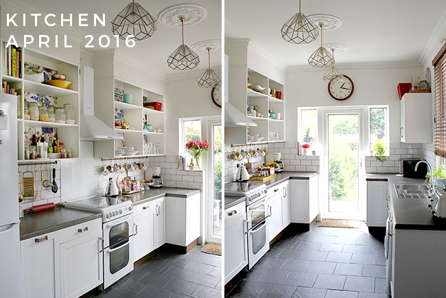
While I recognise that in pictures, it didn’t look too bad, there was a host of issues that I wasn’t happy about (click that link for more details). The old laminate worktops and sink/faucet had never been replaced and we’d made a few ‘newbie’ mistakes when we’d installed the tiles and decided that fully re-tiling was probably our best option. Once we completed the dining room remodel earlier this year, it was time to finally finish this space once and for all.
As the remodel got started, I realised it was a good opportunity to finally turn it into my ‘dream kitchen’ – well, within reason. There was plenty that I liked about our existing kitchen so it was never going to be a full remodel, more of an upgrade and we saved quite a bit of money by working with what we had in terms of the cabinets and layout and DIYing nearly all of it.
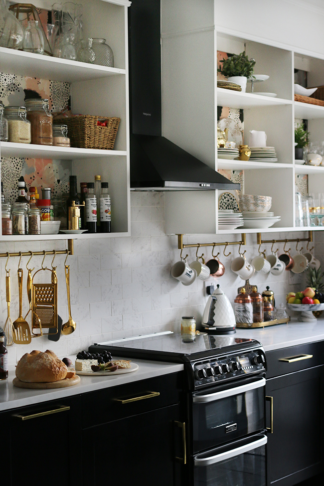
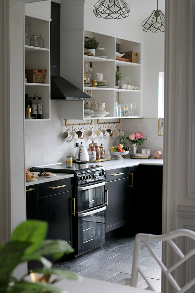
So *drumroll please*…. here she is… my new sexy black, white and gold eclectic boho glam kitchen.
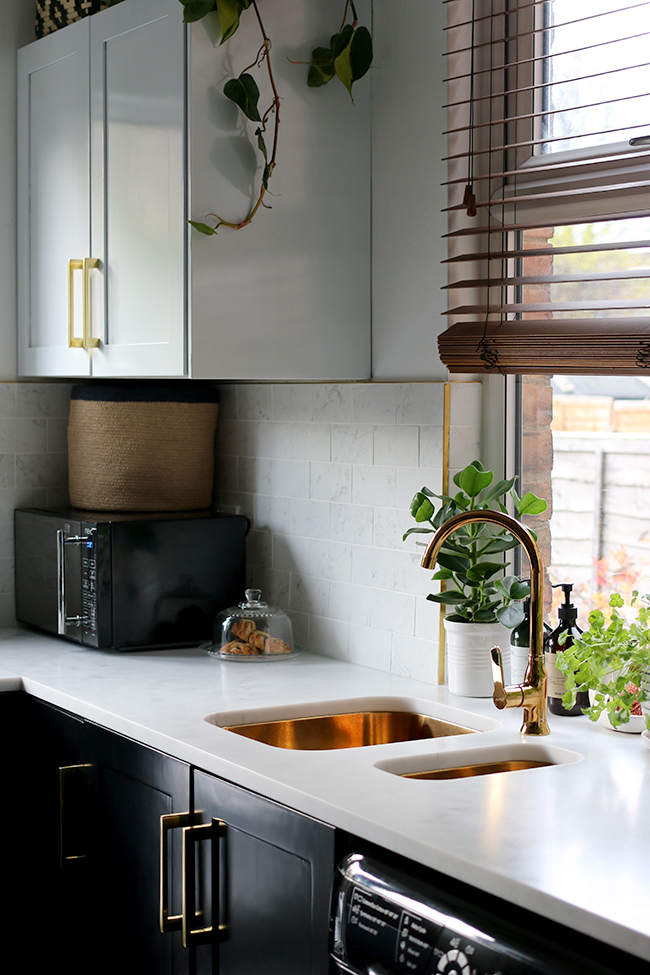
First things first, I need to acknowledge the amazing sponsors I had, without whom this whole project would have taken months longer. The tiles (and tiling) were courtesy of Tile Mountain, the cooker and washing machine were from AO.com, the white flatback bin was from the lovely folks at Brabantia, the black & white bamboo baskets and leopard vase are from MiaFleur, some of the artwork is from Desenio and the wallpaper was provided at a discount from 17 Patterns. These are all companies I really like and would recommend without hesitation. Most of these, in fact, I approached personally to help me out on this project and I couldn’t be more grateful for their support.
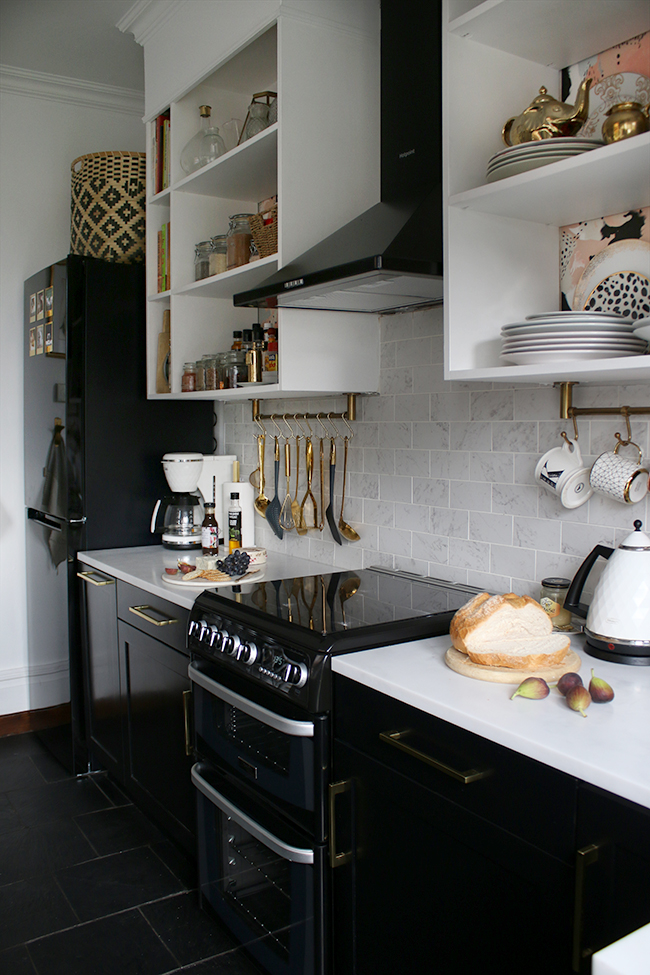
As you can see, we decided once the cabinets were painted, that the existing white appliances just looked a bit off in the space. Thankfully, Wayne’s mum is moving into a new flat soon and she was going to need appliances so they’ll be getting a new home. The black cooker hood and fridge freezer were the last additions we made but they nicely balanced out all the black and white in the space. (Oh and just a little note for my American brethren, yes, there’s a washing machine in here – it’s pretty common in the UK for your washing machine to be in the kitchen! ;))
The new tiles have, of course, been paramount in transforming the space. I adore the marble effect look and I chose to finish everything off with a gorgeous brass trim. The fact that the tiles are porcelain, however, mean they are so hard-wearing and clean really easily. You can read all about installing them here.
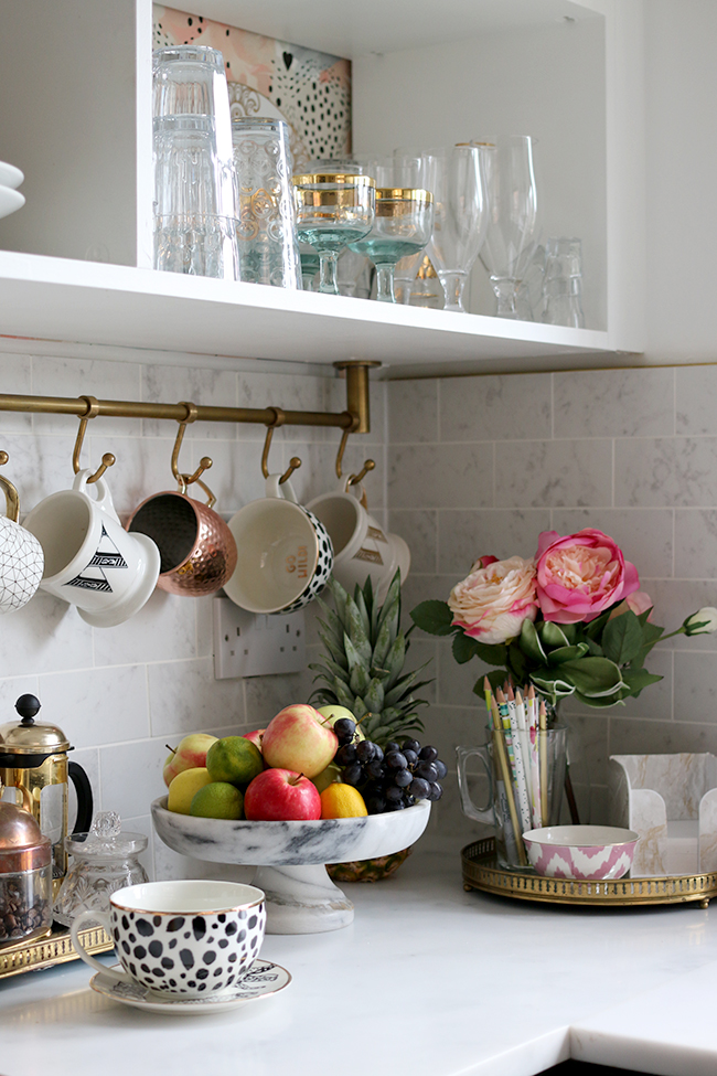
Of course, our biggest triumph was the installation of the Minerva acrylic worktops. You can read all about how we did that here. I couldn’t be happier with this choice. They have a beautiful feel to them and are super easy to keep clean.
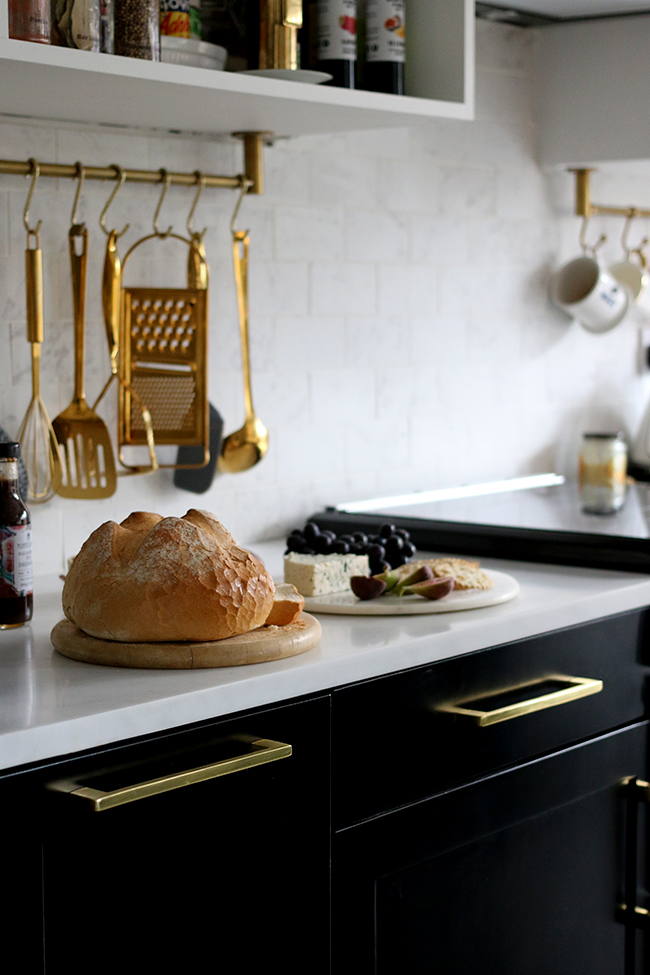
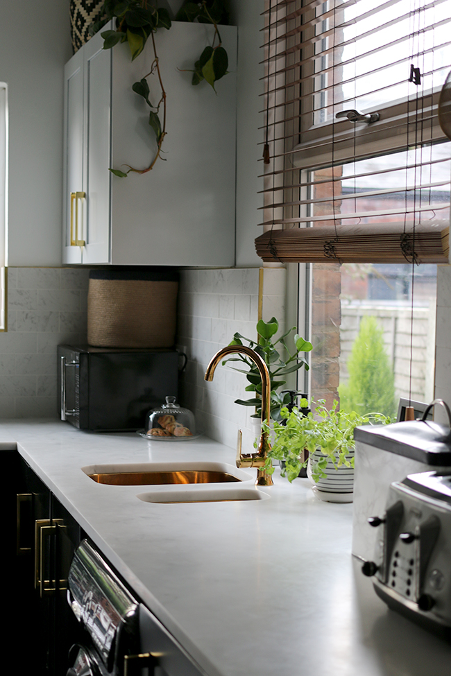
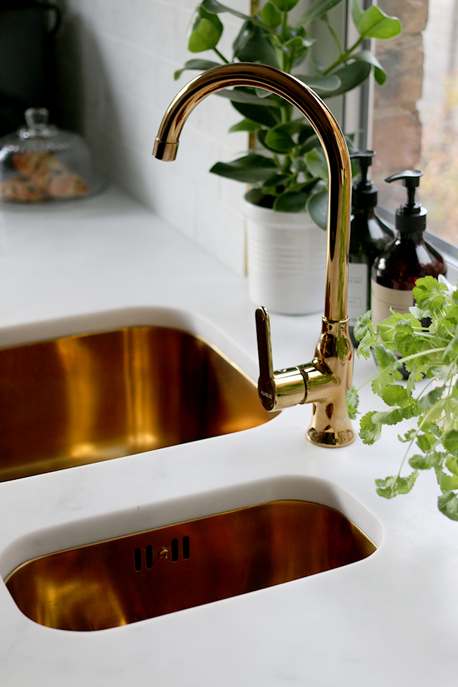
Of course, I’m still totally in love with the gold sinks and taps from Olif. I noticed recently I rarely used to shoot this side of the kitchen simply because it was always so MEH. But now, I love the gold accents against the lovely marble effect worktop. It’s just made a huge difference to this side of the kitchen.
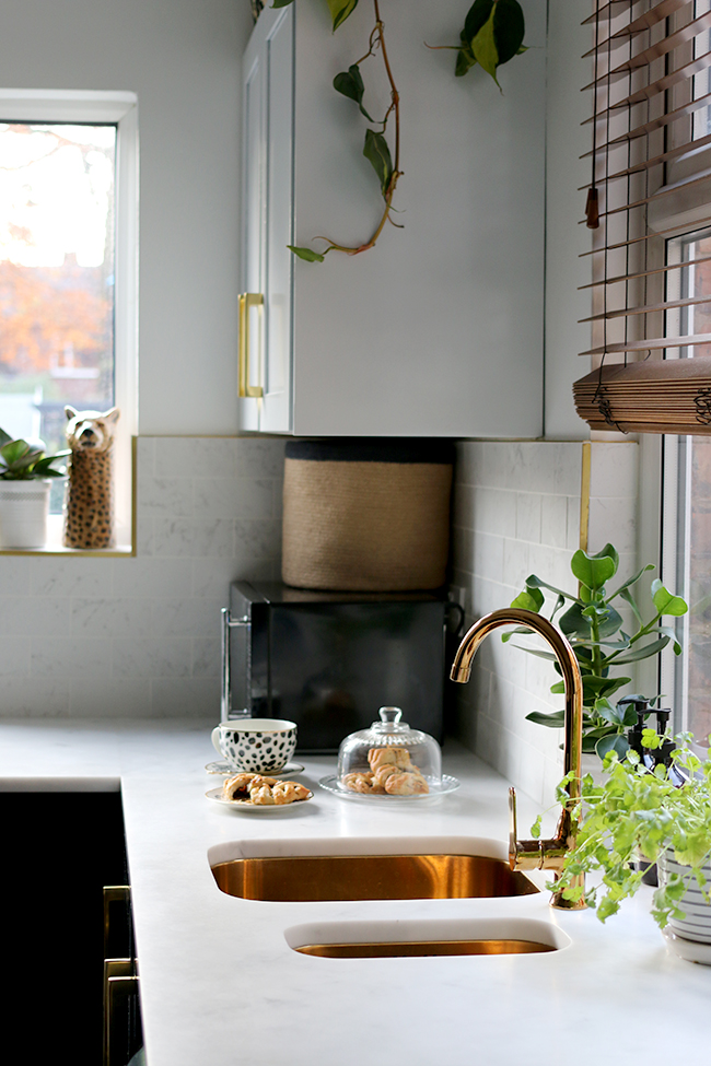
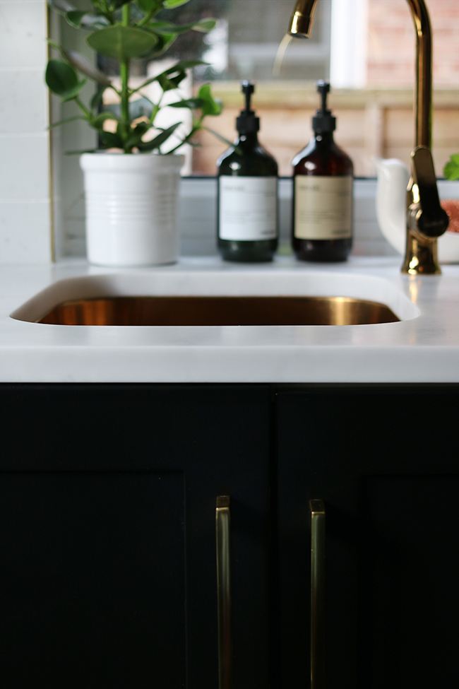
We also went through a heck of a lot of palaver to paint the kitchen cupboards black. You can read all about that here. It took longer than we’d expected but it was totally worth the effort for the final silky finish!
We also gave the whole kitchen a fresh coat of white paint which was desperately needed and I decided to take the opportunity to replace the wallpaper behind the shelving units. I fell in love with Love Leopard almost immediately from 17 Patterns a few months ago and decided pretty much there and then I had to use it somewhere.
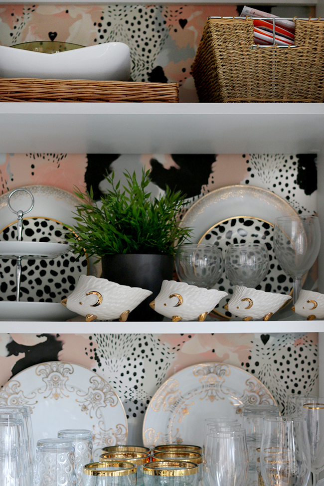
Thankfully, the old paper came right off (yay!) and the installation was quick and easy. It’s a paste the wall type paper which I totally prefer in terms of ease of application and I had the whole thing done within a few hours. It’s beautiful quality and I adore the spotty pattern.
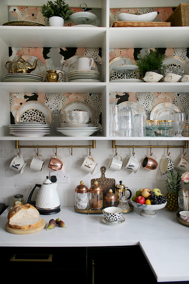
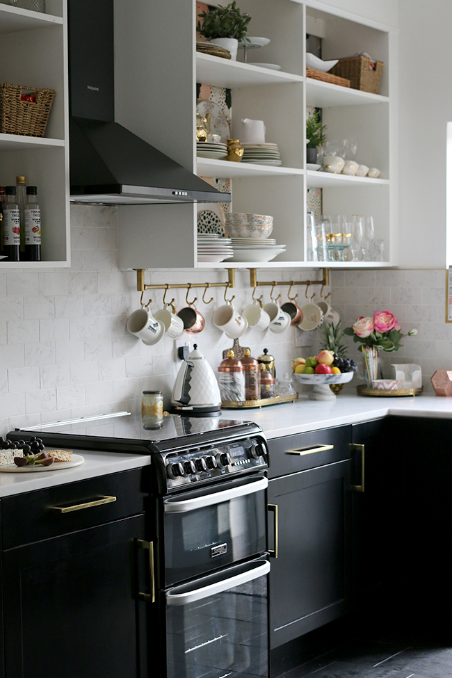
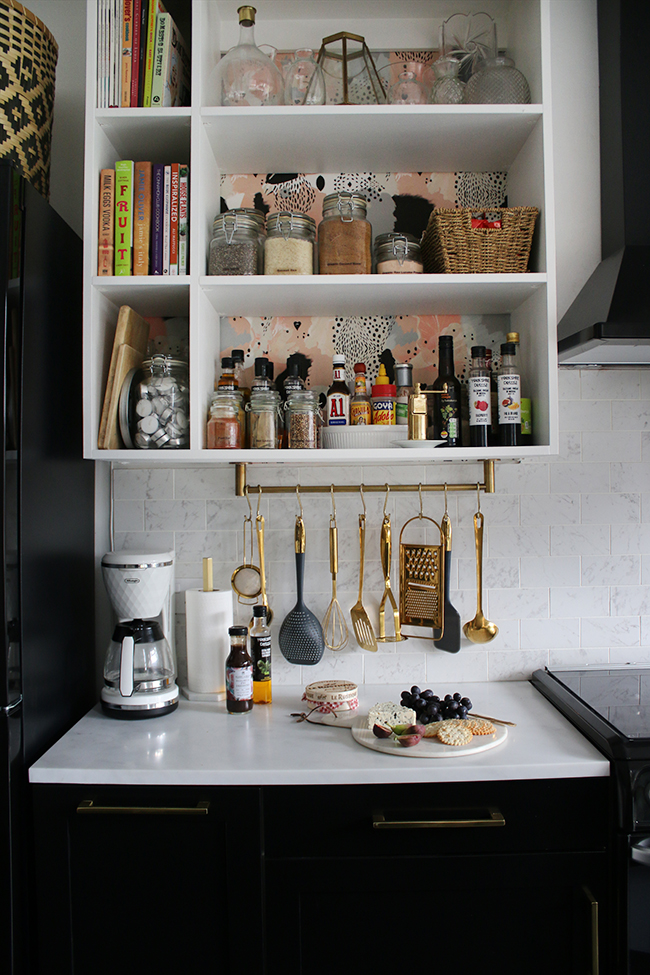
As for some of the accessories, I chatted about a few of the bits and pieces I added in this post and in this one. I’ll be doing a full source list soon so if you spy something else you like, hang tight – I’ll be sharing everything soon.
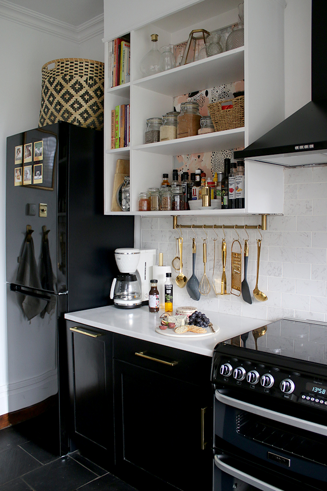
As much as I would have loved to figure out a way to hide the microwave, we just didn’t have the room to put it anywhere else. It does fit rather well into this little corner, however, so yeah, it is what it is! The basket on top holds all of Quito’s things like his lead, poop bags, his towel, some toys etc. It makes it much easier to grab for his walks! And how cute is that leopard vase from MiaFleur?
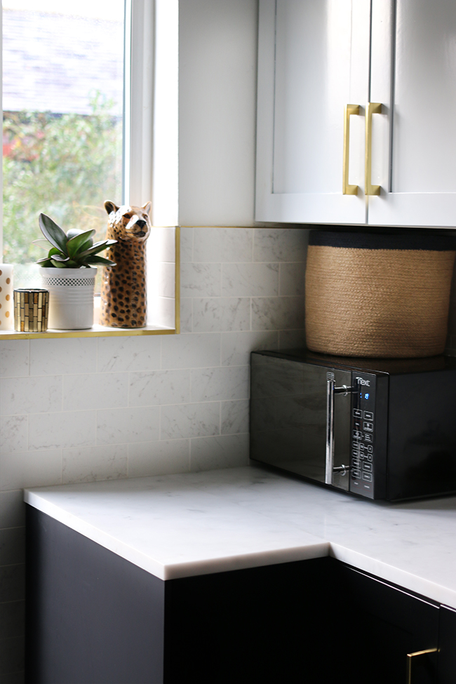
Speaking of corners, I couldn’t be happier with that brass detail outlining the tiles on both sides of the doorway. Tiling to the floor around the doorway also means the corners can withstand the frequent abuse of a dog and two cats constantly coming in and out in wet weather!
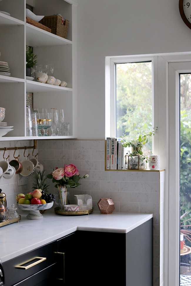
Here are a few more shots just to be gratuitous.
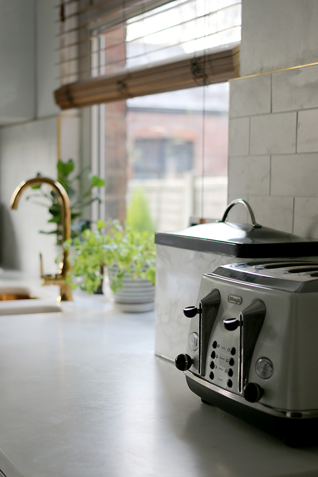
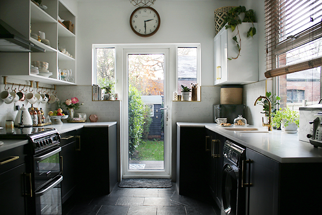
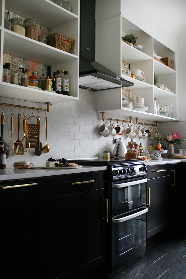
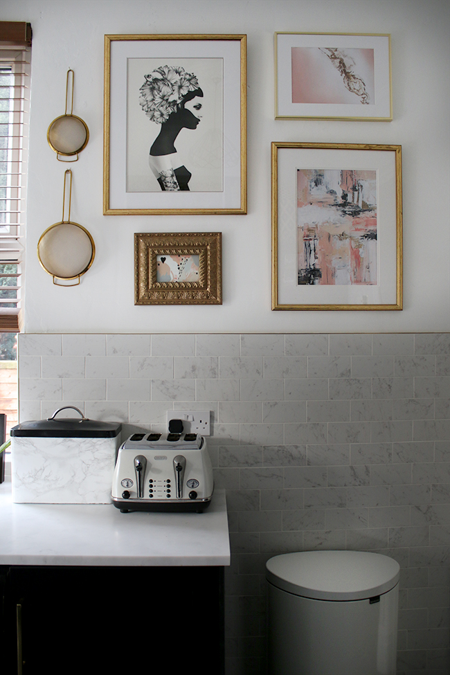
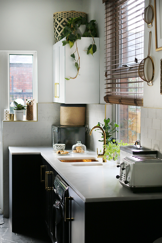
So, after a good few months of toiling away on this space, the kitchen is finally complete! I genuinely love the space and it’s as hard-wearing as it is pretty.
Thanks again to my fabulous sponsors for giving us the opportunity to make this remodel possible and thanks to you for your patience as we completed all the work! I hope it was worth the wait!
**UPDATE!** As I get so many questions on the worktops: Click here to see the worktops installed / Click here for how we finished the joins / Click here for how our worktops are holding up one year on
Disclaimer: Some of the items used in our kitchen remodel were provided free or at a discount for my review but as always, all images, words and opinions are my own. I only work with companies I really like and think you’ll like too! Thanks for supporting the brands that support Swoon Worthy!










The brass trim looks really effective. I love the work tops and gold sinks! Also, how you’ve divided the bottom from the top with the dark lower cabinets, it takes the emphasis of the length / height and seems to make your space squarer, wider. The black cabinets look great. Bet it all blends in with the dining area and living really well.
I LOVE IT!!!
You guys have done such an amazing job on this. So many great details here. You have nailed this kitchen.
And can I just say, only YOU could have found a leopard print chopping board. Amazing!!
Can you just sit down now and relax please? No more projects for at least a month!
xx
Your new kitchen is stunning! Sophie x
sophiehmstewart.com
The kitchen looks so beautiful now it’s finished, I really like how you’ve mixed everything so well
Mel ★ meleaglestone.co.uk
Absolutely Stunning!! SO Swoonworthy indeed!!!!
Absolutely gorgeous as always! I love the darker cabinets, they work so well in the room and somehow frame the lovely garden view so much better. And you know I am in love with the worktops and that gold sink and tap. If I didn’t know how lovely the rest of your house was I’d imagine you’d be spending all day in here!
Also, pls can I come round for cheese and biccies? That looks yummy! :-) xx
Fabulous job. Your kitchen looks amazing. I love all the details you put in. Worth the wait.
xx
Looks absolutely stunning just as I knew it would! So happy for you and to have it finished in time for Christmas entertaining – fantastic! Enjoy it lovely xxx
It is soooo beautiful – a nice combination of light and airyness thanks to the white walls and open shelving whilst also packing a punch with the dark cabinets and appliances. You must be so proud!
I love the contrast of the light worktops with the black cabinets
It is absolutely gorgeous! I love that gold elephant tea pot. It was worth the wait. Enjoy!
Oh this is bloody lovely! And so you! What will you do now?? Ha, you deserve to put your feet up and bask in the glory of your kitchen xx
I love absolutely everything about this kitchen-just gorgeous!!
It’s so so beautiful! I’m totally in love with how it turned out.
Kimberly – this is amazing!! It looks so sleek and stylish. I love how the wallpaper so beautifully goes with your gorgeous crockery sitting on the shelves. And those two copper mugs hanging underneath pick up the blush colours in the wallpaper perfectly. It looks so great!
The chic black is great too – definitely worth changing the appliances to match those gorgeous silky black lower cupboards. The marble effect tiles and worktop is beautiful, and well, we’ve all ooohed and aahhhed over that gold sink!!
All finished off with your gorgeous styling – all those little touches. It looks fabulous!
Oh, and the microwave doesn’t look out of place at all – because it’s black it ties in with everything – it certainly didn’t jar with me or anything.
All in all – perfection!! Good work Kimbo! xx
So individual! Love it. xx
Wow Kimberly, I love it ALL! It’s pretty and edgy at the same time and has so much personality, quite unlike any other kitchen I’ve seen! Bravo, really beautifully done!!
Wowza!! Love it & so worth all your hard work.
So beautiful! You did a wonderful job and it is so functionally glam I just can’t stand it.
On another topic…next time you do a vlog, I would love to get a “walkthru” of your house to see the flow. Just a quirk of mine, it that the flow of a house helps me visualize how the rooms meet and run together. Just a suggestion!
Looks AMAZZZZZZING! Love all of it. And that wallpaper is divine. x
MY EYES.
IT’S SO BEAUTIFUL! Really well done hun – looks so glamorous and liveable too! Can’t get enough of that wallpaper either. I’ve been on the lookout for a feature wallpaper for Luna’s new bedroom. I think we might have a winner <3
I think I need that sink you’ve got! Heck, can you wrap it all up and send your kitchen my way? Pretty please ;)
It looks AMAZING!! Well done to all of your hard work and design ideas, they have come together perfectly.
It is so beautiful!!! I love all of the details. It’s so elegant and glamorous, yet homely and useable at the same time! The sink is utterly gorgeous. I think I really need to get my hands on one for my kitchen. The details are lovely. You must be very happy with it, it’s stunning!
Gorgeous kitchen – I just love black and gold!!
May I please ask where you bought the black and white girl/head with flowers print from hanging in the kitchen?? Thank you ?
I’ve loved watching your step by step makeover – you have such style and you’re so lucky to have Wayne who knows how to do these DIY things! The kitchen looks amazing xx
Absolutely beautiful remodel. The lower black cupboards make perfect sense and it looks so elegant with that slate flooring. Those counter tops are stunning!
Absolutely beautiful – I could cook in there all day! Love how you have continued your look throughout the house…really personal and just lovely!
Fantastic. I love the gold sink, I’ve genuinely never seen one before! It looks brilliant. You’ll be on the hunt now for the next project!
Awwww Kimberly it’s plain and simply beautiful. I know we’ve been getting glimpses of it for a while now, but to see it in all it’s glory is truly amazing. I can’t honestly tell you which bit I love the best, because I love it all. One of the best things I like most is that yes there is new work surfaces, and tiles, but you’ve worked with so much that you already had. A lesson to those who think they have to rip everything out and start again. Nice one Kimberly and Wayne, a job really well done xxx
Oh wow, the black and gold looks stunning. The sink, oh my! Even washing up can be glam. It’s all gorgeous and very you, well done.
Absolutely love your kitchen makeover!! Xx
SO SO SOOOOOO good friend! It’s amazing!! You should be so very proud!
Wow, it is stunning!
You must love coming downstairs in the mornings.
Kitchen looks wonderful – where is your brass tile edging from?
A total triumph! So beautiful, and every single one of your decisions were spot on. Love it! Xx
Your kitchen looks stunning. Love the tiles, prints and gold elements. x
Just whaaaaaat?!! Kim you have been so busy! What an incredible job you’ve done (hello-sink!) I’m right at the very beginning with ours and no idea what to do, but I guess it’s best to just start and see where the journey takes us. Hopefully towards black cabinets! xx
Congratulations! Your kitchen is stunning!!!
OMG I just love your work. It’s just stunning and it’s so nice to find one of these blogs for UK people so I can relate. I was wondering though, the open shelving units in your kitchen. Did you make them or buy them ready made? I am looking to revamp my kitchen and I plan to go the open shelf way and I love the one on the left with a narrow opening and a wide one and I can’t seem to find one similar…pretty please!!
Hi Stefanie, Ahh thank you and nice for you to ‘find’ me! Ha! We purchased them from Jali – they allow you to custom create shelving systems which then come to you like ‘flat pack’ furniture. You can read about that here: http://www.swoonworthy.org/2011/07/progress-report-jali-shelving-and-my-startling-impatience.html/
We then added the ‘risers’ to the ceiling and added the cornicing:
http://www.swoonworthy.org/2011/08/progress-report-crown-molding-cornicing-and-open-shelving.html/
They are brilliant and would highly recommend them :) xx
Hey Kimberly!
I love your style! I want to ask where you got your copper metal coffee mug racks? I guess your kitchenware utensils are hanging on them too. Love them!
Hi Kyla, Aww thank you! They are actually brass and they are from Rowen & Wren :) https://www.rowenandwren.co.uk/products/hardware/bitra-hook-rail.html xxx
Hi I love your kitchen and was wondering where you got the brass hanging rod below the cabinets? anne
Hi Anne, they are from Rowen & Wren :) https://www.rowenandwren.co.uk/products/hardware/bitra-hook-rail.html xxx
Those tiles are beautiful with the gold trim. It makes a nice change from the same old chrome everywhere trend. Great work and a fantastic Kitchen.