As a blogger, I literally receive hundreds of press releases from agencies every single week. It’s just one of those things that most bloggers and journalists will understand. Everything from the appointment of a new PR representative to a new contemporary architectural masterpiece to a refurbished restaurant in Dubai somehow makes its way into my inbox and I will admit, 99% of them end up being deleted. I’m so incredibly picky about what ends up here on Swoon Worthy that it has to be exactly right for me to share with you. This, my friends, was one of those instances. The rare 1% that make the cut.
Now, my love of House of Hackney is no real secret. I’ve done a few posts featuring their wares over the years because they have such a unique look that’s somehow timeless and yet very on-trend. It’s my favourite kind of ‘English Eccentricity’ and they have an incredible more-is-more approach to their designs. So when I received an email saying they’d ventured into bathroom design, I had to take a look. Believe me, I wasn’t disappointed.
The thing I love about bathroom design is that because you don’t spend as much time in them, you can afford to go a bit more bold and crazy if you choose to. Big patterns turn even the smallest spaces into tiny jewel boxes and really flexing your design muscles in the space can actually be a lot of fun. I so wish we had more than one bathroom in our home because I’d love to design another but the bathrooms designed by House of Hackney and CP Hart’s in-house design team are incredibly inspiring.
They’ve designed two bathrooms for CP Hart’s flagship showroom in Waterloo, London so if you are in the area, it may be worth paying a visit. The theme they chose for the designs is ‘Adventures in the Urban Jungle’, exploring the changing nature of the modern, urban bathroom.
House of Hackney co-founder Frieda Gormley said with regard to the designs, “We started with creating mood boards, pulling together our ideas… gravitating towards a quartz pink scheme and a moody verdant ink scheme. From here, we incorporated key materials across metals and marbles which were luxurious new elements for us to work into the schemes, and from there the final designs were created.”
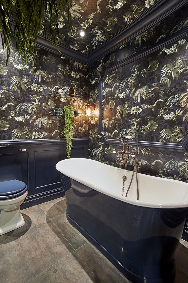
Granted, these designs may be a little bolder than what you may want to go for in your own home. However, if we look closer, there are nuggets of inspiration in each that you can incorporate into your own bathroom design. Let’s first look at the inky blue urban jungle with House of Hackney’s Limerence Wallpaper in Ink.
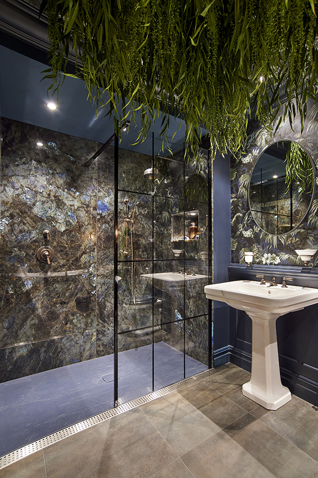
Yes, what you see there is a living ceiling. Freaking incredible, right? Well, considering the bathroom usually has higher humidity levels that your average room, plants thrive in bathroom conditions (just make sure there’s a bit of sunlight there as well). Consider hanging planters for your ceiling or even plants that hang out in your shower. Why not?
I also rather love the crittall style glass shower enclosure. If you don’t have the space for a massive walk in shower like this, then you can always adapt the styling with a black framed glass instead of a shower curtain. Pull your pattern into the wall coverings and textiles instead and use a contrasting material inside the shower itself.
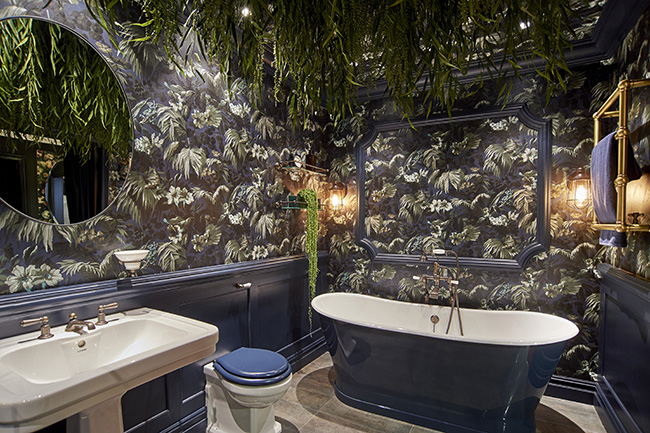
The only thing about this bathroom that jars with me ever so slightly is the coloured toilet seat. If it was an exact match for that deep inky blue, it may not bother me so much but it seems to stand out and who wants to make a toilet seat that noticeable? Hmm. Otherwise, top marks all around. Love the detailing of the painted wainscotting, panelling and the juxtaposition of the contemporary round mirror against the more traditional pedestal sink. And who wouldn’t love a freestanding tub? These are all ideas that can be incorporated into your own bathroom design.
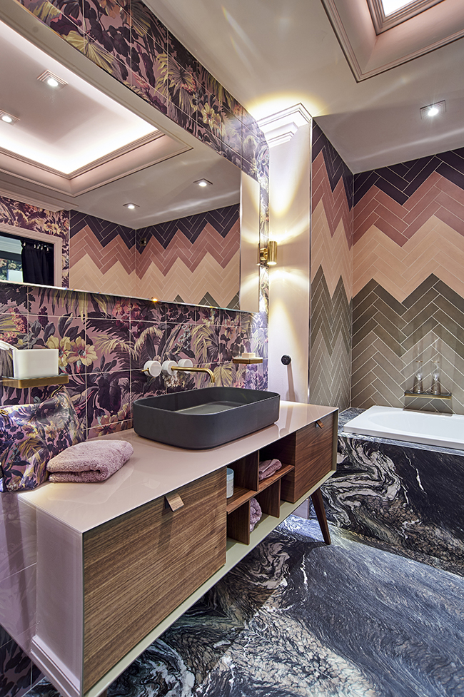
Okay, moving on to the pinky peach wonder with Limerence in the Quartz Pink colourway…
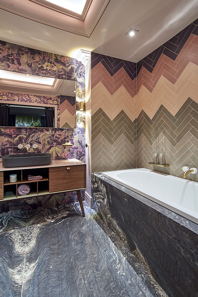
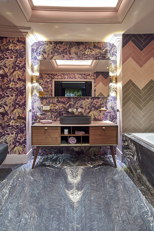
Now, I’m loving the retro-inspired herringbone colourblock tiles. That actually wouldn’t be difficult to incorporate into any bathroom design, really. The colours are very on trend as well in peachy pinks, olive and navy blue. Consider using marble or tiles from the floor up to the walls and around the bathtub to create what appears to be a larger floorspace as there is no interruption for the eye – it’s really a very clever effect.
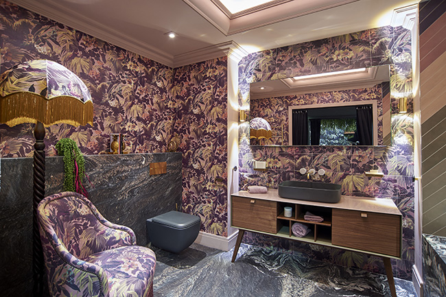
What about the use of a mid-century style cabinet in here? You could consider finding a vintage piece and reworking it for your bathroom sink and essentials. I love the splayed legs as well which will give you the illusion of a more open space.
And then of course, it’s the fully upholstered chair and fringed lamp, creating what ends up looking more like a sitting room than a bathroom. And really, isn’t this what’s happening with kitchen design as well? Utilitarian spaces are starting to blend with the rest of the home, becoming an extension of the living space. While I would imagine it may be a risky choice to put upholstered furniture in a bathroom, there’s no reason not to make your bathroom a bit cosier with a chair if you have the space, as long as you stick to fabrics and finishes that can withstand the humidity!
So I’d love to know what you might think of these quite out-there designs! Love them or hate them? I have a feeling they might be a little controversial but there’s nothing wrong with pushing the boat out to get people talking, right? What are your favourite elements? Anything you’d steal for your own bathroom design? Let me know in the comments!











Woah! Just woah!
So many gorgeous patterns and design inspo right there. Not sure that floor lamp is IP rated though ;) xx
Love love love! But making me want those all elusive brass fittings for my bathroom even more! Have you come across any new sources recently?!
They both have so much going on that you have to look at the picture’s a few time’s to take it all in. I agree about the blue toilet seat, it just doesn’t look right, and it’s a shame because the colour on the side of the bath and wainscoting is amazing.
We’ve only got a small bathroom, and it’s on my list for this year, sooooooo, I may now have so new and fresh idea’s xxx
Wow! Love them both! Can’t see them blending into my house style but still love them!!!
Love the hanging plants and glass wall, ….not so sure about the herring bone in the bathroom, too busy for me 😀…..but I do get the ‘swoon factor’ 👍
These bathrooms are mind-blowing!!
Hi there, I am Rebecca and work for CP Hart – I worked alongside House Hackney on these room sets. So pleased to see them being so well received, they were great fun to work on. I just wanted to let you know that the toilet seat is in fact the exact same RAL colour as the other midnight blue elements in the room, it is just unfortunately showing up a little lighter in the images here. It would be great if you were able to come and see the displays, we would love to show you around.
this is a great bohemian look for the bathroom. has a great 5 star hotel feel about it.
bohemian effects in bathrooms is a very creative idea….I love the crittall style glass shower.
Great !!! The bathroom tiles are so innovative and out of the world.
I especially liked the black framed glass instead of a shower curtain idea. Seems to work pretty well.
Thank you for sharing your ideas was of great help.