I think if anyone knows anything about the decorating trick I’m talking about today, it’s fashion bloggers. They seem to know exactly how to make a budget work to create a really high-end look without spending silly amounts of money on absolutely everything they are wearing. So you might see an H&M jacket matched with Dior sunglasses or a Prada bag with a Primark teeshirt. And while most of us won’t have the huge budgets to kit our homes out with the most exclusive ranges, there is a way to maximise your budget to get a really high-end look without resorting to completely blowing your budget.
The secret is in the splurge. I have always said that if you can swing it, try to invest in at least one really good quality piece and it’ll elevate everything else around it. A splurge doesn’t even have to be a high ticket item – it can also mean something that’s custom made or bespoke or investing in quality antique pieces (even if you found it at a bargain price).
Now, of course, budget is relative – I realise this. Where I may not think twice to spend £30 on a cushion, I know that £30 might be a huge outlay for someone else. For me, spending £1000 on one piece of furniture is a big investment that takes a lot of thought and consideration. Perhaps for you, your big investment pieces are more around the £3000 or £5000 mark. Or, they may be at the £200 mark. No one’s ‘splurge’ item will be the same so I really just want you to think of it as relative to your own personal circumstances. I don’t want you to think that when I say ‘investment piece’ I’m talking about a very specific price range, I’m just talking about the best which you personally can afford in your own home. Those items that are a bit more than the typical low-cost mass-produced items you can find everywhere.
So today, I wanted to share how I’ve used this ‘high end/low end’ concept in my own home in relation to my personal budget. Mixing and matching budget-friendly pieces with those that required a little higher outlay to create that mix – and the resulting synergy – which results in a more expensive look overall.
Mixing High and Low in The Bedroom
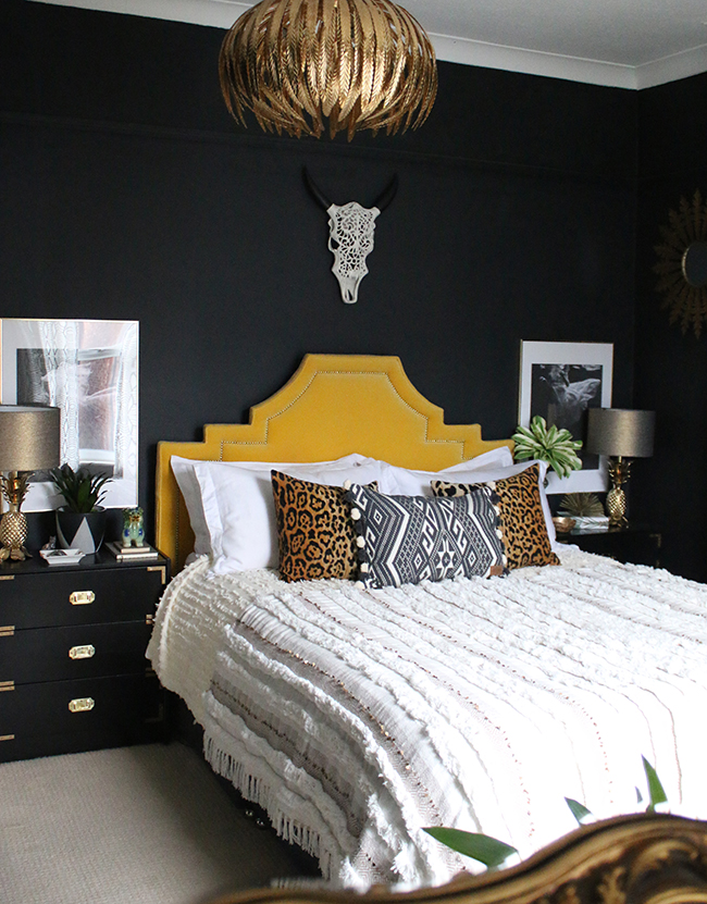
Let’s start in the bedroom. Here I’ve mixed a higher-end bespoke custom-made headboard that cost me around £450 5 years ago with fairly high-end lamp bases. The lamp bases were £250 for a pair. However, I’ve mixed these items with low-end Ikea drawers costing just £20 that I’d hacked (painting and adding my own campaign style hardware) along with topping those expensive bases with inexpensive lampshades (about £15 each) and an inexpensive Moroccan-blanket costing just £69 from M&S. (You can see more of my bedroom and where I purchased everything here.) Could I have spent another £200 on lampshades and £1500 on matching nightstands? Of course. But I don’t think the resulting mix would have really made that big of a difference overall.
For something as important as a bed, I think it’s worthwhile spending a bit more money to get the look you want. The headboard cost a bit more (and of course, if you are DIY-savvy, you may consider making one yourself, using a really beautiful high-end fabric to up the wow-factor but still save a bit of cash) but it really is the focal point in the room. It elevates everything else and nothing looks particularly cheap – even though some of it really was quite inexpensive in relation to it.
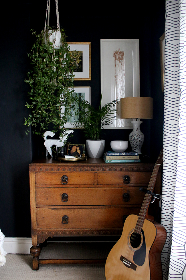
On the other side of the room, the chest of drawers was relatively low spend (about £100 on eBay) but it was a great quality vintage piece at a great price (and yes, it took me a while to find it). The artwork elevates this area as well. The large white one is a limited edition print from Rosie Emerson costing about £250 with custom framing. Not cheap at all but it elevates the other artwork alongside of it – an inexpensive mass-produced print from Desenio and a postcard I framed from a gallery exhibition I attended.
You might want to consider patiently searching for a beautiful vintage piece at a good price or consider choosing just one or two pieces of original or limited edition artwork alongside more inexpensive prints to elevate the whole wall of art. Find out how to be an eBay Ninja here.
Mixing High and Low in The Living Room
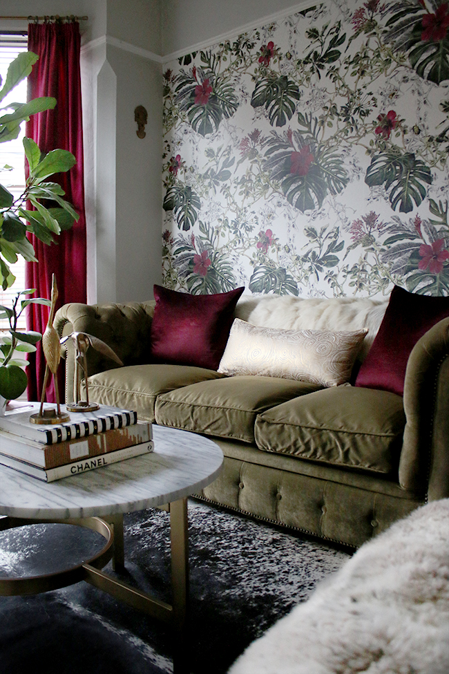
In the living room, the sofa and wallpaper are the show-stoppers here. We really splurged on the sofa at the time. It was a bespoke design costing us around £1800 nearly 6 years ago (showing quality pays off on these big items – it still looks fantastic) which was a huge outlay at the time as we’d only moved in and didn’t have a lot of spare money. Later, I used a higher end wallpaper which really gives some wow-factor to the space. I saved a bit using it as a feature wall (thus reducing the number of rolls I needed) and I used the offcuts to update a really cheap set of drawers on the opposite side of the room (seen below).
The marble coffee table was a bit more of an investment (I think about £250 a couple of years ago now from West Elm) but I combined it in the room with inexpensive cushions (£30 from West Elm and the gold from the Anthro end-of-year sales which cost me around £12 including the cushion inner). The curtains are another Ikea hack – just £40 for the pair – but I adapted them to have a pencil pleat header instead of the grommet header it came with, making them look a bit higher end. You can see how I did that here.
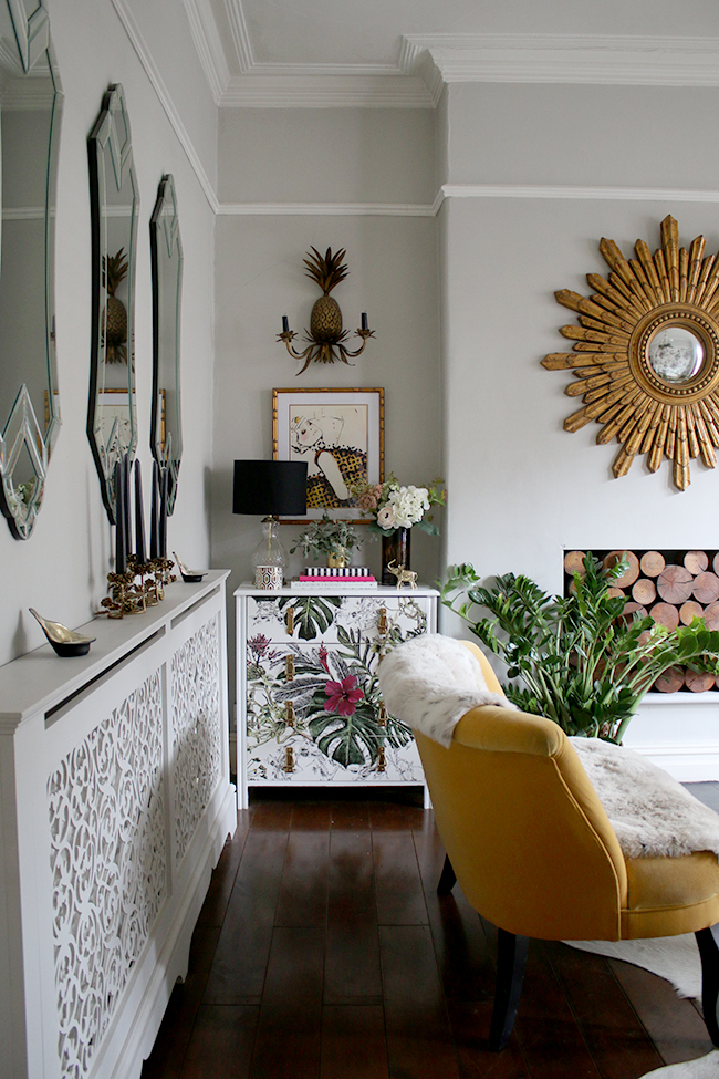
On the opposite side of the room, there’s that offcut of higher end wallpaper mixed with a very low end cheap set of drawers I purchased years and years ago (I can’t even remember when I bought that – it must be at least 10-12 years old now and I know it didn’t cost me any more than around £50). Above this is a set of higher end pineapple sconces – the pair cost me around £200 which was eye-watering at the time but I really think they add a lot to the space so they were a worthwhile investment, especially considering I’ve had them now going on 5 years.
The lamp was an eBay find a few years ago – vintage, not costing me more than around £20 if I recall correctly. That gorgeous print above cost a mere £5 from John Lewis but I added a more expensive custom frame to elevate it. Custom framing is another way to elevate inexpensive prints and make them look like fine pieces of art!
Mixing High and Low in the Dining Room
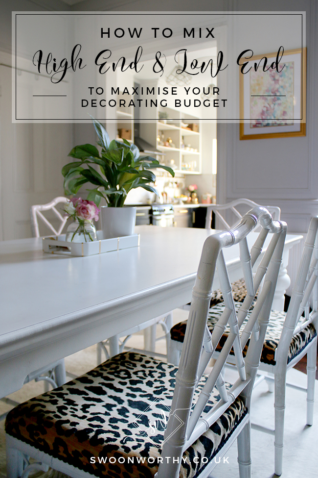
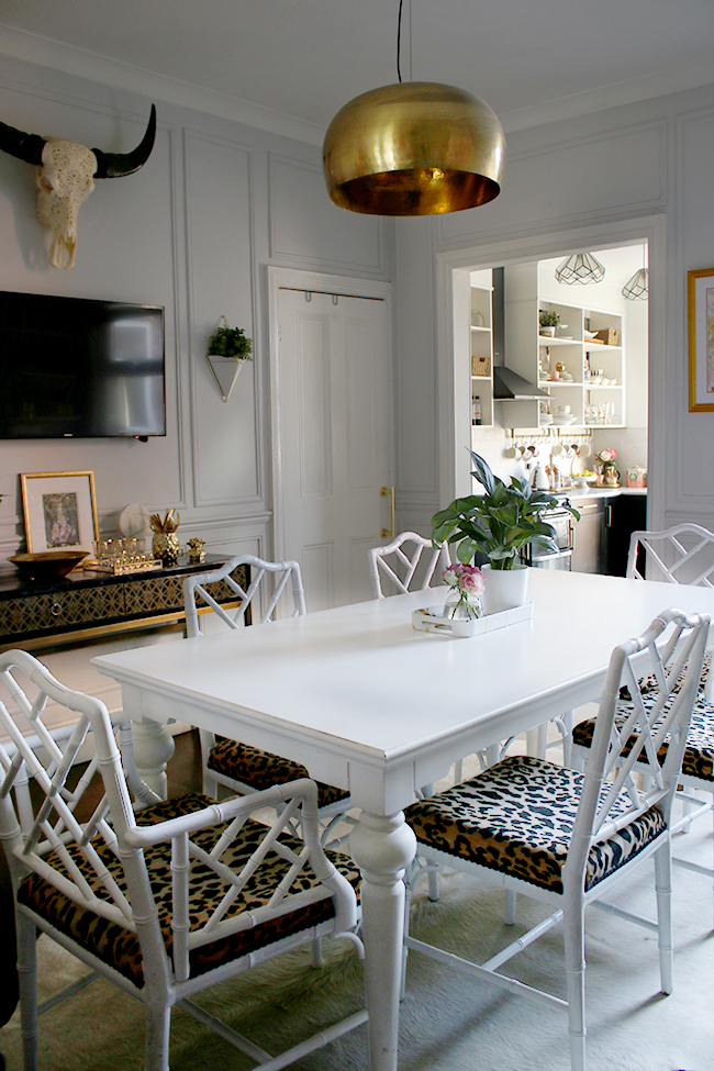
And finally, the dining room which we refurbished this time last year. The vintage Chinese Chippendale chairs were a worthwhile investment but my goodness, I paid for it in the time it took to find a full 6 piece set. To this day, I still have readers contacting me about where I found them (all on eBay!). They are rare and they are difficult to find at a good price but while it wasn’t as big an investment in terms of money, it was a hell of an investment in time, taking me years to gather the whole matching set.
The print above the fireplace is another large limited edition print from Gina Julian which cost around £250 unframed. Not chump change and not mass-produced but certainly becomes a focal point in the space due to its size. The investment in the wow-factor great art creates is always worth the additional spend if you can swing it. The wallpaper was £72/roll but again, because I only needed a small amount, the outlay isn’t quite as high. For wallpaper, I really believe that getting something you absolutely love and that makes an impact is paramount to getting a higher end look as you are paying for the manufacturing process which allows for a great amount of colour and depth than the cheaper mass-produced papers. Check out my post on How to Create a Good Feature Wall for more info on that one.
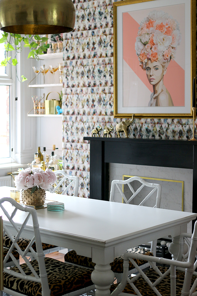
Where is the low end in this room? Well, that shelving you see above the bar cart (which incidentally was an inexpensive find on eBay about 5 years ago) were created via DIY costing only around £20 per shelf. You can see how I created those here. The fireplace surround is cheap and was here when we moved in, simply painted black. The tiles aren’t real marble – they are a porcelain tile that mimics the real thing (rather well too – you’d never know the difference but you’ll know it by your bank balance) combined with an inexpensive brass trim work that makes the whole thing look a lot more expensive than it was.
My top tips for mixing high and low
- Headboards, sofas, wallpaper and art are always great places to spend a little more and can create the cornerstone of any statement design.
- Spend less on smaller accessories – things like cushions, candles or smaller objects can be thrifted or mass-produced to save money.
- For inexpensive pieces of art that you really love, invest in high-quality custom frames which will make them look more expensive.
- Spend time searching out high-quality vintage bargains. It’ll be worth the time you spent to save money but it does require patience to find the perfect piece at your perfect budget price.
- Consider look-a-like products that mimic the look of a higher end finish for less.
Do you utilise the high-end/low-end mix and match in your decor? Let me know in the comments!




Love this post ~ such great ideas. Do you do your own photography? The pictures are lovely. Thanks for all the great content, Kimberly!
Hi Carrie, thanks so much, I’m pleased you enjoyed it! Yes, I do my own photography – just years and years of practice and I’m still learning! ;) xxx
Really enjoyed reading this post Kimberly, some excellent ideas.
In the bedroom we bought a sleigh bed, as you said it was eye watering at the time when we bought it. Looking at it now it was worth it, it still looks as good, and I love buying bedding, and it doesn’t matter where I get it from, it always looks good. Same with the sofa and chairs in the living room, we paid as much as we could for it, and I honestly can’t tell you how long we’ve had it, with some nice cushions it still looks great. xxx
I love mixing high end and cheaper pieces. I agree that investing in certain things like sofas is a good idea and buying cheaper accessories. You can save so much money by DIYing furniture x
LuxeStyle
I love taking a mental inventory of my home and feeling proud that I was able to make it look great by mixing it up. Many items are from tag sales; quality vintage with a nice patina. 🙂
Great post lovely! I do this ALL THE TIME it makes home feel less showroomy and more homey
Great post Kimberly – and something I need to take heed of as I begin the decorate my new place.. given the teeny tiny budget I’ll have! xx
Your house is so beautiful Kimberly. I love mixing high end and low end too. It really gives the home more character and at the end of the day, you don’t feel guilty when you want to replace the decor.
Wow what an incredibly valuable post full of tips. Thanks Kim! I can sense me coming back to this when I’m sourcing items for the house. I couldn’t agree more with splashing on the bigger statement pieces (like a headboard or sofa) and save on the cushions/accessories. I’ve started making my own cushions – it’s so affordable and super easy!
Fi x
This is so inspiring!
Once again I am so impressed by your content. This is really helpful and inspiring!!