For years, my home was a real mishmash of colour. If you look back on my blog between the years of 2012-2013, you’ll see how enamoured I was with using pretty much every colour of the rainbow in every room and when I look back now, I admit, I shudder a bit. Oh, I loved it then and I’m glad I had that time to experiment a bit – to really just throw everything I had at a space and marvel in the resulting chaos.
It’s not so much the case anymore. I have a palette in my head that I love and I know what colours I’m not as keen on. For instance, I can completely admire blues and turquoise colours done well in other people’s home but in my own, it feels too cold to live with somehow. On the other hand, I’ve always been in love with olive green. I debated for about 10 minutes when I chose the velvet fabric my sofa – should I choose a colour I was in love with at the moment? Or one that I knew I had loved for years? Thank god I went with the latter because it’s a piece that years on, I still love.
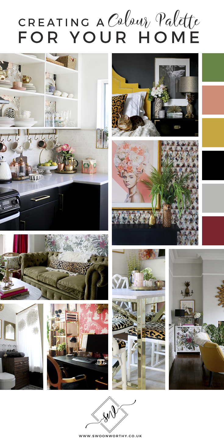
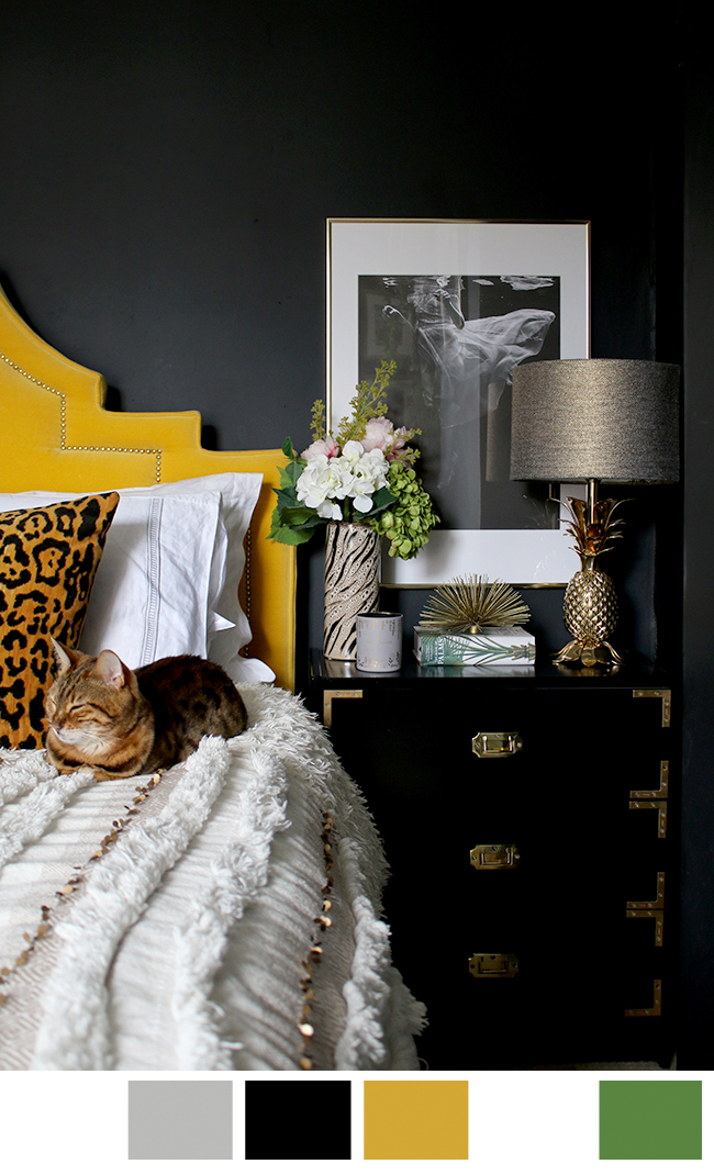
Another colour I’ve loved for years is mustard yellow. I’m not as keen on really bright clear yellows – I like mine a bit muddy, more of a mustard or an ochre. I chose the velvet (reoccurring theme here) for my bed’s headboard, again deciding to go with something I’d loved for years. The mustard yellow is a stand out for sure in the room against black walls but it’s warm and inviting and works well with other colours that I love.
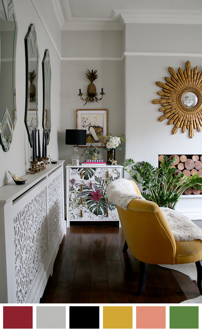
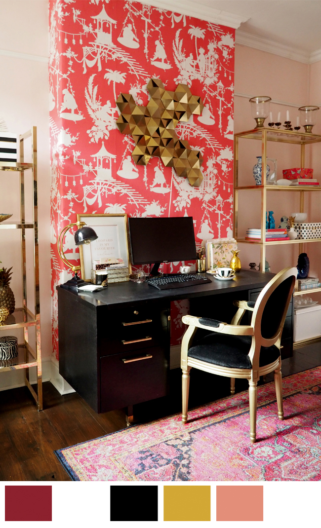
Of course, I can’t help but be swayed by trends on occasion and there are a few at the moment that I adore. I updated my living room a couple of years ago and brought in a dark berry shade which seems to be gaining in popularity this year, hot on the heels of 2017’s Instagram darling, blush pink. Turns out, that dark berry colour marries beautifully with the (also trending) natural greenery I love in my home – from deep forest to pale spring green which ended up creating a layer upon which the other colours shine.
Speaking of trends, I have played with blush in my home for sure. My office was painted in a blush pink a couple of years ago (although I admit, if we weren’t moving, I would have changed it by now) but I’m rather in love with those salmony shades that lend more to peach, brought into both my dining room and kitchen. As an accent, blush and peach are soft and playful and add a touch of femininity to a room but they also balance the darker, richer shades I adore.
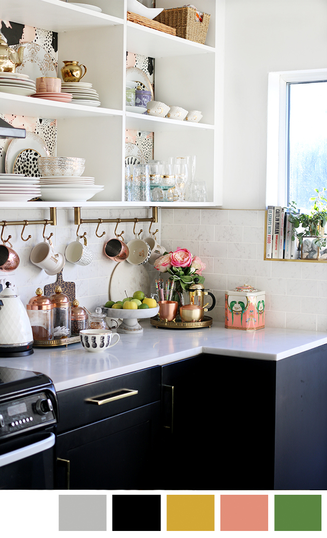
There are also recurring patterns in my home. I realised when updating the branding on my website, that I am drawn to an irregular black and white polka dot. You’ll see it in my kitchen wallpaper and on my favourite H&M plates and mugs and there are small splashes of it in my office. It’s not everywhere but I do love it.
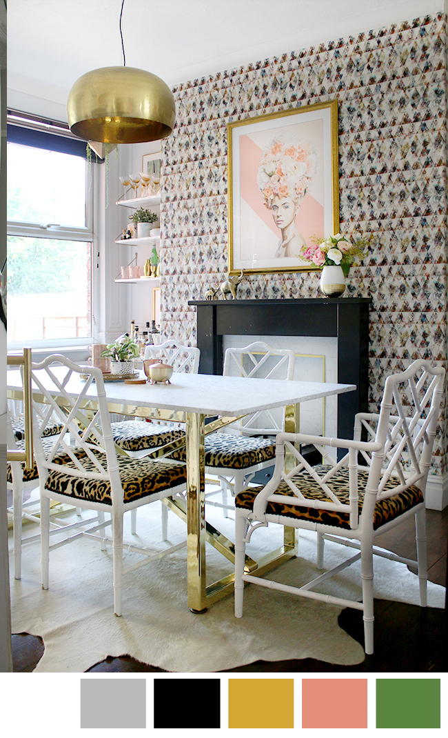
Of course, it’s no secret I adore leopard print and have done for decades now. My rooms are not covered in it but you’ll see it in nearly every single room as an accent. I’ve used Braemore Jamil Natural in my dining room, living room and bedroom – yes, I will hand-on-heart swear to you it’s a neutral that goes with everything. But look at the colours and you’ll realise it’s just a combination of two favourites – blacks and golds with a bit of neutral dark brown for depth.
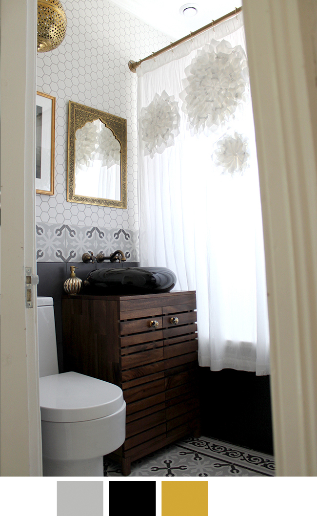
Speaking of neutrals, my go to’s are black, white and grey. I remember back in 2010 when I painted my living room grey (along with my bedroom and kitchen at the time, both of which have since been repainted), visitors to our home commented it was a colour they would have never thought to use but marvelled at its effectiveness to create a wonderful base upon which to build. Now, of course, it’s pretty much everyone’s go-to neutral although I wonder if the tides are starting to turn. I reckon we’ll see more in the way of warmth in our neutrals in the coming years, taupe and beige coming in to warm our homes back up.
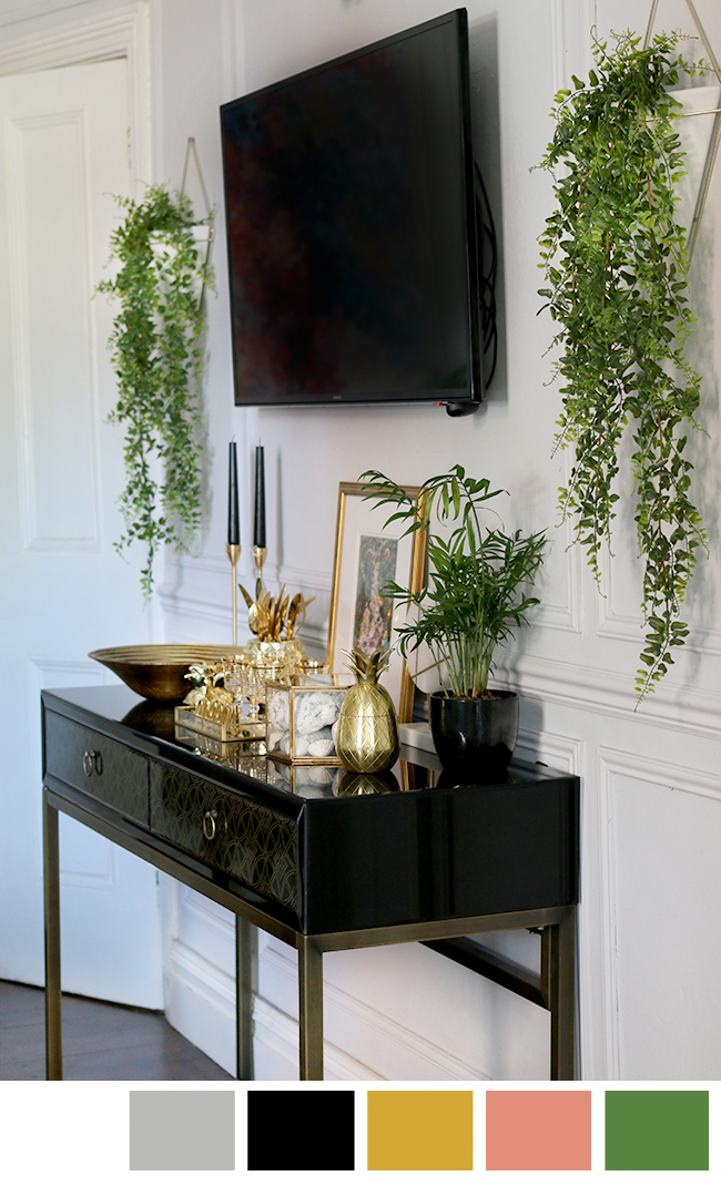
Now black and white – that’s definitely a combination I adore. I have used black and white in every single one of my rooms and I love that bold contrast they create. I especially love it in combination with gold and brass (no surprise there) – it’s just such a classic combination and I feel like it will truly never date. Every room could use a bit of black, white and gold in my opinion. I mean, it’s the theme of my blog and of my home (and really, of my wardrobe too).
Knowing that a house move is on the horizon, I’m much more sure of the colours I want to use in our next house. In my head is a palette of colours I’ve grown to love and ones I find easy to live with. This house has been an experiment in style but I feel more sure-footed this time around after experimenting with colours and patterns for so long.
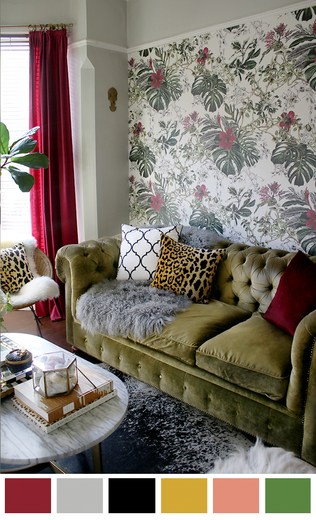
When creating a palette for your own home, I’d suggest considering those colours you’ve loved for years. If you’re not sure, take a look at your wardrobe for clues. What colours make you feel good and confident? These are the ones you want to surround yourself with. Pick maybe 3-4 colours that work well together and in isolation – different shades of the same colour can work well too. The choose a few neutrals – I’d always recommend black as one of them. And then, finally, any patterns or finishes you are especially enamoured with. Of course, I’m going to recommend gold or brass – I know it’s a trend at the moment, but I promise it has staying power and it warms up a space like no other.
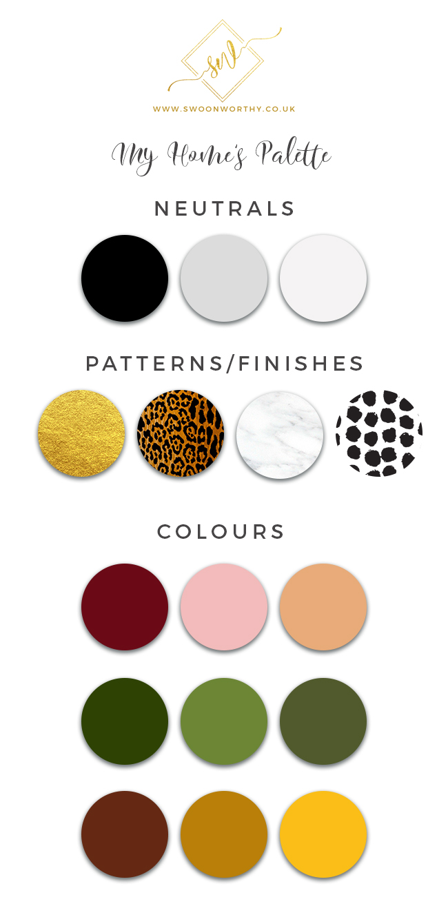
You can create a physical mood board with paint chips and fabrics, a Pinterest board or an editing programme (I use Photoshop for everything personally but Adobe Powerpoint or MS Paint can work just as well). It may take a bit of trial and error to see what works best for you but once you’ve created your palette, choosing paint, fabric or accessories becomes infinitely easier and you’ll create a cohesiveness in your home.
Of course, I’m not saying you have to stick rigidly to your chosen colours – there may be the odd colour you want to throw in as an accent from time to time, after all (inexpensive accessories are always a great way to do this) but when committing to your large pieces and paint colours, you may find yourself reaching for the same palette again and again.
Do you have a working colour palette for your own home? What colours are you naturally drawn to? Let me know in the comments! And for more tips, check out my post on How to Use Pinterest to Define Your Personal Style.










This is something I’ve been thinking about a lot recently. We’ve been in our house for 3 years now after years of renting and at first I wanted to try ALL THE COLOURS!! but now that I’m getting better at this whole interiors thing and finding my true style I know a neutral background of black/white/grey with gold and pink accents is what I like. I being in other colours with accessories, art and soft furnishings which are easy to change when my attention wanders! And you definitely helped me figure this out 😊
This is a really helpful and timely piece for me – thanks so much. I am in the nice position of picking colour schemes for our new house. I feel like I’ve been influenced by the navy blue trend that has been everywhere this year, as well as yellow, so am wondering whether they’ll look dated in a few years even though I love then now. I agree with you about the drama and warmth of black and gold. Decisions, decisions….! :-)
Thank you so much for this post. it’s such a simple and practical idea, i’m definately going to create one and take it shopping with me all the time.
i tried hard to do things the English way when i first moved here, but i can’t resist my tropical childhood memories. i have completely reverted to a clear bright palette with a crisp white as the neutral.
do you think your childhood environment has developed your style and colour preference?
I seem to be drawn to black and gold. It’s so traditional but I love it. I love anything with black and white stripes but also I do love dark gray with silver and mercury glass thrown into the mix. (well not literally lol) Or. I love light gray with white.. and I think I am the only one in the whole world who does not love subway tile! What is wrong with me :-)
I’m still a bit of every colour goes I have calmed it down a bit as in each room now only has about 3 different colours in them so I am toning it down a bit. Xxx
I’ve always loved each room being a different colour. I keep the flow across rooms by keep flooring, doors and trim the same. Now in a new home I will continue my passion for different colour rooms but will choose different colours from the last home. Some of my colour choices are on trend and some are not. I choose the colours that make me feel happy.
Striking – your images are amazing and work so well. When you have some flair, I think all you palettes will work ;-)
I love it all. I love but scared to use too much of it in my house. Your house looks cosy. Can I just ask where are your 3 mirrors that are above your fireplace cover? I love them. Thank you.
Aww thanks so much! And if it makes things simpler, just start with a relatively neutral pallette and play with accessories for a while until you feel a little more brave in adding colour in larger areas ;) As for the mirrors, would you believe they are from Argos?! ;) xx
Thank you Kimberley. I can’t find the mirrors on Argos website. I guess yours aren’t a recent buy then? Thank you:
Oh I just had a look myself and they must not have them anymore sadly. It was a couple of years ago I got them! So sorry about that! xx
Thank you so much for this post
I think as you get older, your style and taste evolves also. Fresh from college, my decor style was white matching furniture with tons of grandmotherly florals everywhere. Over the years, through trials and lots of expensive errors, I’ve finally found my own personal decor style. I can relate with what you said about loving certain colors but in someone else’s home. It took me awhile to come to the realization that not every color/print is going to work in my home just because its what’s on trend at the moment.