Oh, Pantone. I know your heart is in the right place. I really do. I know you have a whole team of amazing experts who sit around a room and think long and hard about what colour best represents the zeitgeist of the world at that moment and do your best to interpret that into a single colour. I’m not saying that your job isn’t hard. I’m not saying that your expectation is that the world will agree with you. But here in the interior design community and for the bloggers who write their work based on your predictions, I’d like to take this opportunity to speak for the many and say that you’ve got it wrong.
Now, I realise this is a ballsy statement. I realise I probably don’t have all the facts. That I haven’t spent my life examining every nuance of every nation and I haven’t even spent my entire life tracking trends and feelings and shifts in the market. I know I am not qualified to bring down such an illustrious group or company. But but but.

This colour you chose. It’s the colour of Cadbury’s. It’s not what I think of when I want to consider a new room scheme. It’s not what I want to see filling up my inbox with PRs trying to hawk their client’s goods to me by way of the 100s of press releases that will take over for the next 12 months. I’m sorry that I don’t like it. I’m sorry. IT’S F**KING PURPLE THOUGH.
Okay, so I’m not going to continue this post as though I’m speaking directly to Pantone. I’m gonna talk to you guys because well, you guys are the ones who read my blog and they aren’t. (Shame, perhaps they’d like to take a look at my 2018 Trend Predictions?) However, I’m here to share with you my alternative to Ultraviolet, Pantone’s Colour of the Year 2018 which is basically the same colour as a large children’s television dinosaur. The alternative, my lovely friends, is lilac.
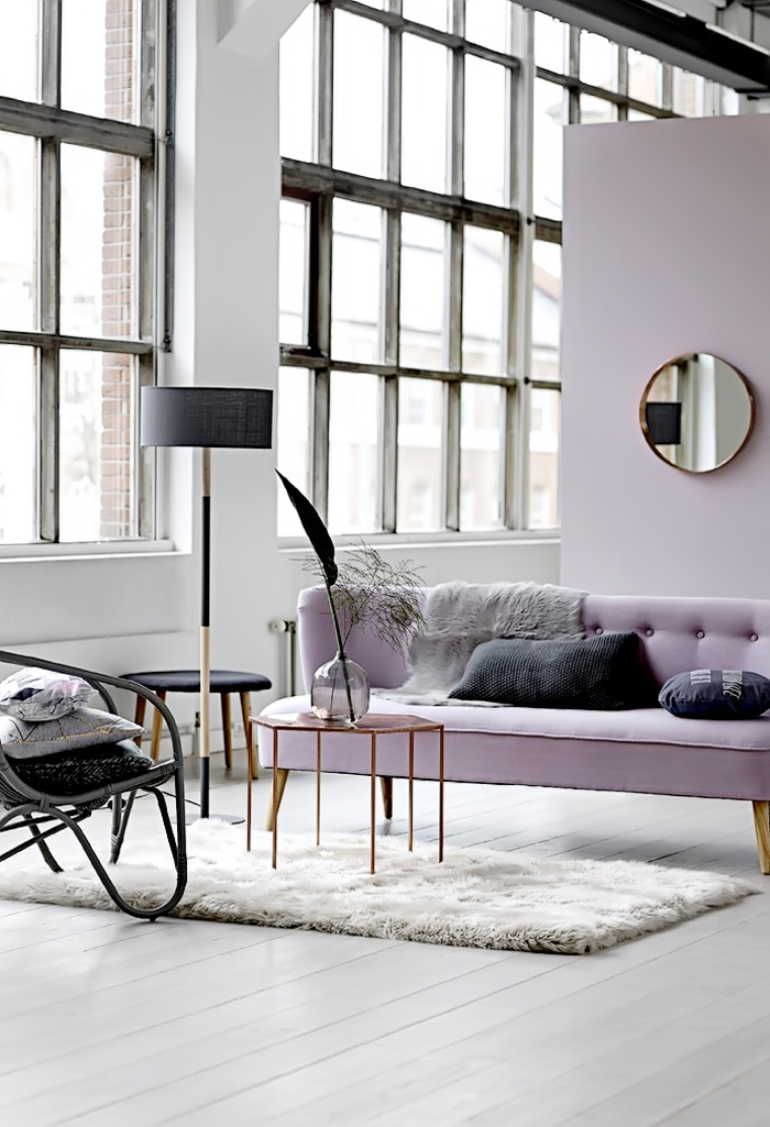
Bloomingville via Only Deco Love
Now, I realise my choice may be a bit hard to swallow. Maybe not as hard as CADBURY’S PURPLE but ya know. It’s not a colour you may have seen used much since, oh, 1983. And I get that it’s hard to look at stuff coming back into fashion when you may be old enough to remember it the first time around. But you need to let that go. You need to remember that trends are cyclical.
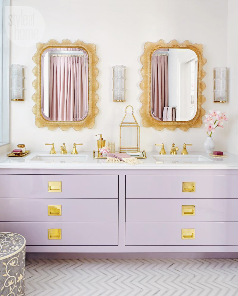
Designer Tara Fingold via This is Glamorous, originally published in Style at Home
Hey, I do get it. I mean, I love burgundy these days with lots of greenery. My living room is covered in it. But do you know that in one of my very first flats, waaaay back in the year 1996, the entire thing was decorated in burgundy and hunter green? Oh yes, yes it was. And ya know what? My living room now and my living room then is absolutely NOTHING alike, not least for the reason that I don’t have a floral wallpaper border winding around the whole room.
So, yes, while trends are normally cyclical, they do emerge in whole new ways. They are combined with different colours, different materials, they will look totally different according to what you place with it. So that 1996 floral wallpaper border in burgundy and hunter green is totally reinterpreted in a bold and delicious tropical style wallpaper in my living room instead. It’s much more contemporary, it’s much more current. It no longer screams 1996. Thank goodness for that.
And this, my friends, is why we should probably embrace lilac as a contender against the abomination that Pantone has chosen.
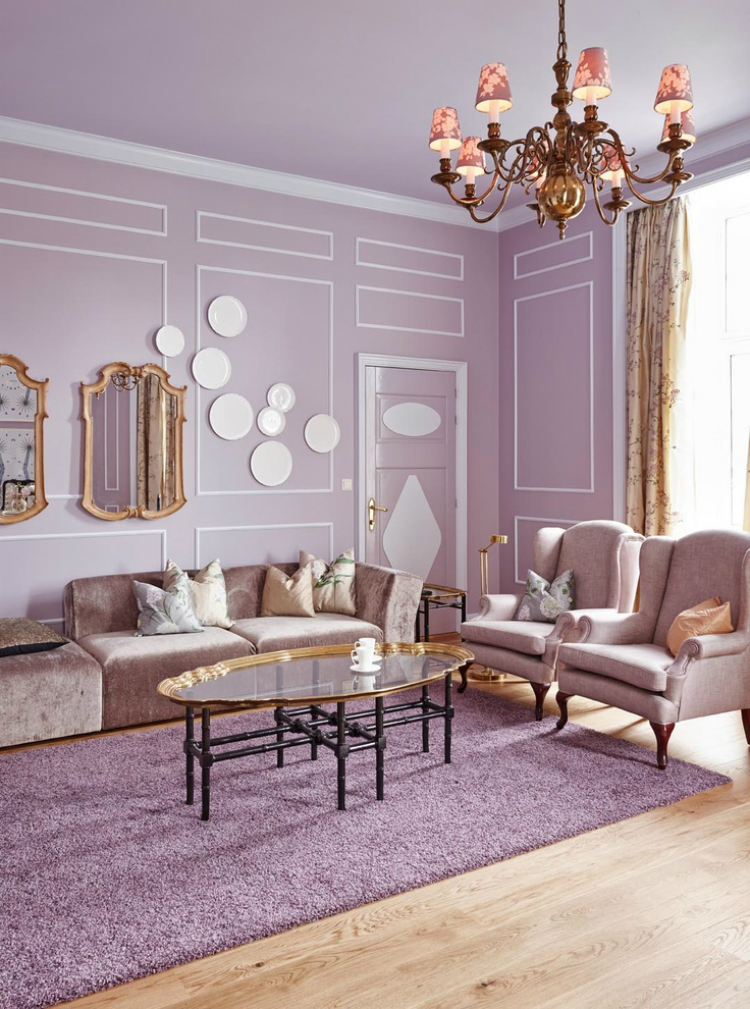
The Mikado Suite at Grand Hotel, Oslo / Photography by Sveinung Bråthen
We know how beautiful blush pink could be. It emerged as the Instagram Darling of 2017 and has sprung up everywhere, being proclaimed as the new neutral. Lilac, with its quintessential associations with feminity, is not too far off. It’s a little cooler, yes, it can border on grey which we all love and it warms up beautifully when combined with my favourite metal, gold.
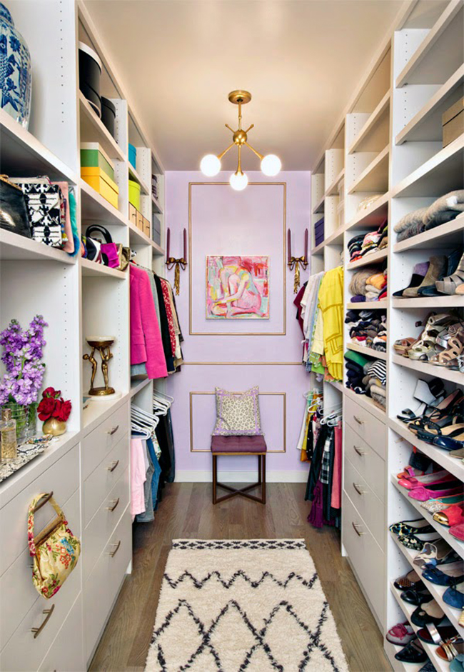
Mimosa Lane / Photography by Jason Kindig
Want to toughen it up a little? Combine it with black to temper its sweetness or throw in a bit of leopard print as above to give it a bit of zhush.
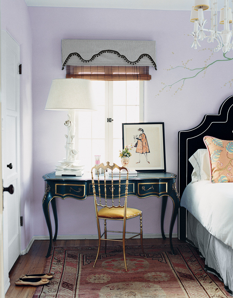
Photography by Melanie Acevedo for Domino
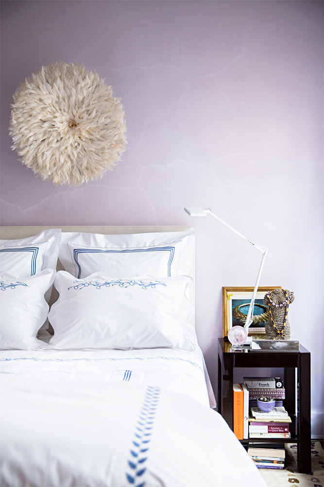
Design Amanda Ross / Photography by Brittany Ambridge for Domino
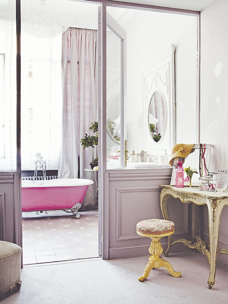
It works beautifully with French-inspired decor as well. Curvy lines, wall panels, silk curtains and you can pretend you are living in a chic Parisian apartment.
If Parisian chic isn’t your bag, it can just as easily work with a more eclectic mix of decor with contemporary artwork and mid-century style furniture. Those warm woods and vintage pieces go a long way in grounding lilac and a few acid yellows create a wonderful tension. It’s brave, I know, but somehow it really does just work when mixed with the right companions.
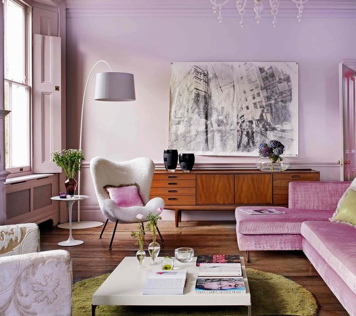
Mel Yates for Living Etc, via The Walk Up Blog
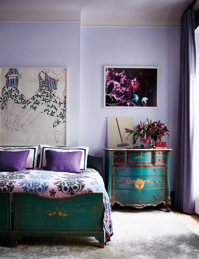
Pamela Bell via Domino / Photography by Stephen Kent Johnson
So, yes, I do have a little bit of a yearning for a touch of lilac in my home. Could you see it in yours? I’d love to know what you think of Pantone’s choice as well – what would you have as an alternative? Or, perhaps you love it? Hey, we’re all different here and it’s totally cool if you want to rock purple your own way. Go on, talk to me. The comment box awaits!













I agree with you, purple is not a favourite of mine, usually they have a second colour? I love the lilac it’s so chic and effortless, especially when it’s got a grey undertone. It will be interesting to see how the interiors world receives it. I hope there isn’t too much purple in the fashion world. Would never want to wear it!,
Hope you’ve found a new nest?
Love this article! I’m in the process of painting my basement in a very similar color (BM 1241 Morristown Cream, a light purple-grey-pink with warm undertones). We have a giant limestone fireplace in that room and it’s in use as a family/playroom. The light purple looks gorgeous with the limestone and I love that it has a playful feel, but doesn’t look childish at all.
I totally agree with you! Lavendar has my heart… you’ve shown the perfect designs to inspire.
I couldn’t agree more! When I saw it, I was like WTF?!?! I much more persuaded by your choice of lilac – the photos for your colour references are GORGE. xx
Totally agree re that harsh purple… and you are swaying me toward lilac!
I was a bridesmaid many many years ago and wore a shiny, Cadbury, puff sleeved frock. Puff sleeves seem to be back in fashion….might have to dig that dress out!! Seriously I really don’t like ithe purple or lilac but am looking forward to the interiors world to see how it will be used.
I am in the minority here but I love the coty. I’m done with all the blushes and pastels and breath of color. I needed some saturation
With you on this 100% Kimberly – absolutely loathe the coty. Terrible choice but I guess makes it easier to be an anti-trend hero!
Totally agree with you! We can’t get our heads around ultra violet. I think it’s a shame because it damages their authority on the topic. I know playing safe all the time doesn’t work either but willy winked purple was in no way the right prediction.
Ha ha Willy Wonker * don’t ya just love autocorrect
Cracking post Ms D. Nailed it as ever!x
I am genuinely shocked by all the hate for this colour. I really think there are no bad colours (except beige 😝), only bad colour combinations. So perhaps you haven’t found the right combinations for where violet/purple works really beautifully? I did a tongue-in-cheek instagram post saying I won’t be doing a blog post about COTY but maybe now I should, to counter all this hate! 😂
I think you are probably right in that I’ve never seen a room in this vivid purple that I ever thought was a great choice for the space so YES DO THE POST! I need to see your amazing eye and I would love to be convinced that it can really work :D Do it! xxx
On it 👍
Whoop! xxx
Great post!!!! This purple has caused quite a stir hasn’t it! I don’t know what it is but I’ve always dislike the colour from childhood. I think I just don’t get the colour, and there aren’t too many colours that I do not love… If I had to do purple it would be a greyed lavender… edging as close on the spectrum to the grey has possible :-)
To be honest with you, I feel the same way about most Pantone Colour of the Year selections! Even Greenery from 2017 – Love the colour on its own, but could never find a way to incorporate it into projects or my own home in a way I liked besides just adding in lots of plants (which I’ve been doing for ages anyway!)
It is probably worth noting that there are a couple of colours in the “Colour Harmonies” section of Pantone’s announcement post (go to “Tools for Designers” & scroll down) which come close to the colour you’re suggesting, most notably Pantone’s “Orchid Hush”. Also one or two of your pics here include tones of Ultra Violet with the lilac, and as Pantone suggests, it works really well (even if, like me, you’re not a purple person)…
I think the key thing to note is that Pantone usually selects fairly bright, bold colours for their COTY & while they may not seem super relevant to our Western countries, these colours are representative of global trends, far beyond our Western culture… And countries besides UK, Australia & the US use a hell of a lot more bright colour than we do!!
I don’t mind the COTY. I had something between this and the lilac in my bedroom for ages and loved how cosy it was and helped me sleep. I think it would probably choose the ultraviolet as a spot colour though rather than on all 4 walls.
Equally I won’t be getting 100s emails every week pushing only that trend so I can see why if you’re not totally 100% for it it will wear thin quickly.
I totally agree with you! You’ve shown the perfect designs to inspire.