Over the break between Christmas and New Year, you might have thought I didn’t even touch my blog, seeing that there were no new posts published at all here on Swoon Worthy. I always take a break from posting at that time of year and relieving the pressure of putting content out there is an incredibly freeing exercise. However, it doesn’t mean that my blog sits stagnant. Not at all.
Every year, I like to make changes to my blog around that time. To be honest, I am forever tweaking my blog design, making sure it looks current and up to date and over the last few months, I have taught myself (by way of YouTube videos and articles around the web) how to work with Divi Builder which is what my website was originally built on. I’m still learning, of course, but I’m feeling much more comfortable as the platform makes it easier to change the design which means I can make sure my site stays up to date and fresh. The break gives me so much more time to just sit and play so it’s a great time for me to really examine the design and make the changes I normally don’t have a lot of time to do.
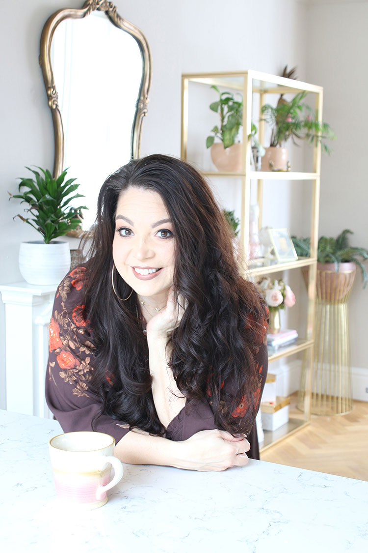
I thought I’d just let you know of a few changes I’ve made. I know for many of you, you probably normally tend to just land on a blog post thanks to an email (if you aren’t subscribed, you can do so at the bottom of this page – see my face? Yep there.) or a tweet or a share somewhere on social media or perhaps via Bloglovin’. Or you might have arrived via a Google search or a link from another website or Pinterest. The likelihood is, that you’ve completely bypassed my home page which is totally normal.
But for those who may look at a post or two and then head over to the homepage after that, you’ll see that I’ve updated quite a few things on that introductory page. My site is fully optimised which means that it adjusts to the size of the screen you are viewing it on but personally, I think it looks best on a full screen or a tablet rather than a mobile seeing that everything is kind of squished down and minimised on a tiny screen.
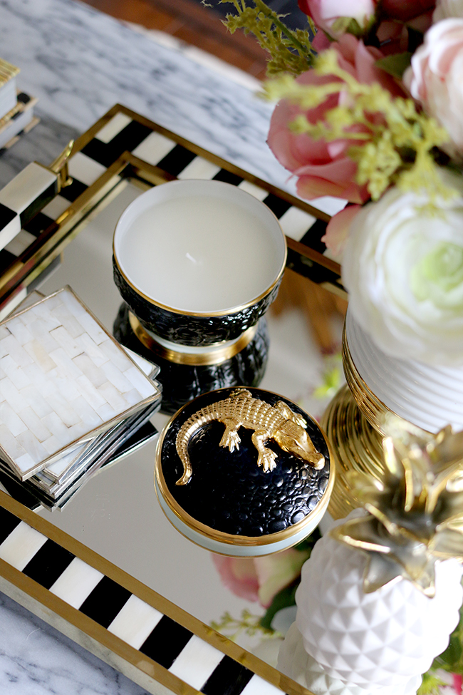
I’ve replaced a few of the static images with larger images that use parallax (a fancy term for an image that moves at a different speed to the text – or stays static as the text moves) so while you will still be able to view my home tour, my about page and subscribe to my blog, the format has just changed slightly. You can check out a little video here of what it now looks like when you scroll if you are on a mobile now and want to have a look or head to the home page now (opens in a new window):
I also updated all my category pages so that you have a lovely big image at the top of each section which will give you a little bit of an idea of what you’ll find in each of those areas. After 7 1/2 years, there are a LOT of blog posts so the categories simply organise the content so that you can find what you’re looking for that much quicker. The addition of the large header image is really more an aesthetic change than a functional one but I like how it looks!
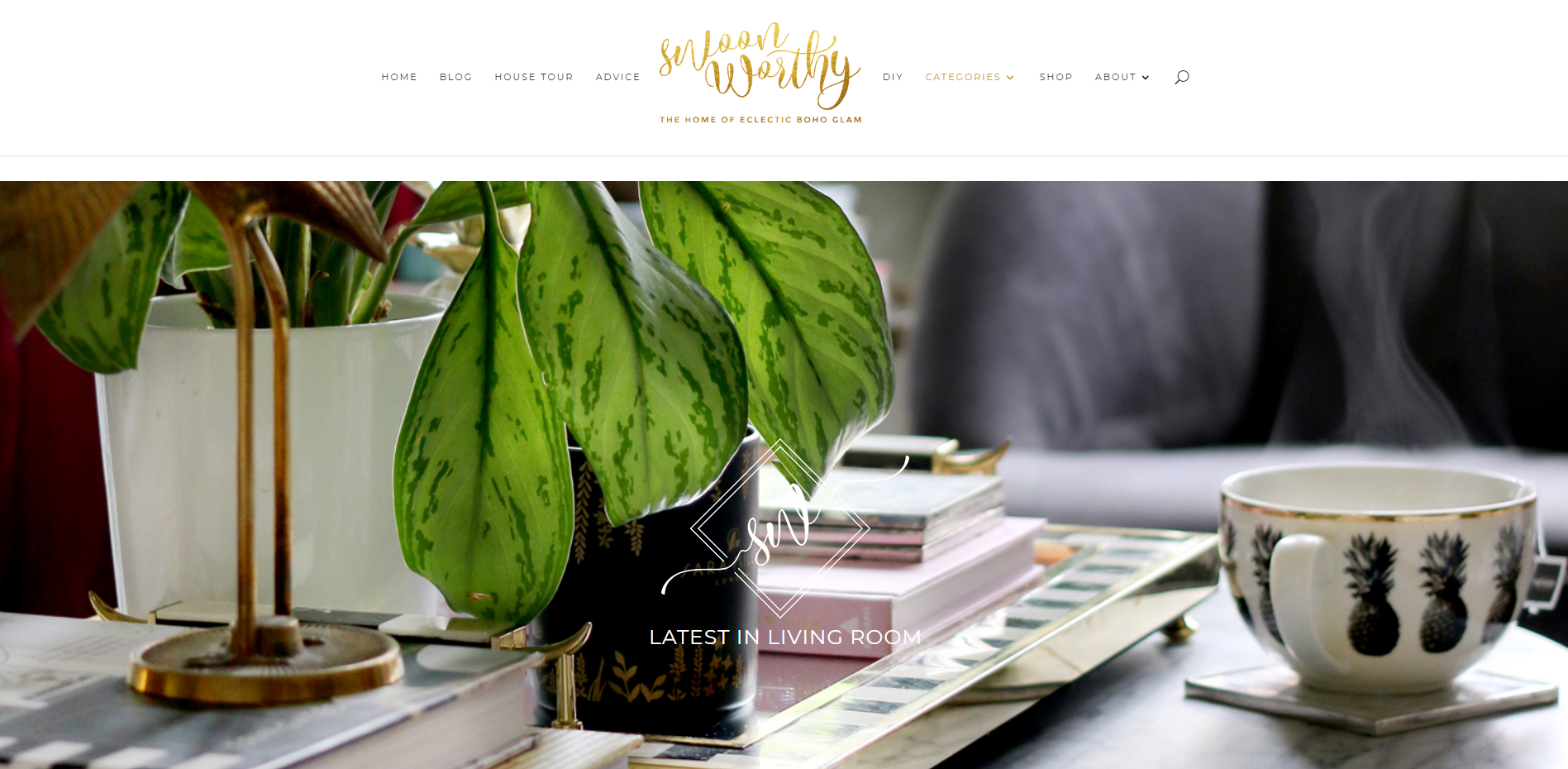
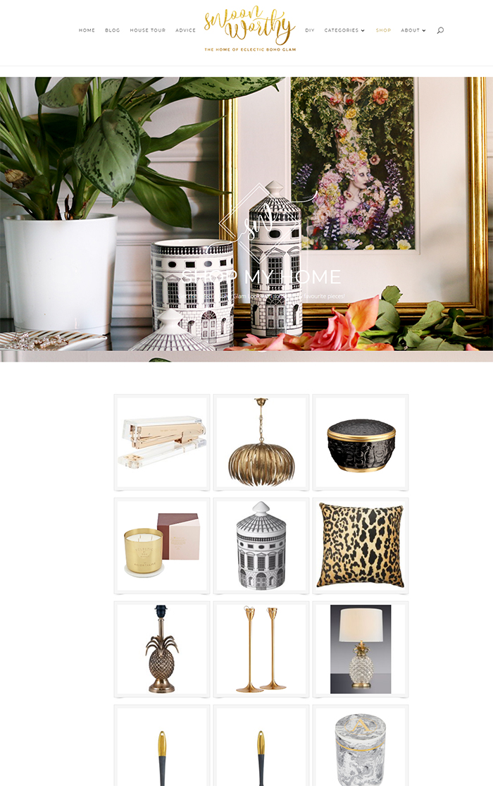
Most excitingly, however, is that I’ve added a new ‘SHOP’ button to my blog up there on the top menu navigation. No, I haven’t opened my own shop selling products I’ve designed (that’s definitely a dream of mine though!). Instead, I thought as I get so many requests for where I’ve purchased things for my own home, I thought I’d create a resource that links to lots of different items I have purchased in the past.
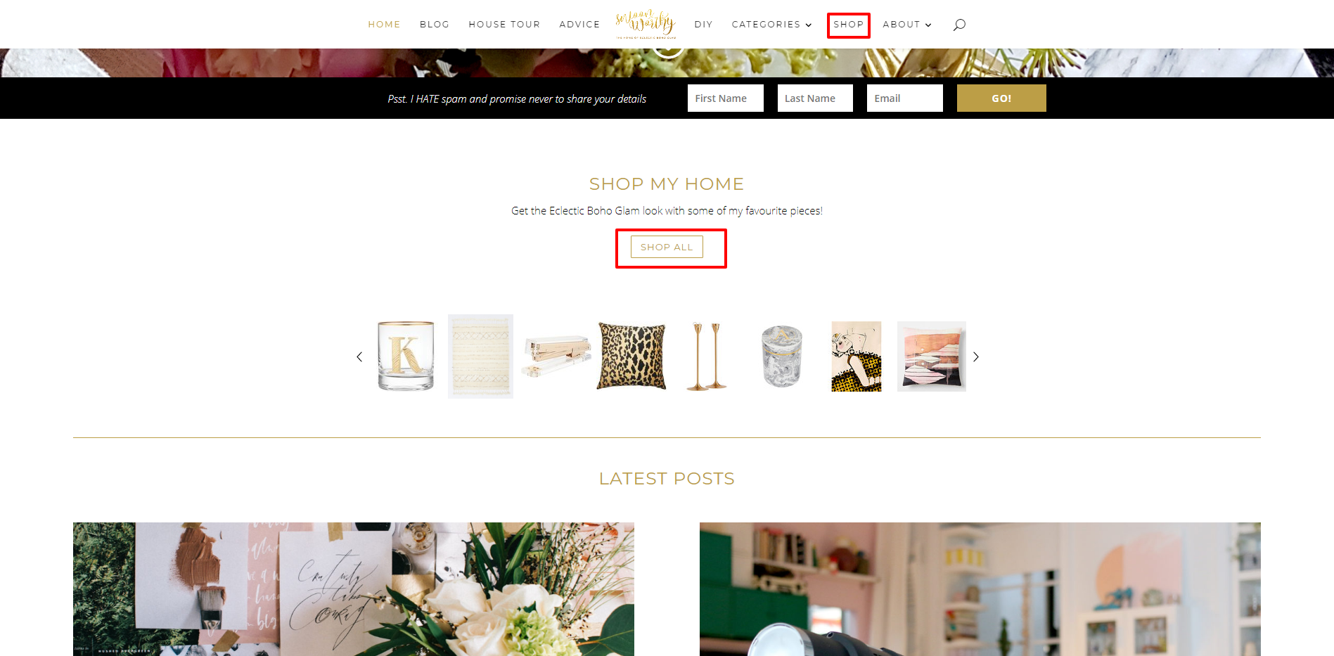
You can get to my shop in a few different ways… you can click on the menu above that says ‘SHOP’ (on a mobile, it will be listed in the drop-down – click the three little lines at the top and scroll down) or you can go to the home page and click on the ‘Shop All’ button in the section that says ‘Shop My Home’.
Of course, not every single thing in my home is listed there. I’ll be adding to it as I go and of course, over the years, shop stock changes and so not everything is available. I’m also limited to the brands I’m able to link to due to the limitations of my affiliate network which provides this functionality. However, where I haven’t been able to link to exact items, I have tried to link to things that are very similar to items I have purchased.
By the way, my shop page does contain affiliate links which essentially means I receive a very small commission if you make a purchase of something that I’ve recommended. It’s basically a brand’s way of saying ‘thanks’ for the referral but you won’t pay any more for anything if you use my links and it’s just another way that I can continue to provide free content on my blog and keep my animals well fed and a roof over my head! ;)
I will be also creating a ‘Wish List’ as well as we move into the other house so this will be a separate page where all the new items I’m eyeing up with the view to purchasing will be listed there. I think it’s a great way to just quickly see what kinds of things I’m loving at the moment and items that I hope to include when we finally move!
Want to jump to the shop now? CLICK HERE!
So I hope you like the little changes and the new shop page! I realise that money is tight for everyone right now at the start of the year so it’s probably the worse possible time for me to be sharing this with you – ha! But well, perhaps a small purchase or two for you home is exactly what you need to brighten up your home a little bit on the greyest days of the year!









This is amazing! Would love to know where you got your gold trays from in your kitchen, I need a snazzy tidy up for my condiments!
Aww thanks Melody! I bought them quite a few years ago from Angel & Boho but they currently have ones that are pretty similar: https://www.angelandboho.com/gilt-mirrored-trays-25020-p.asp
xxx
These are perfect, thanks so much! Your blog is quickly becoming my go to for homewares!
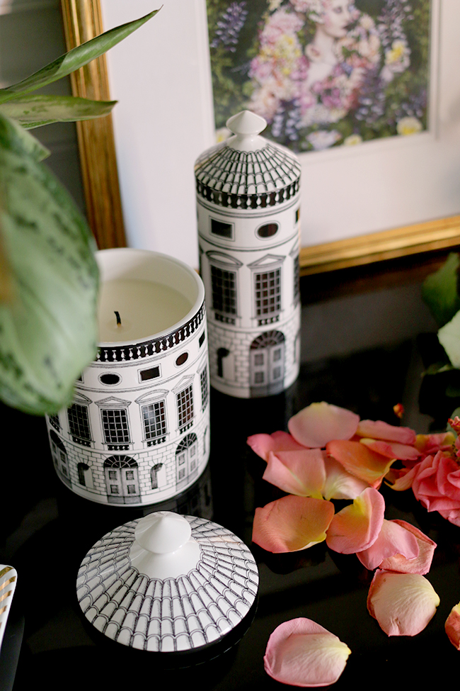
I really love those Fornasetti candles, but £140?! Disappointingly WAY out of my price range! I hope you got those free!
The ‘shop’ idea is a good one though. It’s frustrating seeing something I like on a blog or in a magazine article, and not knowing where it came from. Having the links can also lead to websites/businesses that I may not have been aware of, and I love discovering new retail sites, other than the big brands that everybody knows.
Happy 2018, hope your move goes well, and I’m looking forward to seeing all the cool and lovely things on your blog this year.
I know, they are so expensive but my god, they are just beautiful. True confession – I almost never burn it because it’s just too damn pretty to use up. Saying that, the scent is so strong, I simply need to take the lid off and the whole room is filled with fragrance. So I would say it’s definitely an ‘investment’ sort of luxury piece!!
Aww thank you so much! Hope you find it helpful! If there’s anything you ever spy on here and it’s not listed on that page, just leave a comment, I’m happy to help! :) xx
I know what you mean about not wanting to burn them! I bought a 3 wick candle from M&S that I didn’t need to burn as the scent was so good, and it’s in a lovely glass container.
Oh, and what I mentioned earlier about discovering new websites was illustrated nicely when I clicked on one of your links! It was the link to Redcandy, never heard of them before, but what a find! They have so much stuff I love, and I’ve made a note of some things I want to get for my living room when we redecorate it soon. So thanks for that, if it wasn’t for that link, I’d have never known about them!
Oh I’m so pleased to hear that! Yes, Redcandy has an amazing selection :) Happy Shopping!! xx
Absolutely love your blog but the full width advert which appears at the bottom of every page, covering so much of it, is completely distracting ad irritating. Having to close it each time you want to read a blog post makes for a less than enjoyable read. So sorry ! Your ideas and inspiration are great, please consider ditching these huge adverts!
Hi Cat, thanks so much for your feedback and honestly, I totally understand that it can be kind of annoying to have the ads pop up! The truth is, I need those ads to support the site in order for the content on here to always be free for my readers and so that I don’t need to take on as much sponsored content. You can read a little more about why I have the ads on the site here:
https://www.swoonworthy.org/2017/05/truth-blogging-career.html/
I hope you understand and thanks again for reading! xxx
Even if we can’t buy now it’s something to look forward to, and save up for xxx
Very true! Thanks so much lovely and happy future shopping ;) xxx
This is great….just been on the site wayfair for table lamps……never seen such a fabulous choice, but on the other hand you’re making a hole in my wallet !!!!
Ha!! #sorrynotsorry Happy Shopping! xx
I think the Shop feature is great, it helps people to easily source the items they love. It’s a nice addition to the site!
Great idea! I’ve also been considering adding something similar to my site because I see lots of lovely stuff that I want to tell everyone about but don’t have the time to post several times a day, so something like this would be great to keep adding to.