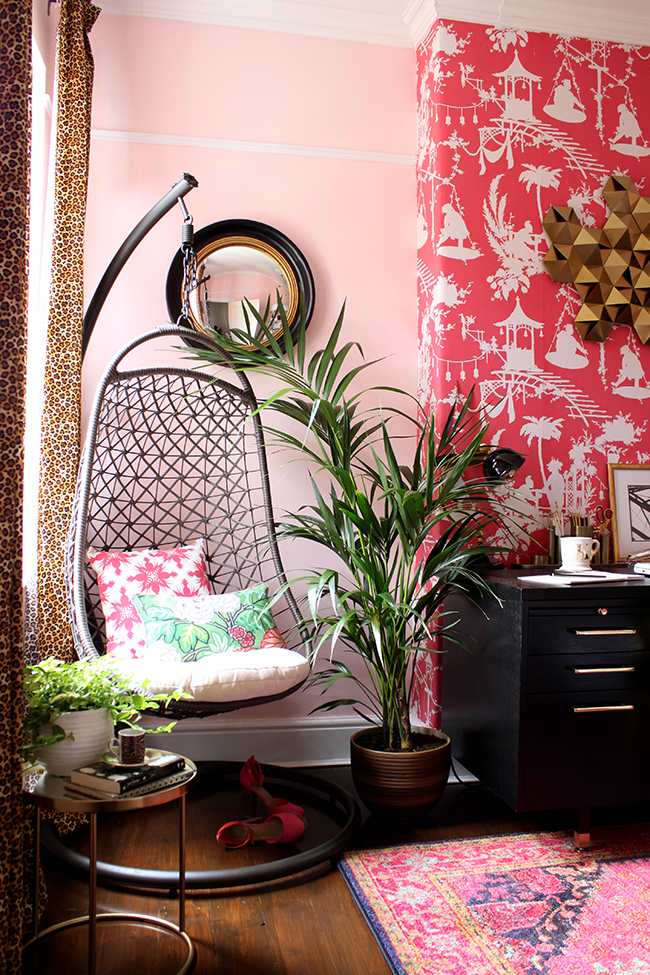
I realise that’s a cryptic title but let me explain. The thing is, I really was convinced that blush pink was a passing trend. I really thought it would fade out and new colours would take its place and we’d all move on from the Instagram Darling of 2017. Now, don’t get me wrong – I fell for it too. In fact, I fell for it a good few years ago before it was really much of a trend at all when I decided to paint my office pink in the Spring of 2015.
It was as though a switch was flicked on sometime around the middle to end of 2016 and suddenly blush pink was everywhere. And it was glorious. A rose-tinted haze fell over my Instagram feed and image after image contained this lovely soft colour. I wanted some. I mused about finding a blush pink armchair. I created room designs around the colour. I wanted this colour somewhere in my house.
The office? Well, I loved it when I did it but the pink wallpaper was very bold and I tired of it fairly quickly as I tend to do anyway. But the colour of the walls wasn’t the exact blush I was after because the undertones of the colour I did want (a more faded/muted/dirty blush) didn’t work with the wallpaper. Needless to say, I sit here, facing that wallpaper, on a daily basis at my desk so I was bound get fed up with it after a couple of years. #lessonlearned
Anyway, the fine line I’m talking about is this… at what point does a trend just become something you really love? Where’s the line drawn between something that’s a passing fad that you quite fancy trying out yourself and a love affair that is bound to last 5 or 10 years? And I find that I am struggling to answer that question because dammit if I still don’t love me some blush pink, even 3 years on. The ridiculous thing is, I don’t WANT to like it because I’ve convinced myself it’s too trendy to actually invest heavily in it and I can’t afford to replace my furniture every 2 years once the trend passes.
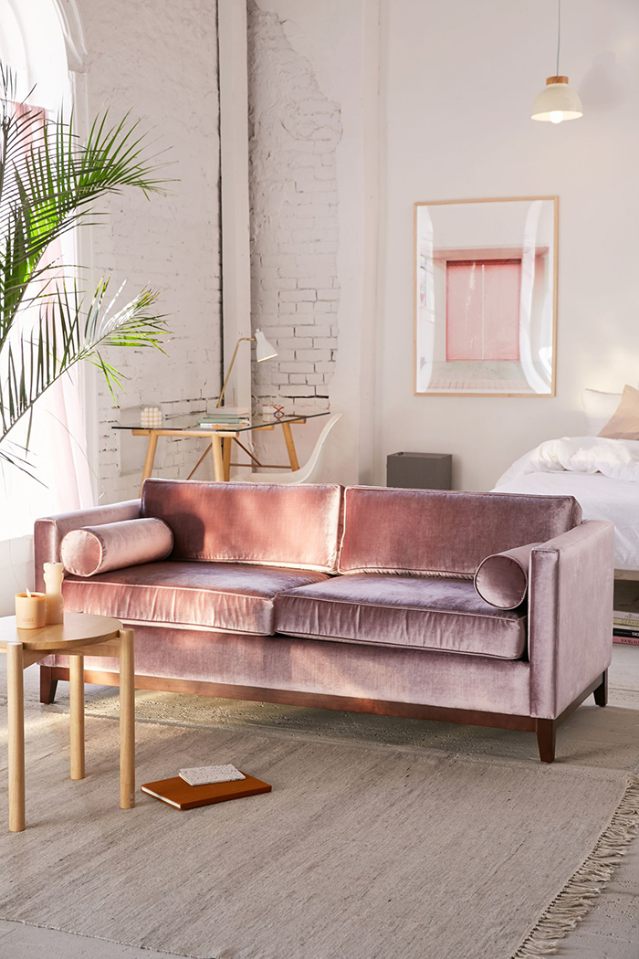
Urban Outfitters velvet sofa – yes, of course I love it.
And yet, I find myself planning the decor in our next home and blush pink is working its way into each room. I’m utterly in love with a few colour schemes right now and every damn one contains blush pink (and plenty of gold because it’s not a trend to me, having loved it for about 7 years now). Here are a few of them…
Blush, Peach and Burgundy Colour Scheme
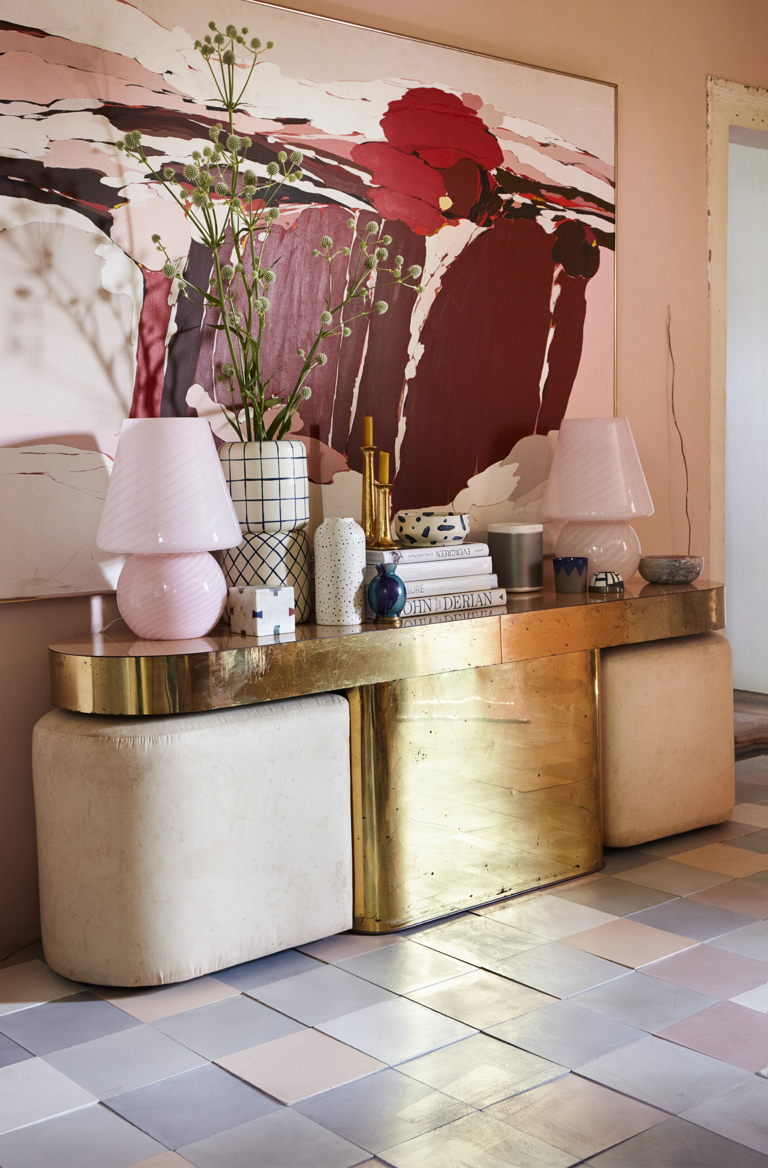
The first is this – burgundy, peach and blush pink. I fell hard for this gorgeous image, the home of Paul Denoly and Nick Blaine of Hawkins New York as seen in Sight Unseen and photographed by Pippa Drummond. I mean, the Milo Baughman console is a stunner, don’t get me wrong, but the artwork celebrating this colour combination is glorious.
Here’s another picture if you are unconvinced as of yet…
This whole image, created by the very talented Lauren Saylor of A Fabulous Fete is essentially the same combination. It just works beautifully.
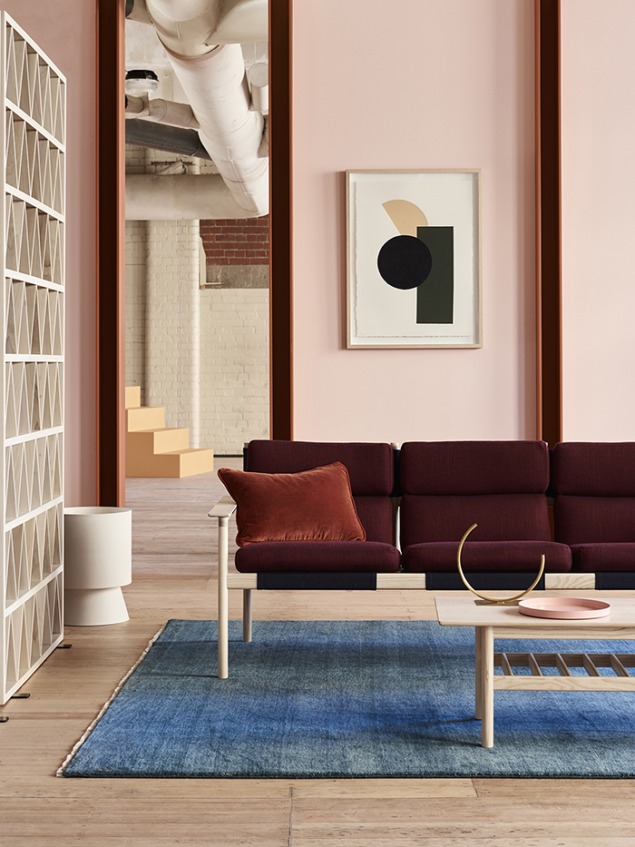
Here it is again as featured in The Design Files Open House in Australia, curated by TDF founder Lucy Feagins with styling by Annie Portelli and photography by Eve Wilson where an entire space is dedicated to this colour combination of blush pink, peach and burgundy. I’m not a huge fan of the blue rug personally but everything else is incredible.
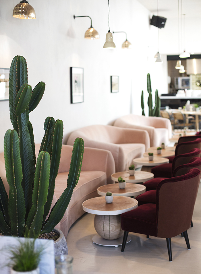
And one last time at No197 Chiswick Firestation as photographed by The Lovely Drawer and yes, every image also contains some measure of greenery but again, that’s just a given. Give me some blush pink and burgundy velvet in the same room, throw in some lush plant life and I’m utterly smitten.
Blush and Mustard Colour Scheme
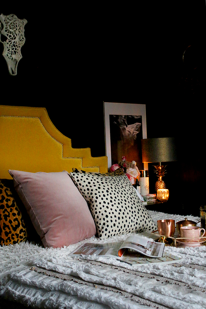
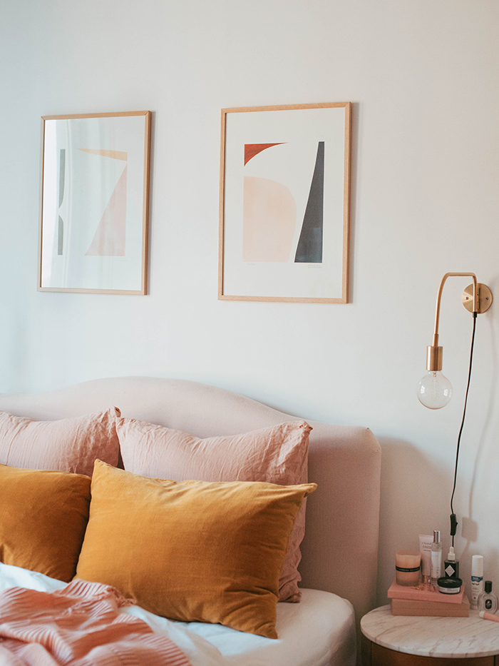
The second is what I shared in my bedroom with you recently – mustard and blush. I love how moody it looks in combination with the black walls…
But it looks just as lovely with white walls too…
Also, I love that Kate La Vie’s bedroom above is like the reverse of my scheme above. A blush pink headboard with mustard yellow cushions instead of the other way around – and of course, white walls instead of black.
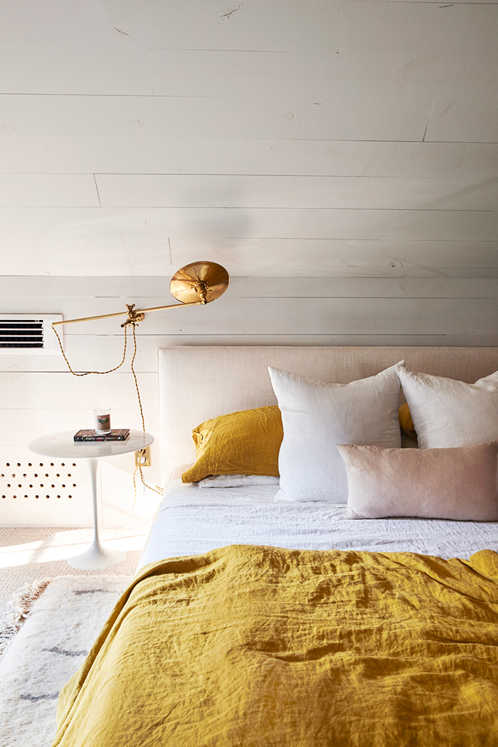
And here again with a similar vibe is again the home of Paul Denoly and Nick Blaine of Hawkins New York from Sight Unseen. That crinkled linen bedding is just giving me all the cosy vibes.
Greige and Blush Colour Scheme
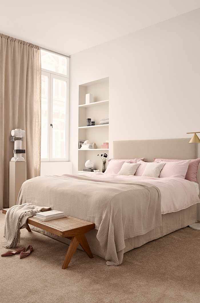
The third is just gloriously gentle and relaxed and it’s another colour I’m finding myself drawn to but again, in combination with blush – and that’s greige. Warmer than grey and leaning more into beige (yes, I know, me liking any form of beige – WHO AM I?!) there’s something wonderfully warming about this colour combination and it’s a serious contender for at least one or two rooms in the new house if we ever get in there!
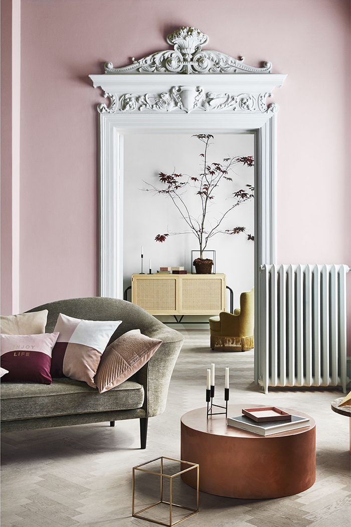
It just looks beautiful with blush as evidence in the photos above and below from H&M’s 2018 Spring Lookbook, created by stylist Lotta Agaton with art direction by Therese Sennerholt and photography by Heidi Lerkenfeldt. For me personally, I’d have loved a tiny bit more contrast, however – a touch of deep rust perhaps?
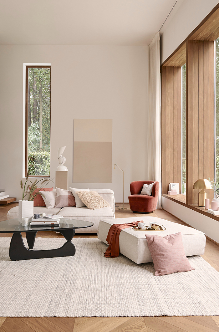
Ahhh, yes, see, that’s better. The blush here is just a subtle accent but this colour combination is just warm and wonderful especially with all that natural wood.
Notice in the image above there’s a bit of burgundy and rust shades as well as a little mustard in the background. Like I said, it’s that bit of contrast that really works so well against that greige sofa. *Sigh* I love it. I can’t help myself.
And so I find myself wondering if I should just go for it. I mean, one of the main things about any trending colour is in its availability. At the moment, blush pink is pretty much everywhere and whether it’s furniture, accessories, art, wallpaper – you name it, you can find it at varying price points. So that’s another reason I’m thinking it might be something to just embrace. If, after 3 years, my love affair with blush has not waned and I’m fighting it, should I just give in? After all, I always tell people, if you love something, it’ll have longevity in your home.
But do I still love it because it’s still trending or do I love it because I love it? I suppose there may be only one way to find out and that’s to just do it and see how it goes. How do you convince yourself you actually love something or if you are just being influenced by a trend? Are you loving these colour combinations as much as I am? Let me know in the comments.










I feel exactly the same about blush! I’m trying to work it into my gray and metallic (gold, silver, copper) bedroom. It’s in my living room too, dusty blush sheers on the windows and a navy persian with shots of pink. When I lived in New York in the eighties my apartment was peach floor to ceiling. Blush is the new peach, but I still like peach, too. Color has to deeply resonate whether it’s a trend or not. Blush is just damn pretty. So go for it. By the way, I’m impressed you found time to post in the midst of this move. Are you making boards, gathering swatches, cruising for furniture? I can’t wait to see!
I agree Beth, regardless of the trend, color definitely has to resonate to matter at all. I’ve cringed at some of the colors Pantone has chosen over the years but that’s because I just don’t care for them. I have a leopard print couch that I absolutely adore and change out throw pillows all the time because it is, of course, the BEST neutral ever :), but others may hate having something like that in their home. I love seeing your palette choices bc it does make me think of other combinations and that’s always a good thing! I encourage my clients to think out of the box to keep things fresh but always classic and a little trendy goes a long way.
Leopard rules! I agree it’s a neutral that works with just about everything. There’s a spot of it in most of my rooms, even if it’s just the bolster on my sofa. It’s eternal, not trendy. I’m struggling with introducing a pop of color in my gray/metallic bedroom (with accents of warm wood) and keep trying blush but it seems to throw everything off. Some blushes can look a little dirty, you know? Thanks for responding to my post. I love Kimberly’s blog more than any others and feel like she’s a good friend. Share your website and I’ll take a look at your work (if you have one). Have a wonderful day. (I’m in Florida so it’s still morning.)
Suzanne, a leopard print couch is CLASSIC – when are animal prints not on trend? Never! You rock that sofa. I love the sound of it. And yes, you’re right – it’s a colour that’s really resonating with me, might as well embrace it ;) xxx
Ahh at least it’s not just me! It just seems to work everywhere, right? Oh and peach is definitely having a moment right now as well – I love them both! Posting schedule is pretty sporadic but I’m trying – ha! And yes, in between all the phone calls, packing, chasing and trying to get some answers on our move – there’s been a LOT of planning and dreaming ;) xxx
First time I’ve commented but I love this post, to be honest I love any of your posts that talk about colour palettes as we have purchased our first house about a year ago (in South Manchester so I feel some of your moving pain) and coordinating things seems much harder than I thought it would be!
I really like your cheap DIY up cycling ideas and my living room would be bare of furniture without it! So thank you. I wondered if you would think about doing a blog about deciding whether to use dark colours on your walls? I think it looks great in your bedroom and basement and I would like to use a dark colour in one of my bedrooms but I can’t decide if it would fit the room and find it a bit scary (and my partner even more so) .
Sad your moving out of my area as I always hope you’d do a ‘meet the blogger’ event, but good luck with everything!
Hey Haley! Aww thanks so much for the comment and I’m so so thrilled to find out you’ve found the blog helpful in your own home – yay!! As for using dark colours, I actually wrote about determining whether a dark colour would work in a room a little while ago – you might find it helpful!
https://www.swoonworthy.org/2016/01/handy-flowchart-should-i-paint-my-room-a-dark-colour.html/
I’m thinking of doing a few workshops once we move and the new house is in some kind of presentable condition so stay tuned ;) Thanks again for your support, it really means a lot to me! Mwah! xxx
I had never been a person who has liked pink, but I caught the blush bug in 2016 and I haven’t been able to shake it. I made myself crazy trying to dye a set of sheer curtains the perfect shade of peachy blush, but I still love them to this day. I have to stop myself from putting blush bits in all the other rooms in my house, and it’s honestly really difficult!
It’s funny you should say that Shannon because this love for blush feels like it came from nowhere – I was never a huge fan of pink either! I love the peachy blush shades myself (more so than the more grey pinks) so those curtains sound amazing ;) And yes, me too, I want it everywhere! My other half is gonna hate it! LOL! xxx
I totally love blush pink! I’m currently finishing off my grey, metallic & warm woods bedroom & will definitely be adding some blush into the mix there. I try not to fall for ‘fads’ as it’s so costly to keep up with but sometimes something comes along that I just go crazy for – this is one of those somethings. Loving the posts Kimberly x
I know exactly what you mean Lisa! I’m trying to fight it but I just can’t help myself! ;) xxx
Well if you go for it in paint and cushion and other small accessories then if it is just a trend it won’t cost the earth to switch out….. I wonder who’s advice that is 😎
That’s what I’ve done with greige and I love it.
Hahaha! I love that you are giving my advice back to me Andrea! I will probably start small and just add to it as I go, probably the safest bet, right? ;) xxx
Well that’s what I did with the greige paint. Your advice gave me the courage to try something new as I thought well I can always repaint if I don’t like it… and paint is cheap …. well I fell in love with it and it’s now in all our bedrooms upstairs and a feature wall downstairs.
SUPER boring I know but it makes an excellent neutral backdrop that I can the switch colours out in my bedding and cushions 😎 like the core of a capsule wardrobe!
BTW your advice has kind of also sparked a velvet passion too. Started small in cushions and when we move I will mysteriously acquire a chair or small sofa …. Keep faith for the move it will be worth it in the end 😘
Not boring at all – we need neutrals in our homes to make all that awesome stuff stand out! I use grey A LOT in this house because it’s so easy to dress up but think I’ll be moving to greige in the new house ;) As for the velvet – YASSSS GIRL! Gotta love some velvet ;) xxx
I’ve had a guest room in shades of ochre, gold and blush pink for the past 5 years and am just thinking about redecorating – maybe I should hold off?
I feel exactly the same about blush! I totally agree with you!
Well, this blog couldn’t come at a better time.
I am dealing with a blush pink bathtub in our new (old) house.
I have been struggling with this being a fad, and how I can translate it into a colour scheme instead of having the expense of replacing it completely.
I think it could be something I love, and I am grateful for the different schemes that you have presented.
I am REALLY loving blush and burgundy, and also blush and olive green. I’m thinking of how I can get these colours into my home post-reno… still a while to go but I like to dream :-). I find this pale peachy pink to be such a happy colour, for me it doesn’t matter whether it is on trend or not. Also, one sure way to never tire of it (for me anyway) is to not paint walls in that colour, but enjoy it in sweet little moments like cushions, flowers and other accessories. xx
It’s a nice warm neutral and yes it’ll go out of fashion but if you still love it then don’t overthink it. It doesn’t matter if it’s trendy or not, as we all say, have it because you love it. I love the greige and pink, really works for me, it’s nice and cosy! You’ll never win me over to peach but a little pale pink I can deal with !