So I asked the other day on Instagram what you’d like to see next on the blog – our plans for the garden or my ugly kitchen. And, funny enough, the majority chose my ugly kitchen in the poll. We are always told as bloggers that people want to see beautiful, aspirational images (and I do too!) but what I think is really going on is that you want to know that those of us who blog about interiors are pretty much just like you. Because we are! Yes, we have ugly rooms that we haven’t gotten to quite yet and while I shared my very not-up-to-standards dining room with you recently, that clearly wasn’t enough. So here we are, continuing the ‘before tour’ as we have a look at my kitchen.
If you aren’t already aware, we are planning on a huge remodel of our downstairs over the coming months. This remodel will see a small extension going in what is currently the utility room and downstairs bathroom and the kitchen will be moved into that space on the opposite side of the house. So this kitchen is purely temporary for us until that one is completed. Because every single penny is being sunk into that remodel, I don’t want to spend a solitary quid on this space. Like – nothing. Not even paint. It’s just pointless seeing that work will start soon.
I also know that as soon as I update or change one thing, I’m going to want to change other things and before ya know it, I’m £500 deep in renovations. So probably best for me to not even start down that road. It’ll only end in tears – or an empty bank account.
But in the meantime, I thought perhaps this might be a bit helpful for those of you living with less-than-stellar kitchens – especially for those of you who are renting where you can’t do much to change your current decor or those who are prioritising other projects in your homes and just have to live with what you have for now.
So I’m going to chat about what I’ve done to make this kitchen just a little more liveable for now and then I’ll talk about what I would do to give it a budget refresh if we were going to be living with it longer. So hopefully this isn’t just a ‘look how ugly my kitchen is’ post – it’s actually going to help you out if you find yourself in the same boat as I am in!
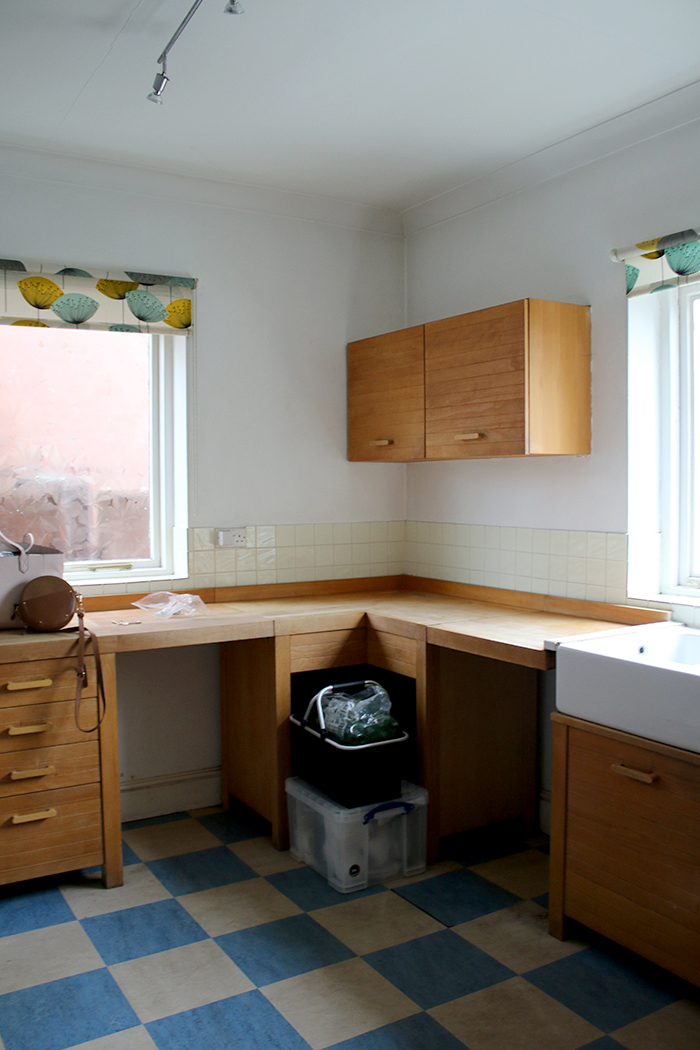
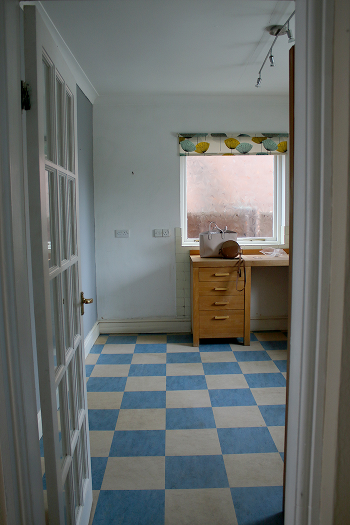
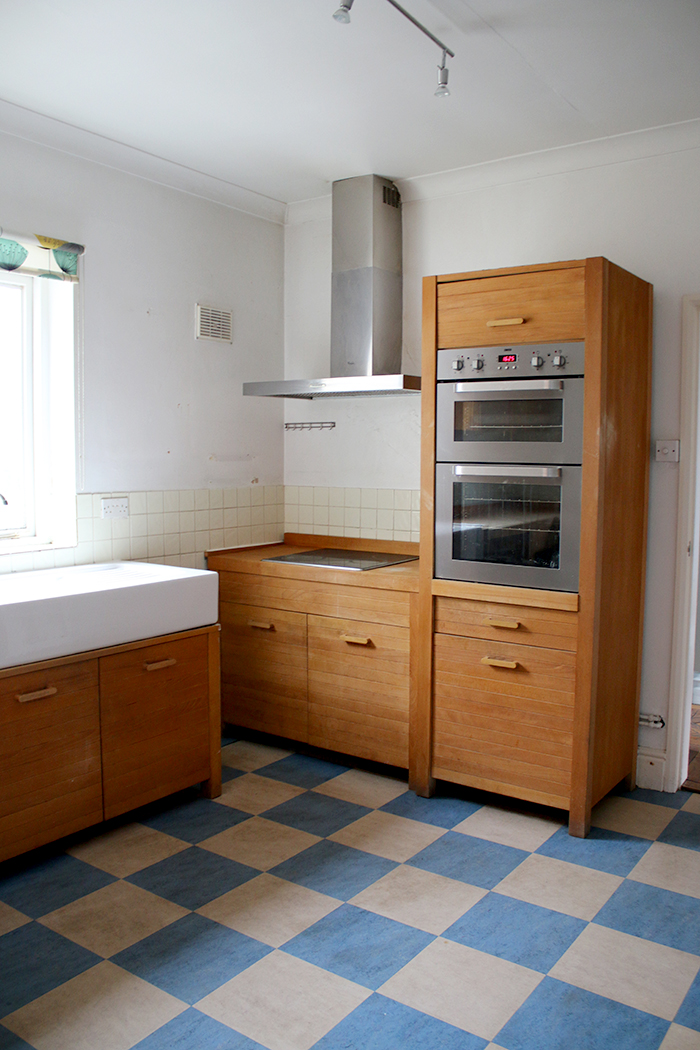
Here’s what it looked like when we moved in…
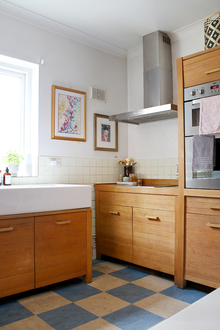
As a bit of a reminder, here’s what we were faced with when we moved in (you can see the whole empty house tour here). The kitchen is in the back of the house and north-facing which means despite the fact there are two windows, it’s pretty dank and grim back here most of the day (not helped at all by the decor). The units themselves are actually not that bad (I’ve had a few people remark they actually quite liked them) and while they aren’t really my style, they aren’t in terrible condition.
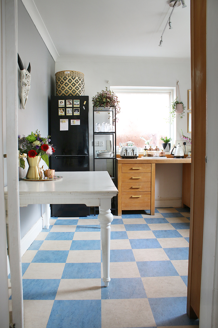
What is in terrible condition, however, is that flooring. It doesn’t matter how much I clean it, it remains looking dirty and ugly and stained. I’d guess they’ve been in here for quite a long time but the blue and beige colourway just doesn’t do the space any favours at all and it desperately needs ripping out. I absolutely detest it.
The walls are in desperate need of patching and painting as well. There are marks, stains, holes and chipped paint pretty much everywhere in the room and there’s one inexplicable blue wall that doesn’t even match the flooring. It’s just very tired and very unloved. The lighting is also awful – 90’s cheap chrome spotlights – not my favourite way to light up a room personally but there are certainly better alternatives on the market today.
So… here’s what I’ve done to essentially dress it up for now and make it a bit more of a livable space…
Updating our ugly kitchen
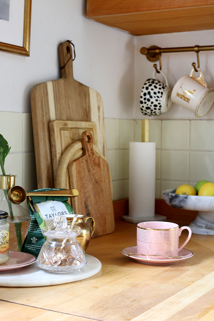
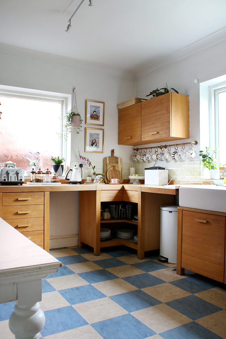
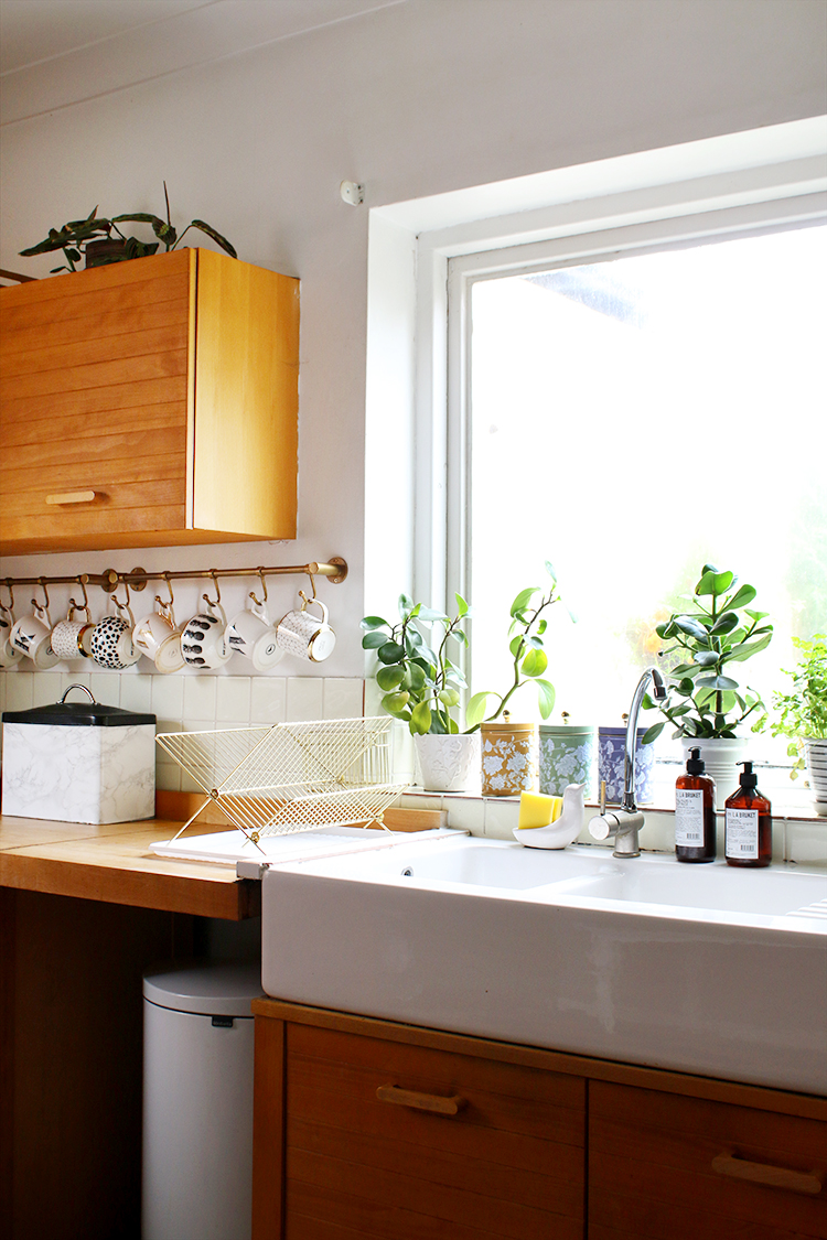
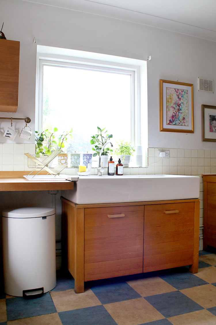
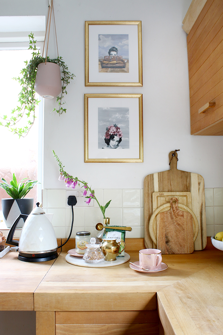
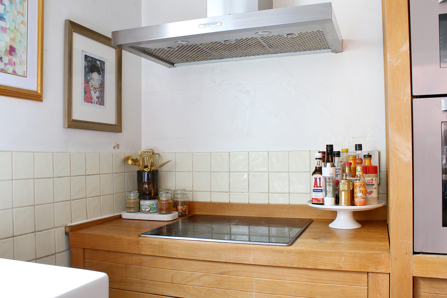
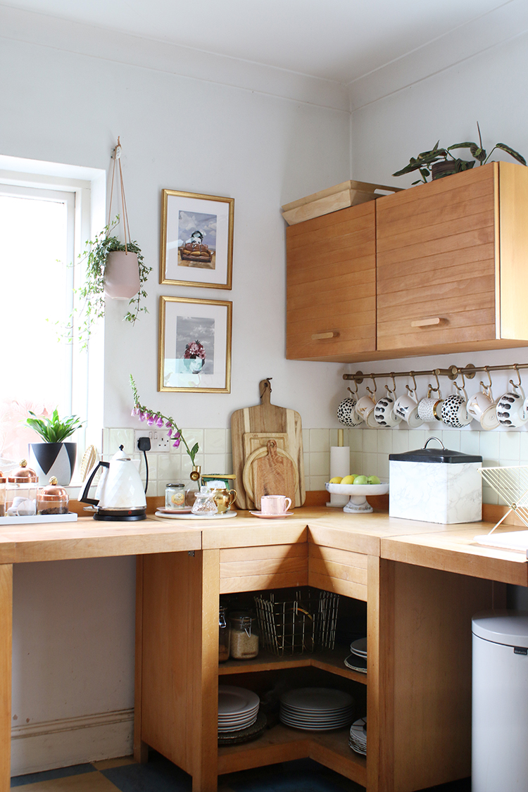
So this is what the kitchen looks like now and here are some of the ways we’ve made it a bit more liveable.
Additional Storage: Something we very quickly realised as we unpacked is that there simply wasn’t enough areas to store all my various kitchen bits. I am a hoarder collector when it comes to pretty kitchenware and while I used to have some lovely open shelving in our old kitchen to store it all, I very quickly ran out of space for everything here.
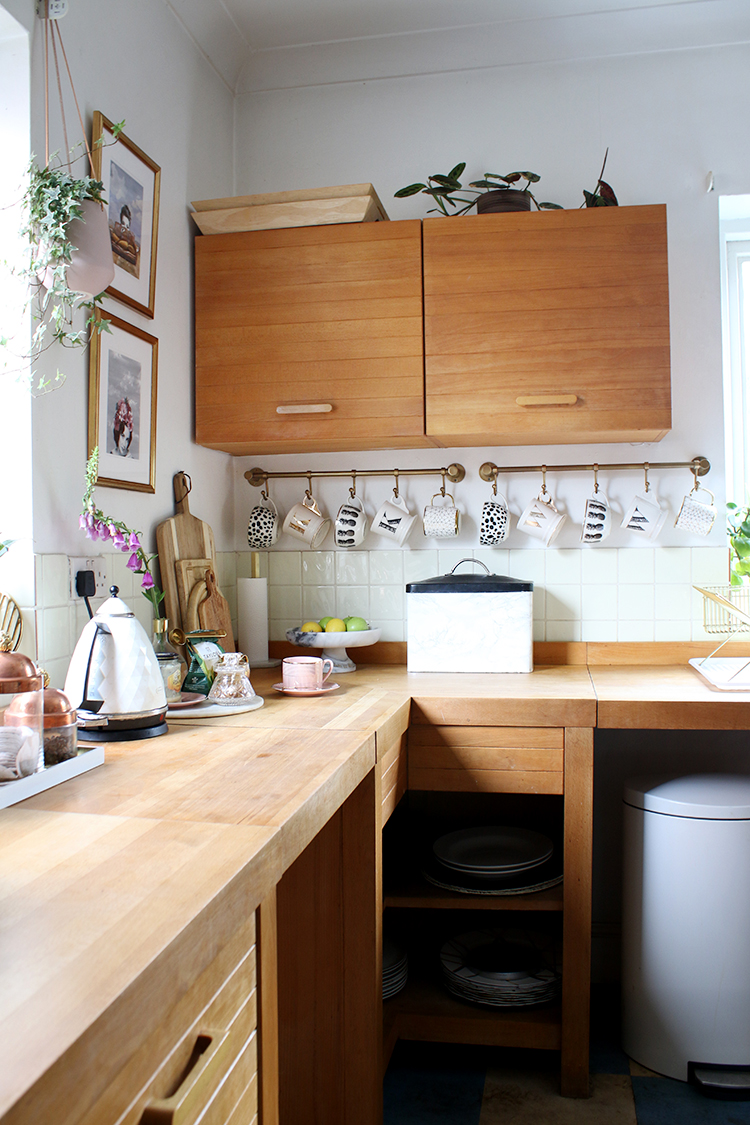
I was able to hang my mugs on the little brass hanging racks under the upper cabinets which allow me a little area for display and utilised the open shelving on the bottom cupboard to house plate sets as well as some of our dry goods.
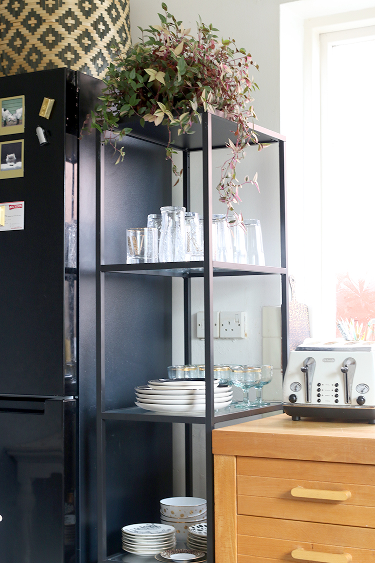
I also moved in the IKEA Vittsjo shelving unit that used to live in our glam cave. It’s been brilliant for everyday items that we are constantly reaching for and it fits perfectly into the gap next to the refrigerator.
Additional Prep Space: You may also notice that we put our old white wood dining table in the kitchen as well. It’s a little worse for wear now as it was stored in our shed most of last year (!) but we figured we might as well make use of it whilst we had it! We also had chairs in here initially and then realised quickly we prefer to eat in the dining room so the chairs were removed. The table, however, comes in handy because there aren’t enough worktops in here and it provides some very necessary prep space!
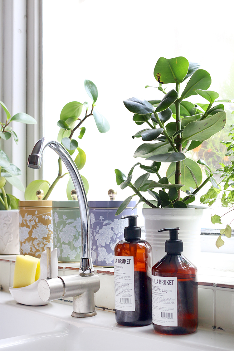
Plants: Aside from additional storage, I also added plenty of plants. There’s just something about lots of greenery that can bring any room – even an ugly one – to life a bit. They are on the windowsills, on the shelving and on top of the upper cupboards.
Art: With the walls being in pretty terrible condition, I figured my best bet was to just cover them as much as possible with framed prints, hoping it’ll distract the eye from the fact that it’s in desperate need of painting. The frames add some depth and interest to my ugly kitchen and just make it feel a bit more like me!
Pretty utility: When your utilitarian items can also be rather pretty, I think you are on to a win-win situation. You’ll notice I don’t have an ugly bottle of Fairy Liquid next to my sink – instead, I have L:A Brucket dish soap and handwash and my pretty gold utensils are in a tortoiseshell glass vase next to the cooker. It may feel a bit like you are rolling shit in glitter but it definitely helps when the kitchen doesn’t look like it’s completely neglected and you’ve just given up on it.
What I’d change in a budget makeover (if we were doing it)
If we were not planning our kitchen renovation so soon (for argument’s sake, let’s say we were going to live with this for a year or so), then there are a few things I’d do to change it on a budget for now. The first thing I’d do is replace the flooring. There are some great inexpensive vinyl flooring products out there right now that would go a long way in brightening up this ugly kitchen!
Because the cabinets are wood, I wouldn’t go for a wood-effect flooring in here but perhaps flooring that mimicked the look of slate or marble. Even a vinyl that resembles patterned tiles would bring it up to date and give it a bit of contrast.
I’d also patch and paint the walls. Because the room doesn’t get a huge amount of light, the current white just looks dirty (trust me, it looks better in the pictures and that’s saying something!) and so I’d probably opt for something in a soft grey or greige colour.
The tiles are pretty ugly as well. I desperately wish they were white rather than a yellow-cream colour but you can get some amazing tile stickers these days that would cover those ugly tiles right up. Another option is to use tile paint. I’d probably just go with white in here to freshen it all up but if I wasn’t going for a patterned floor, then a patterned tile sticker might be fun too.
I’d replace the lighting as well, swapping out those ugly chrome spotlights for something simple in white to blend in with the ceiling!
Those big gaps in the lower cabinets would have to be rectified as well. The most likely solution is that I’d get a dishwasher for at least one of them but on a tiny budget, I’d opt for putting a curtain across the gaps to hide the bin and then hide additional storage behind the other.
So that’s what I’d do if we weren’t going to be creating a new kitchen in our home. There are a lot of things about this kitchen which I would change (okay, let’s be honest, it’d be ALL of it) but well, for now, it’s just going to have to do and these little changes and additions I’ve made have certainly made it so that I can tolerate it just a little while longer! I am thinking of pulling together a blog post with lots of cute budget decorating ideas for kitchens to give it a revamp for a really low price so stay tuned for that. In the meantime, I’d love to know: Do you have an ugly kitchen or did you have an ugly kitchen you had to live with for a while? What did you do to make it more liveable? The comment box awaits!











I apologize if you discussed this, but is there something really strange about the arrangement of this kitchen?
Even galley kitchens, probably my least favorite design, at least make sense.
Why is the cooker off by itself? It’s almost like it’s an afterthought.
I think I mentioned how horrible it is in the past – it’s absolutely IMPOSSIBLE to cook in because nothing makes sense in the layout! That’s part of the reason why we added the table in there as we needed somewhere to set down things when they came out of the oven or off the hob – truly truly awful layout xx
I can’t wait to see your solution.
I’m certain that it will be just as beautiful as your last kitchen was!
You’ve done such an amazing job bringing it to life, I love your styling and everything you do. You’ve made a dreary space so much nicer.
You have a magic touch, Kimberly! You can prettify anything :-). Bet you can’t wait for your renovation and a lovely new well-functioning kitchen though!
My name on this comment was supposed to say Meera!
Really love yr magic touches and details but I also really like yr kitchen. Looks like many of the kitchens that’s installed in the 70s houses here in Denmark, which are quite popular. Can’t wait to see yr new reno, what an energy👊🏻👊🏻👊🏻
Great post Kimberley and very much like the existing ceramic sink and you’ve done wonders making it Swoonesque!
You make even that ugly kitchen look great! I agree – that floor is just awful!
Looking forward to seeing the new kitchen!
Susan
Love it! You always do good work. Would really like to see you do up a really tiny kitchen and studio space.
I think I’d cover most of that floor with a rug!
We’ve been living with a horrible kitchen for a couple of years and hiding the questionable flooring helps.
I live in a rented house and whilst the kitchen is useable, its pretty damn ugly! I am having to live with it a bit longer and totally agree that plants improve the look no matter how ugly! Love your blog/home, cant wait to see the reno!
OMG that floor is disgusting but otherwise I think it’s not so bad…..looking forward to seeing the makeover though.
Fairly Lights!! Whilst we were saving up for our dream kitchen for 5 years apart from painting the mint green walls plain white we had a large chrome bakers unit from our previous garage that we used for all our china storage on top and food in baskets on lower shelves. The whole thing was then wrapped in fairy lights. At least it made me smile! Your units are really quite nice but that layout and floor – well done for making it bearable but I can honestly say i cannot wait to see the new extension and kitchen. :-)
I think you have done a fabulous job of “rolling shit in glitter”! That phrase made me laugh!
I feel your pain, we lived for 3 years with a tiny corridor of a kitchen while we saved up to move it to the dining room, and it was utterly ridiculous trying to cook in there, even if I did my best to make it look okay. I actually liked the solid wood units though, but the rest was totally dated, so we moved them to the new kitchen last year, updated the handles etc and added marble quartz worktops and now I love my kitchen…even if it is STILL not finished yet! We need a new floor (coming soon I really hope) and a mantel and to finish the paintwork and hang things on the walls and get a shutter for the front window and then maybe we are there. But it is still a million times better, so even if we’re living with a less than perfect kitchen, it’s way more perfect than it was. Just a little while to go til it is actually perfect! Can’t wait to see what you’re going to do with yours – any plans for moodboard posts?xx P.S. You may have inspired me to blog about the state of our house right now, eek!
I’m amazed! It looks a million times better already just by being styled really well! You clever thing you!!
You are very wise to get the kitchen sorted out as the first project. We lived with a temporary one for 8 years and then we were just putting the last tiles up as it went on the market!.
Thoughts……Do you have one of those indoor/ outdoor rugs from your old place which could go on the floor?
That grout/ silicone behind the sink would bug me . I used HG Mould Spray on a shower where the silicone was going black and it was amazing. Less than £5 from Amazon.
You kitchen isn’t ugly …. there’s a lot of potential… well done 🙌🏾
Wow you just breathed in a fresh breath of charm. Totally love it
I find myself in a very similar situation… expect the planned renovation will take place in 2046. So I may have to live with it for a few years. You’ve given me a few tips to tackle a mini-renovation, though!
Great blog post, i find it interesting how you managed to come up with such creative ideas! We have 19 displays up in Yorkshire, some are straight runs which would be perfect for small spaces. We would love you to visit us and feature our showroom on your website! There’s a coffee in it for you!
Amazing ideas. I love this. Everything looks very beautiful. Thanks for sharing.