Now if you haven’t read my previous post about investing in trends and how trends actually work, then I would implore you to go read that post first. Why? Because the whole idea that one trend is IN and one trend is OUT is actually ludicrous as trends just don’t work that way. There is no date at which something officially becomes old-fashioned so you’ll still see lots and lots of the trends from this year still going strong in the next. In fact, I resisted the urge to do a big trend post because I keep seeing things like, ‘Velvet is going to be huge in 2019!” and I’m like, Hang on… isn’t that already a big trend? and wasn’t it on 14 other lists in 2017 as a ‘big trend’ too? So yeah, it all gets a bit hard to keep track of as things just overlap from one year to the next.
However, I thought I’d just highlight a few things that weren’t necessarily huge mainstream trends over this past year and ones I’m actually pretty excited about, simply because they feel a bit different and fresh to me. Remember the bell curve in the last post? Well, I’ll let you know where I see them falling as I go through them now… (see, that’s why you need to read that one first. Go on. Do it now. I’ll wait.)
Beige is back
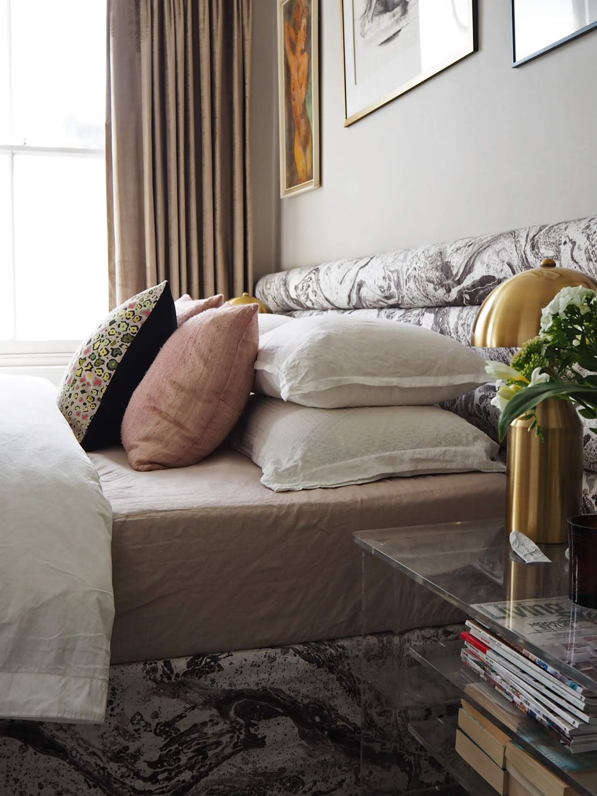
Image: Bianca Hall from French for Pineapple shows just how gorgeous beige can look.
We’re hearing a lot about grey being ‘out’ which, for all intents and purposes, really isn’t ‘out’ at all… Okay, so its bell curve has been HUGE AND LONG and so it’s likely just at the stages of ‘late majority’ in the curve now that everyone and their mother has a grey lounge. But I promise, you don’t have to repaint or get rid of that beautiful grey sofa you have so there’s no need for panic here – grey still has a place. However, there is another neutral that’s sneaking up at the moment which I’d say is at the ‘early adopter’ stage right now. And yes, that’s beige. Now, we aren’t talking magnolia here. We are talking about beiges that are just a bit less yellow than that – warmer, greyer beiges with just a hint more softness.
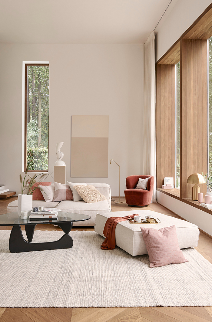
Image: H&M Home
Now, 10 years ago, I would have scoffed at the idea that I would like brown shades. But, well, the more I see it, the more I’m liking it. I painted my lounge in Dulux Dusted Moss (a soft warm grey) back in 2010 and visiting friends and family thought it was bizarre (although most admitted they quite liked it) because it just felt really different. And now, after 10 years of grey shades dominating neutrals, beiges and taupes are suddenly feeling that little bit warmer and that little bit different as a backdrop to other shades.
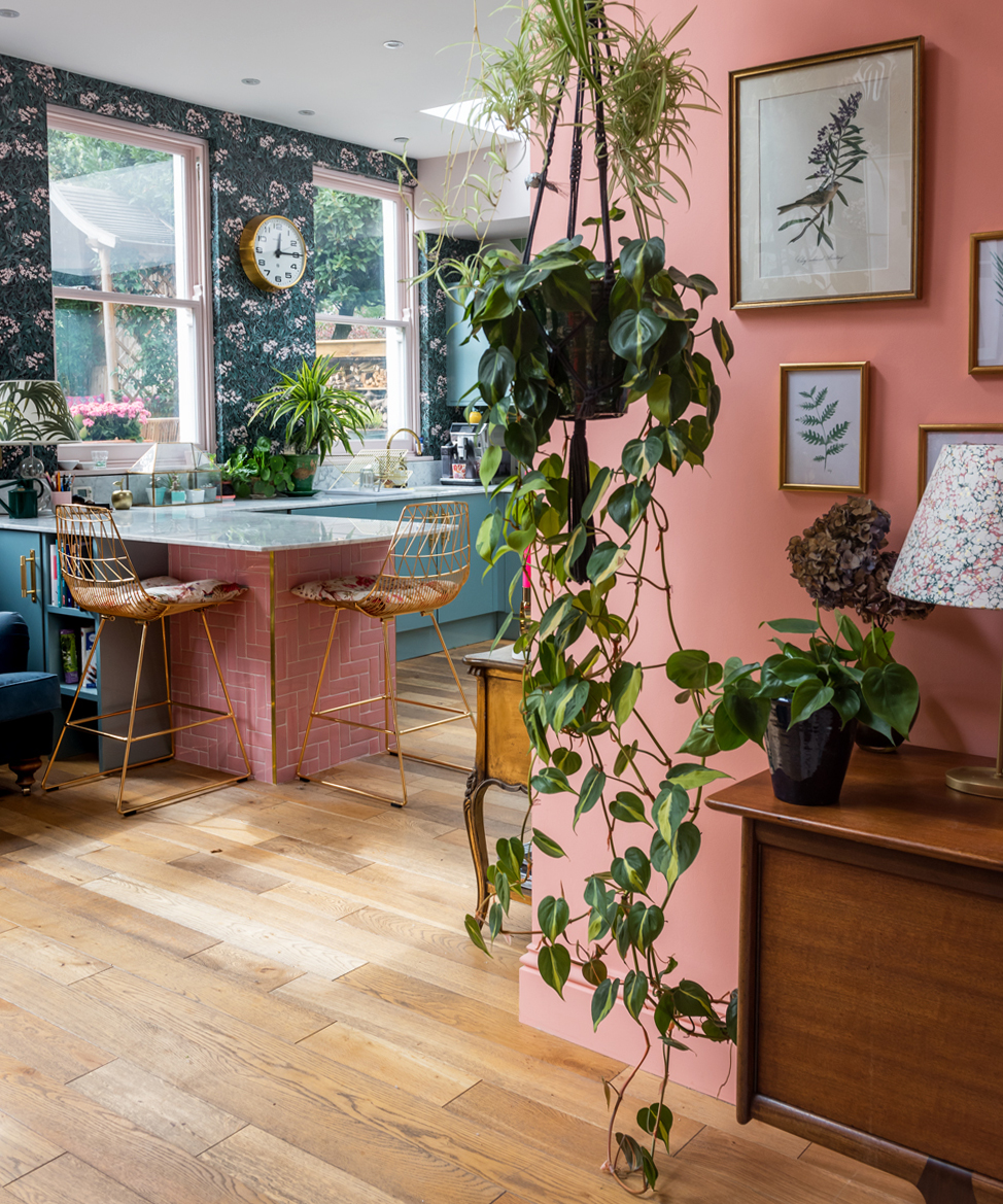
So peachy
Image: Emily from The Pink House’s fabulous playroom in Painthouse’s Ida, a peachy pink that plays nicely with all the bold colour happening in the kitchen
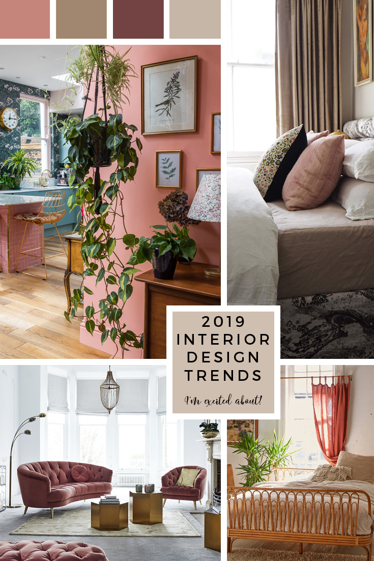
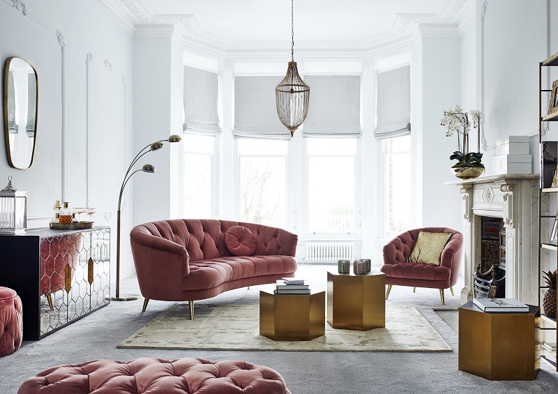
I said ages ago that peach was going to be big and well, it is. It’s at least at the early majority stage now as I’m seeing more and more get on the peach trend and more brands bringing out pieces in this 80s favourite. It’s colour cousin, the (still popular) blush pink, looks beautiful with it and if you want to ramp it up a bit, go with a darker rust colour or combine it with burgundy. I’ve been barking on and on about those kinds of colours all over my blog over the last year and I’m still excited by that whole palette.
Basically, any shade of orange – from coral pinks to pastel peach to dark rust to deep chocolate browns are going to be winners in 2019.
Warm Whites
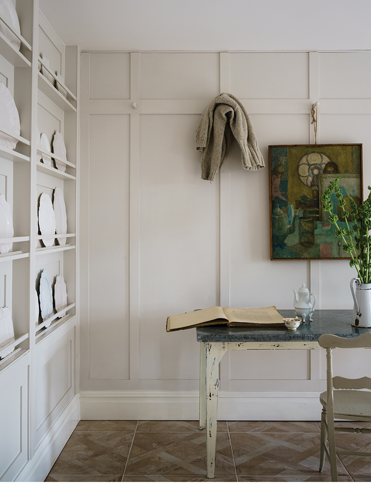
Image: Farrow & Ball School House White
I think people are moving away from brilliant white as a base and leaning more towards shades that add a bit of warmth to a room. After looking at a whole bunch of samples, ‘School House White’, one of Farrow & Ball’s new colours is a great way to introduce yourself to the trend. It’s not technically a beige but rather a really lovely warm white that gives you a little bit of saturation without screaming and it’ll contrast nicely with any white woodwork or ceilings.
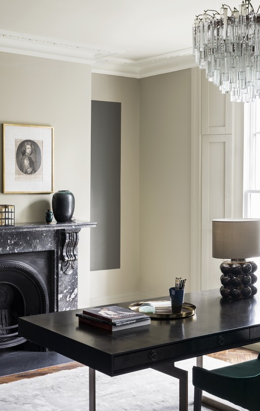
Image: Paint & Paper Library using Wattle V / Photo: Paul Raeside
While brilliant white is still a good solid choice for a simple and no-fuss background (we used it in our bedroom makeover), if you have a room that doesn’t get quite as much natural light, then a warmer, softer shade of white with just a hint of pigmentation will give you a similar look with just a bit of softness.
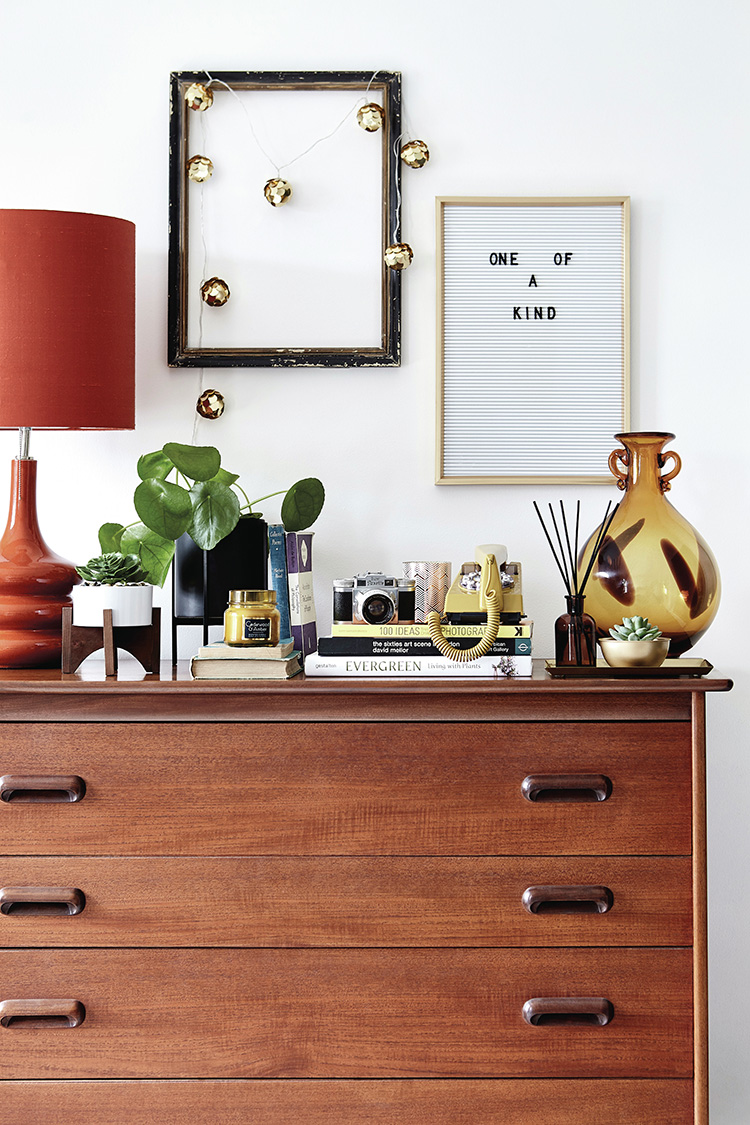
Return to the 70s
Image: Primark
Now this plays a part in why all these warm shades like beige and rust and orange are so big right now. They play right into the retro feel of the 70s which suddenly feels a bit cooler than what we have been seeing for the last decade or more which is mid-century modern. Again Mid-Century modern isn’t ‘out’ – it’s again just in the ‘late majority’ stage so you can still indulge if you love it.
Image: Urban Outfitters
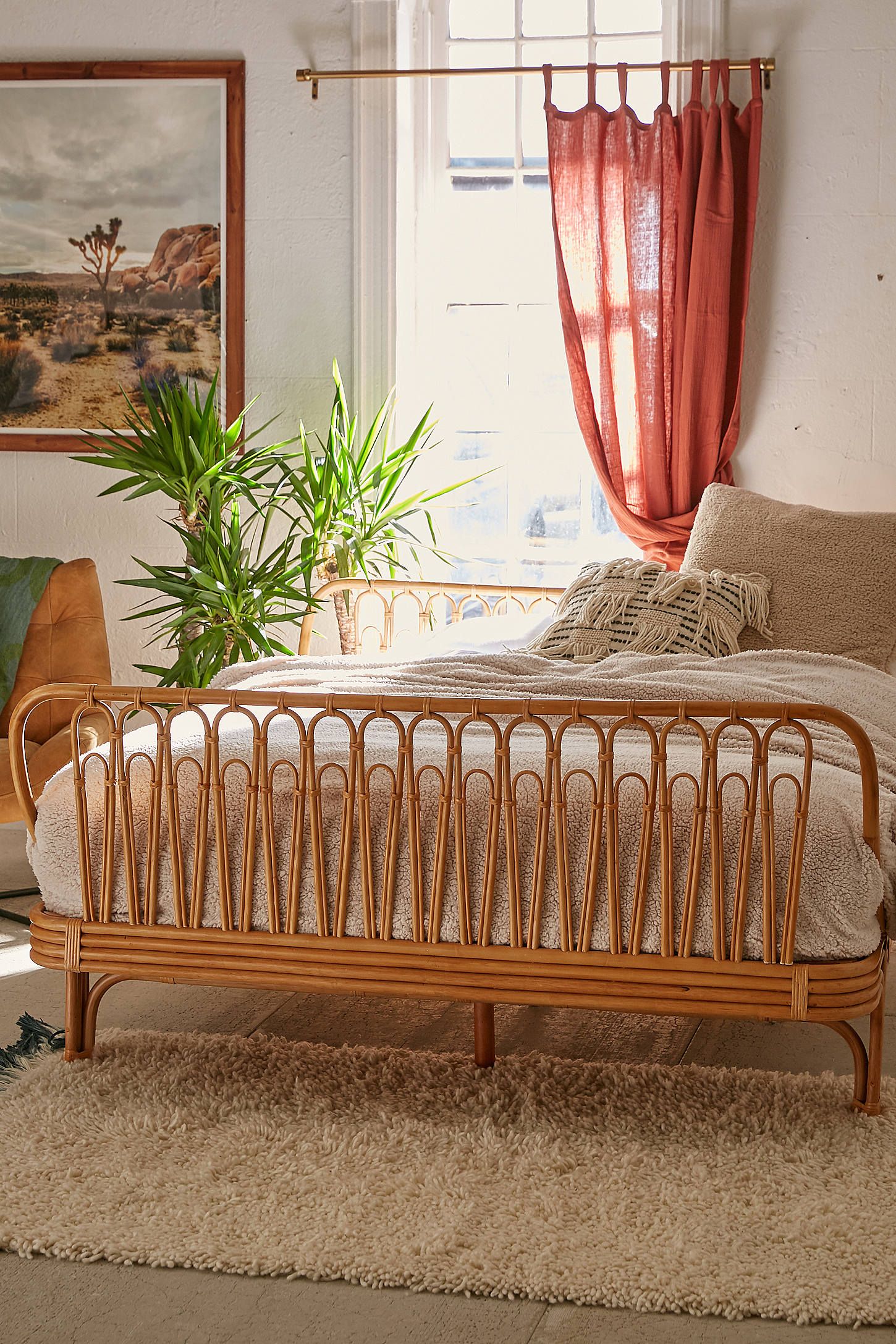
This look is more in the early majority stage (even if it was on my 2018 trend post) but this time around, I’m seeing a lot of rounded sofas and plenty of fringing on everything from sofas to lampshades to mirrors and more – huge news if you want to get into the 70s vibe ahead of the curve. Of course, the whole boho look is still going strong but this definitely has a bit more of a retro vibe with lots of natural textures, woven furniture and lots and lots of shades of orange and beige. Yes, I was a small child in the 70s so while I personally can’t see myself recreating our orange and black floral wallpapered bathroom from my childhood home, there’s still little hints of the colours, textures and shapes that feel at once both nostalgic and new.
Speaking of curves…
Image: Barker and Stonehouse
In fact, round shapes are pretty big news right now. Curvy tiles, curved sofas, round dining tables – the circular shape will soften all the straight edges of a room and give it a bit of a feminine vibe. It’s a bit of Art Deco influence coming into play and probably a reaction to all the straight, hard lines of Mid-Century modern. In an uncertain world, I think people are looking for soothing organic shapes and well, curves in a room do feel that bit more relaxing and inviting.
Trends that are still on the high point of the bell curve…
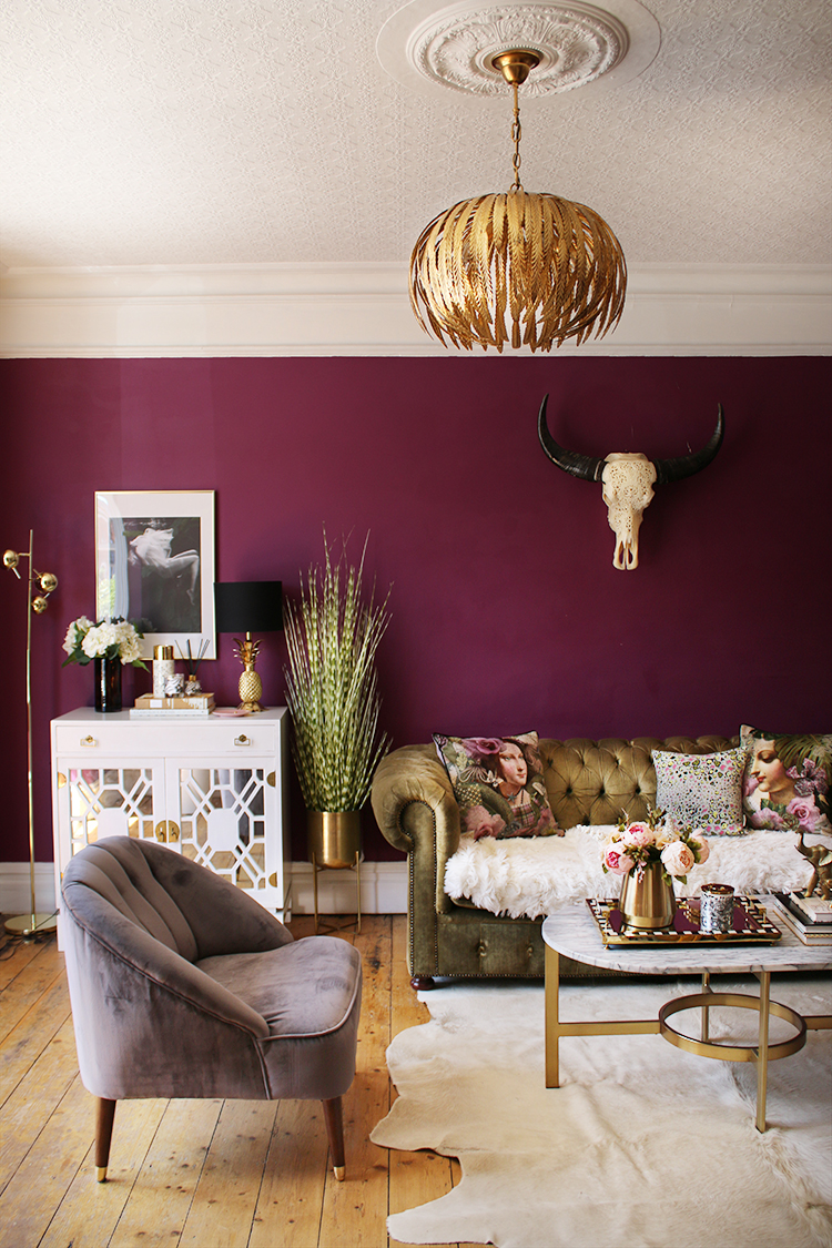
So this is the stuff that’s still at the peak of the bell curve or in late majority stages which means they’ve been popular and are likely here to stay at least through next year and possibly beyond: Velvet everything, brass and gold, blush pink, large format artwork, handcrafted and artisan pieces, bohemian styles, Art Deco-influenced furniture and design, mixed material kitchen and bathrooms, herringbone flooring… you get the idea. Pretty much everything that was really popular this year and many of the things I predicted over a year ago are still strong trends and continue to dominate the design world so you can still have fun with all of those.
And, of course, I still love plenty of those things as indicated in my living room above! But the trends I highlighted in this post are the ones that feel fresh and different to me and therefore, I’m a little excited about incorporating at least a few of these into my home over the coming year. What about you? Any trends you’re seeing that you’re excited to try? Let me know in the comments!















I love the new darker brownish-grayish-beige colors and they even work well with the gray walls that everyone, including me, now have. Adding these colors as draperies, furniture upholstery, rugs or accessories, is a good way to introduce them into our homes without changing wall color. I plan to do just that to update my living room look and from what I’ve seen so far, it will be amazing.
Thanks Pat – agree, they work really nicely with greys as well, a totally versatile neutral. I’m painting my dining room tomorrow in a lovely browny grey and I already have grey curtains in there so I’m thinking it’ll all layer rather nicely :) Best of luck with the living room update! xx
Currently giving my house a bit of a refresh for Christmas so it’s interesting to see what’s out there! I could do with a bit of advice though. It’s “easy” enough to decorate all the pretty rooms that we live in but I’m currently revamping my utility room. It’s tiny and so I’m getting the joiner to make some units to try and make it a more useful space. It’s going to be all MDF so I want to paint them the same colour as the walls. How do you make a space like this interesting? I don’t even know where to start. I seem to have rejected every colour!
Hey lovely, we’ll be doing our own utility space next year but if you think about it like a ‘tiny kitchen’, decorating it is similar. Why not paint the units in a slightly darker colour than the walls? Or consider some butcherblock worktops to warm the space up and hang some shelving and artwork? Or use pretty tiles for the flooring (or consider patterned vinyl that looks like tile if you are on a budget!).
I have a Pinterest board that I recently started to provide me with some more inspiration: https://www.pinterest.co.uk/swoonworthyblog/utility-rooms/
and my friend Fiona from Fifi McGee just updated hers on a budget: https://www.instagram.com/p/BpAHVUqF4fi/
It came out SUPER cute with lots of DIYs (see her highlights under ‘mini projects’)
Hope that helps! xxx
Also think the indoor plants is the next trend really compliments the room, lovely x
Interesting and lovely colors are coming to trend. I liked the peachy combined with green plants and some golden touch
I have seen all of this come and go about 20 times . Designers do not follow trends
Diana, of course, everything is cyclical (I was around for a few of these too so they aren’t anything new) and I didn’t say designers followed trends. In fact, if you read my previous post which I reference in this one, I actually say designers and innovators create them and others simply follow. Not the other way around. x
Kimberly . I said that designers dont follow trends and it was no criticism of you at all …just my view after 25 years ! I think your site is wonderful by the way …very inspiring
Oh, I didn’t take it as criticism, just wanted to clarify! But thank you – that’s really nice of you to say ;) x
Keep up the good work …I teach interior design and have your site on my ‘must see ‘ sheet for the students xx
Oh wow! Aww huge thanks! :D xx
A couple of years ago I was given my grandma’s red velvet sofa – curved back, capitone, fringing – I always loved it, but was almost wishing it was blue-teal…! So glad the current /new trends will be giving me inspiration on how to style around it (I do still love it, even red!).
I think you are spot on! love your forecast….
Sarah
at ReVamp Boutique
Well articulated Kimberly! Thank you very much for sharing your knowledge with us about these amazing styles.
I see more elements of pink on some interior homes this year. In part on particular walls as with 80s Retro Art with slight geometric design concepts in Art, and I do feel more asthetic on all things organic and a meditative type Holistic approach to things being more visually fluent on the eye that calms the mind with nature coming into the home again but more on the influences of a Asian naturual beauty spar. With water and bamboo and naturual woods.
Hi, great article here. I’m interested in your views on custom made wooden furniture and designs/ trends in that field. Do you have any views?