Long long ago, back in 2012, I made a massive discovery and decided to share it on my blog after I’d revisited painting my Edwardian Home’s living room. This living room had a picture rail – ya know, the bit of moulding that goes around the entire room about a foot (more or less) below where the coving meets the ceiling. In years gone by (and probably still now), people used these to hang pictures from (thus the name) so they weren’t having to put nails into their walls.
This is quite a desirable feature for a lot of period houses. You’ll see picture rails used in Victorian, Edwardian, 1920s and 1930s houses – it’s pretty common. And when I’d moved into my home back in 2010, I noticed that the previous owners had only painted up to the picture rail and then above that point, it was painted white along with the ceiling. I’d seen so many people do this in their own homes, I just assumed that was the ‘done thing’ and repeated it in my living room.
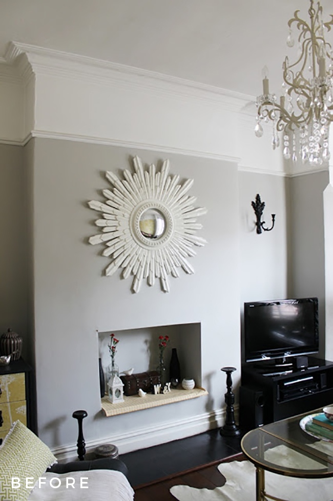
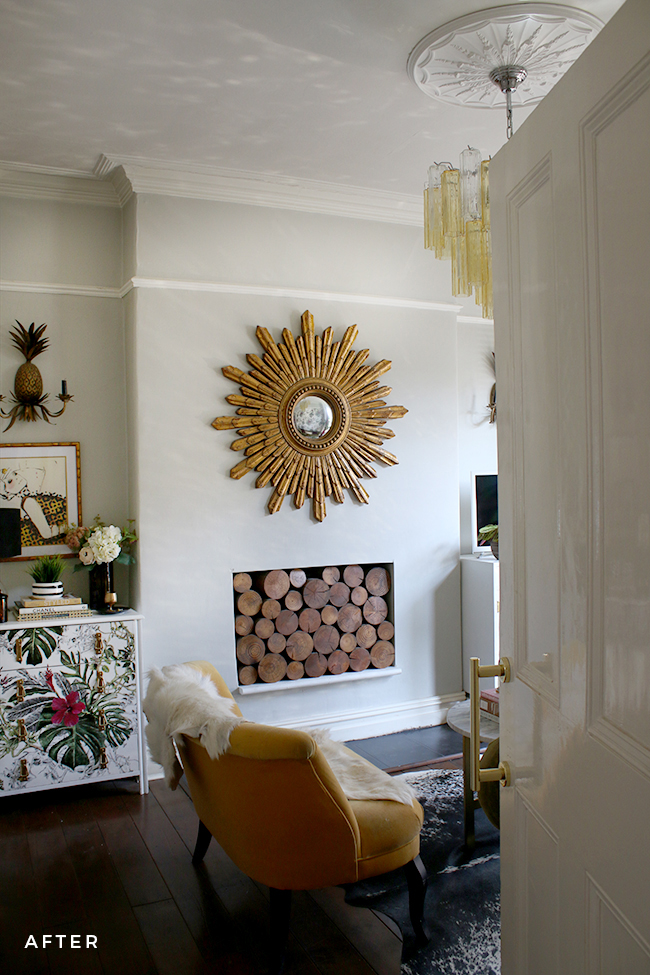
It bothered me though. Despite the fact I’d used a pale grey colour (Dulux Dusted Moss 2 for those wondering), my lovely high ceilings didn’t look all that high. I decided, after painting my bedroom, that I would revisit the painting in this room and so I painted above the picture rail to see if it made a difference. It did. In fact, I was shocked by how much taller my ceilings looked.
I shared my findings on the blog. Crazy thing? That one post has remained one of my most popular posts of all time. More than 50,000 views on that post alone and it hasn’t ever slowed down. Now, the first shot was taken in 2010 and the second was taken in 2017 so yes, of course, there’s a difference in the decor. But hopefully, you can see that such a subtle change in the paint colour above that picture rail has made the ceilings look higher. Were I to do it again, I’d have painted the picture rail out in the same colour as the walls rather than leaving it white. Live and learn though.
But why is that post so popular? Clearly a lot of people Google this question and for good reason. Yes, it’s the done thing but why? Why is it the done thing? I’m American and so it was something I’d never come across before in US homes and despite having lived in the UK for 18 years and despite seeing it done over and over and over again, from normal common folk to experienced interior designers, I still am not really sure. Whatever the reason, it seems a lot of people are questioning this too and thus the reason that blog post continues to get so much traffic. I figured 7 years later, it was time I revisited this subject.
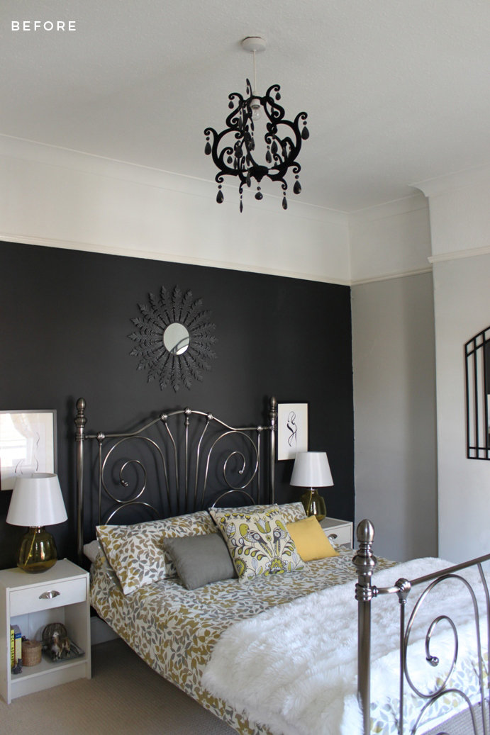
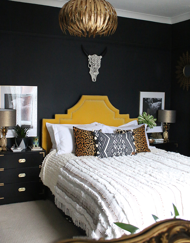
Since that fateful trial run, I’ve done it again over and over. Every single room I’ve ever had with a picture rail, I’d take the wall colour and go right up to the coving. I did it again in my bedroom in that house, painting the rail the same colour as the walls (this time in Dulux Night Jewels 1, a nearly-black slate grey) and it made a massive difference to the whole feel of the room.
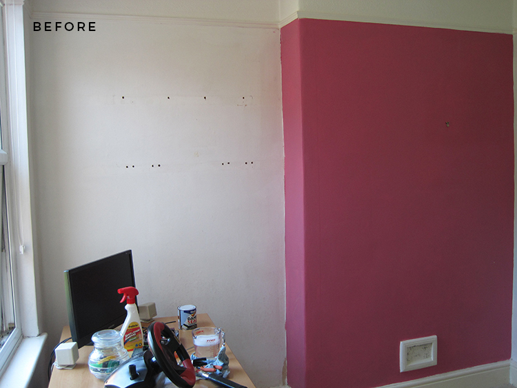
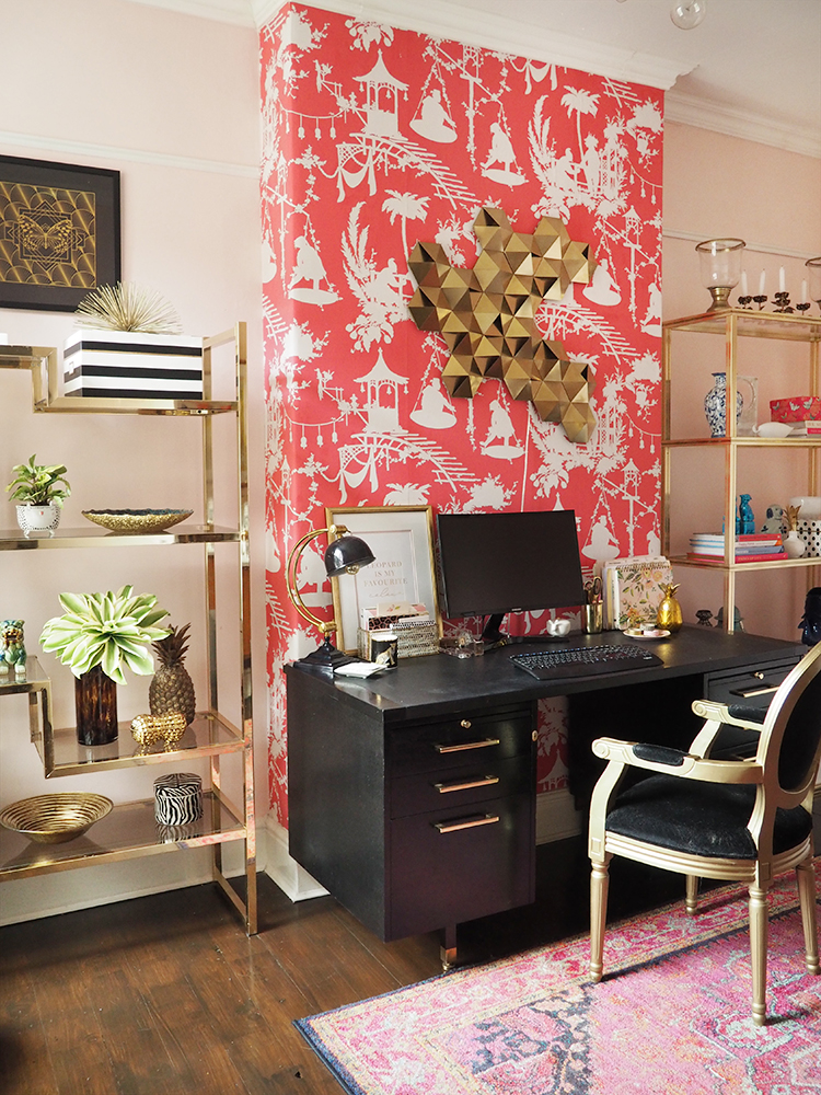
I did it again in my old home office.
The ‘before’ shot was the only one I could find from when we’d first moved into the house in 2010 so apologies it’s not that great but you can see the difference it made, taking that colour all the way to the ceiling. I even (shock horror) removed the picture rail along the chimney breast and wallpapered right up to the ceiling. Big difference.
As a side note, because I know I’ll be asked: what about wallpaper? Should you wallpaper above the picture rail? I’d say, in most cases, yes, you should. Paint out the picture rail (first, before you hang the wallpaper) in the same background colour as the wallpaper if you want it to blend in or be a bit adventurous and take an accent colour from the wallpaper and use that instead for your picture rail. But yes, you’ll have the same effect of the walls being taller and thus your ceilings looking higher.
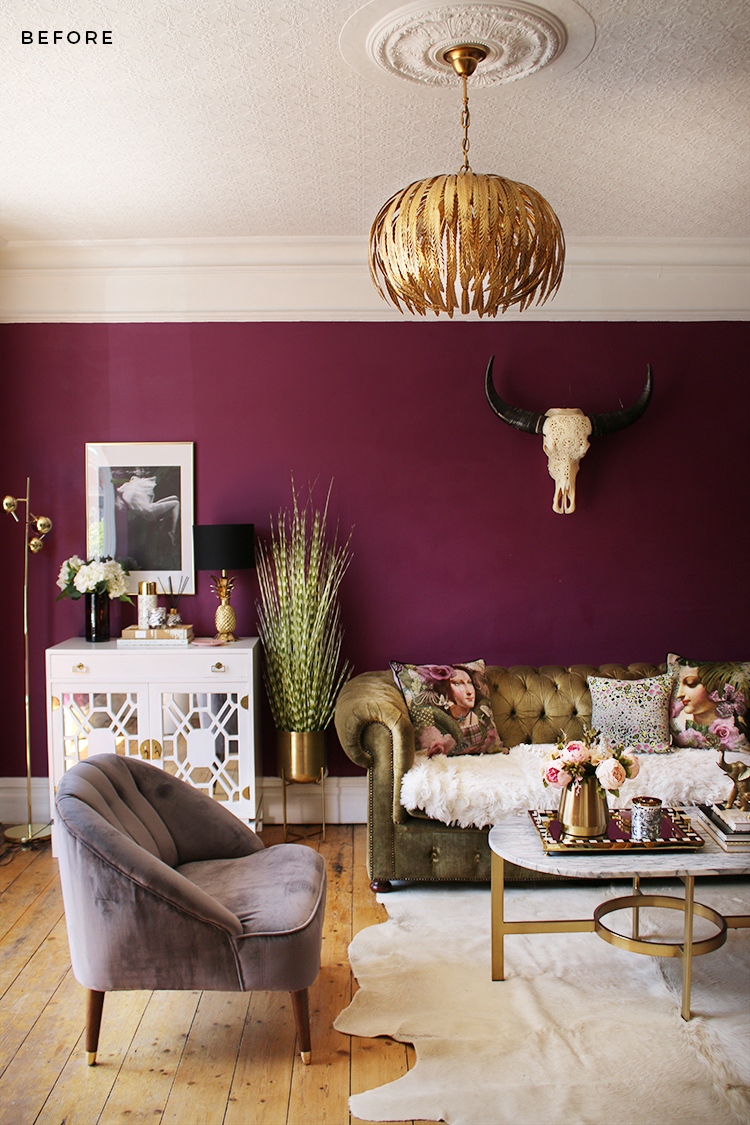
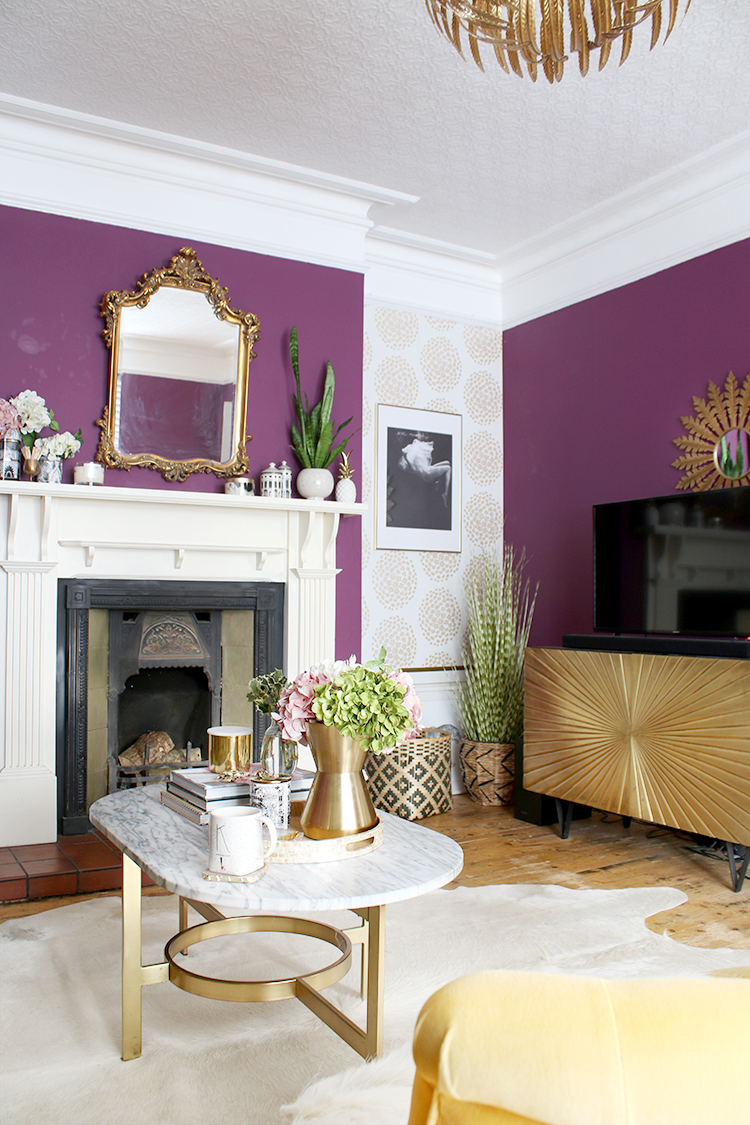
When we moved into our current home, I noticed once more that the previous owners had taken that dark berry colour in the living room only up to the picture rail, leaving the wall above the picture rail white along with the ceiling. It seriously annoyed me. As in, every time I looked at it, I felt agitated. The dark colour made the room look squat. We have nice high ceilings in this house – why did the ceiling feel so low? It was the ‘picture rail effect’ once again.
Now, I have a feeling that people assume that painting that bit above the picture rail white will make your ceilings look higher. But I don’t think they do. Even with a lighter colour on the walls, the ceilings will appear lower. Darker colour on the walls? The effect is even worse. Why oh why would you want your ceilings to look lower than they are? It completely baffles me.
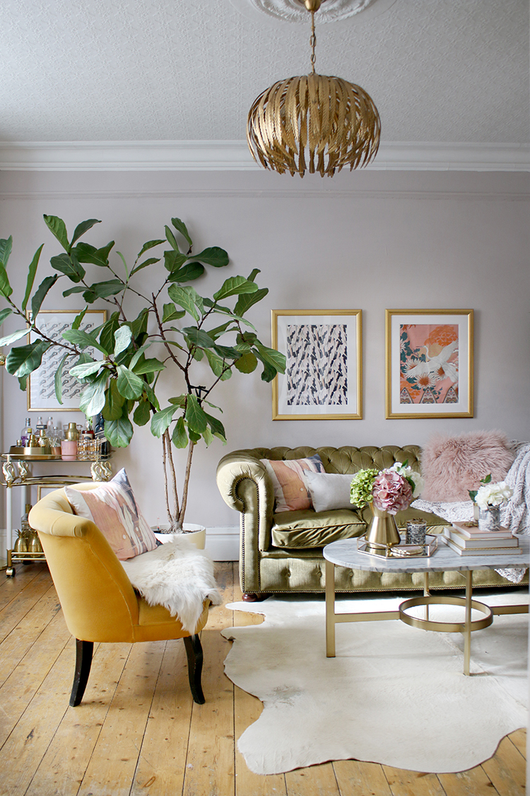
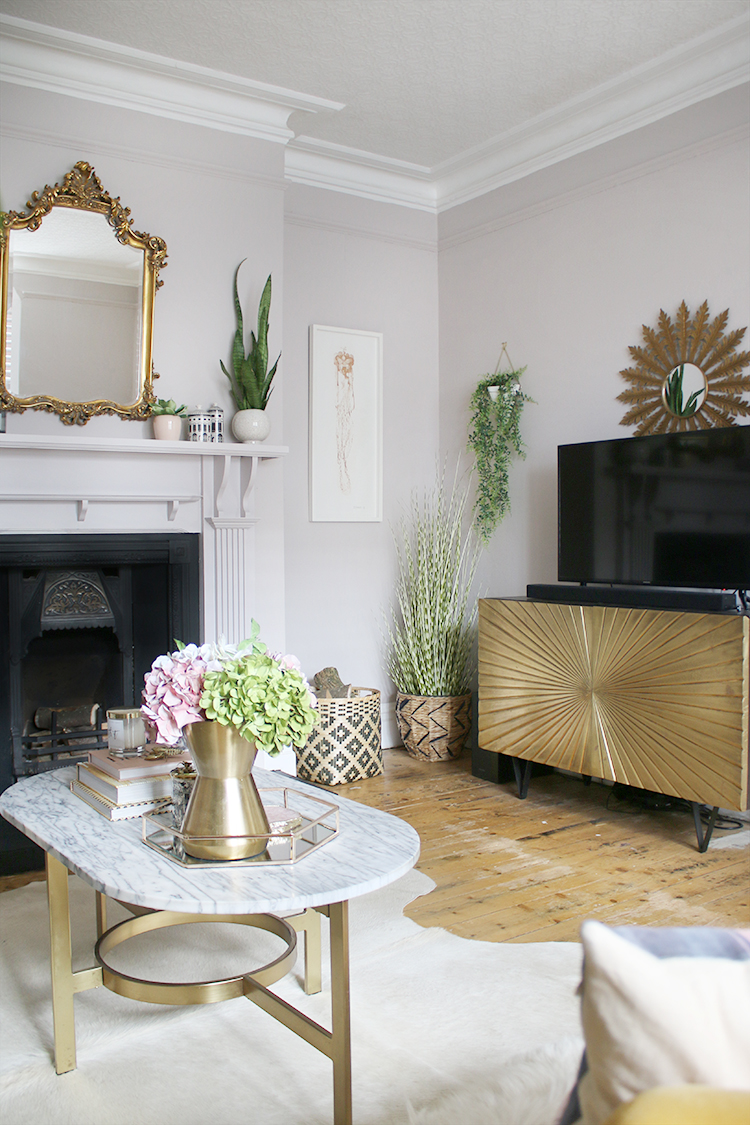
Of course, when I decided to repaint my living room recently, I completely painted out the picture rail in the same colour as the walls and took it right up to the cornice. Such a huge difference. Yes, I’d gone from a darker colour to a lighter one, but the results are undeniable. It felt like the ceiling had lifted and those lovely tall ceilings had a chance to finally shine and in this room, we’re only talking maybe 8 or so inches.
I feel like I’m on a one-woman mission to get people to paint above their picture rails. Currently, there’s a burgeoning trend for painting your ceilings in a different colour other than white and to that I say, fabulous! Do it! Try something new! Or, paint everything in the same colour – from your walls to your ceiling as well as your picture rails, coving etc. for a total wrapped-up-in-colour effect. But if your ceiling is a different colour to your walls, then no, don’t take that ceiling colour all the way down to meet the picture rail unless you want your walls to seem shorter. Now, as someone who loves a soaring high ceiling, I’m not sure why you would want to but let’s say your walls are 14 feet high and you want to create a bit more cosiness? Okay, knock yourself out. But otherwise, I implore you, don’t do it.
And just in case you want to see the side by side difference, I present you with my own findings…
So now, over to you guys. I’m sure someone will pipe up and say it does make your ceilings look higher or the room brighter or something but nope, I don’t buy it. I’ve done it in multiple rooms and every single time my walls look taller and thus, the ceilings look higher and the room bigger, no matter whether it’s a light or dark colour. But maybe someone can explain this strange trend here in the UK to me? And if not, after seeing these pics, would you consider taking your paint colour all the way to the ceiling next time? Let me know what you think! I’m intrigued to hear from all sides of this one!






It’s an interesting perspective and it just goes to show how different people can see the same thing differently. To me all the rooms with picture rails that have walls painted all the way to the coving look like they actually have lower ceilings, and also the picture rail just doesn’t look right to me, ie. the room looks better if it’s removed. In any case, I much prefer painting with different colour up to the picture rail and leaving the rest white. Either way your post is very useful because it helps people see both versions and helps them decide what to do.
How interesting Maya! I wonder if it’s one of these tricks of the eye (do you see two people’s faces or a vase? sort of thing) because to me, it feels very obvious that the walls look higher, thus the ceiling higher. Interesting that it may just be a matter of perspective – of course, there’s no ultimately ‘wrong’ way here ;) To each their own, especially in your own home! xx
You may well be right Kimberly! Also it could be what one is used to. I think I particularly like that below the rail colour division (I’ve lived in old Victorian properties for a long time) so maybe all that contributes to what looks better to me. Either way, I have no picture rails in my new house, it’s a 1930s property and quite artdeco in design, so I won’t be needing to make these choices anytime soon. Best of luck with your renovation, I’m really looking forward to it all come together. xx
Yes, perhaps that’s part of it too – this is what you are used to seeing and so seeing it a different way looks strange to the eye! Whereas from an outsider’s perspective (ie an American moving to the UK), it’s always baffled me! lol Thanks so much lovely! xx
I’ve just wallpapered mine in the kitchen/diner. Walls are white with wallpaper above the picture rail (more of a plate rack I suppose) and I’ve done a feature wall in the same paper. I’m so pleased with it but I was in two minds whether to go for it. There’s very little on Google about wallpaper above a picture rail. I think paint looks great and I’ve seen some beautiful ceilings painted too. I say be bold and go for it. You can always paint over it if you’re not keen. Yours look fab.
Interesting and no, there’s not a lot of information out there! I agree though, you might as well try it and if you hate it, well, you can always remove wallpaper and repaint! xx
I remember reading articles in the 80s, that suggested painting above the picture rails the same as the ceiling,, in order to make the ceilings look lower. So yes, that effect was intentional.
Oh that’s really interesting, Julia! I wasn’t in this country in the 80s so perhaps it’s a left-over thought process from back then when they were installing false ceilings to lower ceiling heights anyway! Thanks so much for sharing that! xx
Dado rails were fashionable then too!
I’ve been interested in interior design since I was a child. I used to love it when my dad brought home the new Habitat catalogue!
I agree with you 100%!
Yay! Thanks Kristen! ;) xx
I agree with painting above the picture rails also, but I do like leaving the picture rail white like the ceiling rather than painting it out, as you did in one of your photos.
So now we have 4 options:
No paint above the picture rail; paint above the picture rail;
paint above the picture rail and match it to the walls; and,
paint above the picture rail but leave the picture rail white like the ceiling and trim.
In the end It all comes down to what is pleasing to the eye of the person who
lives there. Thanks for making us think about this once again.
Agree, it all comes down to personal preference – for me, leaving the picture rail white ‘interrupts’ the eye as you follow it up to the ceiling so you tend to lose some of that tall ceiling effect! But I do think it’s worth thinking about what you want from your room, rather than simply following the done thing ;) so hopefully this post will help people to do that and make a more informed decision! xxx
Well now that you mention it, I agree that the ceilings appear higher when the area above the picture rail is painted the same color as the walls. I’m giving my own white picture rails the side eye now! But at 5’3”,
all ceilings look tall to me! 😂😂😂 What I find particularly impressive, though, is how you took that fabulous mirror frame from flat white to gilded! Gorgeous!
Hahaha! I’m 5’3″ too so fellow shortie here! ;) Ahh I would love to take credit but that is actually two different mirrors! I just loved that style at the time and so I had one in white and one in gold ;) xxx
The side by side help so much. My preference is for same colour up to the roof but with the picture rail in an accent colour.
Sadly our ceilings are only 7’6” / 8”, so I will be going right up to the coving.
Ahh definitely, if you have lower ceilings, then you’ll want to take that right up to the coving – or if you fancy it, you can actually paint the ceilings in the same colour as the walls for an enveloping effect :) xx
Annnnd suddenly I MUST have high ceilings with picture rails in every single room of my future house.
This was a really fun post.
Thanks Kimberly!
Hi Kimberley, I’m one of those people who have Googled this question many times :-) We have painted 3 walls in a gorgeous vintage dark rose colour up to the picture rail, then painted the ceiling and above the picture in calamine but it doesn’t work so are considering painting above the picture rail in the rose but keeping the ceiling in calamine. The fourth wall will be wallpapered but now I’m wondering if we should wallpaper above the picture rail as well now (not sure I can bring myself to break that news to the OH though as he will be doing the wallpapering :-) x
My walls are a light grey and one accent wall is wallpapered with a light grey alligator skin. I painted above the picture rail a darker grey. It didn’t make the ceiling feel any lower and added a bit of contrast.
I agree with you, Kimberly! I am an American living in New England. I’ve been exposed to Victorian-style homes all my life here. Painting above the picture rail is the traditional application for these homes. Which, of course, originated from your side of the pond! While it doesn’t bother me when I visit said homes (my eye is accustomed to it after all), it would most certainly not be my preference in my own. Thanks for your wonderful blog! I look forward to seeing your pretty new kitchen!
In one of my apartments (many years ago), not only was the area above the picture rail painted but it was a contrasting color. The wall was white and above the rail, it was pink.
As to my preference, I guess it ultimately depends upon how high your ceilings are… Mine aren’t all that high so, I have to paint to the ceiling.
Honestly, I like all your befores and afters.