We finally made it, folks. After 6 months of dust, tradesmen and chaos, I’m finally sharing the results of what has been rattling around in my brain for nearly 2 years. I’m not even really sure where to start but I suppose we’ll go back to the beginning. That seems most logical. When we viewed this property back in December 2017, I came home from the viewing and sketched my plans for this space. Before we even knew our offer was accepted, I knew exactly where the new kitchen would go and with the help of some brilliant people along the way, we are finally here, the potential of this house realised and my dream kitchen even better than I could have imagined.
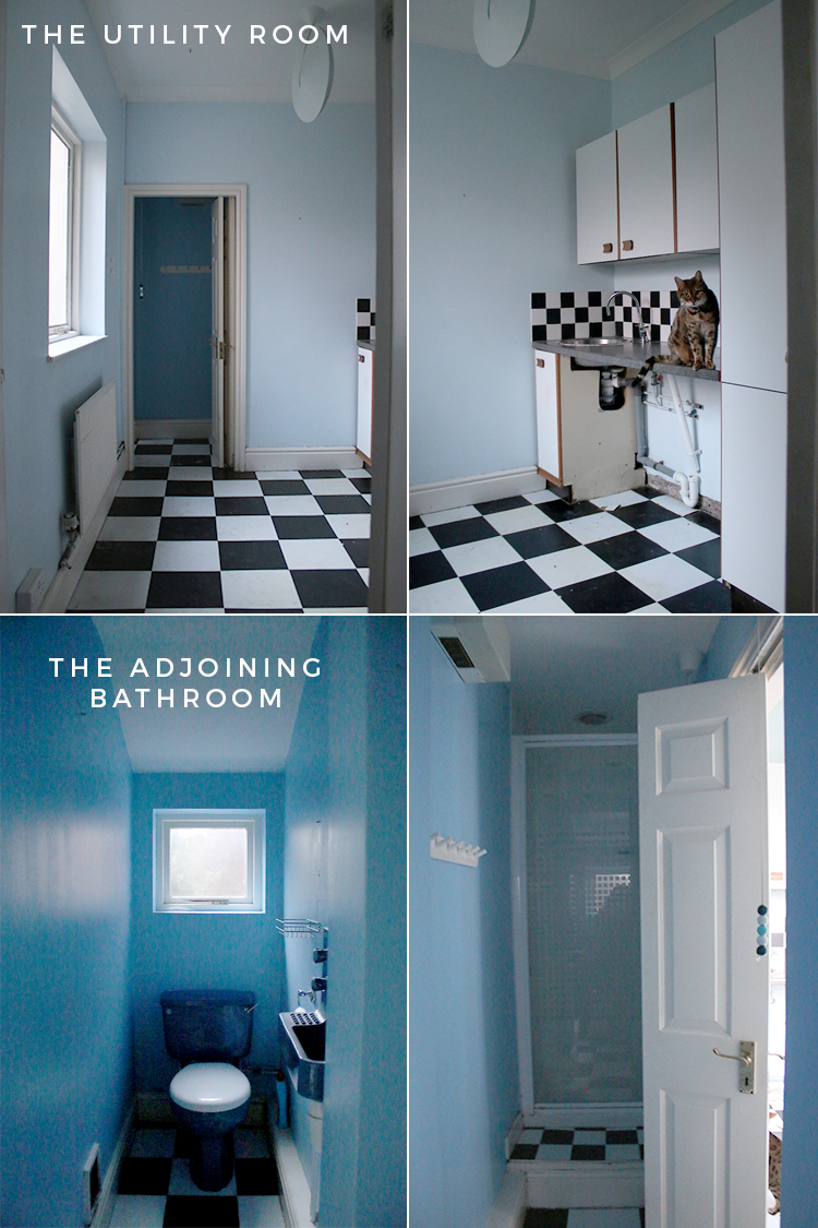
Of course, I need to share with you what this space looked like prior to me getting my hands on it. This side of the house was initially a rather large utility room as well as what I affectionally called ‘the murder bathroom’. Yeah, it was that pleasant.
It’s incredibly hard to imagine that this was what the space looked like before but well, we essentailly knocked all this out, created a small extension and decided this was going to be the new location for the kitchen. I’m grateful during the entire process, we still had our ‘old’ kitchen – conveniently located across the hall from this one. So we were never without a kitchen which made the process a lot easier.
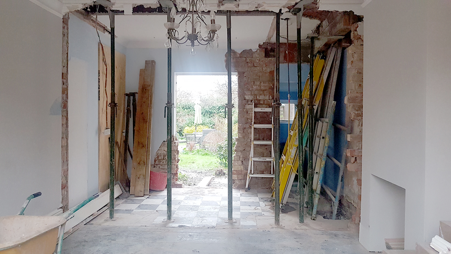
I think picture was taken the very first day. It got a whole lot worse before it got better but better it did.
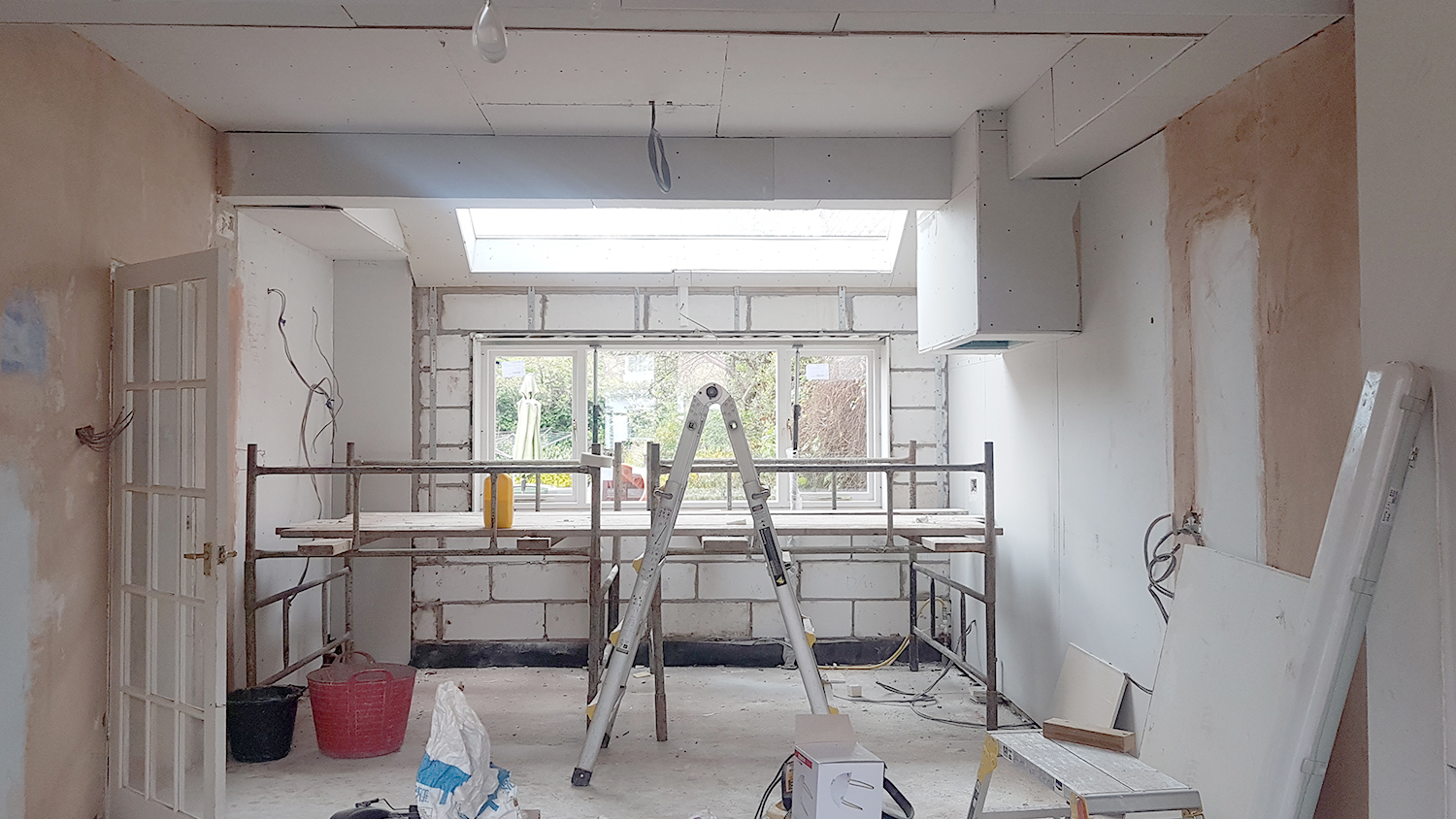
This was a couple of months on. New small extension in place, drywall going up and taking shape. I’ve shared the process of the renovation in these blog posts if you’d like to catch up with more details: Kitchen Renovation 1 / Kitchen Renovation 2 / Designing My John Lewis of Hungerford Kitchen / Kitchen Renovation 3
I won’t keep you waiting any longer… I have always wanted to create a video for my reveal posts and so here is the new kitchen (thanks to Nick Boy for creating it for me):
Can’t see the video above? Turn off ad blockers to view or click here to view it on my YouTube channel.
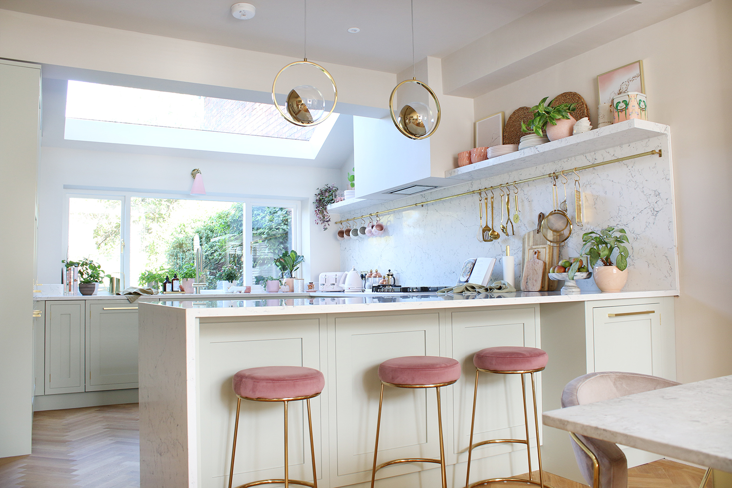
Of course, for those who would prefer to look at pictures and read the story behind the new kitchen, here’s what it looks like today.
Now, like any large project (in fact, this is probably the biggest we’ve ever undertaken and maybe the largest one we will ever undertake), we had plenty of help along the way. I’d be remiss if I didn’t first start by saying I got an excellent architect on board right from the start, Karen Harper of Added Value Architecture and managed to find a pretty fantastic builder, Hatton Developments. Of course, there are always hiccups in every build but I found both Karen and John to be incredibly solution-focused and working with them was a pleasure.
Once the shell of the building was in place and the walls plastered, it was time for Wayne and I to get to work. I approached Luxury Flooring about working with me on this project and happily they accepted and we laid the engineered oak parquet flooring over the course of a couple of weekends. You can read more about how we did that here.
I also have been working with Earthborn Paints as one of their ambassadors this year as I’m a huge fan of their clay paints and they supplied the paint. We used Donkey Ride Clay Paint for the walls and White Clay Eggshell No 17 for the woodwork throughout which creates a lovely warm glow.
However, by far my biggest sponsor of this project was the wonderful John Lewis of Hungerford. I worked closely with their designer Rebecca Nokes throughout the process and she helped bring my vision to life, making plenty of suggestions to get the most out of the space and she was exceptionally patient with the fact that I kept making changes literally right up to the last minute!
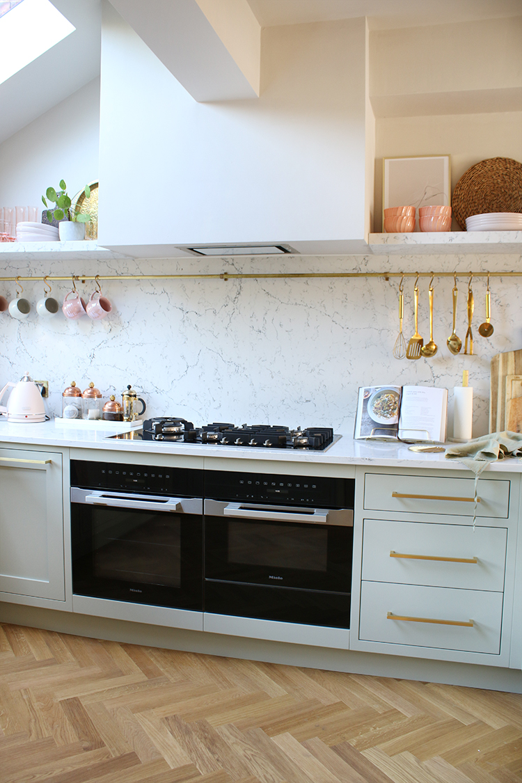
John Lewis of Hungerford supplied all the kitchen units as well as the Meile appliances and even got their close partner, Caesarstone on board to complete the kitchen of my dreams who supplied the quartz worktops, backsplash and shelving in White Attica. JLH also supplied the fitting of the kitchen, sending their expert installer, Aaron here for an entire week to get the space finished and then sent another team of experts to install the worktops. I couldn’t be more grateful for John Lewis of Hungerford working with me and having the faith in my design – I’m truly honoured to be working with them and couldn’t be prouder of (or happier with!) the results.
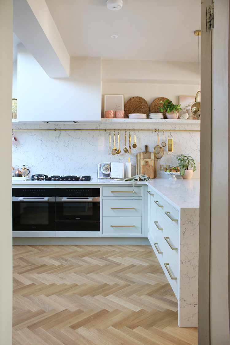
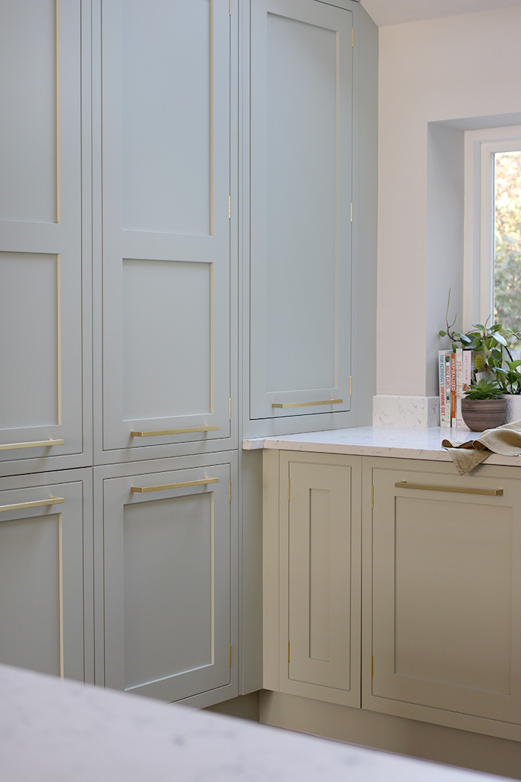
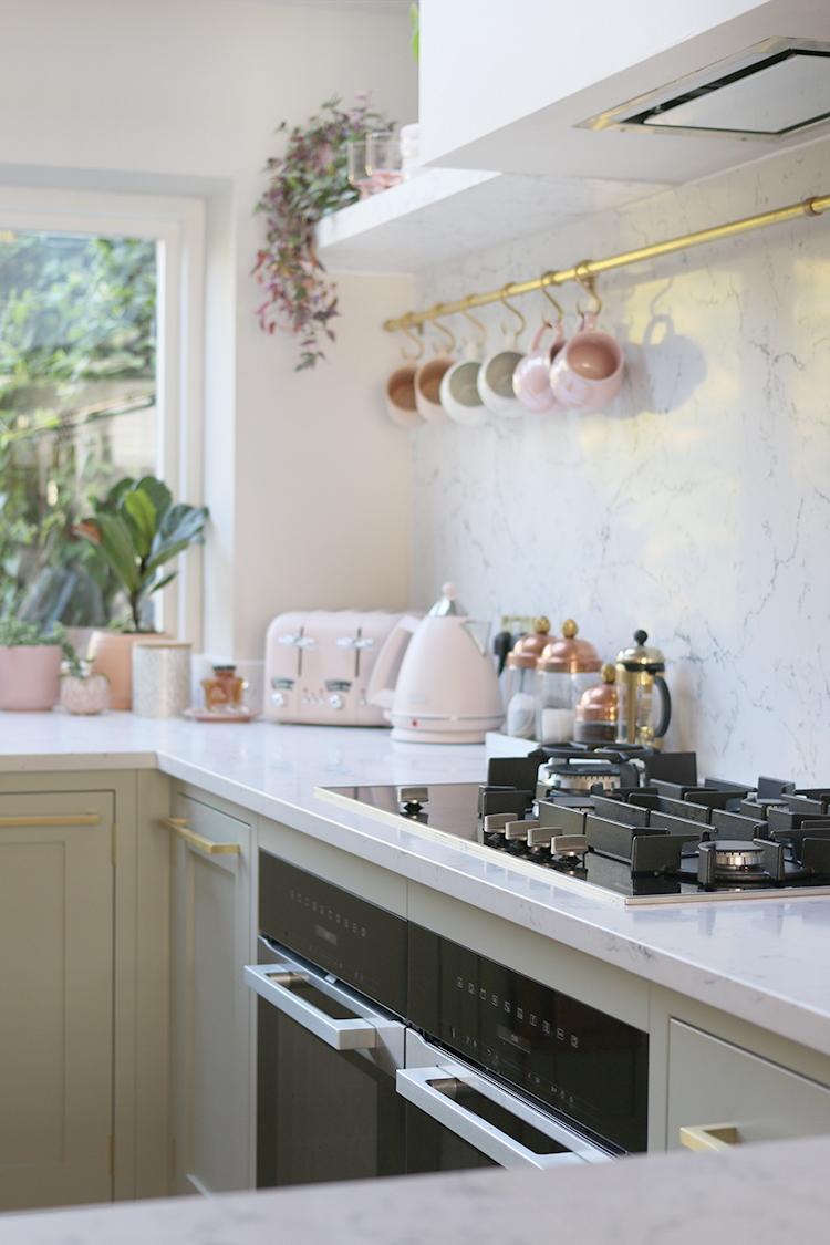
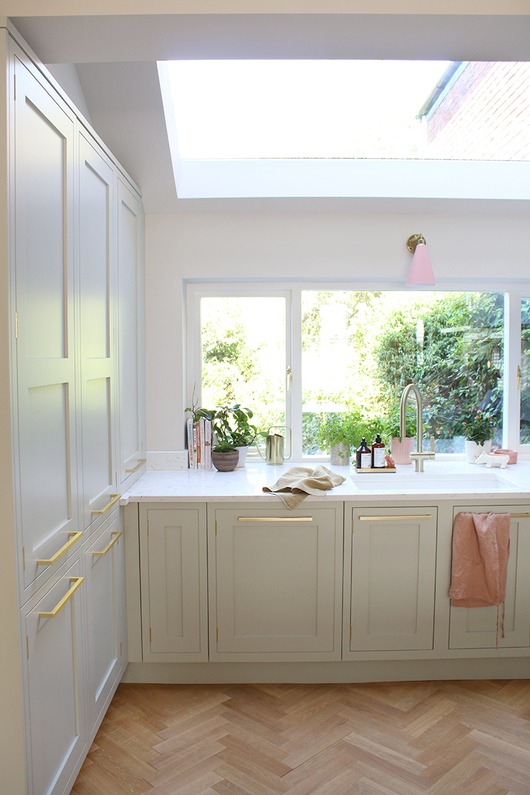
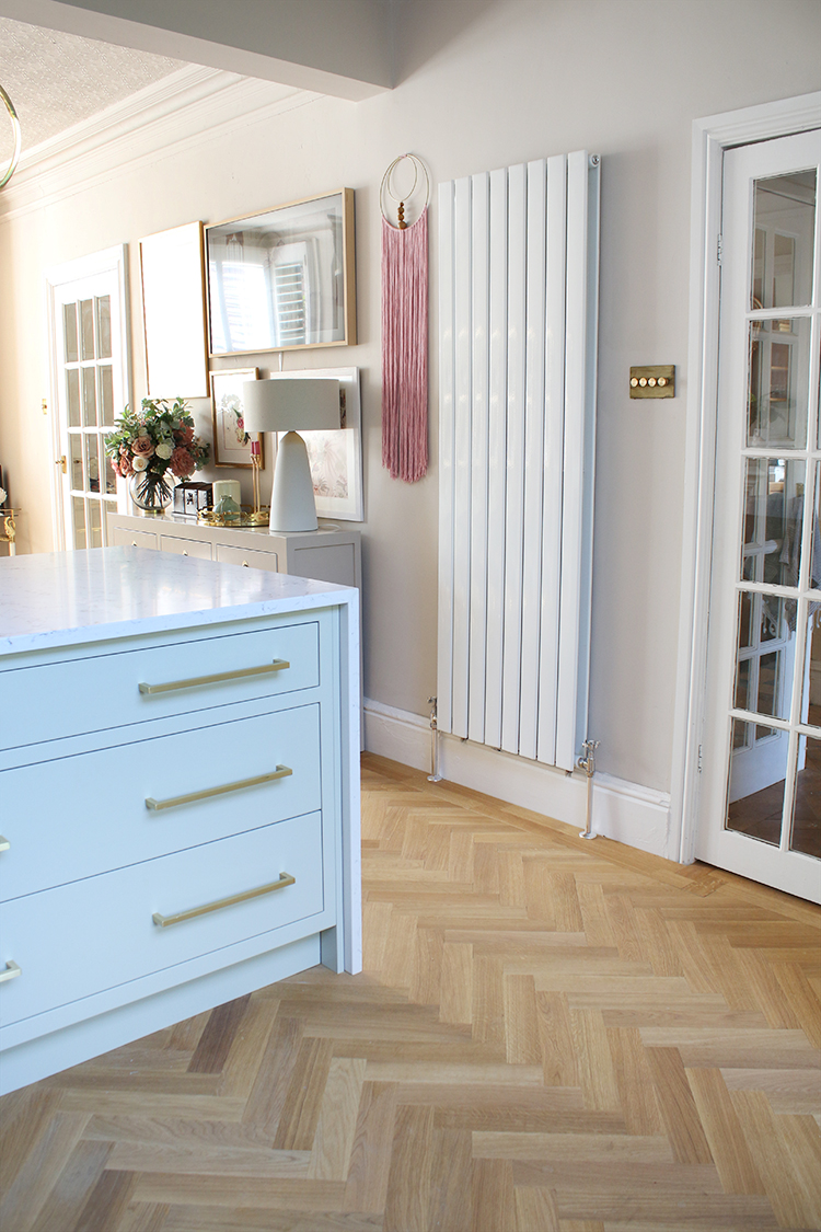
The units were professionally painted by John Lewis of Hungerford to match Farrow & Ball Mizzle and the beautiful depth of the paint colour means at times it looks pale and soft sage, other times a warm olive, depending on how the light hits it. I am utterly in love with the finish which is warm and bright and easy to keep clean. The handles are their own range in brushed gold, creating luxury and warmth.
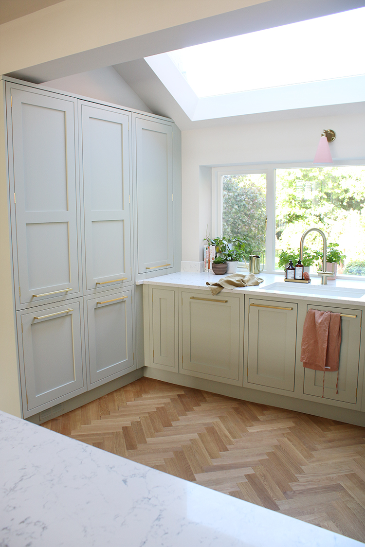
As you can see, all of our appliances (aside from the cooker and hob) are hidden behind integrated doors. On the left above, is our fridge-freezer and the unit next to the sink is our dishwasher. There’s also an integrated bin hidden in the peninsula unit.
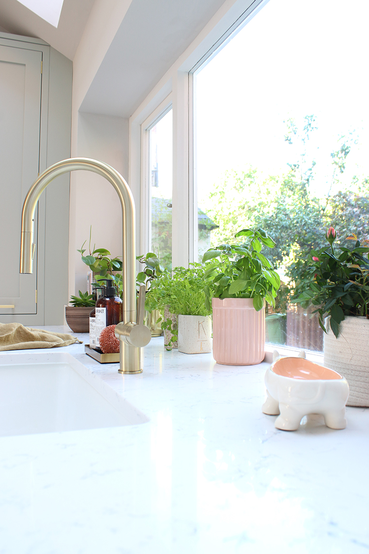
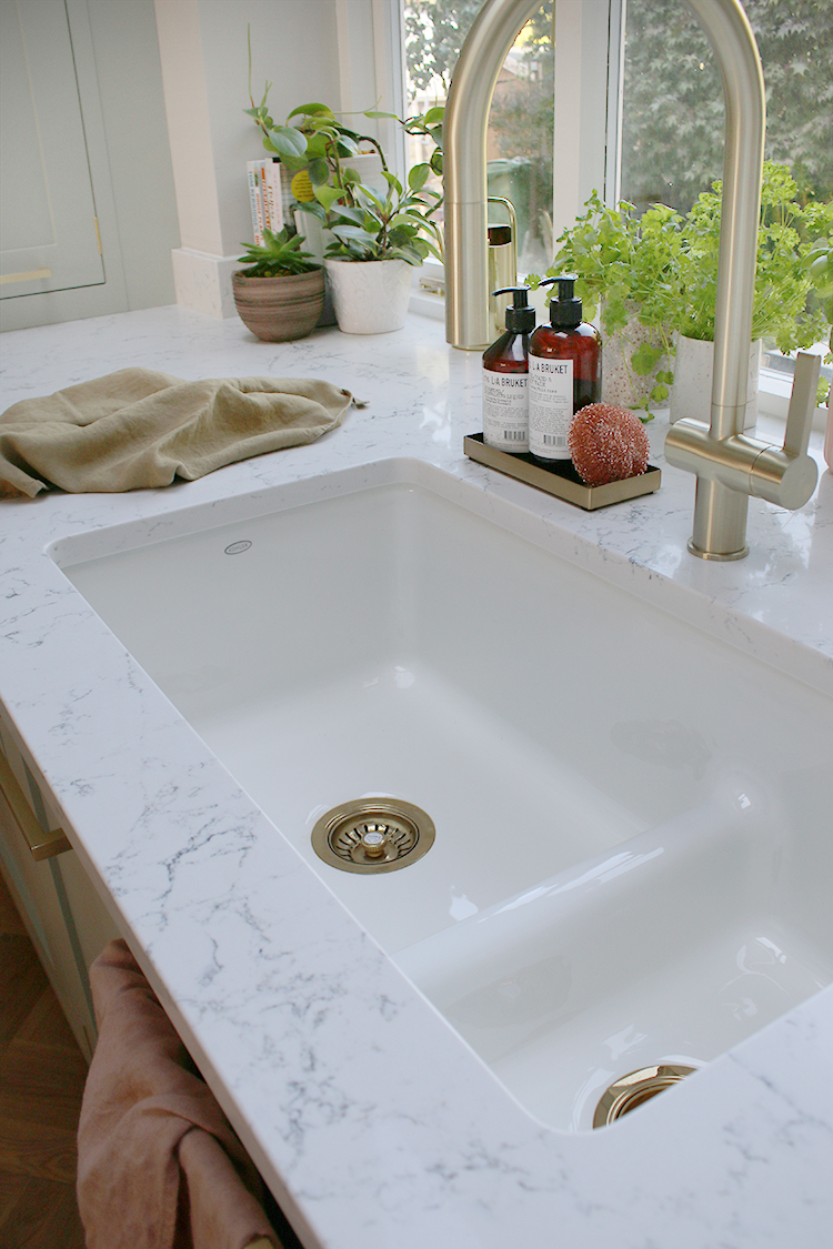
We decided to have the worktops float right into the window creating a lovely large space behind the light-filled sink for plants and herbs. Oh and speaking of light, that was such a huge part of what I wanted for this space.
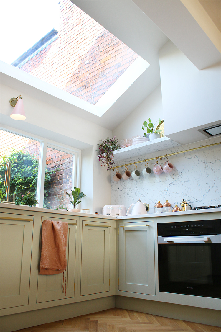
I’d asked Karen for the biggest rooflight and window we could get away with under Building Regulations and she delivered. The triple-glazed rooflight is by Roof Maker and the large kitchen window – which makes the most of views onto the garden – was custom made in timber and double glazing by a local company that my builder put me in touch with. This (north-facing!) space is always light and bright even on the most miserable rainy days!
I also worked with Kohler who provided their Iron/Tones cast iron sink in white which is huge and deep in such a beautiful soft reflective finish which bounces light beautifully with the brushed brass tap and brass waste traps. It’s those little details that really create a sense of luxury in this room.
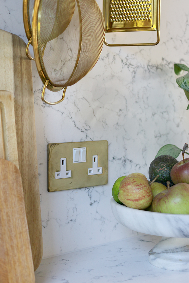
Speaking of details, I was also supplied the most beautiful range of sockets and switches from Dowsing and Reynolds from the smoked gold collection. I was originally going to use simple white sockets to blend into the Caesarstone backsplash but when I saw them in person, I knew these beautiful gold sockets were a feature in their own right and deserved to be noticed.
You can see the gorgeous 4 way dimmer switch above as well as the large contemporary flat panel radiator we chose from Soak.com. You can also see a sneak peek into the adjoining dining room which I’ll be sharing later this week!
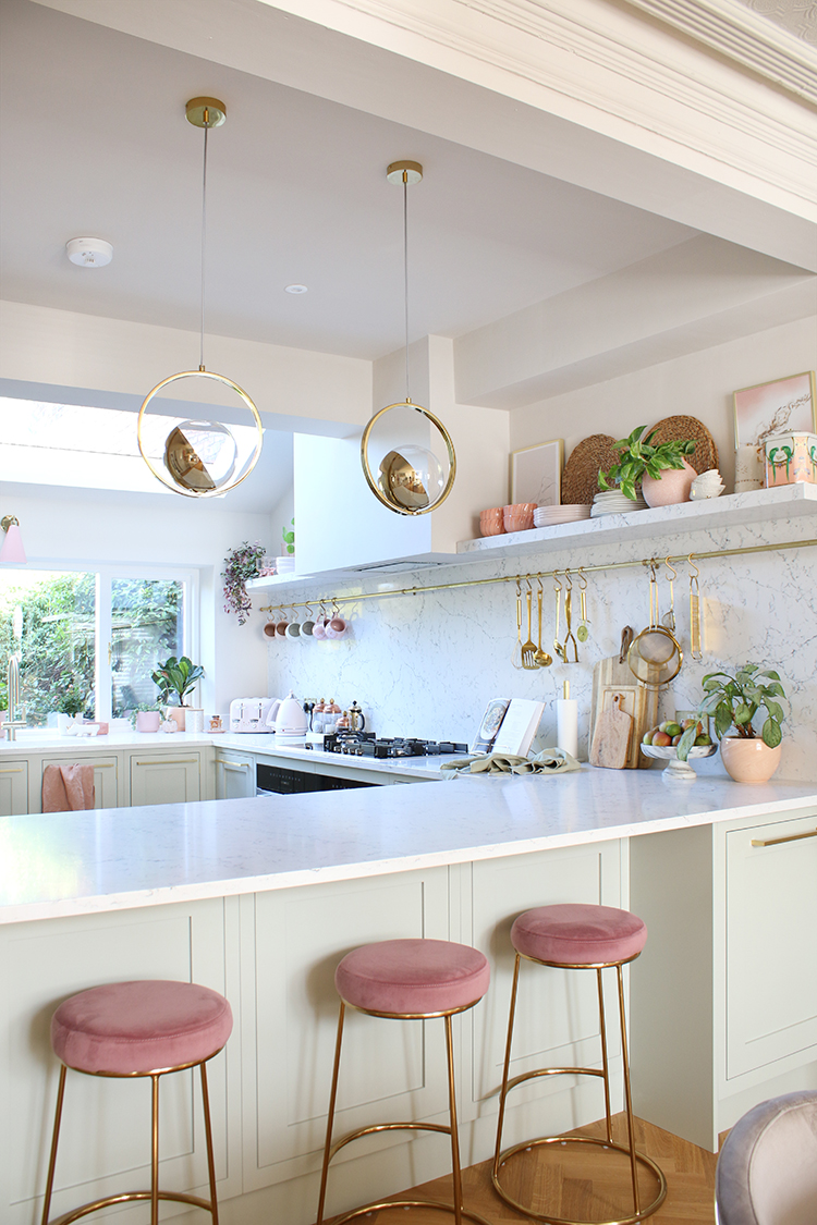
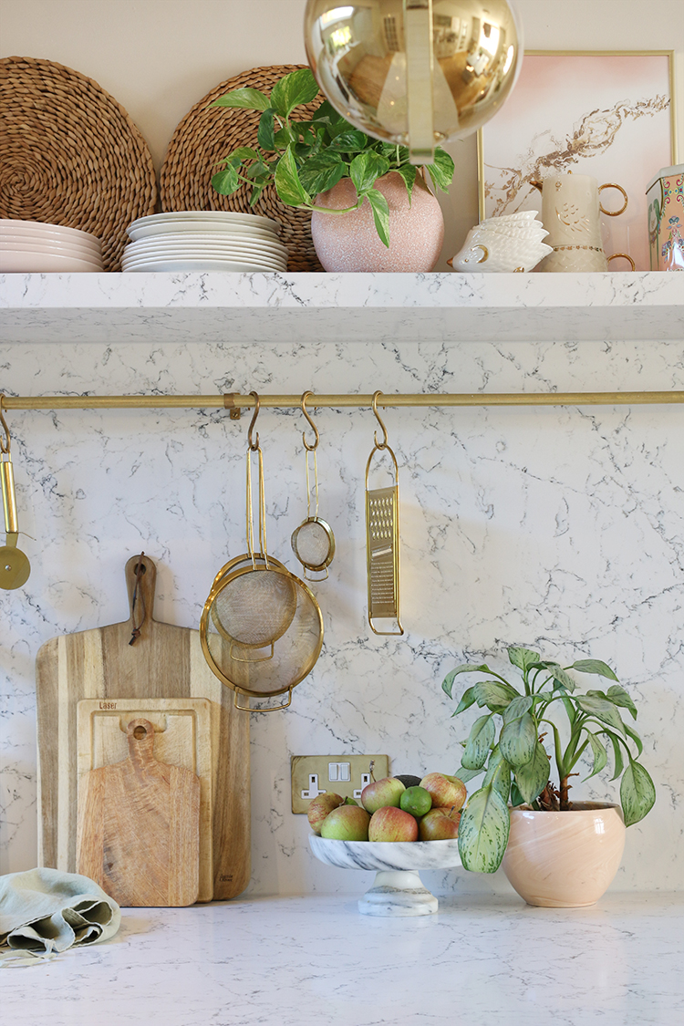
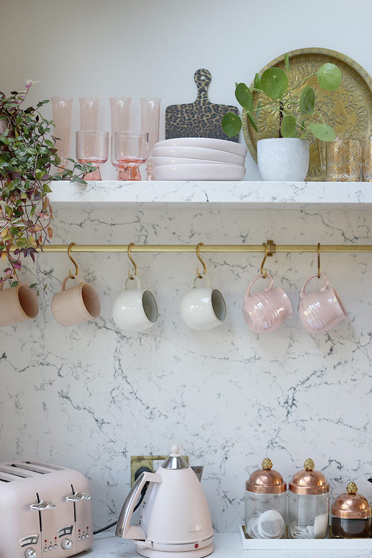
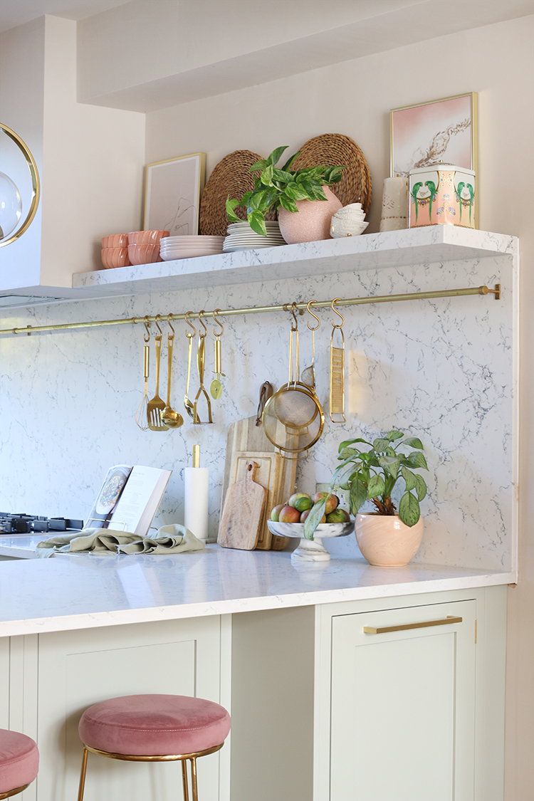
No kitchen of mine would be complete without a few areas for display and I decided on a single open shelf running across the entire back wall along with a brass rail to hang utensils and mugs. I love how much texture and personality I was able to bring in with mostly items I already had. In fact, you might remember a lot of these items from my old kitchen. It’s been nice giving them a chance to shine again.
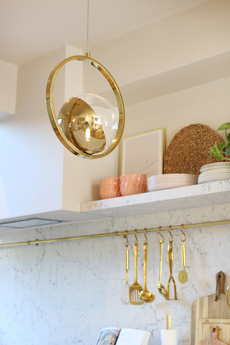
For the lighting, we decided on multiple points to create the perfect mix. There is a small pink wall light over the sink and 2 ring ceiling pendants over the breakfast bar, gifted from houseof. We also have two spotlights nestled on each side of the RSJ that runs through the middle of the space.
I purchased the DeLonghi pink kettle and toaster ages ago (in fact, I think it was during the January sales) because I’d knew they’d be the perfect accent here – nothing like planning ahead! I did pick up a few new mugs, however, and the ones you see above are from HomeSense and Rose & Grey. The copper and gold Ruffoni storage jars I’ve had for years but you can pick them up in Amara.
I do love that the hanging items along that rail breaks up the expanse of the backsplash without taking away it’s impact. The pink velvet bar stools were a bargain buy from Dunelm.
There isn’t a single aspect of this kitchen that I really regret and I can’t even begin to tell you how much this kitchen has already changed our lives. I know that sounds a bit crazy – it’s just a kitchen after all – but genuinely, it’s given this home a new lease on life. Cooking and preparing meals has once again become a true pleasure, we spend our mornings sat on the barstools looking onto the garden and it’s become the hub of our home. We spend more time in the kitchen and adjoining dining room than almost anywhere else in our home.
I’ll be sharing the dining room reveal with you very soon but in the meantime, I just wanted to give one more shout out to my incredible sponsors who assisted me in creating a truly special space. And of course, I couldn’t have done it without your support, my fabulous readers and friends following my journey and cheering me on through the mayhem and dust and chaos. I hope it was worth the wait!
Disclaimer: I worked with a number of sponsors on this project but of course, I wouldn’t work with any brand that I didn’t love. Special thanks to John Lewis of Hungerford, Caesarstone, Dowsing & Reynolds, Kohler, houseof, Earthborn paints, Soak.com and Luxury Flooring for gifted and discounted products. All words, images and opinions my own as always.












WOW!!!! This is an absolutely glorious space. I can see why you had the vision to put it exactly where you did. I love the use of soft colors and natural light. Enjoy this space– it’s perfect!!
Thank you so much! It really does make so much sense to place it where it has the best views of the garden :) xxx
You must be thrilled with it! Great job and so you.
Ahh thank you! We really love it! xxx
It looks beautiful. Well done Kimberly.
Aww cheers lovely, I’m chuffed to bits with how it came out! xx
You’ve definitely got me swooning Kimberly! Every single element of this is just stunning. I bet you never want to leave your new kitchen! And I just loooove the ceiling pendants. xx
Oh thank you! I admit that I’ve spent more than a few days working out of the adjoining dining room rather than my (yet to be updated) office! ;) xx
absolutely amazeballs, I love it every inch of it. well done xx
Awww yay! That means a lot – thank you darling! xx
It was so worth it its fabulous you must be so proud of all you’ve achieved in such a sort time. Its stunning flower absolutely stunning. Xxx💜💜💜
Everything is beautiful, I love how all the colours work so well together. I’m currently planning my kitchen and it’s a similar colour palette, and now I’m even more excited to get mine done!
Oh how fab! I’m so glad we decided to go with that soft green – it’s just so easy to live with :) xx
Oh it’s not soft green, but it’s all the other beautiful colours. The soft green is stunning and yes so easy to live with. Also, a colour that will last forever too.
Stunning ❣️!!
Oh this is just beautiful. So warm and inviting. Love it all! Can I ask where the brass rod and hooks are from? I have a very long run behind my hob like yours and it just looks a bit bare. Thanks! xx
Ahh thank you so much Claire! The brass rod and hooks are from deVOL ;) They are lovely quality and they make them specific to the size you need! xxx
I thought they might be. Thanks for letting me know! Xx
Just WOW! Superb achievement in just 6months. Making the garden the backdrop with that large window brings a beautiful natural balance to the stylish interior, with the potted herbs bringing the garden in. I also love how the more sophisticated elements of your design (e.g. marble, gold, lighting) are balanced by the ‘comfortable’ elements (plants, pottery, joinery). This kitchen would make me want to get up for my morning coffee and cook real meals! Lovely little film too :0) Txx
Aww thank you! It feels like it’s been a LONG road but we got there in the end! Ha! And the outlook to the garden is just beautiful – I have no idea why they didn’t choose the kitchen in this position to start but well, it’s lovely that it’s there now :) xxx
Just plain WOW Kimberley! I mean, I knew it would be, but it’s more spectacular than I imagined! The marble quartz running up the wall and into the shelves is gorgeous, the huge picture window and the massive skylight, even the light switches and sockets are a thing of beauty! Absolutely stunning! You must be so delighted! xx
Oh thank you so much lovely! I genuinely couldn’t be more happy with it – it’s just a pleasure to be in the space now (unlike the old kitchen where I’d race in and race out as quickly as possible lol) ;) xxx
I don’t see a video, but the pictures are very good. Your new kitchen looks fantastic. I love the marble worktop, the style of the cupboards is classic and won’t date, and I love the amount of light that the skylight brings in.
It’s really lovely.
Oh no, I wonder why it’s not showing up for you? Try this link instead:
https://youtu.be/t_G9emwTUdQ
Thank you so much – I couldn’t be more pleased with how it’s turned out! xxx
Thanks for the link, the video still isn’t showing up on this page, there’s just a gap between your paragraphs. Odd that, but the YouTube link works fine. That light above the sink is lovely, and a good idea when you’re using it at night. I’m a bit jealous of your pantry cupboard!
Kimberly, it looks amazing! So much light!! Love that it has a leafy green view too. You did good girl. xx
Aww thank you Carole! I really love it – the view to the garden just can’t be beat :) xxx
Congratulations on your dream kitchen Kimberly! Every detail of your design is spot-on, and well-done also on assembling such a great team of collaborators. You’ve done them – and yourself – proud! Loved the video – just wish it was longer – and hope you’re going to making more of them in the future!
Oh thank you so much darling! I couldn’t be prouder of the brands I’ve worked with on this one and so grateful for their support (and yours!!) :) I definitely will be utilising more video in future posts – it’s nice to bring that dimension into my blog! :) xxx
What a gorgeous job, The colour combo looks so fresh and inviting. Love it all.
Ahh thank you Sueli – really happy with the colours, it just feels like a lovely bright space to be in! Happy you like it! xxx
Looks amazing, Kimberly! :)
Thank you for the recognition! :D
Looking forward to the ‘ginviation’ to see it first hand! ;)
Ahh thank you so much for all your help on it! I couldn’t be more pleased with how it’s all come out :) And definitely – we need to break in the space with a bit of a gin party! Ha! xxx
Wow, Kimberley it’s soooo beautiful! And so very you! You are a true inspiration. The cabinet colour is dreamy and the touches of pink make it pretty but not too feminine. Congrats and enjoy.
I knew this was going to be fabulous. I keep going back and pouring over all the details. All that wait and work were so worth it!
Kimberly-
This is soooo you! it’s stunning and inviting. I love every detail! Congrats on achieving such amazing space!
:)
xx
Breathtaking and stunning!
You are a design goddess. So so good
My jaw has just dropped to the floor. Such a beautiful and amazing space. I swear, I would sleep in that room for not wanting to leave it. I’m in love with everything you’ve done, and that flat panel radiator is genius. Your decorating skills, of course, are the icing on the cake. Only you could design a green, pink and gold kitchen and make it fabulous. This should absolutely be in a design or decorator magazine very soon. Can’t wait to see the dining area now.
OMG! It looks like it came out of a fairytale!!!! In love with everything! Wish you enjoy it every single minute!!!
It’s absolutely serene and stunning ! I hope you will do a blog on how you organized your drawers and pull outs as that was one of the most challenging parts of my reno – not wanting to waste a space and sometimes I see things others have done and it’s helpful see new ideas – cheers !
Oh Kimberly, it’s beautiful! And I am so happy for you, I MAY OR MAY NOT have teared up a bit <3
Wow!!! It looks gorgeous and so light and glam! I know how much hard work it takes and how rewarding it must be to finally have your dream kitchen. You’ve done so well and it looks amazing! xo
Love it all.
The cupboards are spectacular. As are the countertops.
You are truly a design goddess as someone stated above.
Can’t wait til you reveal doors and drawers open and maybe the lights on in the evening.
Kimberley your kitchen is a joy and a delight, gorgeous! Your big reveal did not disappoint..your eye for design and detail is on point. Can I ask what make of extractor hood did you use? And is it in-built?
The wait was so worth it! What a dream kitchen. You must be over the moon with the result!
You are FREAKING AMAZING!!! My favorite transformation EVER!!! Congratulations!
My goodness Kimberly, WHAT.A.DREAM! I’m speechless, it is all so so soooo beautiful!! I can’t imagine you’d ever want to be away from this space 😍😍😍😍😍
Now, that’s what called Perfection. Keep up!!
So so beautiful. 😍😍😍 That sink game is impeccable.
This is my style to a T. Natural with plants, feminine, gold, inset cabinetry. UGH.
Question though, what is supporting the stone shelf?
Ahh thank you! The shelves are supported by huge steel inserts that are drilled into the wall – it was a nightmare trying to figure out but basically you need to ensure your wall is strong enough to take it (in this case, it was going through brick) xxx