I mentioned we were going to be replacing the flooring and the sofas in the living room on my Instagram not long ago, referring to it as a ‘mini-refresh’. Well, I was very quickly corrected by someone who said, “A mini-refresh is some new cushions!” Ha! And I realised yes, it’s a bit more than a few new cushions so I’m calling this a ‘midi-makeover’ instead! We replaced some really big-impact items in this space and I’m so excited to share how much living room has changed.
I know you’ll want to get into the pictures right away (and I don’t blame you) but first, I just wanted to talk about how far this room has come in the year and a half since we moved in. I have always had big plans for the living room and I’d say we’re probably about 85% of the way there now, doing bits and pieces as and when we could. The funny thing is, this is the probably one of the most successful rooms I had right off the bat, simply because the items I already had worked well with the dark plum colour of the walls.
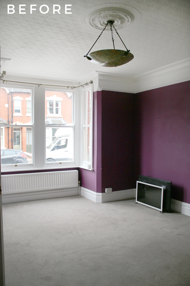
And so, the first things we did long ago after upgrading the electrics in here was to replace the old-fashioned light fixture the previous owners had left behind, remove the carpet on the floors and install shutters in the bay window.
Despite what it looked in photos, the floors, sadly, were in pretty bad shape. Huge gaps between the boards, evidence of woodworm from years ago, lots of damaged boards and spatterings of filler, paint and all sorts. I’d always known I wanted to upgrade the flooring to match what we’d planned on doing in the dining room and kitchen.
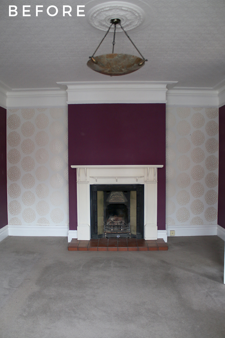
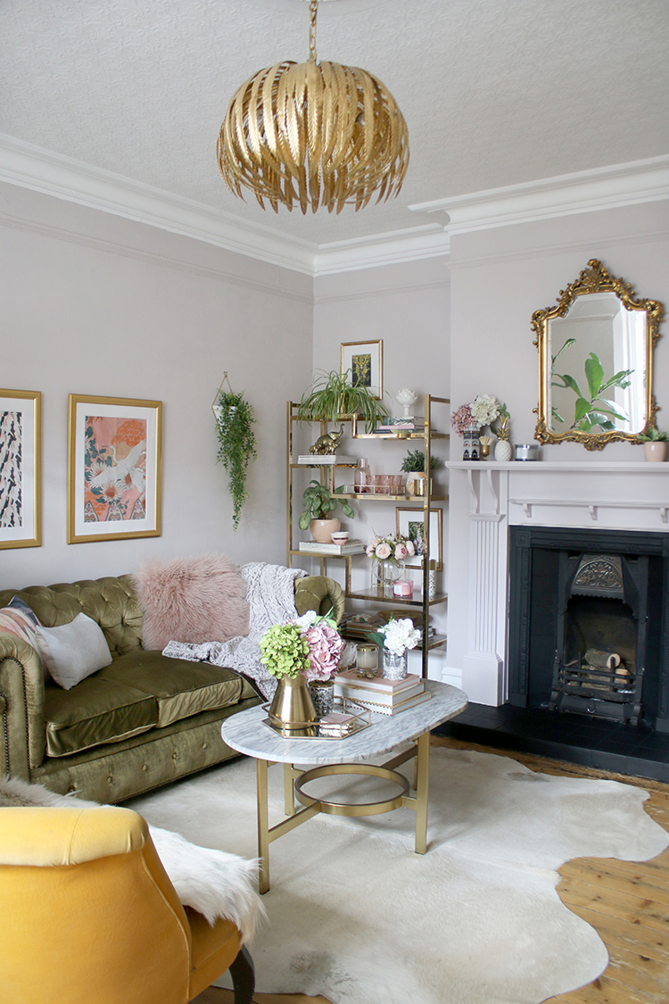
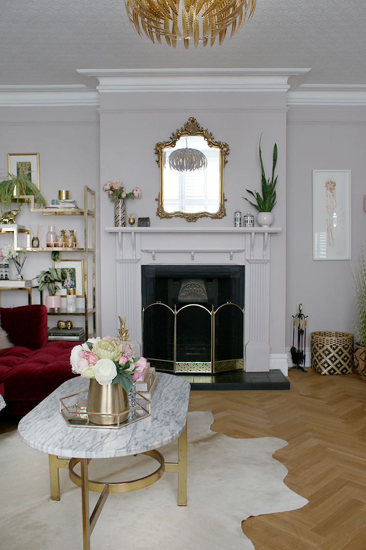
Just before the renovation of our dining room and kitchen began, however, I decided with the chaos to come, I needed a space that felt like our own to escape the dust and mess. And so I decided to give the whole room a fresh coat of paint (Earthborn’s Paw Print) which instantly made the room feel brighter and fresher. I also gave the fireplace a bit of a makeover too. It was a good start but there were still issues waiting to be addressed.
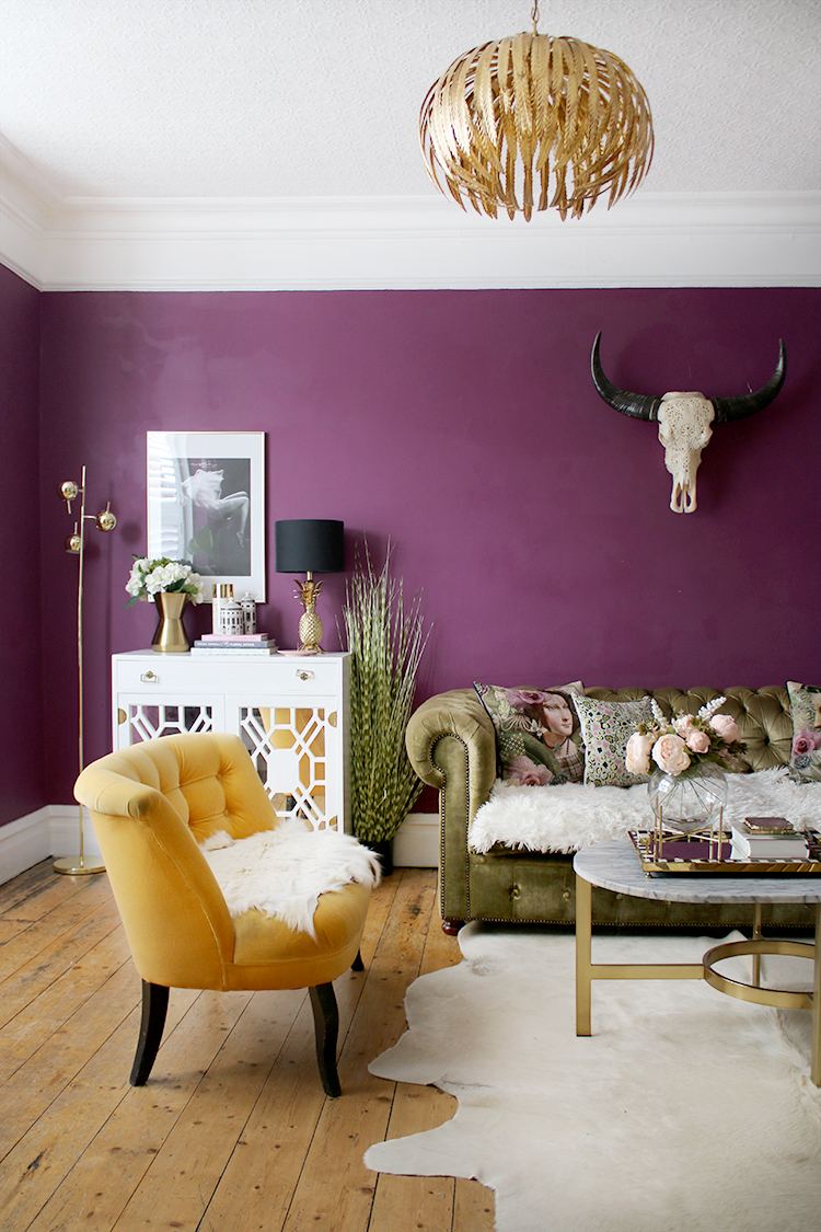
The problem? This is actually quite a good-sized room (by Victorian-era English home standards anyway!) and we just weren’t making the best use of the space we had. It’s much bigger than our previous living room and so when we moved in, we were able to use our existing pieces in here but the furniture just wasn’t proportioned to the room. Our olive green chesterfield and yellow sofa were both purchased with our old small living room in mind and so they felt completely lost in this larger space (I know, total #firstworldproblems). And while you probably couldn’t tell in the pictures, we actually had a huge expanse of just ‘dead space’ in around 1/3 of the room just behind that yellow sofa.
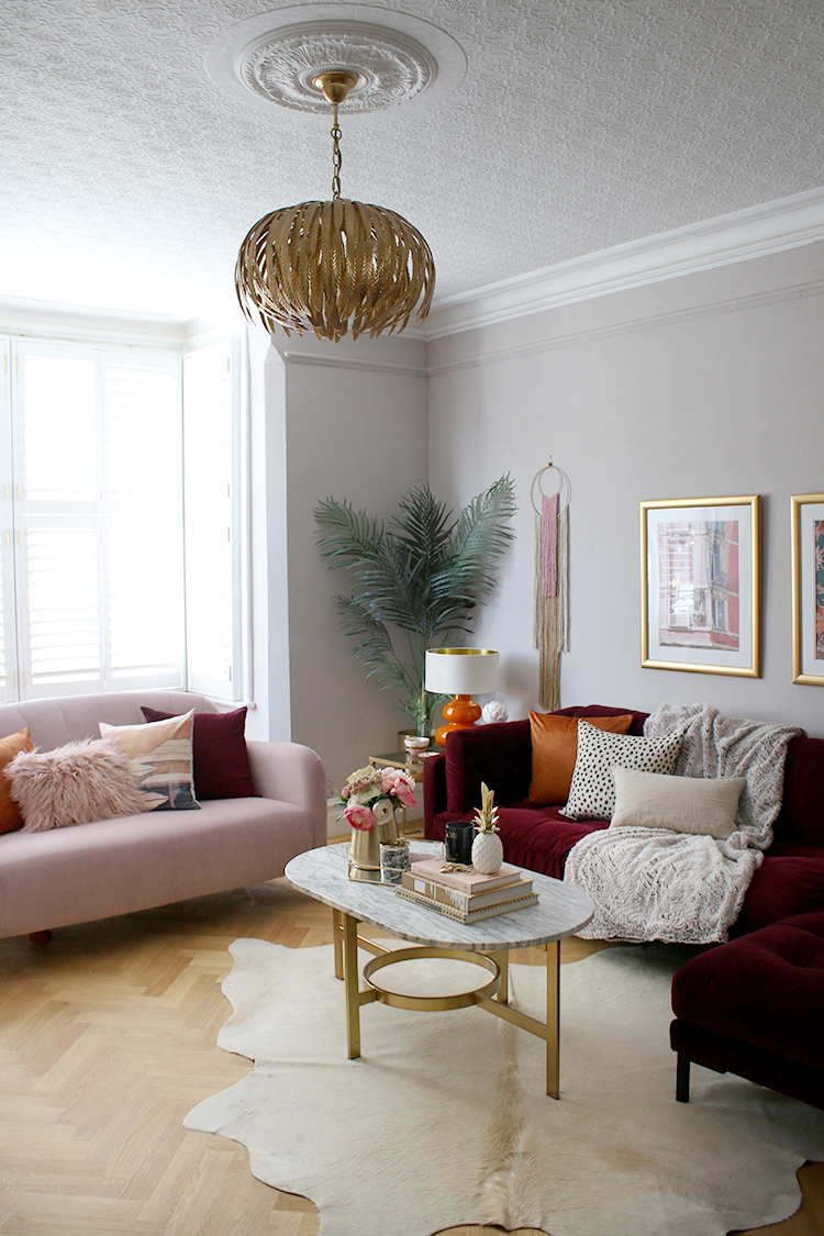
So this ‘midi-makeover’ addresses those issues – replace the Chesterfield with a larger chaise lounge, replace the little yellow love seat with a 2-seater sofa and replace the flooring. Of course, the decorating domino effect is a real thing and I made a few more small changes which I’ll talk you through! So here’s what it’s looking like now…
We’ll start with the flooring as that’s what really began this makeover project. When I first ordered our flooring from Luxury Flooring at the end of last year(!), I had the forethought to order enough for the dining room, kitchen and living room. So we had just finished up laying the parquet in the dining room and kitchen (you can see how we did it here) and after realising how easy a job it really was, decided we might as well carry on and do the living room as well. This was partly because we were so sick of seeing the dusty boxes piled up in our hallway and it was all a push to get our house back after the renovations!
It’s made a massive difference to the whole feel of the room – literally and figuratively. Not only are the floors properly insulated (and so the room is so much warmer, just in time for winter!) but they really just set the mood I had always wanted for this room – sophisticated and grounded in tradition but with some contemporary and glamorous additions as well for a perfect blend of old and new.
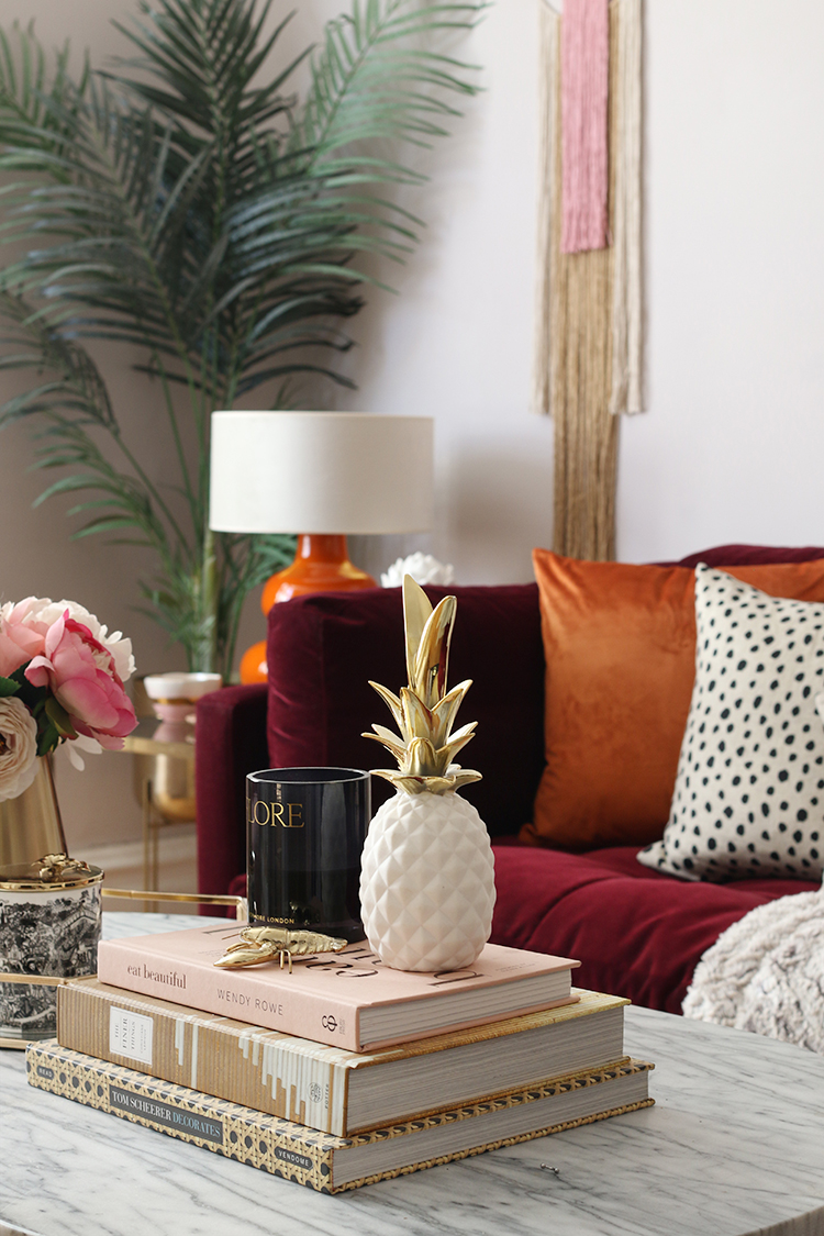
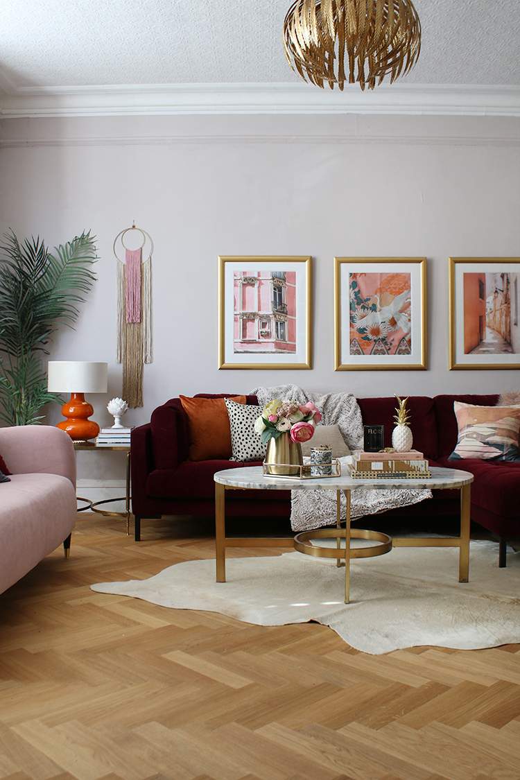
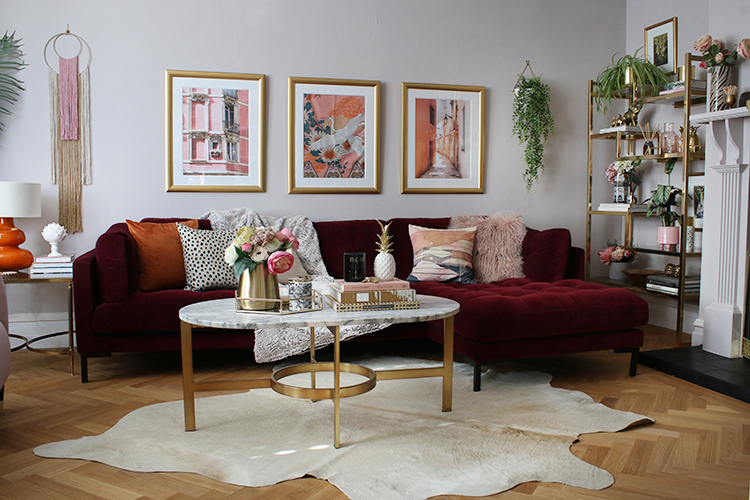
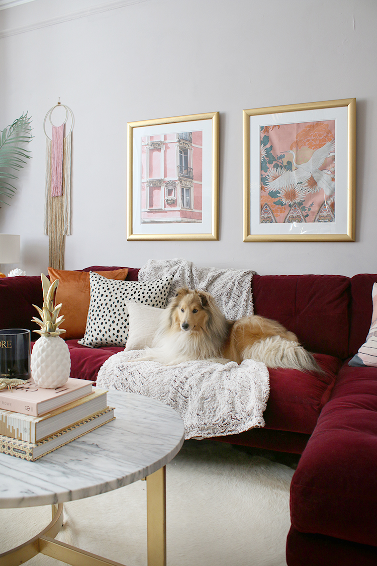
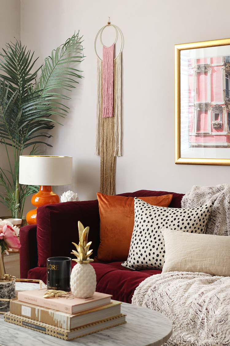
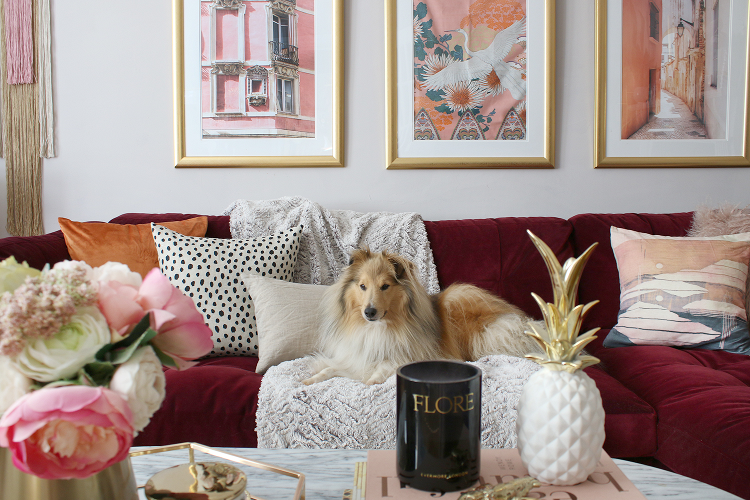
The next big change is, of course, the olive chesterfield is gone and in its place, I purchased this beautiful burgundy velvet sofa from Swoon Editions. I’ve wanted a chaise in here for such a long time and it’s been amazing to finally be able to really stretch out on the sofa! It’s a far better fit for the room and I love that it’s structured in style (so I’m not constantly re-fluffing the cushions!) but still very comfortable so you can just sink in and relax.
I decided on that deep berry colour (it looks more red in some pics but I think the image above shows the colour well) although I’d debated for a while if I should stick to something more neutral. In the end, my love of colour won out!
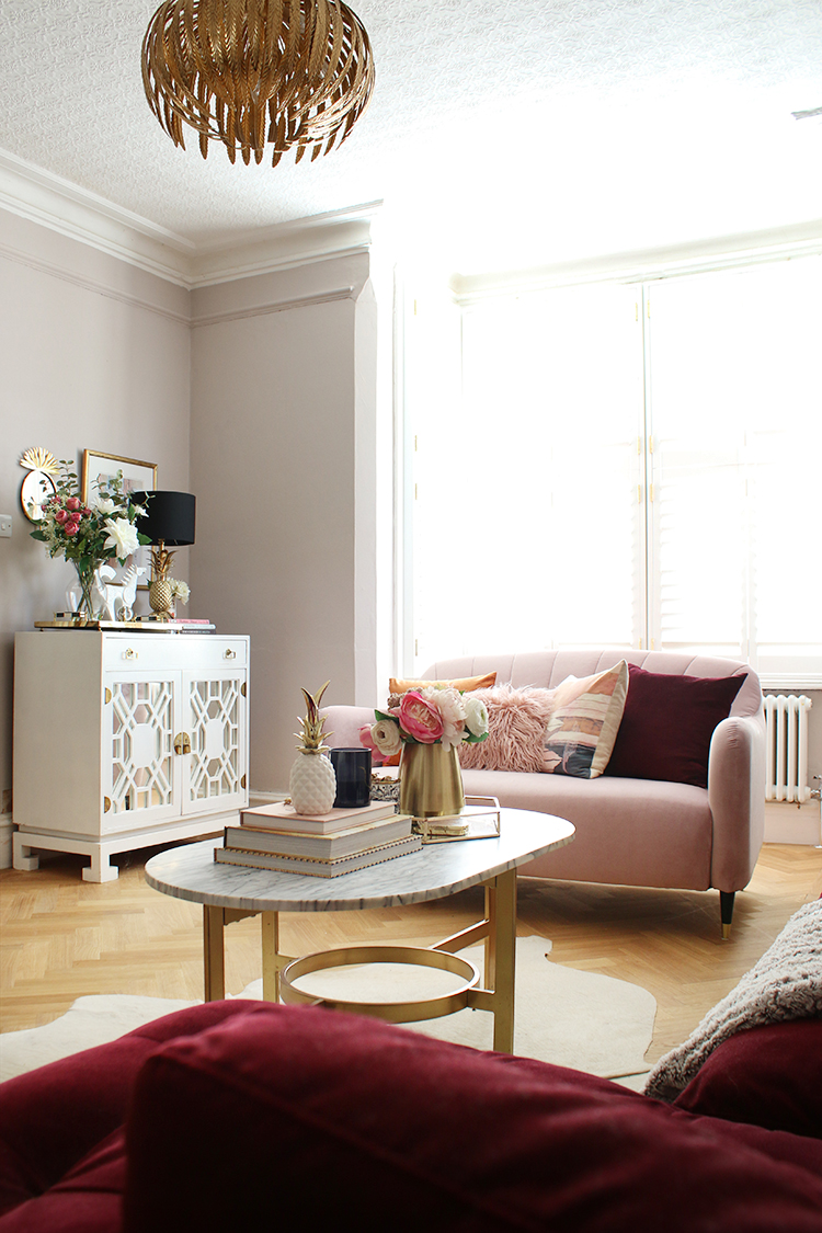
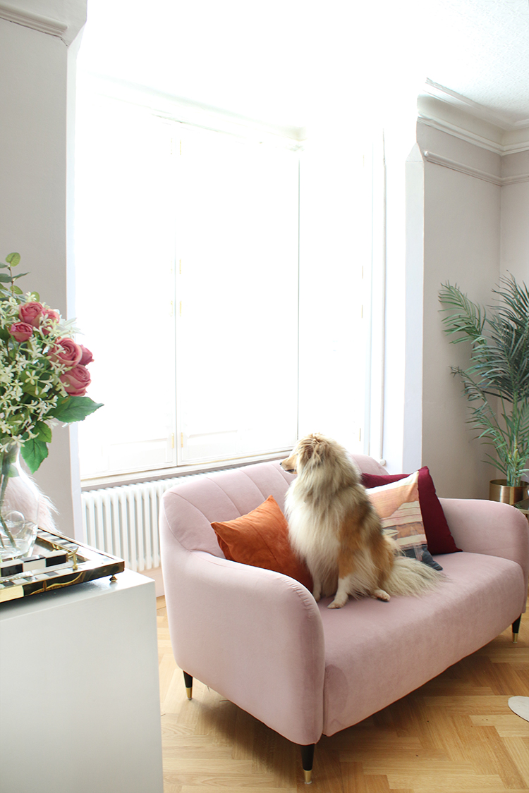
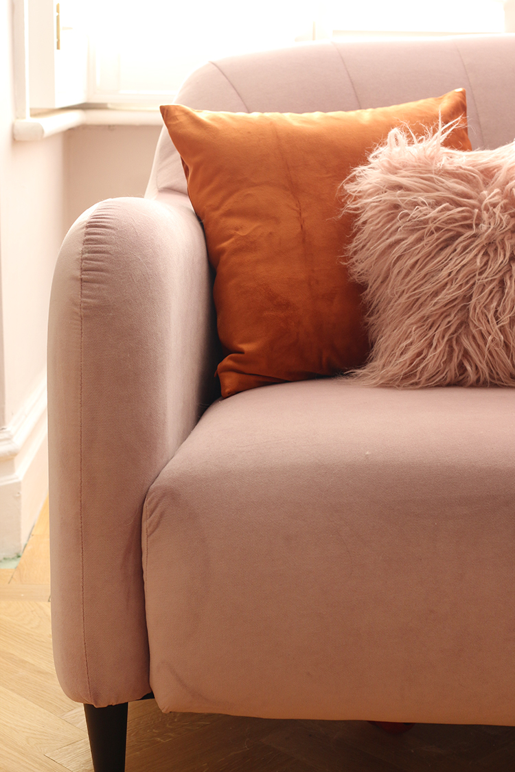
And of course, the last piece of the puzzle is this gorgeous velvet pink sofa – it’s the Fluted Back Meghan 2-seater sofa from John Lewis but the most exciting part of it is that it’s made with Aquaclean’s Harriet Plain Velvet Fabric in Rose. I’m an ambassador for Aquaclean this year and while I’m going to be chatting more about the fabric itself soon, can we just appreciate those sumptuous curves and the beautiful colour? I’m rather in love with it.
It was the perfect choice for this side of the room. Big enough that you can comfortably seat two people and yet, small enough to fit the space in front of the bay window so that you can still walk around it. Now, I will admit that I was a little nervous to bring in a sofa that was this pale in colour. As you can see, it’s Quito’s favourite ‘perching’ spot, meaning he’ll sit there and stare out the window all day (and bark at whomever dares walk by). I needed to be sure whatever I got wasn’t going to be instantly destroyed by mucky paws!
Simply put, AquacleanTechnology is an advanced fabric protector – not just a spray. It’s a treatment that covers every fibre with an invisible molecular layer that prevents dirt from penetrating the fabric. Pretty much any stain you throw at it (wine, ink, sauce, fat, mud, chocolate, cream, etc.) can be cleaned with just water (!!).
I’m going to be putting that to the test with this one and see how I get on and letting you know what I think so stay tuned for more on that. But it may just mean that those of you out there who are debating whether velvet really can be practical will finally get to take the plunge, knowing that the sofa will survive whatever life (or pets or kids) throw at it. More coming soon on that one.
As you can see, I’ve also changed the artwork in here. The length of the sofa meant I really needed something interesting to sit behind it and so I decided to hang 3 similar frames that I already owned, swapping out the art in two of them with a couple of gorgeous prints from Desenio. I just loved the colours in the prints which brought out the pink and oranges in the middle print (which is actually not a print at all – it’s actually a tea towel that I loved and decided to frame!).
Speaking of orange, I decided that just for Autumn and Winter, I’d add in a little extra of that luscious rust shade into the room. This is the beauty of accessories because they can add colours or accents that can be so easily changed when you fancy something different.
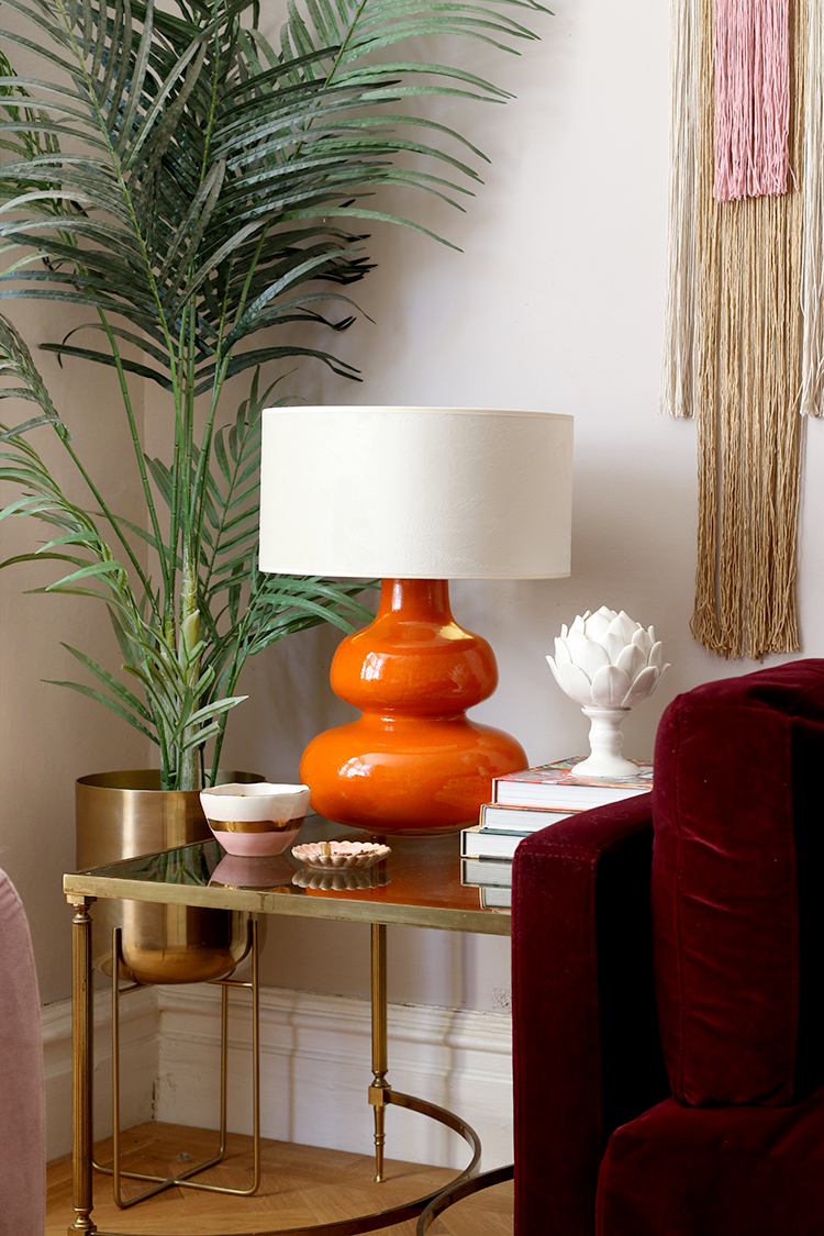
I purchased that curvy orange lamp from Habitat and chose a creamy velvet lamp shade (with a gold lining) to top it and I purchased a couple of really inexpensive velvet cushion covers in rust to bring in the colour a few more times in the room. I love that the room is currently sporting a very Autumnal sunset palette – burgundy, pink, peaches and rusts are all colours I adore and they add so much warmth and richness in a room. In the warmer months, I may swap those out to something softer and lighter but I thought it was quite cosy just for the time being.
I also made the wall hanging you see – these are so easy to make and if you fancy having a go yourself, check out my tutorial here.
You might also notice that the fiddle leaf fig tree that used to be in this room is now gone (it’s gone to live in our bedroom for now!). I realised once we had everything in place in this room that the entire corner you see above was taken up with the tree – it was just getting far too big for this room! And I really wanted to put a table in that corner. Moving the tree freed up so much space!
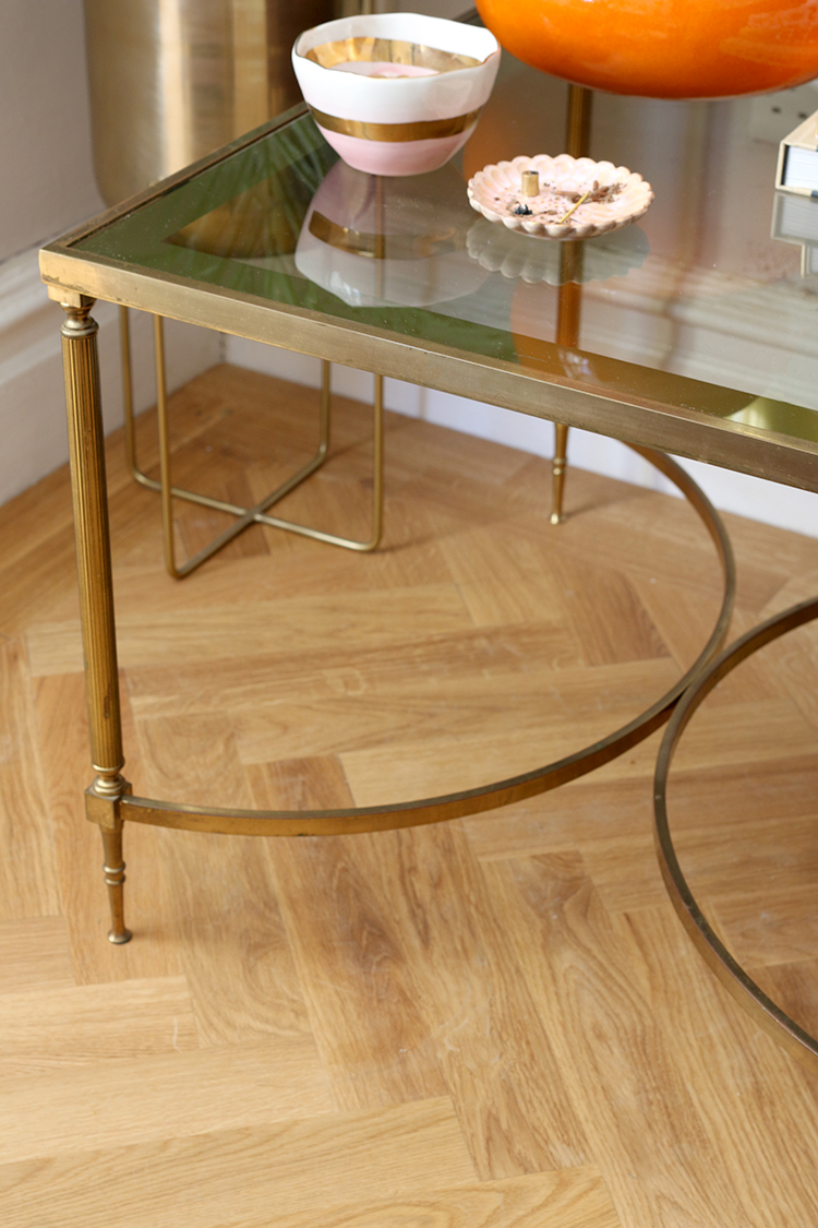
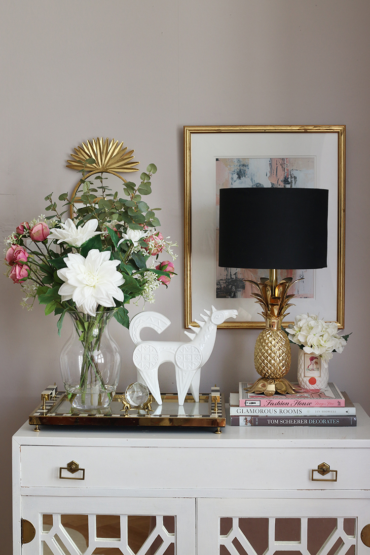
I was so happy to finally be using this vintage table I’d been hoarding for years now (those who have followed me for many years might remember it’s actually part of the coffee table I used to have when I first moved into my old house! I’ve had it THAT long!). Sometimes it helps to be a furniture-hoarder! Ha!
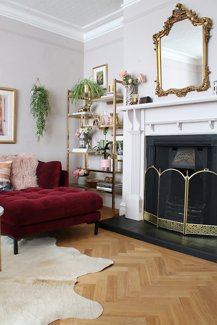
I also finally purchased a fireguard for our fireplace. It’s something we’ve needed for a long time now but even though it’s probably far enough away, as the chaise sticks out a bit, we just didn’t want any sparks or anything damaging it!
I didn’t have a huge budget for this space but this inexpensive one from eBay does the job perfectly, looks rather lovely and it was less than £20! Bargain.
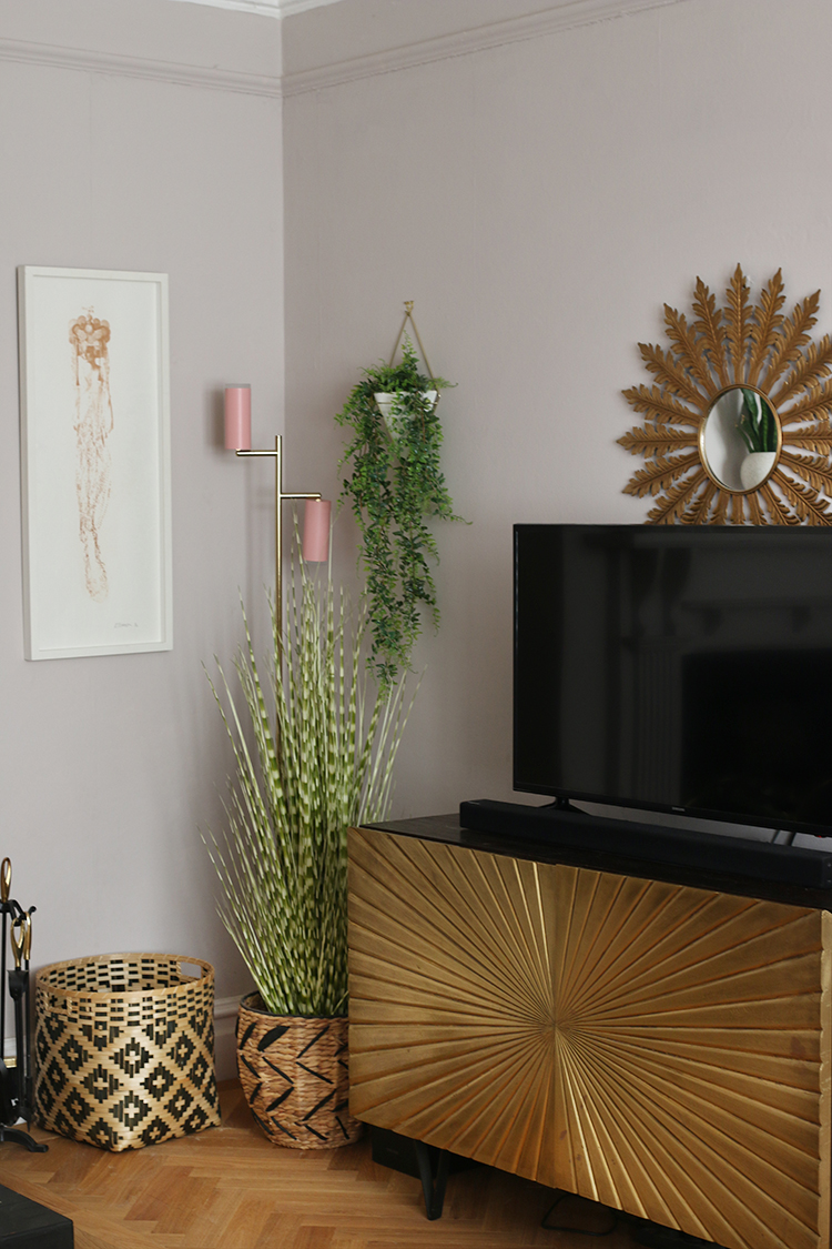
On the other side of the room, not too much has changed here! Eventually I’d love to have another Samsung Frame TV on the wall here (like I have in the dining room) but for now, the gold cabinet from Swoon Editions is doing quite a good job from distracting the eye from the big black box alongside some baskets. The larger one holds the wood for the fireplace. The cute pink floor lamp was gifted from Houseof as part of an earlier collaboration.
I also received that gorgeous bunch of blooms as part payment of a styling job I did with Laura Ashley (you can see that on their blog here). As you probably know, I adore faux flowers and have them everywhere! These are rather pretty and pick up all the pink tones in the room perfectly.
As you can see, Quito is rather enamoured with the new look. And I can’t blame him really! The room flows so much better now with the entire room now in use, it looks so much bigger and more luxurious with the new floors and furniture. I couldn’t be happier with the space.
As a bit of a reminder, I thought I’d go back to those before pics and see how far this room has come!
(I genuinely still can’t get over that’s the same fireplace! Ha! I hated it when we moved in and couldn’t be happier with it now! Ahh the power of paint, eh?)
What’s left? I’d love to do wall moulding/panelling in this room – we did it in our old dining room and I have always wanted to do it again when we moved here. We haven’t really had the chance to do that in all our little updates over the last year and a half but I really still want to install them so that will be forthcoming. As part of that work, some of the walls need a bit of help/skimming and so it’ll likely be a bit of a messy job including repainting and replacing things like sockets and switches. So yeah, when I’m ready for a little update here next time, that’ll be part of it!
In the meantime, I’d love to know what you think of the changes! Let me know in the comments below!
Disclaimer: This post contains some gifted products and forms part of my collaboration with Aquaclean. Huge thanks to Aquaclean who supplied my beautiful pink sofa and Luxury Flooring who provided a discount on our flooring. Also contains some previously gifted product via other collaborations with houseof, Laura Ashley, Soak.com and Earthborn paints.










It looks stunning Kimberly! Your styling is perfectly on point as usual!! I’m especially loving the new sofas. Can I just ask a quick question? I’m thinking of having shutters in my living room and am worried about losing the cosy feeling that curtains create. What are your thoughts on this, having had both?
Aww thank you Cara! I actually prefer the shutters personally because I love how spacious it feels but yes, I know what you mean about losing that softness. I think you have two options here – either include more textured fabrics in the room itself (ie, a nice fluffy rug, some cosy throws & cushions etc) to make up for it at the window OR you can hang floor to ceiling curtains that simply frame the window (but that you don’t actually ‘use’) and install shutters as well. I’m considering doing this in our bedroom bay window :) xxx
Thanks so much Kimberly! xxx
This room is gorgeous. That sofa oo lala! Can’t wait to hear about how the fabric on the two seater holds up with pets. Well done as always!
Wow, that’s a sofa! That deep burgundy works so well with all the gold accents and the pale walls. I’m dreaming of a big sofa to cosy up on at the moment, haha! It’s definitely a step further than a “mini” makeover though ;-)
It’s so cosy, it’s made Netflix nights so much nicer! Haha! And yes, I think ‘mini’ wasn’t quite the right word so I think ‘midi’ is probably more accurate! ;) xx
This is stunning! Reading your blog throughout the years has reminded me that I like a little glam. Thank you for sharing your gorgeous design.
Aww that’s so nice Nicole! Thanks for reading lovely! Gotta have at least a bit of glam in there! ;) xxx
Beautiful colors and style! Typical Kimberly fabulousness!
Looks amazing. I love the corner sofa (i’m current looking for one myself) If this is the mini makeover, wow
Ahh thanks darling, I’m loving the new sofas as well! And yeah, it’s probably not entirely accurate to call it a ‘mini’ makeover which is why I decided to call it a MIDI makeover! Haha! xxx
Looks stunning! Can I ask where the artwork of the bird (crane I think) is from, between the two desenio pics? I love it! Xx
Gorgeous as always!! I love the new wall colour and that sofa, and the loveseat – totally needed in my life! I desperately want a velvet sofa when we do our living room in maybe a year, so if the aquaclean works, let us know because also dogs and cats and a toddler over here so scrubbable all the way!
x
I will definitely be letting you know about the Aquaclean fabric sofa – I have a feeling it’s really going to be put through the test with our fur kids but if it’s as good as what it sounds, then it could definitely be a game-changer for those who’d love a velvet sofa but are just scared of it getting ruined with daily life :) (And it comes in so many gorgeous colours!) Stay tuned! xxx
Once again, your choices are spot on. The new sofa color is amazing, the new floor makes all the difference, and painting the walls has made it all come together. Your room, in my opinion, does have great bones and lends itself to good flow which makes for good furniture arrangement. I only have one negative, and that’s the rug. I love the shape, but would use something in a shag, or something with more texture and softness. Just an opinion….. your room is beautiful.
Ahh thank you Pat! Agree the room has good bones (one of the reasons I fell in love with this house – heaps of potential!) which definitely helps! I’ll also agree about the rug – I would love nothing more than to get a huge beautiful rug for this space but well, it’s just not a possibility with three rambunctious animals. They have destroyed (within months) every single rug I’ve ever brought home and the only thing that can survive their destructive ways is cowhide! Sob sob. So yeah, that’s why I tend to stick with really hard-wearing floor coverings – it’s just a sacrifice I have to make for the sake of the fur kids! lol xxx
I love the combination of burgundy, pink and rust! It’s so beautiful and perfect for this time of year. Lovely!
Ahh thank you! The rust was a bit of a late introduction but I’m really loving the combination for Autumn :) xxx
Kimberly, this is UNBELIEVABLE. I would never think to pair a deep red sofa with a light pink one. It’s beautiful, you must be so pleased with it. When can I move in?
Hahaha! Aww thank you Sarah! I’ve loved burgundy and blush for a really long time now and couldn’t wait to use it in here – I think they are really pretty together too! xxx
You know i really liked the purple, but this colour i love. It makes the room look so much bigger and not as closed in. The new sofas are just stunning, everything flows around the room beautifully. I still need to have a go at one if those wall hangings. Xxx
the burnt orange works beautifully with the deep berry, such an unexpected combo, I love it! This room has the same calm balanced vibe as the kitchen and dining room, there must be good flow in your home:0) I did wonder if some more animal print would appear, this feels like a toned down, pared back version of your style. And that does inspire me, getting that balance & vibe.
Wow what a beautiful living room. Just in time for winter in northern Canada. I have been following your blog for years and laughed when I recognized the coffee table. Thank you Kimberly ( and your other half ) for doing what you do. Love the burgundy and orange too.
OMG I love that you recognized the table, Shelley!!! Thanks so much lovely! xxx
This is such a beautiful room with so many lovely details but still lots of light and space around it all. Cracking work Ms D. I’ll no doubt be chatting to you very soon about your thoughts on the Swoon sofa!!x