When I moved to the UK way back in 2001, I admit, I had no idea what Anaglypta was, I just knew that in American homes, it wasn’t particularly common as far as I was aware. I saw it in plenty of homes here, though, and after a while, came to understand it was something entirely undesirable. Like woodchip wallpaper and thick swirly Artex, these were essentially echos of a previous time where textured walls were all the rage and they were set up as easy fixes to cover uneven, old plaster walls.
As more and more people renovated their homes, the patterned thick vinyl Anaglypta was removed, walls were freshly skimmed and clean, unbroken areas were painted over. House buyers breathed a collective sigh of relief when viewing properties where this work had already been done and all anyone wanted was the quiet that decended on a room after it was painstakingly removed.
However, unlike woodchip wallpaper and Artex (neither of which I particularly like!), I actually quite liked the raised ornate patterns of Anaglypta. Did you know that Anaglypta is one of the world’s OLDEST wallpaper brands? It was actually formed back in 1887 by Thomas Palmer during Queen Victoria’s reign (two years before my home was built!) and the word ‘anaglypta’ was actually taken from the greek language, meaning ‘raised cameo’. It was the very first paintable wallpaper where the designs were pressed into the paper so that the surface could be painted in any colour you wished. Genius!
Now, that pressed pattern really appealed to my maximalist tendencies and I thought the patterns quite pretty. I kept this quiet of course. It was like saying you really fancied shag rugs or the avocado suite in your nan’s bathroom (the shag rugs are back, I’ve no doubt at some point the avocado suite may be too but you get my drift).
Being an American ex-pat, I think, made a difference here. The fact is, I’d never lived through a time when Anaglypta was used on every wall of a house and so I didn’t have any memories of it being something hopelessly old-fashioned. As a result, it didn’t have that eye-roll-inducing look about it shared by so many of my British friends when viewing it – there was no nolstalgic filter. As it was never a part of my past, I had no negative associations with the style.
Of course, over the course of living here for nearly two decades, everything that’s old is new again and it seems Anaglypta is beginning to shake off it’s ‘undesireable’ moniker – at least with those who try to keep ahead of the trend curve. I know a lot of people who still think it’s a “design crime” and wouldn’t touch it with a 10-foot roller!
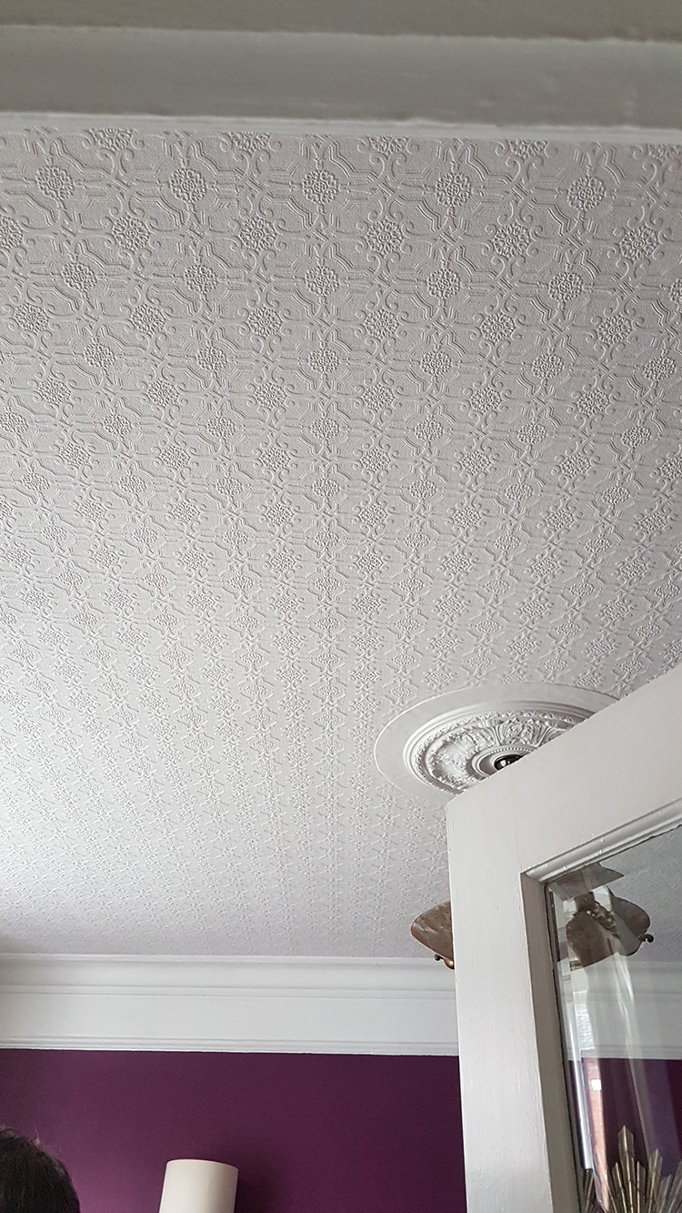
This was taken when we had our second viewing – I loved it so hard, I took a picture of it!
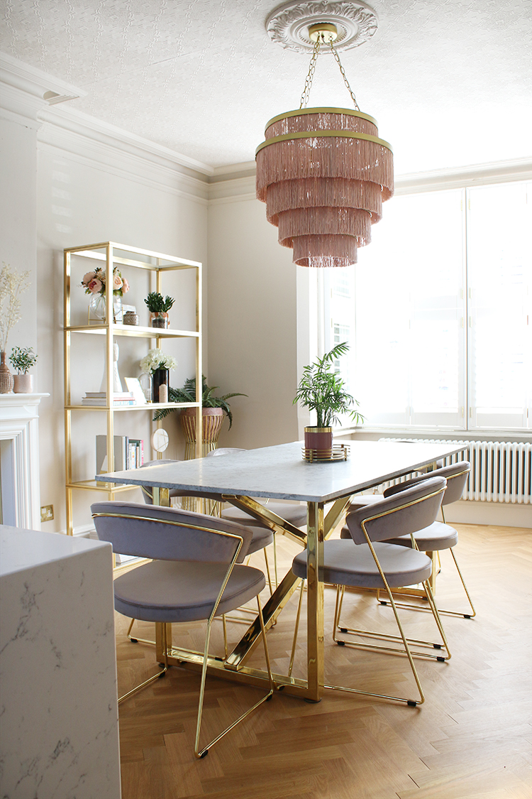
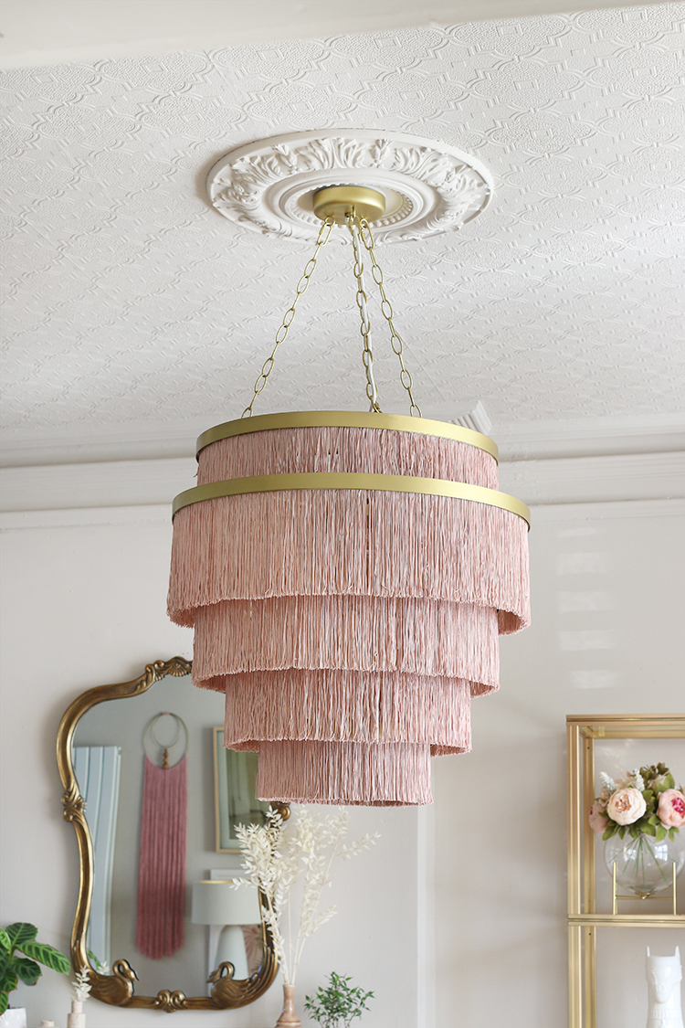
When we first viewed our home, it was one of the first things I’d noticed. It was on all the walls and ceilings of our hallway (more on that in a bit) but in most of the rooms, it was only on the ceiling. Now, our ceilings aren’t ridiculously high but they are just over 9 feet tall which goes a long way in making a room feel a little bigger (I do think the high ceilings make a difference here which is why I mention it – a pattern on a low ceiling might have just closed things in but on a high ceiling, it just worked).
All I knew is that despite the fact our home desperately needed to be updated, I wanted to keep those ceilings. I loved the patterns against the ornate ceiling roses. It didn’t feel like an echo of the 1970s or 1980s, it felt like an echo of the Victorian era our home was built.
I love the contrast between the patterned ceiling in the dining room and the smooth ceiling in the kitchen – as the extension in the kitchen is a contemporary addition, I wanted to retain the old vs new in the aesthetic. But for the older original rooms, I feel it fits in so nicely.
It’s probably a contentious opinion, I realise, and I’ve no doubt I’ll get comments from people saying it’s horrible but well, this is my home which we plan to live in for many years. So, to them I’ll preempt their comments with, ‘it’s fine, you do what you like in your own home’. ;)
Going back to our hallway, it’s on all the walls and ceilings but because we’ve had the electrics replaced and we’re currently sporting a rather large hole in the wall of the stairs, it will all have to be removed as it’s taken way too much damage. I am tempted, however, to replace it below the dado rail and skim the area above.
My point being that if you fancy trying it, you certainly don’t have to use it everywhere. I think, depending how intricate the pattern, it can overwhelm a space when used everywhere and perhaps that’s what people find objectionable. But if you use it in unexpected places (the ceiling) or as an accent (below or above a dado rail), then suddenly, it becomes much more stylish. Paint it in a trendy colour and it comes to life.
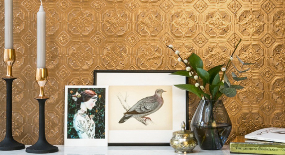
Anaglypta Derby – how amazing is that gold paint on it?!
Unlike normal wallpaper, if you tire of the look, you don’t have to fully remove it. I think it’s easier to live with than wallpaper as it’s only adding texture which can be a bit more quiet when it’s all in the same colour and you won’t tire of it as quickly either – if you fancy a change, simply paint it a different colour.
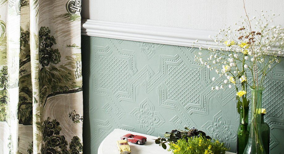
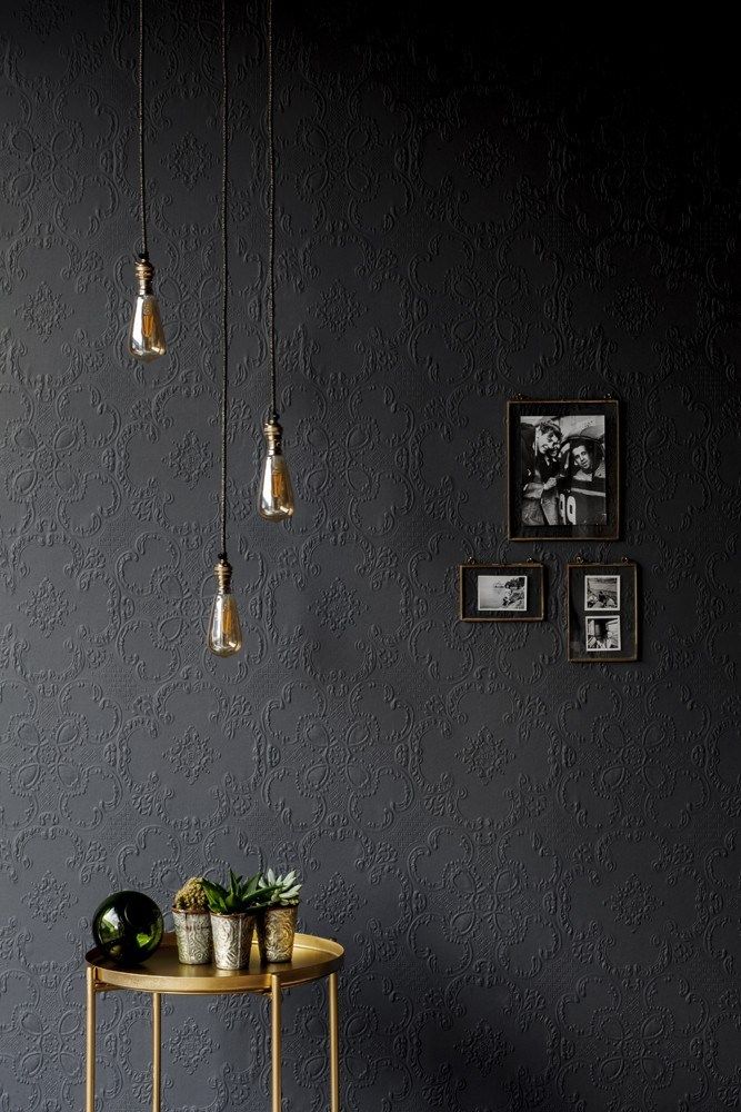
Anaglypta Alfred from Rockett St George looking sexy AF in a dark colour
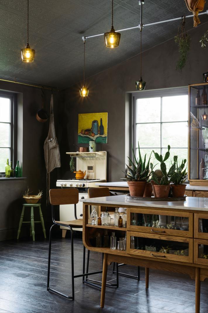
deVOL’s Haberdashery Kitchen at The Cotes Mill sporting Anaglypta on the ceiling
With the trend towards textured walls, I think it’s time for Anaglypta to make its comeback. It comes in so many different designs as well and well, if it’s good enough for Rockett St George, it’s good enough for me too. I’d love to know if you would give Anaglypta a chance in your own home?
This post is in no way sponsored by Anaglypta, I just wanted to share my thoughts on it!











It’s like it was made for your house or your house was made for it. Either way, it looks stunning. I like the look of it a lot and wonder if it depends on the architecture and style of the house.
Ahh thank you – I think it’s a great fit for my home too. With regard the architecture, I think if you find a pattern that works with the architecture of your home, then you’re golden. There are so many different kinds of patterns – from art deco to more geometric ones to quite contemporary looks and everything in between – so it’s simply a matter of finding a pattern that’s a good fit for the period of your property :) xxx
I love it and would use it in a heartbeat if I could think of someplace it would work in our house.
I too love it. Shhh.
Margaret, your secret is safe with me ;) xx
Hi Kimberly, I just wanted to say that i absolutely adore your home and the blog…am also very happy to say hat the gold and dark painted Anaglypta looks stunning, am very temptedI
I think that it looks great, it is totally in harmony with your home and you are very fortunate to have high ceilings. It may look a bit odd or out of place in a 1960’s chalet bungalow but totally appropriate in a Victorian or Edwardian home.
As for avocado bathrooms…….Hmmmmmm!
I’m yet another fan of it – especially on ceilings. The texture saves the ceiling from being a blank 5th wall, and also reduces or completely eliminates the glare from various light sources. Funny this post should come now, as I have several rolls in my closet waiting to go on my foyer walls that were slightly damaged when old wallpaper was removed. It’s easier (and cleaner) to install Anaglypta than it is to skim and sand the walls, plus since my foyer is too small for entry tables or furniture of any kind, it needs the subtle contemporary texture I have chosen for some interest. I was so happy to see your thoughts on this.
We have it in our house, I use it as a splashback for our hob area. My kitchen is a temporary one ( I say temporary, I’ve lived with it for nearly two years now!) I didn’t want to put up anything more permanent, so I whacked up some anaglypta and painted over it in a tough paint finish. You know what, it’s been absolutely brilliant! I should get pics and stick them on my blog really as I honestly think it’s a great way to add texture and pattern without breaking the bank. You could also add colour with it, but I’ve stuck to white for mine as it just worked with my kitchen.
Ha, I saw the title and stopped in my tracks! I have a deep-seated hatred of the stuff *in my home* and so I was keen to read! To be honest though, even though I detest it in my house, I actually have the same opinion as you, it can look fantastic on high ceilings in period properties, and it looks utterly amazing painted dramatic colours.
The reason I hate it in my house though is the previous owner’s obsession with it: our 1840s millworkers cottage (think tiny rooms) had it in every room when we moved in. And not just one type…there was one pattern below the dado rail, one above, a different one on the ceiling and sometimes a feature wall of an entirely different kind too! And of course, it was masking dodgy plaster, so every time we remove it the entire wall comes too and we have to strip the room back to bare stone and start again. So it all costs more too! But that would happen with regular wallpaper too, but still, eugh. xx
It reminds me of many a happy hour spent in pubs as it was prevalent there.
In the gold though – squee!
I can remember when me and Keith bought our home, there was a sale on in the Asda, and they sold wallpaper then, we bought some Anaglypta it was something like 50p a roll, so it didn’t cost us £5 to paper our living room 😂😂, we then painted it grey, were we ahead of our time. Xxxx
I love some of these patterns and they are so much more appealing than the paintable textured wallpaper my mother put in the kitchen of her house 15 years ago. Its so frustrating that 90% of the architecture/home interior/furnishings that appeal to me are not readily available in the US. :-(
I’ve always loved Anagypta, and have never listened to those who don’t like it. I’m even having some added to some walls in my house this very day!