I originally wrote this review post for AO Life but I thought the information was probably too good not to share here too in case anyone was considering purchasing a Samsung Frame TV. I have not been paid for this post but I was gifted the TV as part of our collaboration although sharing my experience here on Swoon Worthy today is independant of that agreement.
I will readily admit that there are many times that I’ve chosen aesthetics over practicality when it comes to my home. I’m incredibly house-proud and my business revolves around interiors and so in my eyes, it’s all part of that.
I put up with some beautiful vintage dining chairs for years that weren’t particularly comfortable. I chose slate tiles for the kitchen in my previous home because I loved the look of them – and then realised how much work it took to maintain them. I prefer velvet furniture over something more practical like leather for a household which includes 3 pets. The fact is, I’m happy to live with impracticalities or slightly more maintenance for the sake of how great something looks – which understandably may be baffling for some.
My other half? Not so much. He’s definitely the more practical one in our relationship and when it comes to tech, this becomes much more apparent.
Can The Frame TV Offer Both?
So, when I first saw The Frame TV by Samsung, I was immediately intrigued. Have you ever noticed in interior design mags or on home makeover shows, there is rarely a TV in sight when a living room is shown? Many stylists will remove the TV completely from shoots, perhaps making the subtle implication that the owners have no time or interest in such things. The truth, however, is much more benign: in aspirational photos, no one really wants to see a big black box in the corner of a room. For however practical they are and however ubiquitous they are, they simply don’t look that good.
The Samsung Frame TV is one of the first manufacturers that have addressed that issue. Instead of a black void sucking the life out of a room, why not create a TV that acts like art on a wall when it’s off?
And when it’s on, you get all the benefits of high quality QLED 4k Ultra HD – something my other half was sure to appreciate. It seemed perfect for both our needs – aesthetically pleasing, yes, but all the benefits and practicality of high-quality viewing too.
Now, my fiancé was insistent on having a TV in our open plan dining room and kitchen but I didn’t want a big black box hanging on our wall! Could this be the product we would both be happy with? And how well does it actually blend into the background of your home? Will it really fool visitors into thinking it’s simply a piece of art? I decided it was worth putting to the test.
The Installation
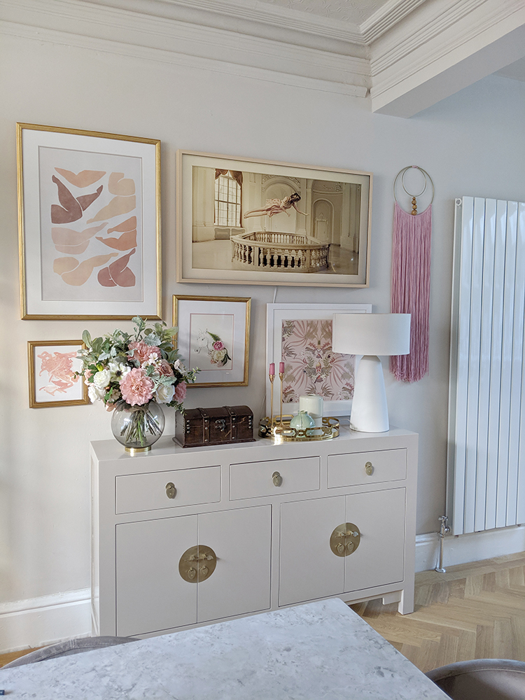
While the Frame TV comes with a slim black frame, unless you are hanging it on dark-coloured wall or have other frames surrounding it in black, it does look a bit like a TV (when completely off). Personally, I prefer the look with either the white or beige bezel but that’s certainly a personal preference. The bezels are available to purchase separately although I do think they add to the illusion that it’s just a framed artwork.
I chose the beige bezel for mine to tie into the colour scheme in my room. Once this was attached (very easy to do as they simply snap into place), it really did look more like a picture frame and less like a piece of tech.
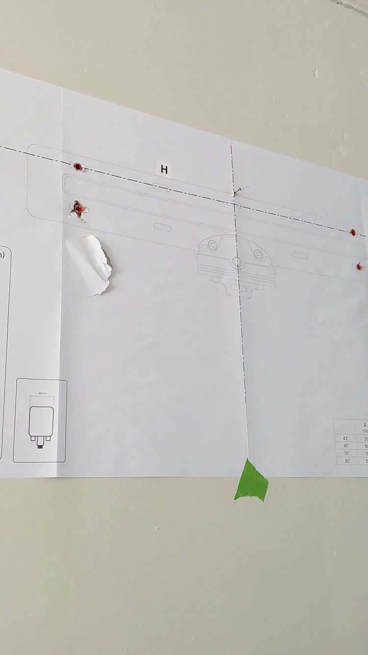
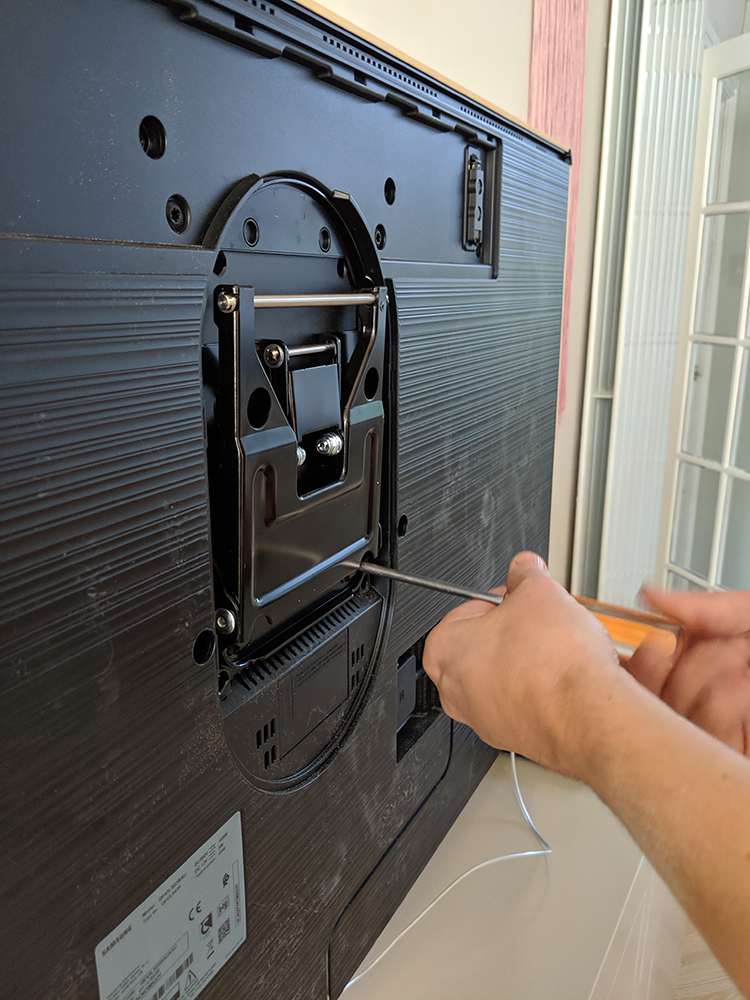
Hanging the bracket on the wall was a relatively easy job for my DIY-savvy other half and it comes with a paper template which makes the job even easier. However, you do want to ensure you use the right fixings for your wall type so if you’re in doubt, consult an expert. One of the clever design tricks incorporated is that the bracket sits within a recess on the back of the TV, meaning the entire TV sits flush against your wall, giving it the look of framed wall art.
Art Mode
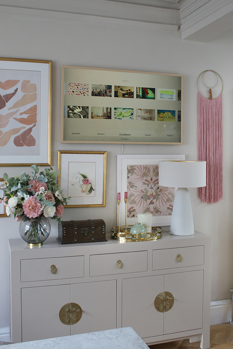
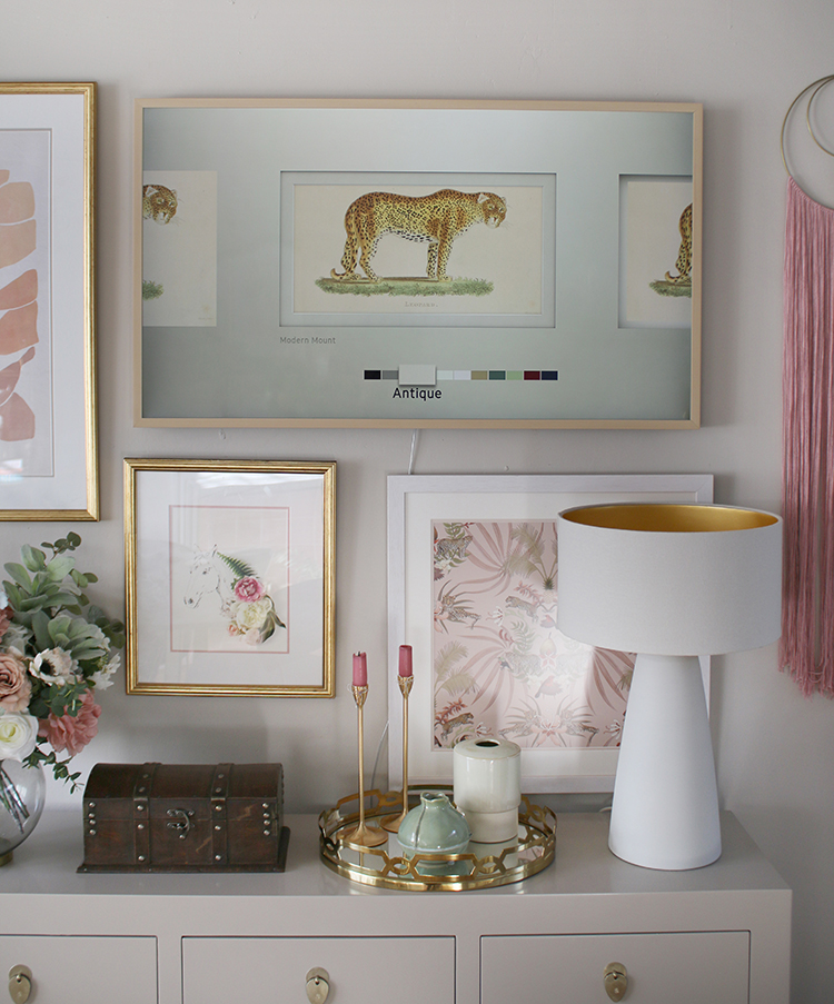
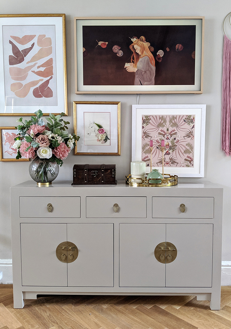
The Samsung Frame comes pre-loaded with around 30 pieces of artwork to choose from so you can find the right look for your personal style as soon as it’s hung. There’s also a subscription product which allows you to choose from thousands of different pieces to display which is simple to subscribe to via the Samsung app.
It’s around £4 a month and for someone like me who likes to switch up their home on a frequent basis, a nice little addition as there is an almost unlimited amount of choice with artwork from emerging artists, V&A, Saatchi, Minted and more.
There’s also an option to display your own photos to create a revolving photo album for a more personal touch and you have plenty of options for things like brightness and saturation as well as the kind of digital mount you’d like – if any at all.
After experimenting with a number of different settings and styles, I saved lots choices in my ‘Favourites’ folder which are easily accessed. I also found I liked the look of the mount. I kept the brightness and settings to ‘automatic’ which meant the display will adapt automatically to darken and lighten depending on the light in the room – it will even adjust depending on where the light is coming from which I found a great feature.
If you’re worried about energy consumption, Samsung have thought of that too. The Frame TV allows you to set the display to only come on when the TV senses someone in the room (although, even when on, the display takes very little energy). It can also be set to switch off the display completely at night when the lights are switched off or after a certain set amount of time.
TV Viewing
Of course, you purchase a TV to watch television so how does it do when in normal viewing mode? Thankfully, the Ultra HD is beautifully smooth and stunningly sharp. The colours – thanks to Samsung’s HDR Elite (a version of HDR10+) – are vibrant and true-to-life meaning nature programmes look beautifully real and the dramas we love have no lag and no blotchy areas when viewing dark scenes.
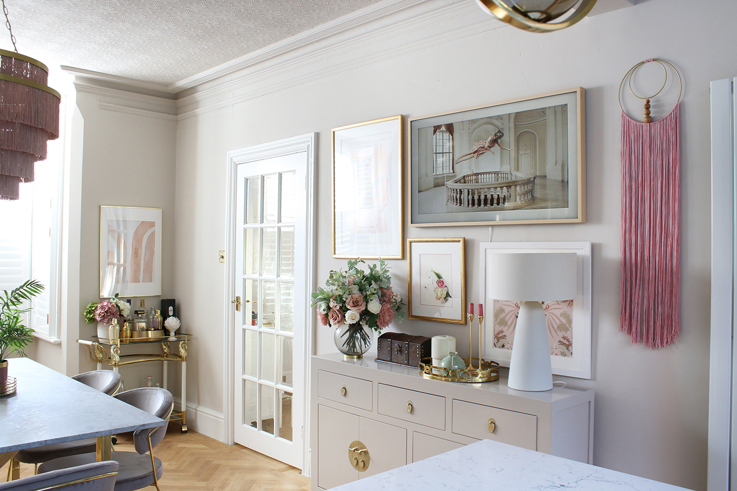
Because of its location on my dining room wall, it’s easy to view whilst I’m preparing meals in the kitchen and the picture is sharp from just about any angle.
It’s also clutter-free, with a simple clear wire stemming from the bottom the only giveaway which plugs into a neat small box that can be hidden away. Mine is stashed under my console table meaning you don’t have to worry about a tangle of wires. They really have thought of everything!
Did It Fool Visitors?
I think the fact that I am fully aware that it’s a television means I notice it more than a visitor who may not be aware. While it’s impressive tech, there is a sort of digital glow that comes from within the TV that can’t fully replicate natural light bouncing off a print.
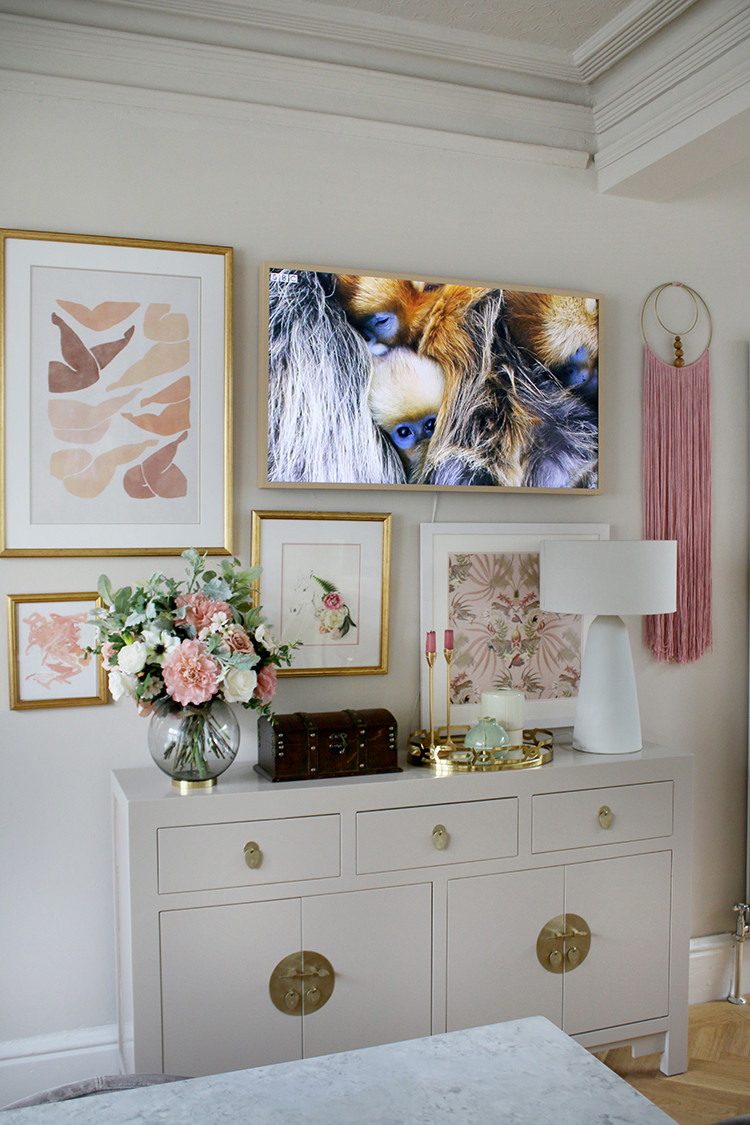
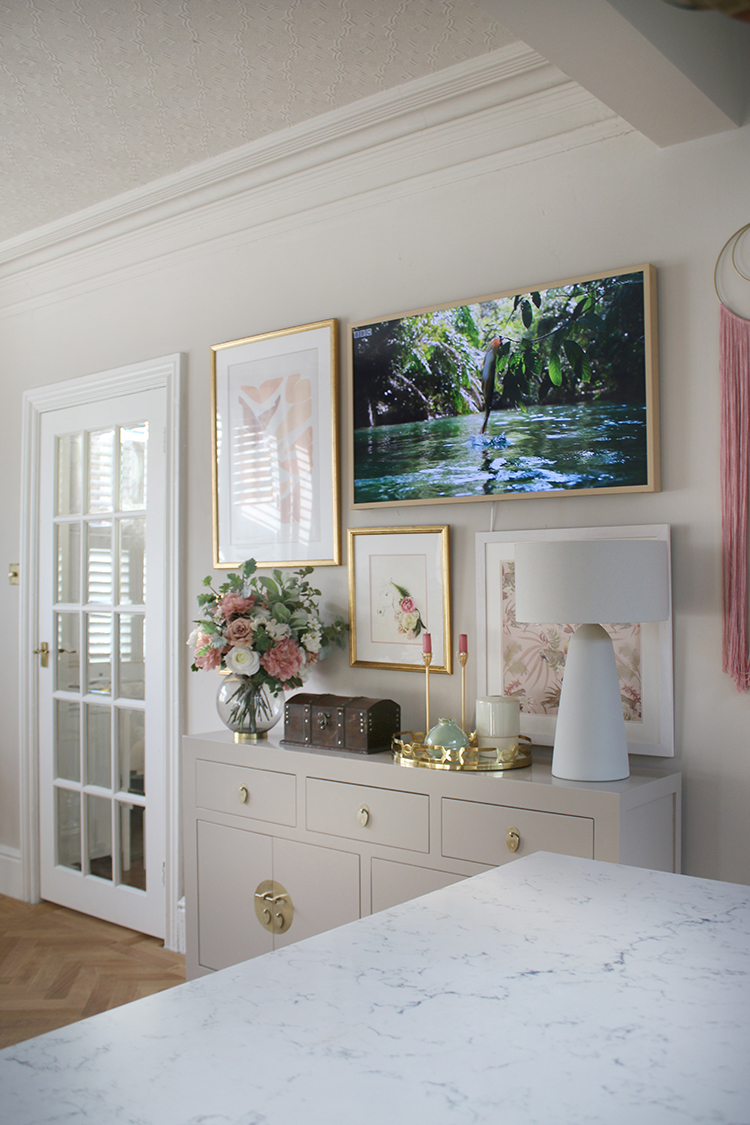
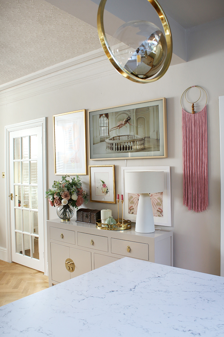
Saying that, when you are standing in front of the TV in natural daylight, it looks nearly identical to the other pieces of art that I’ve displayed around it. And the fact that it’s part of a gallery wall goes a long way in allowing it to blend in.
When Wayne’s friend came around and we switched it on, he was absolutely gobsmacked. “That’s NEVER a TV!” he exclaimed, incredulously, having no idea when he’d been in the room that it was a TV. “Well that’s rather smart, now, isn’t it?” Indeed, it is. In fact, I’ve had other guests who were surprised when I told them, and I’ve not had a single person come into the room and realise it wasn’t anything except for a piece of art. So, it certainly passed the test.
I find as daylight falls and the evenings creep in, that ‘digital glow’ becomes more apparent. In lower light especially when viewing the art display from an angle, the piece doesn’t blend quite as well with the surrounding prints. This doesn’t put me off, however, as I still think it looks so much nicer than just looking at a black screen!
The Verdict
So, does the Frame TV from Samsung live up to the hype? Aside from the digital ‘glow’ in lower light, I do think it goes a very long way in making a space look more pulled together, allowing you to choose what to display to make it blend seamlessly with the rest of your décor.
If, like me, you’ve looked into how to make a TV blend better into a space, this option is practically a no-brainer. Being able to swap between art and viewing the television when needed means I almost never see that dreaded big black box, the motion detector pulling up the artwork before I’ve even realised.
It’s also a great way to swap out the artwork in a room with just a few touches of a button, giving your wall a new look whenever the mood strikes and with new pieces added to the Art Store all the time, you’ll never run out of ways to change it up.
I love that Samsung really have thought ‘outside the box’ for this product and created something that blends the practicality and technology of a high-spec television with a stunning design. I couldn’t be happier with mine and I’m even considering a second for our living room!





How high can it be hung for comfortable viewing?
I think ours is probably hung at the highest point for comfortable viewing as we’re viewing it from the dining room chairs or from the kitchen – so quite a distance away. In a living room, I think it’s best placed as low to head height when seated as possible. The last thing you want is to be straining your neck which is why I’m not a fan of TVs above a fireplace. It’s just too high unless the room is massive and you’re sitting at quite a distance away. xxx
I think this type of TV is amazing and believe pretty much everyone who hates the big black screen in the room would agree that it is a definite improvement. My question to you would be – if you had to pay for it yourself at this time, rather than getting it free, would you have done so? Is it worth what they are currently charging? I’m sure one day, as technology advances, that the costs will be more reasonable, but considering a normal budget, is it worth it at current prices?
Totally fair question but yes, I’d pay for it. I’d actually been saving for it when I decided to approach AO – I didn’t actually think they’d say yes to be fair (!!) but I was prepared to pay the full price if they turned me down for the collaboration. I’m currently saving towards one for my living room because I love this one so much ;) Yes, they are pricey and I do hope they come down in price eventually but until then, I’d still be willing to pay the current price for it xx
I need one of these in my life! Currently, there’s a big black hole, sucking all the light out of part of the living room.
Just wish I could afford one!
Oh, believe me, I have the same in my own living room! I know, they are such an investment and not something you can just purchase on a whim but certainly worth considering, I think! :) xx
That is totally amazing! I remember my first digital tv – it was at least 60cm deep and weighed a TON! When the slimmer tvs came in they would have special sections in showrooms dedicated to them. The prices, as I remember, from the late ’90’s early 00’s were from £1500 – £2000. men would be standing open mouthed gazing lovingly at them! Really expensive, but look at them now. I guess this will be the same for this brilliant telly.
I was actually wondering where you “black hole” was situated and now I know! What a fabulous addition to your art wall.
Are you able to get one of those frames after the tv is already on the wall? I own one today. Also on a unrelated note. I live in a very small studio, just one room, with kitchenette. My bathroom is my only other room. My question is; can I paint the wall any other color than white? Could I paint/wallpaper sections? Or will that make the room smaller.
// Afre 😊
Have you tried uploading your own artwork / photos to it yet? I have just ordered one and the hope was that I would be able to use photographs of my own designs or photographs of artwork that I like. However, reviews suggest it doesn’t have a useful process for this and your own photos are left with some sort of border or poorer quality…have you found that? I haven’t found anyone commenting on the details of how to successfully upload your own quality images…e.g. what format do files have to be in? How many pixels? I don’t really want to pay yet another subscription for yet another digital ‘thing’ in my life however small it seems.