The following post includes items provided in exchange for advertising coverage from my sponsors, West Elm, Earthborn Paints and Woodchip & Magnolia.
I realise this has been a long time coming now but I’m so excited to finally be revealing my combined office and dressing room to you! The truth is, the room was around 90% finished a good 4 weeks ago but we had some delays with one last piece of furniture so I didn’t want to share it until that last piece was in place. However – hallelujah – it arrived a little over a week ago and so despite the fact I’ve actually been using the space for more than 6 weeks now, I finally get to share my new and improved space with you!
Now, I know you are just going to skip over my waffling and scroll right to the ‘after’ pictures (not that I blame you, I’d be doing the same) but in case you are either incredibly patient or you have already scrolled and are now reading over the actual post, I absolutely have to talk a bit about what this room was like before I started planning its complete refurbishment.
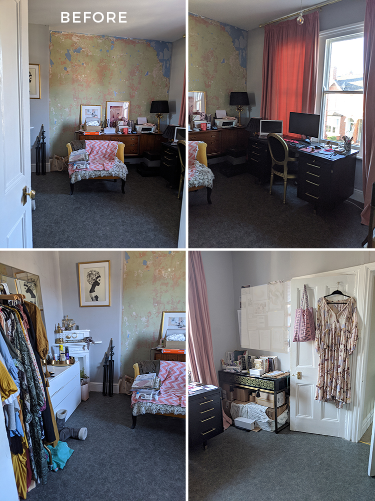
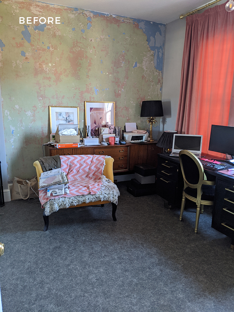
For a good 2 1/2 years, I was working in a space that we can say was ‘less than ideal’. From the cheap grey vinyl flooring to looking at a wall that was bare plaster and filled with a mishmash of old furniture that had nowhere to go to a dangling lightbulb just in front of the window, electrics that hadn’t been updated since the 1960s and more, the room needed a LOT of help.
I reckon I’m not alone in the fact that when a room looks like garbage, it just becomes a magnet for more garbage. And that’s what happened over the years with this space. It became a sort of holding zone for whatever I had no space for or no love for and suffice it to say, it didn’t exactly inspire creativity. It was basically just a dumping ground that happened to have a desk and a couple of places where I stored my clothing, camera equipment and office supplies. The ‘before’ photos you are seeing are what the room looked like just prior to its transformation in all of it’s horrible, messy glory.
Aesthetics aside, there were a few issues I needed to address… there was a distinct lack of storage (as evidenced by the piles of crap everywhere), the room had no focal point, the desk against the window caused too much glare on my screen (so most of the time I was sat with the curtains half or fully shut), the lighting was insufficient, plug sockets were all in the wrong places and none of the furniture was actually fit for purpose as the pieces in here weren’t purchased with this room in mind. It was too dark, too depressing and with plans to start a product-based business, the storage issue was only going to get worse.
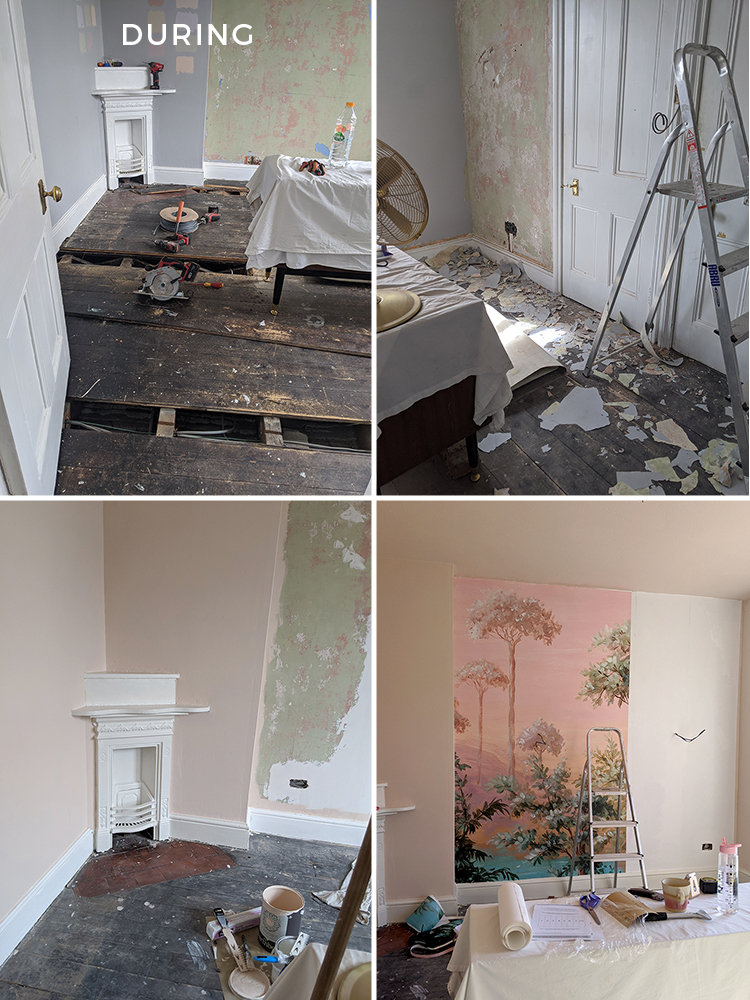
I’m going to take most of the credit for the transformation if you’ll allow me. I think Wayne spent about 20 minutes in here filling some of the larger channels and I did have an electrician who relocated sockets and lighting for me as well as someone to install the new carpet. But I probably spent somewhere in the region of around 40 hours in this room doing absolutely everything else from scraping old paint from the walls, scrubbing old tiles, filling and caulking, sanding, priming, painting every square inch, hanging the lining paper and mural and of course, designing and dressing the space. This has been a total labour of love for me.
Are we ready to see the after? I think you’ve waited long enough…ta da!
You may be thinking ‘is this even the same room?’ Yes, yes it is. Go scroll up again to the before pictures, I’ll wait.
So let me start here by saying none of this would have been possible without my incredible sponsors. I am forever grateful I get to work with my favourite brands on these projects and this is no exception. I discussed the paint from Earthborn in my progress post but to reiterate, I used the beautiful Earthborn Claypaint in Peach Baby on the walls and their brand new creamy white shade Up Up Away in their Eggshell No 17 line on all the woodwork. It’s a dream to paint with and I’ve used their paints all over my house because they are breathable, non-toxic, thick and creamy and the coverage is unbelievable.
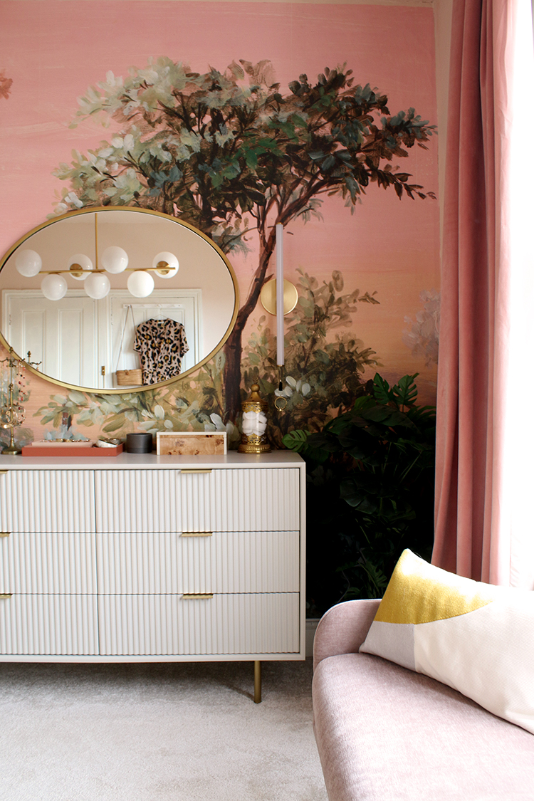
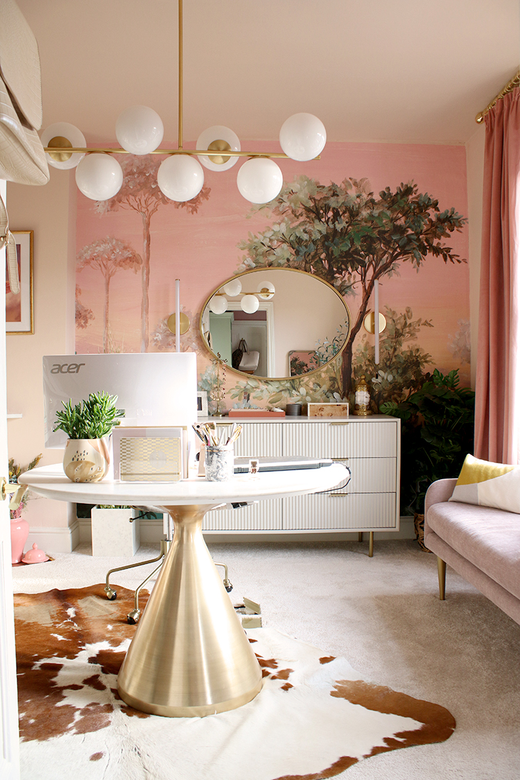
I also previously mentioned Woodchip and Magnolia who provided the most beautiful wall mural, one which I’d had my eye on for a couple of years, knowing that I wanted – no needed – to use it somewhere in my home. It’s the Oasis mural in the peach/pink colourway and it has provided that missing focal point that the room desperately needed. I adore it, it hung so easily and it was the piece that the rest of the design was centred around.
Finally, my absolute dream sponsor on this project was one of my all-time favourite brands, West Elm. I have been a fan of their furniture for years, have been lucky enough to work with them on a couple of projects in the past and was over the moon to be working with them on this one too. All the furniture, lighting and a number of the accessories are from West Elm so I’ll be sharing the sources for everything as we’re chatting through the design.
So this room has a few different functions. When we first moved in, I had envisioned this as my dressing room and my office was going to be downstairs where our old kitchen currently is. However, the room is a great size and the need for a utility room outweighed my need for having two spaces so that idea was fairly quickly nixed in favour of combing the functions here. Then, earlier this year, I decided I wanted to start my own home fragrance line from home which meant this room would eventually need to have even more storage than originally planned.
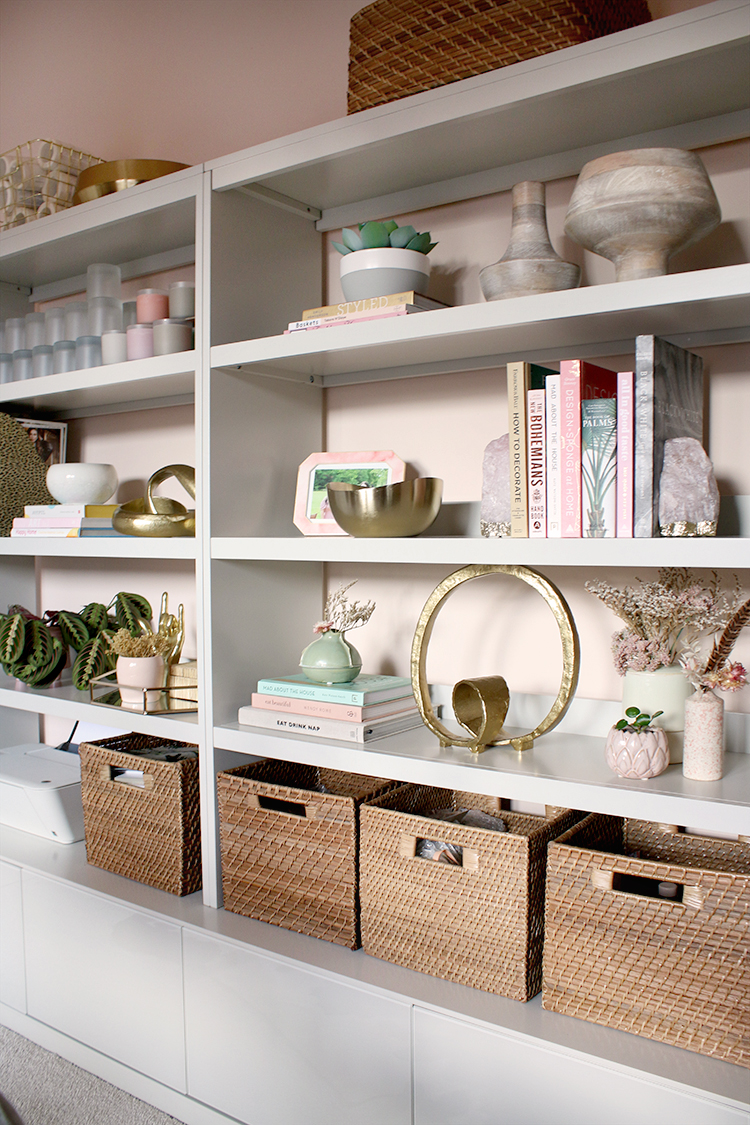
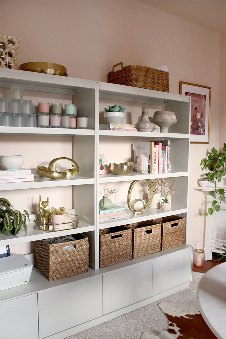
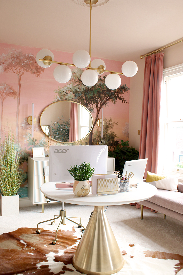
Moving the desk from the window to the centre of the room meant I not only overcame the glare-from-the-window issue but there was more space for storage along the walls – both for stock/packaging as well as my clothing. The Emilia media set was a godsend here, with 8 good size shelves as well as cabinets to hide things away I didn’t need on display. For the time being, I dressed the shelves more decoratively but believe me when I say this is going to be a workhorse, storing glassware, boxes and finished stock so this will eventually be a sort of ‘storefront’ for Swoon Worthy Scents.
On the shelves, I also chose a few of West Elm’s gorgeous accessories, including the Modern Weave Storage Baskets (full disclosure, I chose 2 initially as part of the collab and then I went and purchased three more with my own beans because I loved them so much!) which are currently filled with stock like dust covers, labels, wick trimmers and more. You’ll also see the Metal Loop decorative objects, a couple of those gorgeous Coastal Bowls on the top left which add some texture and warmth and that huge gold bowl style Lost City candle.
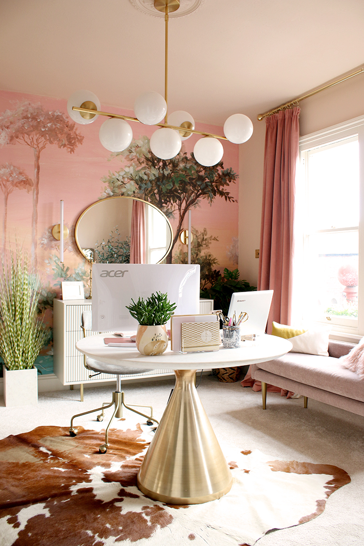
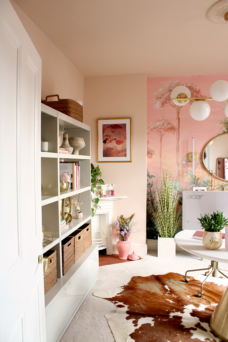
The ‘desk’ is actually West Elm’s small Silhouette pedestal dining table. I wanted something beautiful and elegant for the centrepiece of this room and this marble-topped table and brushed gold base gives me plenty of room for both a laptop as well as a large monitor (totally necessary for editing photos, research and responding to emails all at the same time). I love round shapes in rooms because they soften the harder angles and give the room some movement. It’s heavy as anything (West Elm’s delivery guys were amazing by the way, carrying all this stuff up a flight of stairs!) but it sets the stage for the rest of the space and the nod to glamour that I love.
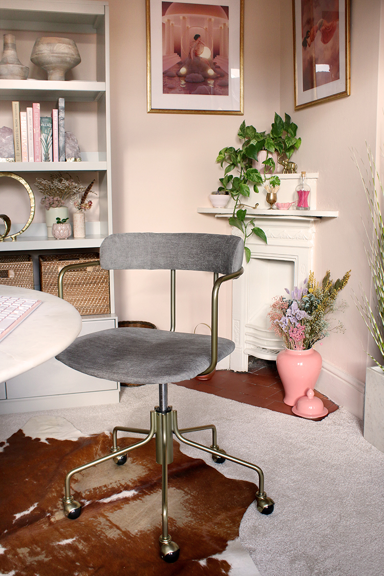
The Lennox swivel chair is both elegant and functional – a near impossible find when you are looking for comfortable office chairs! I wasn’t sure if it’d be difficult for the wheels to move on the carpet but so far, I’ve not had any issue and I’m finding it really comfortable as I am able to adjust the height of the seat – a necessity for a shortie like me!
I layered an old brown-and-white cowhide rug I’ve had for many years (you’ll have seen this last in the ‘glam cave’ in our old house!) over the carpet to add some texture and pattern. I love the look although being totally upfront, I’m not sure how long I’ll keep it in here as it does tend to move around a bit during the day so I feel like I’m forever straightening it!
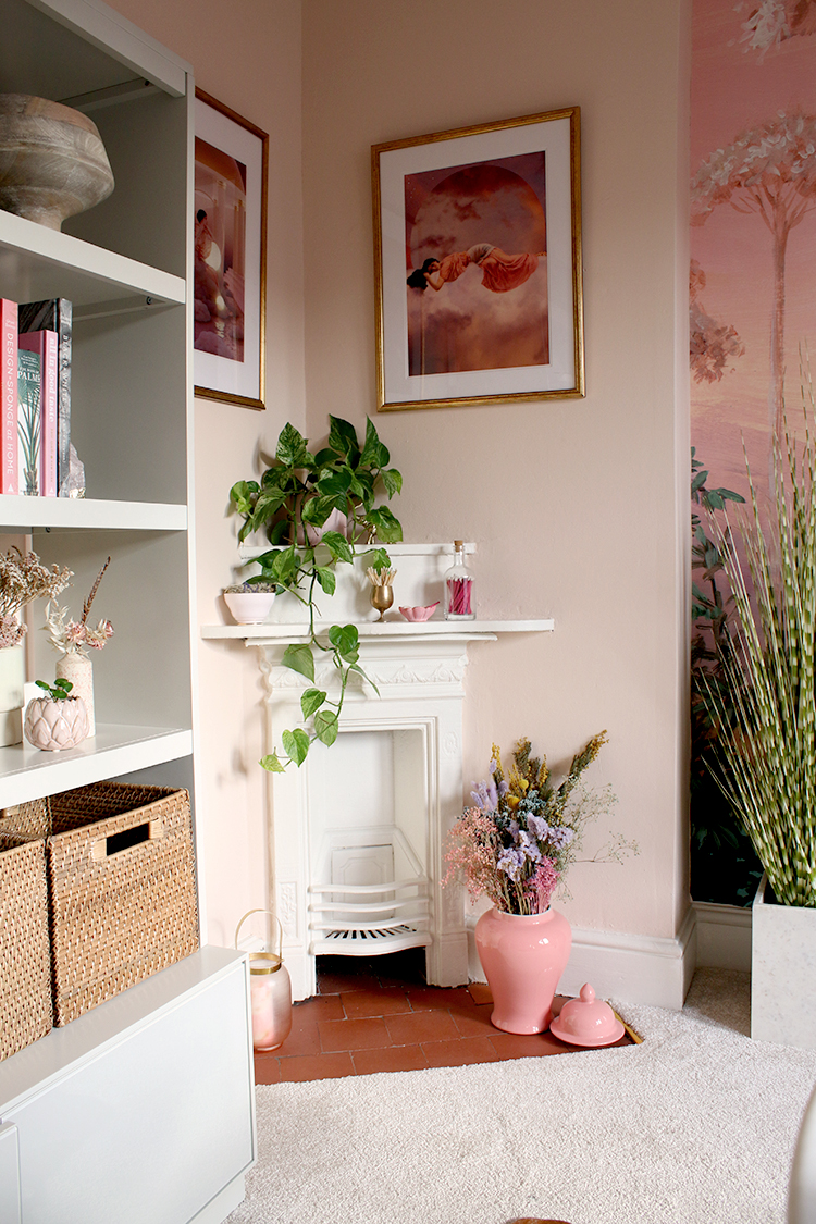
You’ll recall that this little corner Victorian fireplace was something I was really keen on making a feature in this room. I was able to restore the original tiled hearth to its former glory and the warm terracotta tiles are the perfect vintage touch I think every room needs.
Above, the artwork is from a Polish artist I found on Instagram called Soft Warming and on the hearth, a ginger jar from Nine Schools (PR product from a previous collaboration) filled with dried flowers from another Instagram find, Appreciation Project.
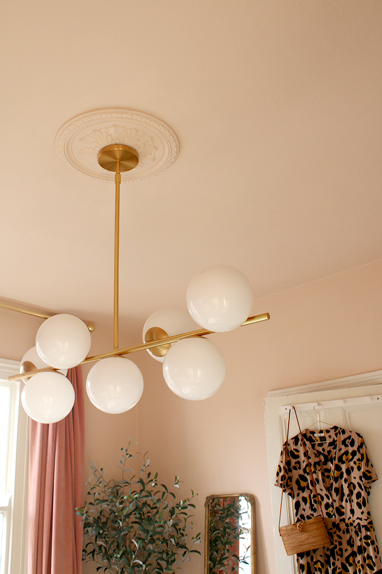
Can we talk about that amazing Sphere & Stem light fixture? I admit, I decided on this particular chandelier after seeing it in designer Karen Bohn’s dining room and playing with larger proportions in your lighting is one of my favourite ways of making a room feel bigger without intruding on the space.
I chose a decorative Victorian-style ceiling rose to offset the ceiling light, a sort of old-meets-new juxtaposition that I’ve used in my designs for many years. You’ll notice the ceilings and ceiling rose were all painted in the same Peach Baby colour, hugging the room in the most flattering tone.
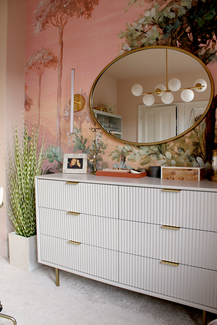
Speaking of flattering lighting, I also included those fabulous LED light rod sconces flanking each side of that beautiful gold framed oval mirror (which echos the curves of the desk) – these are warmer lights than the Sphere light on the ceiling, perfect for putting on my face, illuminating from all sides rather than just from above.
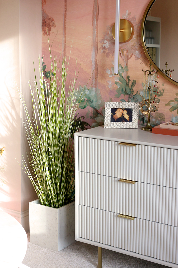
The Quinn Lacquer 6-Drawer Dresser might be one of my favourite pieces in this room. I adore the on-trend fluted drawers and the simple statement-making pulls. The soft ‘haze’ colour is a soft warm grey which is nearly a perfect match with the shelving units. The roomy drawers hold so much more than my old chest and I was able to utilise the top left one as a ‘desk drawer’, so it cleverly hides all the bits and pieces I need and is easily accessed from the desk, with just a swivel!
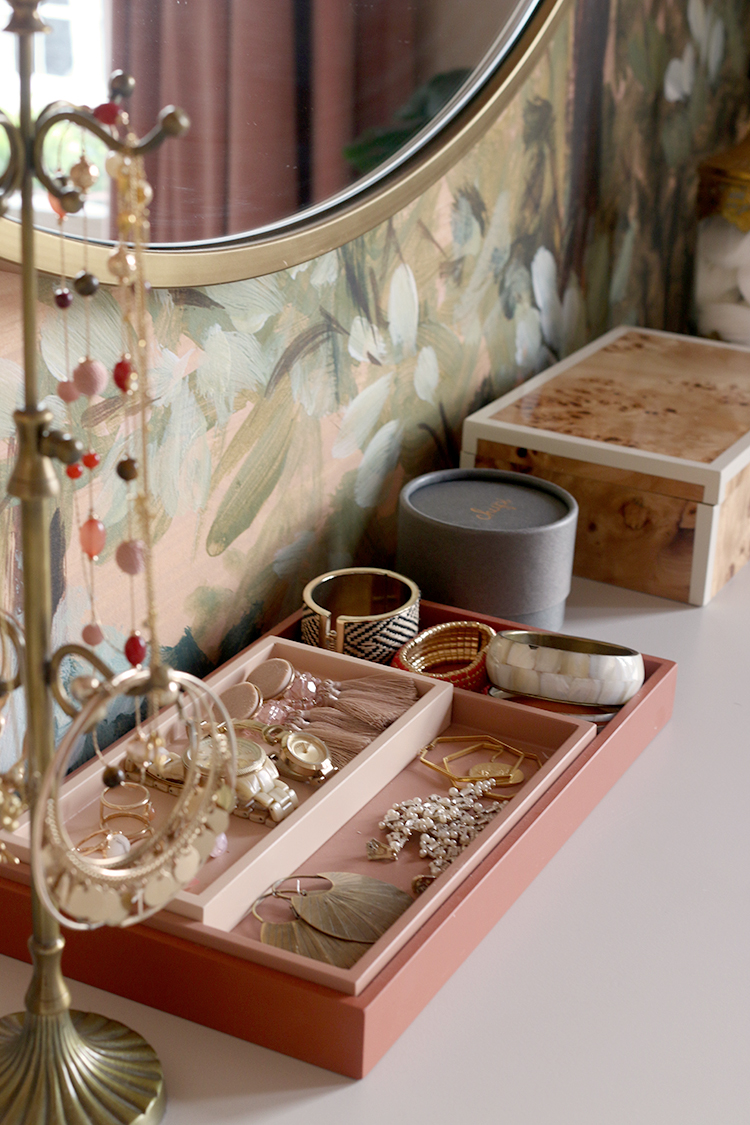
On top, I’ve included the colour block warm trays which hold my everyday jewellery and tie in perfectly with the colours in this room and the gorgeous burled wood box cleverly hides all my daily face creams and serums to reduce clutter. To the left of the chest of drawers is a faux zebra plant I’ve had for years in West Elm’s gorgeous Amalia marble planter which matches beautifully with the desk.
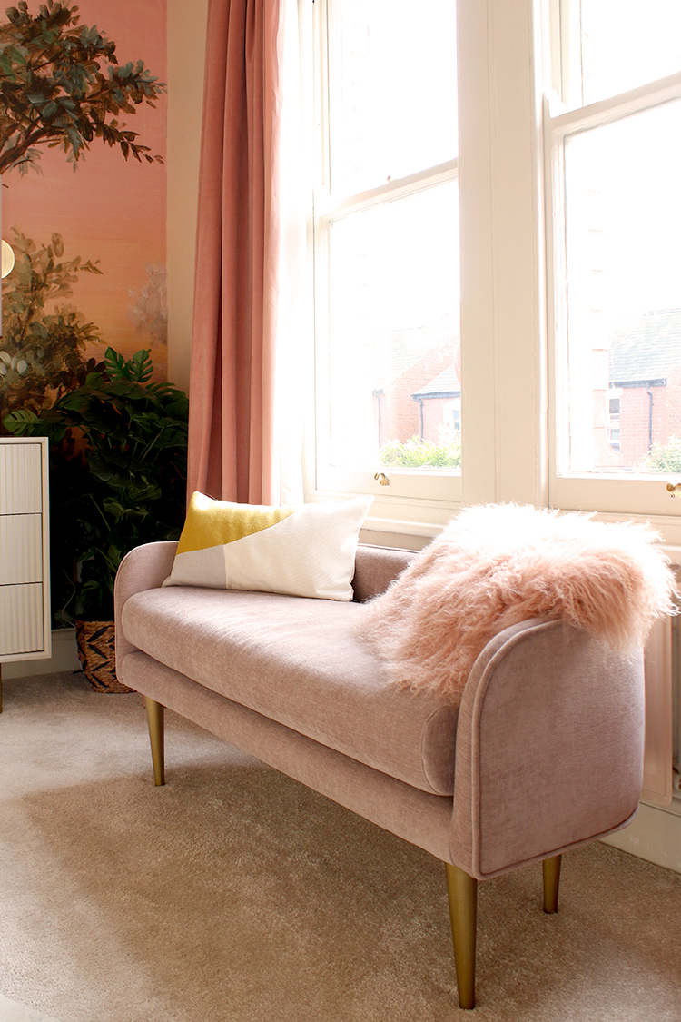
The Celine bench in distressed pink with its beautiful curves was the finishing touch in this space, fitting perfectly under the windows without obstructing the view to the balcony and street beyond. This is such a lovely spot to perch to put on shoes or have a little break during my day. Of course, Quito and Meisha like it too, despite the fact I’ve warned them its not a pet bed!
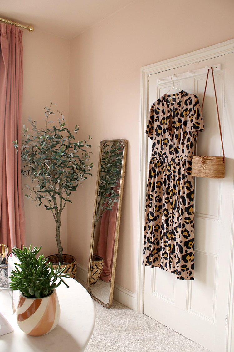
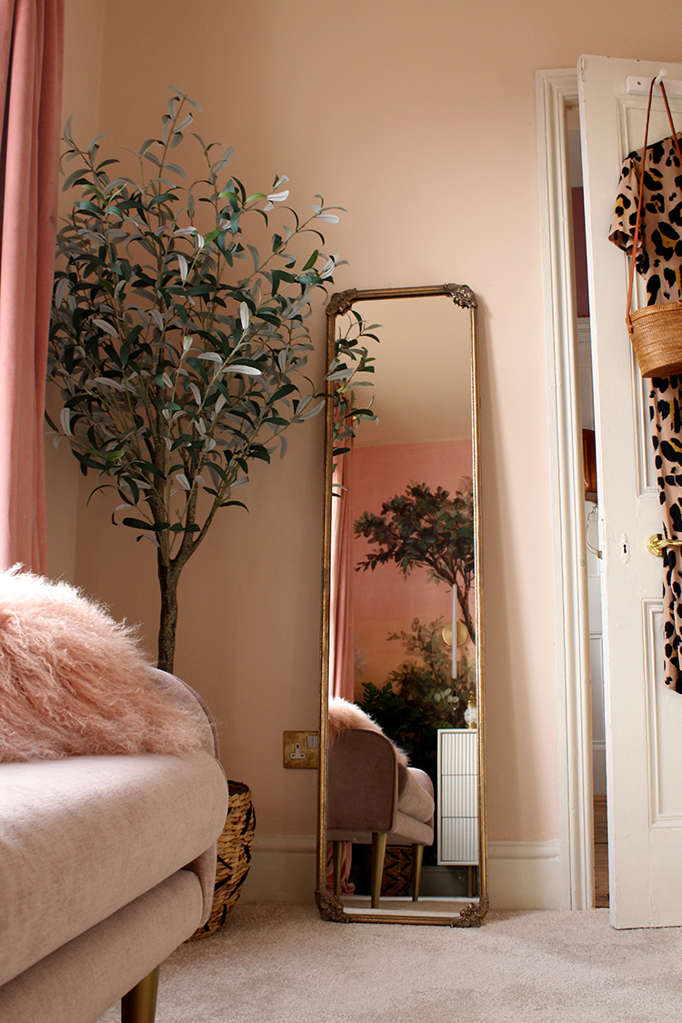
The curtains were a purchase I made quite some time ago (you can see them in the before pics above!) but they work so much better now with the whole look and feel of the room and in this little corner, I’ve leaned a floor-length mirror that I’ve had for ages and placed this incredibly realistic faux olive tree in the corner. Eventually, I’ll have a wardrobe in this corner (I haven’t yet found one I love!) so its something I’ll be adding sometime down the road.
So if you have made it to the end of this monster post, congratulations. It’s taken me more than 2 1/2 years to get to this point but I absolutely adore this space now and look forward to using it every single day. If there’s anything I haven’t linked to and you’d like to know where it’s from, just let me know below!
One more before and after just for fun… The before….
And after…
I’m sure the space will evolve over time, especially once I launch Swoon Worthy Scents and once it’s up and running, I’ll be sure to share it again to show you how I’ve utilised everything to work perfectly for a small product-based business. Until then, I’d love to know what you think of the transformation in the comments below!
Huge thanks to my wonderful sponsors, West Elm, Earthborn Paints and Woodchip and Magnolia for allowing me to complete this project and thank you for supporting the brands that support Swoon Worthy. I only work with brands I genuinely love and think you will too.











It looks AMAZING!!! Wow, wow, wow!!! What a transformation, I LOVE it! You must be so happy. If I was you, I’d probably sleep in that room for the next month or so ;-) xo
It is absolutely stunning! Thanks for sharing your brilliance and good luck on your new endeavors!!
It’s just a dream! I wouldn’t want to leave it …… ever! You are just a star 🌟. I have tried to choose my favourite item/s in the room ……. impossible because they all compliment each other so well, but if I had to then I do adore the beautiful Oasis mural! I can only imagine the joy, peace and calm you feel every time you enter your room! Beautiful! 💗
Gorgeous room! Not sure if you specify and I missed it but what carpet did you use?
Hi AJ, we got it locally but it’s from Tipi Carpets – it’s the Petersburg in cream! Hope that help! :) xx
Thanks Kimberly. I wish I had your style and taste!
What a lovely, warm room! I was going to say that that table is truly the star of the show, but then you have to include the light fitting, the drawers and the mural and, before you know it, it’s just the whole room!
Oh my goodness this looks so beautiful! What a transformation! I totally dream of having such a stylish, feminine space ❤️
Just beautiful. Every nook and cranny has a purpose. It’s been so fun watching the transformation. How’s hubby’s office coming along? 😉
Aww thank you! It’s coming along although at the moment, it’s full of packaging stuff for my candles!! LOL! Bless him! He’s still waiting on purchasing a few new bits including a small sofa once we’re able to find another storage solution – so it’s not quite done yet ;) xxx
It’s just stunning Kimberly! You’ve created a fabulous space to work in. It’s so you, and it’s so swoon worthy! xxx
I literally said “Oh my god!” out loud! Looks amazing! Such an inspirational space. I love the Peach Baby colour on the walls and ceiling, it’s so warm. Also can’t wait to try your candles!
My favourite piece is the wall mural….gorgeous
My favourite transformation in the entire house! Looks wonderful!
Absolutely gorgeous!! I love that chaise under the window but I have a feeling the furbabies aren’t going to listen when you say its not a pet bed. LOL <3
Do you mind sharing where you get your frames? I love the vibe of the prints over the fireplace and I think the frames play a large part of that.
Hi Michelle, actually Meisha is asleep on that little chaise right now! It’s hopeless really lol The frames were purchased a good few years ago from Easyframe! I find them really easy to use, good quality and good value :) Hope that helps! xx
I literally gasped when I saw this. I need, need, need that mural.
Absolute stunner, yet again. Job well done! And thank you for sharing, and I hope you find a wardrobe you love soon for your hanging items.
Love it!!!
Oh, that mural is just IT in that room – well worth waiting for…and the room itself is such a knockout – so very feminine and so very you!!
Your four-footed children will always find their way to anything with velvet – I’m sure you have already discovered that – but Quito would photograph so beautifully in that room as well as the gorgeous tortoise girl, Meisha. I’ll be expecting them in your next post!!
Such a beautiful room and just more gorgeousness from you…thank you…and I want to be one of the first to order a candle, too!
XO
Susan
It’s beautiful! I don’t think I would ever leave it! That mural is absolutely gorgeous and I love the round ‘desk’ too! Well, alright, I love it all!
Excellent post and am glad to read it. Thank you so much for your idea very helpful to decorate at home with furniture. I appreciate to you for such a nice article for making a good interior’s home.
Wow, absolutely stunning! Well done!