So I mentioned that I’d swapped a few things around in the dining room when I shared a few updates in the living room last month. The biggest one: deciding on a whim to swap the rugs between the two rooms. I’d meant to show you the result of that swap soon after that post but being the middle of January, the weather was just so grim and my home looked more like a cave than a house so taking pictures has been a bit on the backburner.
That, of course, has only changed over the last couple of weeks – suddenly, the sun is so much higher in the sky, rather than just barely over the houses until it quickly makes its descent again. I really hate the winter for the shorter days and the seemingly endless rain and clouds. It affects my mood and my motivation levels. So seeing brighter skies the last week or so has really made me feel just so much better, so much more motivated and my home is just that bit brighter which makes taking photographs an actual possibility again.
As a side note, it’s one of the reasons you haven’t seen any new photography on the blog lately until fairly recently – I’ve been mining my collection of photos of the house to create blog posts because shooting new images just hasn’t been possible! #firstworldbloggerproblems #bloggerguilt
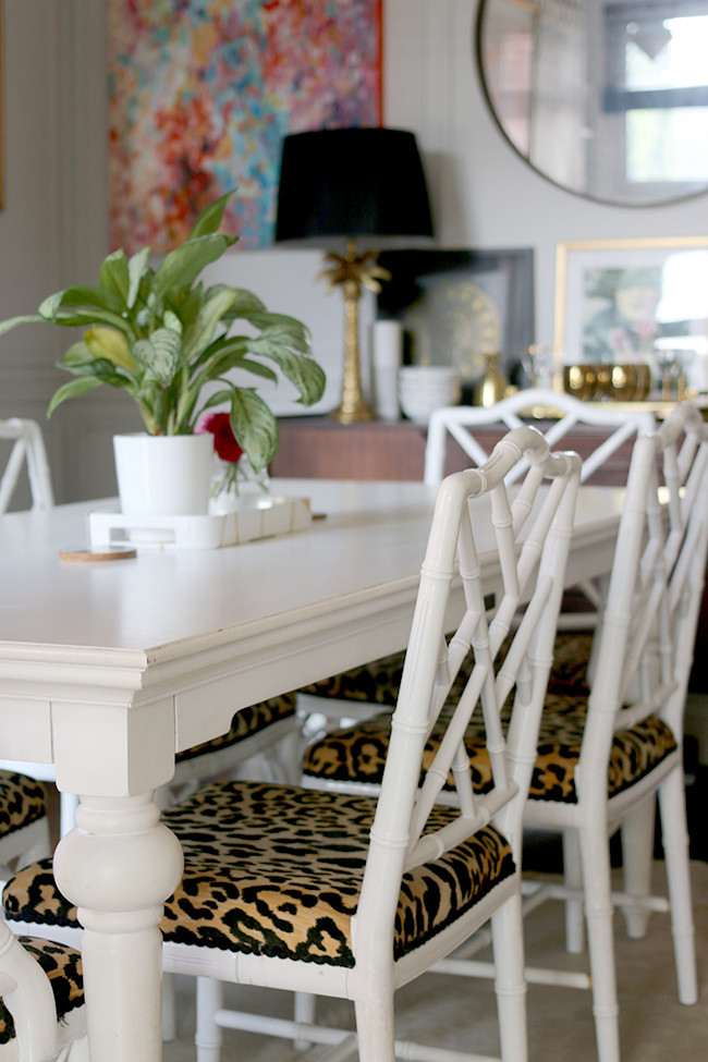
Sooo happily, the sun has managed to break through the clouds this past week so I figured I’d shoot the dining room and share with you what it’s currently looking like. Obviously, we haven’t redecorated or anything like that. It’s just some simple swaps and a bit of a refresh for the Spring.
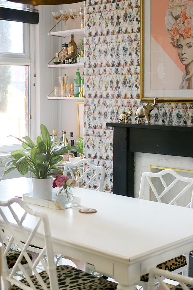
While I will never ever be a minimalist (I just like my clutter a bit too much), I do like to simplify ever so slightly as we move into warmer months. Suddenly, that need to surround myself with stuff to create some visual warmth (‘the nesting effect’ as I like to call it) is not quite as necessary so I do allow a few surfaces to breathe.
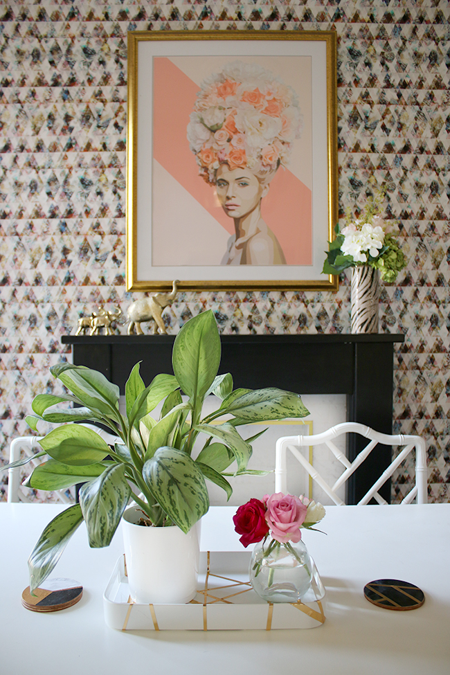
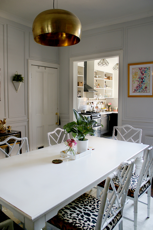
As much as I adore the look of a fully accessorised and styled table, what you see here is what it looks like on an everyday basis. I realised that it’s just not practical to have a beautifully layered centrepiece around here. Our dining room table is in constant use and for reasons beyond my comprehension, the cats seem to be always on top of it. Which means I need to be able to clear it daily and disinfect it before meals quickly. So a simple tray (DIY here) and coasters (DIY here), as well as a plant and maybe a few flowers are the only embellishments I normally leave on top.
For the little bar cart and shelving above it in my alcove, I’ve kept things pretty simple with some greenery (both real and faux!) and a simple black and white piece of artwork. I did have one casualty – my trailing Philodendron that was hanging from the ceiling here has decided to go to planty heaven over the winter *sob sob* – I think being over the radiator just didn’t help anything and it was looking worse and worse until I just figured it was a lost cause.
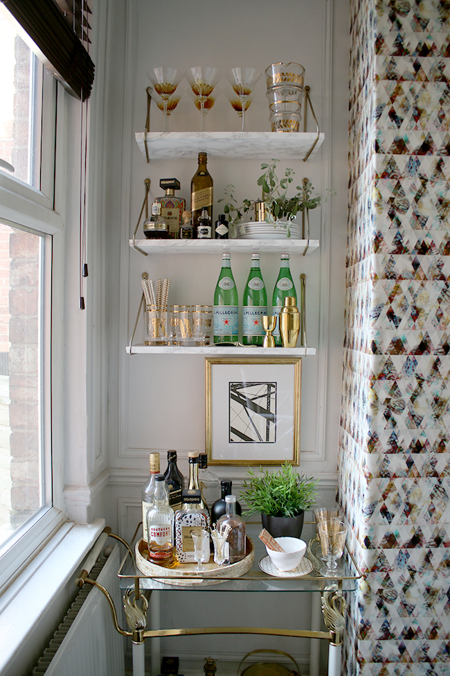
I always have a few fatalities over the winter months – there just isn’t enough sunlight and the air is dry and if I don’t look after them vigilantly, they just die on me. And yeah, I do blame myself!! I’m thinking of getting a faux one here instead just to save me the bother of trying to keep something alive in this corner!
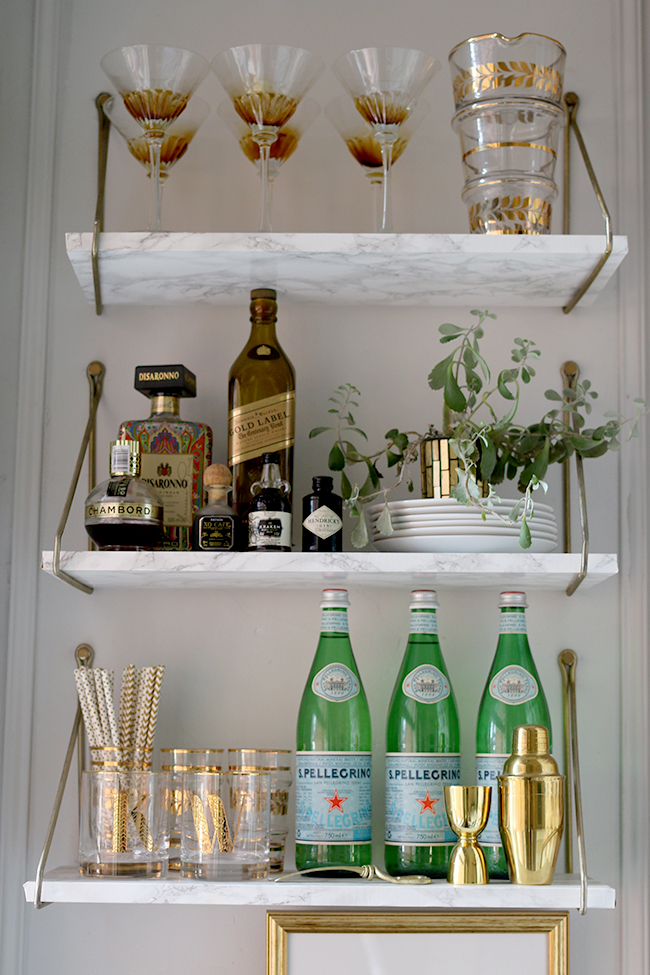
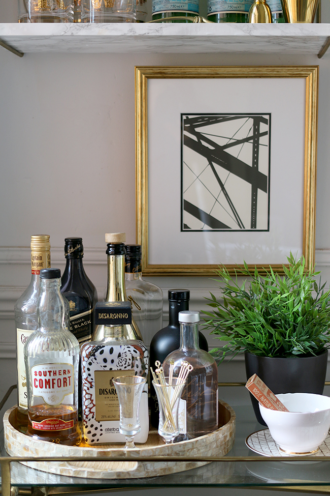
Yes, it’s really really bothering me that I didn’t turn the label outwards on that gin bottle before I took the picture.
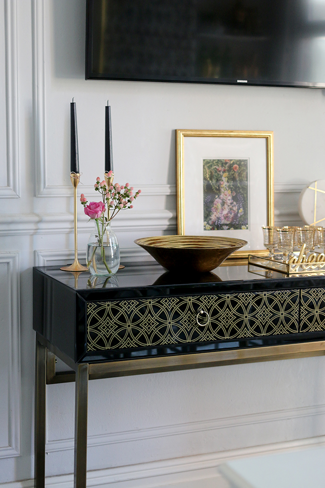
The sideboard has been a bit zhushed up as well. I was never crazy about the styling I did when I did the reveal post on this room and since then, it’s changed half a million times.
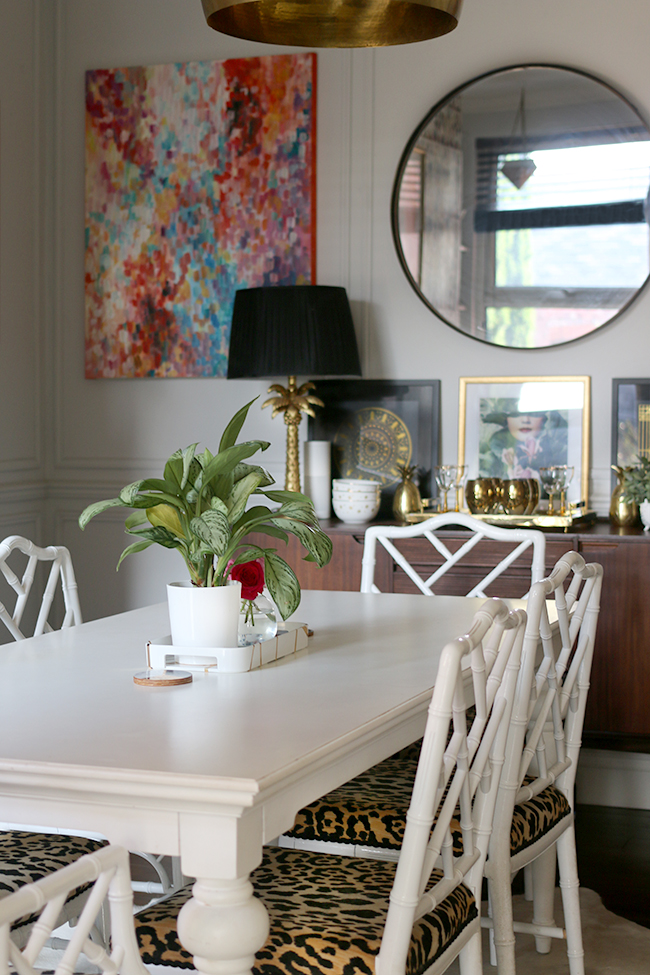
I am quite happy with this set up now, with my Beth Hocknel print* flanked either side with two prints from The Curious Department. And of course, I just had to use that glorious black, white and gold tray from Sweetpea & Willow that I received recently. It may be my new favourite thing in my house.
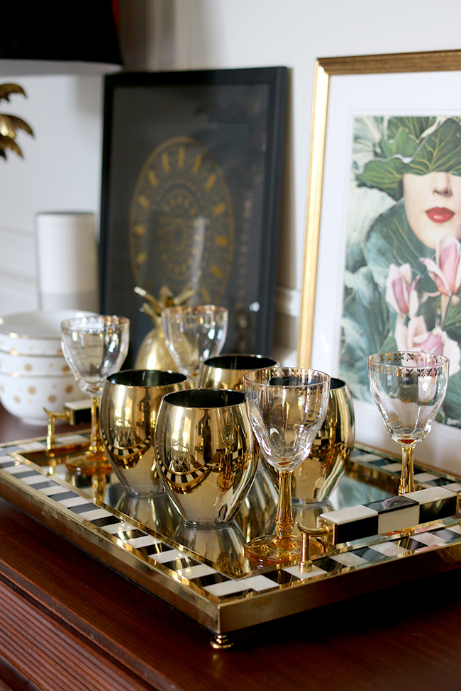
The black sideboard was simplified with just a few accessories on top. I used to pile this table with just so much STUFF and I actually quite like this look. Everything has been chosen with care and I rather like the small touches of blushy pink in the mix.
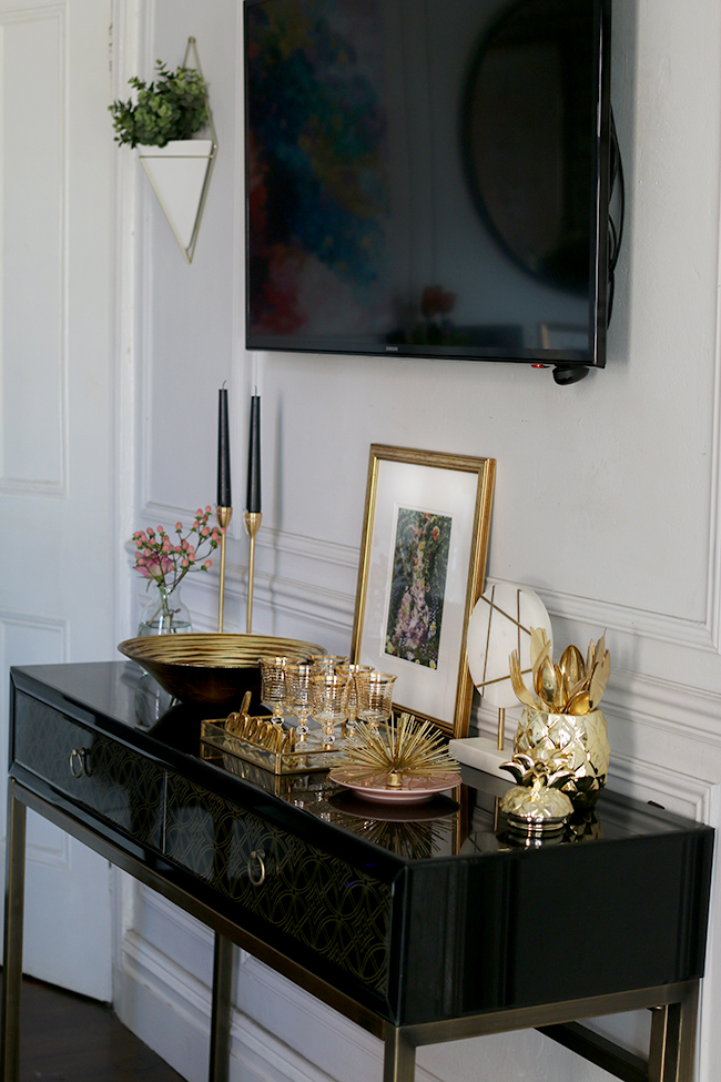
I always get comments about the fact that we have a TV in here. I know it’s a bit odd but is it really that big of a deal? We like it, it works for us. *shrug*
Of course, as I mentioned on Instagram, this little guy insisted on me taking his picture. Considering that we nearly lost him recently (yes, it was horrible and how we managed to get him back is a long story but I’m just so glad he’s home with us now), I thought I’d oblige him. Needless to say, Quito’s been spoiled rotten since his big adventure.
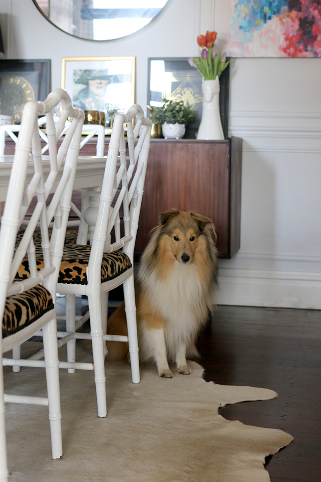
And another…. ;)
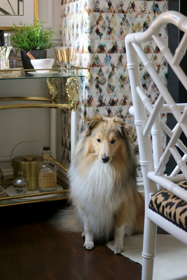
I mean, with a face like that, how could I not?? Anyway, enough of my dog – back to the dining room!
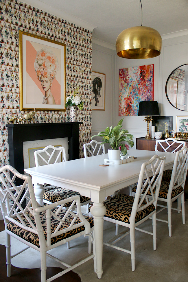
I do really love the white cowhide rug in here. It’s a better fit than the black and white one so all the chairs fit on it quite easily. And cowhides are such a cinch to keep clean – a simple hoover and a bit of dish soap and warm water for spills and it comes up good as new. Hard to believe that one is nearly 5 years old!
Anyway, so those are the changes I’ve made as we go into Spring. Nothing major, just a few simple swaps and a couple new bits and pieces to refresh the space. Have you been refreshing your space lately? Looking forward to Spring as much as I am? Do tell….











Aww, Quito! So much fluff! Beautiful dog, so glad he got home safely.
Love your dining room in all seasons, the gold, the glam, it is simply fabulous. And anyone who thinks they have a right to tell you what you should and shouldn’t have in there (despite the fact you’re sharing it publicly) can take a long walk off a short pier! It’s your home – do what works for you! :-) I certainly do! x
I’m always swooning over your dining room.. everything is just the midas touch! You’re inspiring me to get a rug under my table
Lovely! And the white cow hide really works in there – I love those simple ideas which cost nothing and make a huge difference, so satisfying! xx
Where are the shelves and brackets from please love the look xx
I would also love to know where to get the shelves that you have above the bar cart. :)
They are actually a DIY! You can see that here:
https://www.swoonworthy.org/2016/06/diy-faux-marble-shelf.html/
xxx
Your home gets more and more beautiful! I ADORE your relaxed-glam style and agree with you about layering a little less as we move towards lighter and warmer weather. (So with you about hating winter and feeling glad that the sun is getting higher!)
Sorry to hear of your hanging plant :-( but all your other little touches of green and flowers work beautifully in your room.
Ahh Quito is really the most beautiful dog! xxx
I’m a “more is more” person but like you I like every now and again hide things away and have less on display for a fresh and less cluttered look. But then I quickly get bored and go back to how it was before :)
That tray is just amazing, the whole room is amazing.
I’ve been lucky this winter, (fingers crossed) I haven’t lost a plant yet. Yes I am really looking forward to Spring, it’s seems to have been a long Winter so far, and I’m ready for some sun shine, and warmer weather. Lol I need something to put a spring in my step, and get me going xxx.
What a stunning home, such a great mix of interesting designs and colours that work so well.
great work!
Where did you get those gorgeous shelves?!
Oh thank you Charity! They are actually a DIY! You can see that here:
https://www.swoonworthy.org/2016/06/diy-faux-marble-shelf.html/
xxx
Hello, love your bar set up and especially the shelves. Where did you find the fabulous shelf holders? Thank you! Elizabeth
Ahh thank you – the shelves are a DIY which you can see here:
https://www.swoonworthy.org/2016/06/diy-faux-marble-shelf.html/
xx
Hi, Love the look of your bar cart! Could you please tell me where you got (or how you made) the shelves above the bar cart? I’m trying to find the apparatus that you used to hold the shelves up on the wall & cant imagine what that would be called. 😁🍷Cheers!
Ahh thank you – the shelves are a DIY which you can see here:
https://www.swoonworthy.org/2016/06/diy-faux-marble-shelf.html/
The source of the shelf brackets are listed in the post – they are from House Doctor :) xx
Where did you get the leopard print chair cushions?
Hi SLR, the chairs were upholstered in Jamil Natural fabric if that helps! :) xx