At some point in the next few months, Wayne and I will be taking on our biggest project to date. For those waiting on news, nope, we haven’t moved yet. We’ve had some major delays over the last couple of weeks and I can’t pretend it hasn’t been excruciatingly frustrating but from what we know, we are finally in the home stretch. The move is imminent, I’m confident that it’s going to happen, it’s just a matter of waiting for the final pieces of the jigsaw to fall into place.
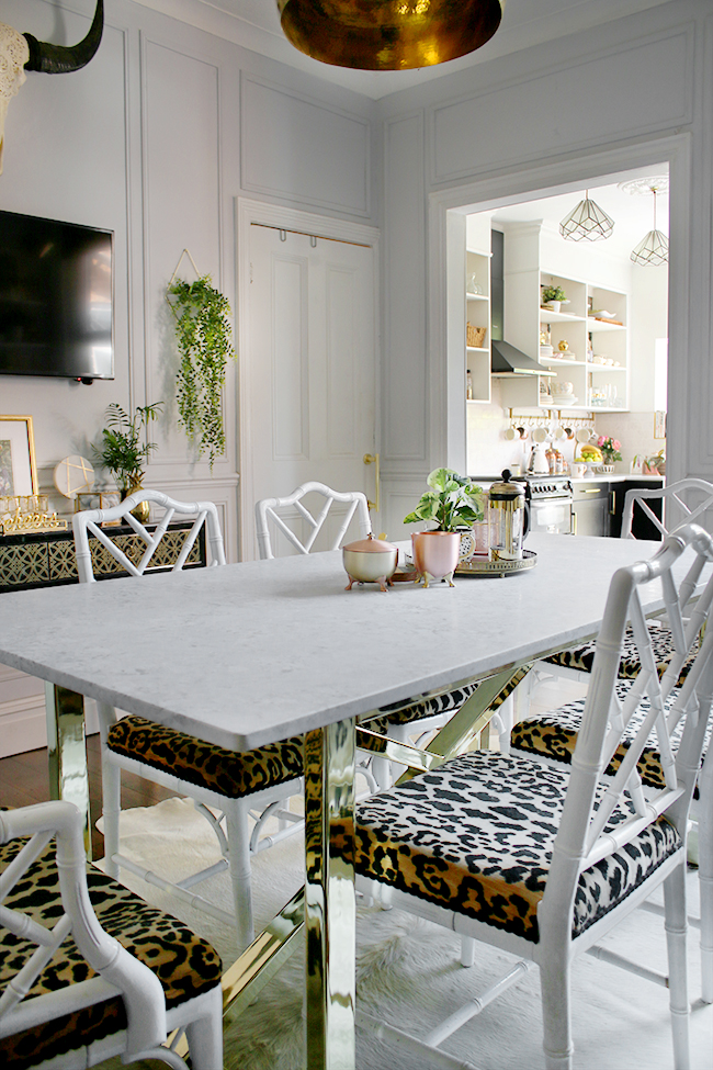
Whilst this has dragged on far longer than we ever thought it would, it has given me quite a lot of time to make some plans for when we move in. When we first viewed the house, we knew that it had the potential for the layout we loved the most – an open plan kitchen and dining area (with a totally separate living room). In fact, during our house search, if there were issues with the layout that couldn’t be adjusted to create it, it got struck off the list. The thing is, after living in our current home for very nearly 8 years now, we know that having those areas (mostly) open to each other has changed the way we live in our house. Our kitchen is a sociable space and having the dining room open to it was always a huge plus point in our own layout. We didn’t want to lose that aspect when we moved.
As for the new house, it has the potential for an open plan kitchen/dining area but it involves quite a lot of work to get it. However, we feel it will add an incredible amount of value to the house as well as better utilise the space we have available. Essentially, we’ll be creating a small extension to the rear of the property and relocating the kitchen to this area, knocking down a couple of walls (RSJs will be required) and relocating the current utility room as well as a downstairs bathroom. It’s a huge project likely to last a good portion of the year (if not longer) and we have the budget set aside to accomplish at least most of our plans. The budget will be prioritised to the building works as well as completing the kitchen. The downstairs bathroom and utility room (as well as my office which will end up where the current kitchen is) will be completed afterwards, depending on how much we have left. If we don’t have much left, then we’ll just have to wait and save until we do!
This means that once work starts, I need to have a pretty solid plan of action when it comes to the kitchen design as we’ll have to submit proposals for the plans to building regulations – and at this point, I’m pretty confident which direction I want to go. Our current kitchen was only just completed less than 2 years ago and I still love it. I’ll be sad to leave it but I’m excited to incorporate a few of the design elements I love about it into the new kitchen as well as add some new features since we’ll be designing the whole thing from scratch – very exciting.
So here’s what I love about my current kitchen and what I’ll probably incorporate into the new design…
Black cabinetry
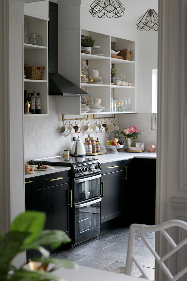
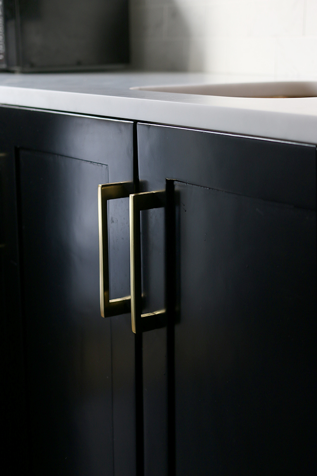
I adore my black cabinets and I don’t regret for one minute choosing black for the base units and appliances. It’s stylish, it’s timeless and it’s a very classy neutral. So there is a very good likelihood that I will choose black cabinetry again in my next kitchen. If it ain’t’ broke and all that…
Shaker Style
I have tried – really I have – to imagine a much more contemporary look to the kitchen design. I know plain flat fronted cabinets are all the rage right now and I’ve seen some that look amazing – but in my own kitchen? I just can’t shake shaker style (Ha! Get it?!). Add to that, it’s a period property and I just think Shaker is such a classic cabinet that never dates so I feel it would really work best given the age of the house.
Gold Elements
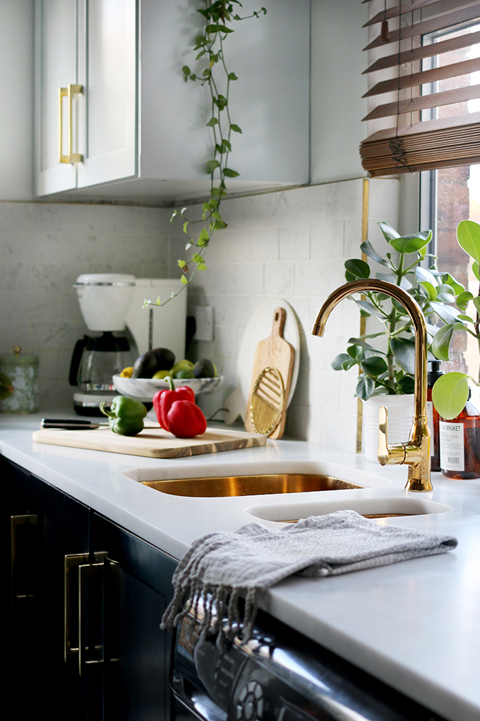
Well, I wouldn’t be me if I didn’t ‘go for the gold’ yet again in our new kitchen design. It’s a finish that I’ve loved for so long and the love of it hasn’t waned in years. Using gold hardware and gold fixtures is pretty much a given. Plus, I love how striking it is with the black cabinetry.
Now, given those elements that I love about my current kitchen, I had a rough idea in my head of what I want in my next kitchen. I’ve been searching Pinterest for examples of various ideas to get my head around whether or not they will work for our future kitchen so I thought I’d share some here today.
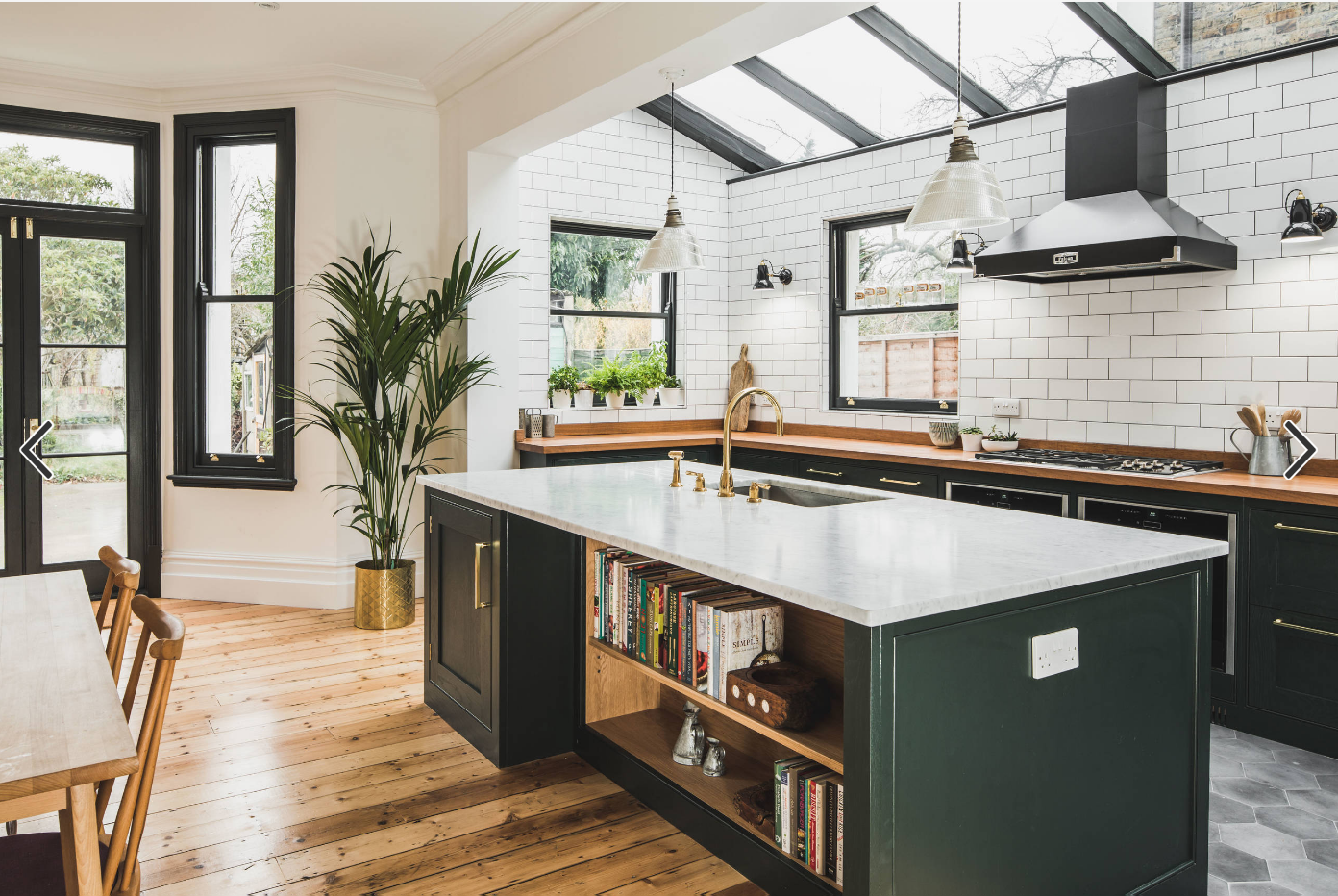
A glass roof extension
Sustainable Kitchens / Designer: Charlie Flemmons / Photography: Charlie O’Beirne/Lukonic
We’d initially considered cutting costs with a simple Velux roof window but the more we thought about it and discussed it, the more we realised that a glass roof would completely change the dynamic of the entire space. It was this gorgeous kitchen by Sustainable Kitchens that sealed the deal for me and I’m hoping we’ll have a similar effect when we finally start work on our own. Our kitchen will face North which means it may have a tendency to be a bit darker but the inclusion of a glass roof will mean that so much more light will pour into the space so this aspect of the design is very high on our priority list!
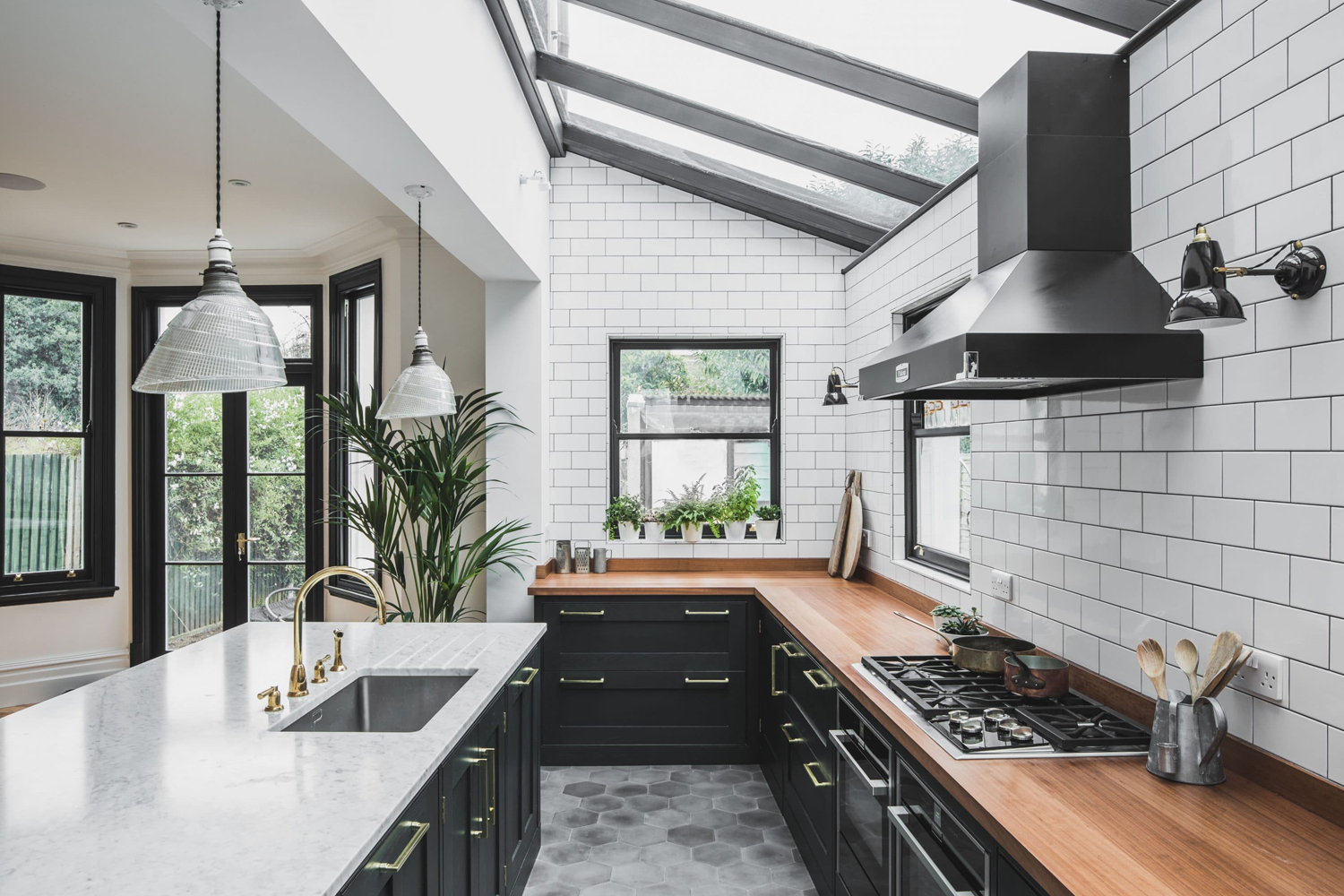
Base Units Only
Sustainable Kitchens / Designer: Charlie Flemmons / Photography: Charlie O’Beirne/Lukonic
I really love the open feel of kitchens without upper cabinets and so I plan to only have base units in my future kitchen alongside a taller pantry. While some of the elements of the kitchen design will feel more traditional (like the Shaker style cabinets), I think having only base units will give it a more open and contemporary vibe. While we may lose out on some storage, we will actually have a similar amount to what we do now so it shouldn’t be too much of a problem.
Brass Open Shelving
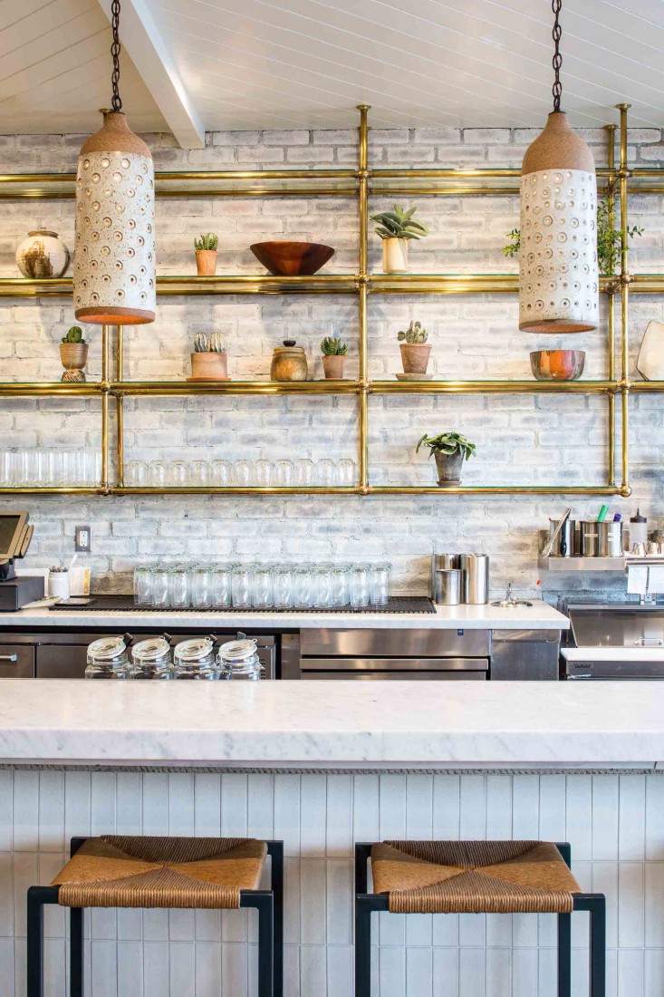
Now that doesn’t mean I don’t want anything on those upper walls – as it goes, I’m desperate for some brass shelving in the new kitchen design. If we had decided that our current home was going to be our forever home, I would have probably planned for this anyway because I am so in love with the design. I was initially inspired by Gratitude restaurant’s design in LA as featured in The Remodelista. The only issue is that the shelving is attached to the ceiling and with a glass roof, this wouldn’t be possible.
Design by Wendy Haworth Design Studio / Shelving made by Eric Beneker Design / Photography Nicole LaMotte
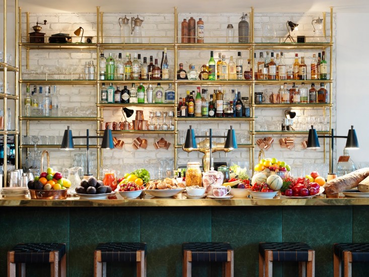
And then I saw another restaurant design for High Road House in London, designed by Alexander Waterworth Interiors also seen on The Remodelista which incorporates a similar style in their club bar but this time, they are attached both at the worktop level as well as at the ceiling.
Ultimately, I’ll likely go the bespoke route for this aspect of the design (I already have someone in mind who I think can help) to ensure that the final design is strong and stable. The look will be similar to these although not exactly – this is inspiration only. Plus, I’m hoping we can secure the shelving to the worktops as well as the walls.
Side note: I’ve really been inspired by restaurant, bar and hotel design lately if you can’t tell. I think with commercial spaces, designers are freer to get creative with the spaces and that results in their ability to push the boat out. I have another Pinterest board on commercial spaces if you want to check that out too.
Breakfast Bar
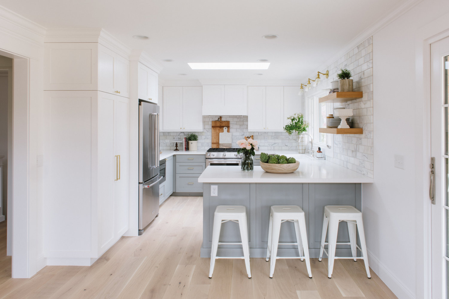
The design also will hopefully allow enough room to have a breakfast bar. I would have loved an island but I don’t think the kitchen will be big enough for that so I’m hoping I can at least get away with having a breakfast bar to create a natural division between the kitchen and dining area.
This kitchen from Studio McGee has quite a similar layout to what I’ll be looking at – so it’s not a huge kitchen by any means but hopefully, I can pack a lot of punch in the design. Ignore, of course, the colour, the upper cabinets and the lack of a glass roof but ignoring that and just focusing on the basic layout, you can get the picture! By the way, anyone know what this layout is called? It’s like U-shaped with an extra leg! Almost Square? No idea!
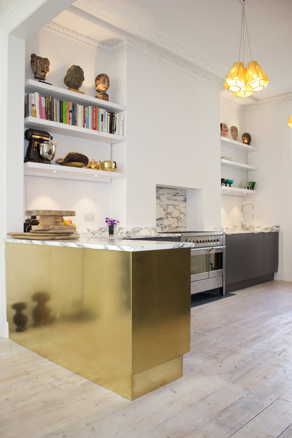
Now I’ve been thinking for quite some time if I can get away with cladding it in brass – I’m not sure if that will be within budget but it’s worth a little dream anyway. How gorgeous does it look in this kitchen design by Square One? Absolutely stunning, right?
Striking Marble
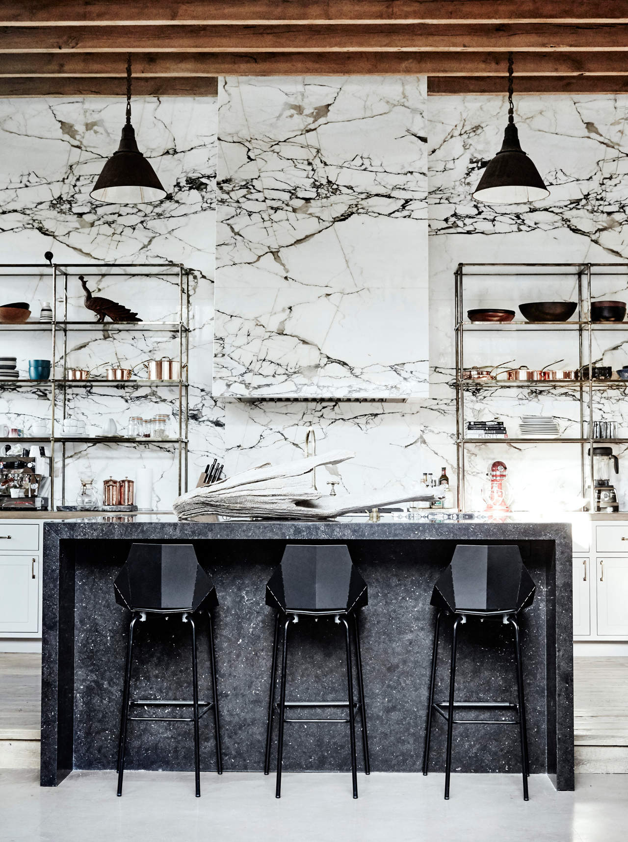
You really need to have a look at this incredible kitchen belonging to Denise Vasi and Anthony Mandler as seen in My Domaine – it’s breath-taking! Photography by Jenna Peffley
I’m still rather in love with marble and so many of my kitchen inspiration pictures incorporate marble in the design. My current favourite is in a really strong dark grain as seen in Arabescato marble – it’s incredibly lush and I’d love nothing more than a huge slab covering the entire wall. Can I afford that? Can I f**k! Ha! So yeah, going to have to think about how to get the look without the huge price tag. Between individual porcelain tiles or even a wall mural, it’s something I’m looking into. How can I get this look on the cheap? All ideas welcome!
What I haven’t yet decided
There are still a few aspects of the design I haven’t yet made my mind up on. While I love the idea of a huge marble slab for the walls, if I can’t squeeze my budget to afford something with a similar look, then I’ll probably need to choose some tiles instead. No idea which ones at this moment in time. I haven’t decided on cabinet hardware or appliances (aside from the fact I want them all integrated rather than free-standing) and I have no idea what I’ll choose for the worktops until I can figure out the splashback situation.
A lot of elements come down at the end of the day to budget. And so really, it’s about figuring out what are the must-haves of my design and my nice-to-haves. We’ll be looking closer at our budget as time goes on and once we’re in and get can some estimates in place, we can go from there!
As you know, we are not loaded and so we are going to try and get a beautiful kitchen with a pretty real-world budget here. Of course, I’ll be taking you on the ride through this huge project over the next couple of months so you’ll have to excuse this initial brain dump! There’s so much more to come and I’m absolutely DYING to get started!
















Gotta ask you about black cabinets – I absolutely love how they look……on Pinterest. Since installing them in my own kitchen I’ve fallen out of love as I find them SO HARD to keep looking clean especially as I have a more traditional style door with detail. I’ve read a few other blogs etc. who agree that black cabinets constantly look grubby which was a relief as it’s not just my cleaning routine! How do you find that aspect of having black cabinets?
Oh that’s interesting AJ! I do wonder if it’s because we used car paint on our cabinets that we’ve had a different experience? I’ve never found them difficult to keep clean – in fact they are much easier for me than the original white kitchen cupboards so I’m loving them! A quick wipe and they are fine – so I wonder if it’s just the finish people are using on them that’s making them problematic? You can read more about the saga of painting them here!
https://www.swoonworthy.org/2016/10/painting-kitchen-cupboards-black.html/
xxx
I think you’re onto something there – car paint is the way to go! I got ours from DIY Kitchens and at first I was very excited by having a custom door (they spray them in Farrow and Ball paint) but 3 years down the line the paint is rubbing off along edges of the door detail and they show every spec of dust etc. It’s not just a matt paint finish, it’s obviously sealed somehow as it has a satin finish but not enough to stop it rubbing away. Thanks – I’m sure I can get a better more resilient finish if I try some different paint.
Kimberly! You’ve ignited a brainstorm! I’m converting the closet in my kitchen into a pantry so I can liberate the doors from my cabinets and show off my pretties, like you have in your current kitchen. Question: Are they traditional box cabinets without doors? I would have to cover the holes and line the backs with wallpaper (oh goodie another design decision!). Is that what you did? I would lose the copper pulls on the cabinet doors, but can install bigger ones on the bottom cabinets. Thank you thank you. I’ve been yearning for an (almost) DIY project. Your inspirations are spectacular, especially the glass roof and the gold shelving plus the black cabinets and gold pulls. But adding a brass front and showy marble just might be too much in my opinion. But dream on, like you always do.
Ha! Thanks Beth, good to hear I got ya thinking! So the existing open shelving I have is actually from Jali – I actually wanted to mimic the look of open cabinets so had them made for me. But, your plan would be spot on – remove the doors, fill the holes and line the back and you’ll have the look ;) As for the brass + bold marble – you may be right there! I would probably opt for one or the other depending on what I can afford to do ;) It always comes down to money!! Gah! lol xxx
Hi Kimberly :)
You could marble effect laminate or melamine (that’s what we sell where I work, http://www.lawcris.co.uk) instead of real marble. Nobody will know unless they touch them and realise it isn’t cold to the touch :)
Hi Pip – oh that’s an interesting idea! Thanks so much for the suggestion – I’ll definitely look into that! ;) xx
Oh I love all of these and thank you for sharing…its lovely to see how your new home and kitchen/dining room will evolve and be created. I had the island element of our kitchen covered in copper sheeting (I was torn between copper and brass at the time) – it really wasn’t expensive from what i remember, we then had LED lights fitted underneath the Silestone (marble effect) worktop so this was always my cocktail bar rather than breakfast bar!! I would have loved to have had a completely glass roof on the side return extension but budget wouldn’t allow so we had the largest Velux which practically fills the space so lets in loads of light. I am so excited for you. :-)
Oh, that’s good to know that the cladding wasn’t too expensive to do and I adore the idea of using lights – hell yeah to a cocktail bar instead of a breakfast bar! Ha! Thank so much for that suggestion! If we find that the glass roof is going to totally blow the budget, then a large Velux window is definitely on the cards ;) Thanks so much, Kath, I’m so excited too! xxx
Such exciting times for you both! I have to say, some of these kitchens have really inspired as we are looking to change ours.
Your extension sounds amazing! x
Thanks so much lovely – I’m really excited too! We just need to get in there now – ha! xxx
When we moved into this house, 11 years ago, I had great fun designing my kitchen! All the other kitchens I’d had, were what was already in the house or flat I was living in.
Due to budget (we only had £1000!) we bought Ikea units and fitted it ourselves. Like you, I chose Shaker style doors, because I liked the clean lines and classic look, and only base units, with some open shelving on the walls. It looks much more open without wall units.
Regarding marble splashbacks, back in the 90s, paint effects were really fashionable, and quite a few books showed you how to do a marble effect, which looked quite convincing, so maybe that’s something you could look into. I remember a feather was used to do the veining.
The fact that you created a kitchen with only base units and open shelving 10 years ago shows how in front of the curve you really were! How fantastic that you achieved it with a grand too! Oh yes, I suppose painting it could be an option although I don’t know if I trust my artistic skills to do it well so I might opt to hire someone to do it for me ;) But it would definitely be an inexpensive option – something to think about for sure! Thanks so much Julia! xxx
How frustrating your move has been put on hold (after you rushed to get everything ready!) but can’t wait to see what you do to the space once you’re in! Love all your inspo imagery, it must be such fun starting from scratch again, but with such a good idea of what you love already :)
So exciting Kimberly. I know it’s frustrating now but it’s giving you lots more planning time and you can never have enough of that. It’s going to look fabulous. I love your taste – can you tell? x
Hi Kimberly, I recently found Stone Peak Ceramics here in the U.S. They make 5×10 ft. ceramic tiles that look like marble slabs.(Yes I know wrong side of the pond). Hopefully someone on your side has thought of it. Cheers to being in that new home soon.
Lots of interesting bits but I’m quite distracted by the square one kitchen. How on earth would you lift a kitchenaid off a shelf having already reached over a worktop? I know it’s only styling but this sort of accessorising makes me question the practicality of the rest of the design!
Hahaha! Do you know I hadn’t even NOTICED that KitchenAid! You are absolutely right that it really is just the styling and I’m sure the homeowners don’t actually store it there as it’s completely impractical ;) The brass cladding there is really why I shared the pic in the post as I said, not so much the entire kitchen design ;) xx
Yes, I think I focus on functional aspects of design first so I noticed it straight away. Good luck with the move, I love Shrewsbury.
Eeeeek!! So excited about this!!! That glass roof is just going to be amazing! I love the idea of the brass on the breakfast bar too – and the idea someone had of fitting lights under the work top is great. Imagine the lights shining off the brass! I also think no top cabinets is the way to go – I’ve always thought I wouldn’t be without top cabinets, but sometimes it’s quite encroaching. When you’re preparing food, you’ve got this massive cabinet right in your face. It would feel so much lighter and more free to have a bit of space around your head! I think my kitchen is just too small for that option, but if we ever move and have a bigger kitchen I would definitely consider it. If you’ve got enough lower cabinets, and the space for pantry storage, then it would be perfect! And a few open shelves for your pretties will of course give more storage! So excited – your kitchen is going to be beautiful!! (So many exclamation marks in my comment – I can’t help it!) xx
Lovely ideas, I’m sure it will be stunning! I don’t think I’ve ever commented before, but I’ve been following your blog from Sweden for a couple of years now and love your work.
Just one thought about the marble, I think there’s a risk that a highly dramatic slab would compete with the brass shelving. In the inspo pics the brass shelving is allowed to be the star against a solid, neutral background. In the pic with the gorgeous Arabescato slab the pipes in the shelving are much thinner and in a color close to the darker greys in the marble, so the shelves almost become an extension of the veining in the slab, instead of contrasting with it.
Since it sounds to me like the brass shelving is already a given I think it might look best if you let it shine against a simpler (=less expensive) backdrop, and then if you want a second “star” in the room, maybe you could actually add the brass to the peninsula without it becoming too much.
And then maybe you could instead treat yourself to an equally stunning, but smaller piece of marble above a vanity or behind a basin in a powder room or bathroom? Imagine it behind a brass console stand similar to this . . . https://www.burlington.eu/en/gold/sanitaryware/b18-1th-t50a-gol/
I really hope your move is happening soon, good luck!
Hi Cecilia – thanks so much for your comment and suggestions! As it’s all sort of just ideas rolling around my head at the moment, I need to see how it all looks together in some drawings/mock ups – I agree, I may only have 2 ‘wow-factor’ elements – the brass shelving, the strong marble and the brass cladding – although to be honest, I’ve never shied away from making a bold statement in my interiors ;) I will say that the image with the bold marble and shelving – if you look at other pictures of that kitchen, the shelving is, in fact, brass and not a silver metal – I think the photography was slightly de-saturated so they don’t appear as bright but they are definitely gold in other pics. :) xxx
Oh, good point, I never looked at the other photos in the My Domaine story! And like I said, I’m sure whatever you go for will be beautiful, just wanted to encourage you that even a simpler backsplash would look great :) Actually, I can’t resist adding another bold statement idea to your mix: you know those fancy range hoods in black with brass straps? Maybe one could do a similar kind of detailing on the peninsula as an alternative to cover it in brass; it could be a nice way of repeating the lines in the brass shelves . . . x
Oh so much fun being able to style your bee kitchen, it will be a great space to play around with. Can’t wait to follow it all
I always love hearing about your plans for the spaces you make over. You have such a clear vision of how you want the space to look and feel. It’s really inspiring. I love the whole glass roof idea and the shelving will be absolutely beautiful. No top cabinets will give a much more spacious feel too. I’m so excited to follow on this project with you.
So exciting, I just know it will look fabulous! Often the best bit is planning it all and figuring out what you want. Hope the project all goes smoothly for you xxx
Ooh a glass roof will look FAB. It’s a consideration for us too, but I’m prepared for the possibility that it’ll be beyond our budget, boo. I’m loving your inspiration for your new kitchen! 😍 Ridiculously excited to follow your projects in your new home 😃xxx
The shelving looked amazing, that would look brilliant, it’s all exciting times ahead not be long now xxx
Hi Kimberly, I’ve had an idea as to how u might achieve the heavenly Arabescato marble look on your kitchen wall with a more down-to-earth Budget….check out your local Art students in the nearest College/University and see if any of them can come up with the ‘look’ on your wall, painted Free-hand for a miniscule fraction of the cost of the Real thing! Lesley. x
Hey Lesley – that’s a really interesting idea! I like it – definitely something to think about so thank you for that! xxx