I can’t even begin to express how excited I am to be FINALLY sharing a room reveal on my blog. And not just a quickie paint job but an honest-to-goodness makeover. It’s the first one I’ve done in far too long and while I’ve been working with what we have and the decorative choices of the previous owners since we moved in at the end of March, we’ve finally gotten to the point where we can really tackle some of the nitty-gritty that I really like doing.
This post may contain some affiliate links.
The funny thing is, I’d actually only intended this to be a sort of ‘Phase I’ of the bedroom – new paint, new lighting and a wall mural were my only plans and I figured at some point down the line, we’d get a new bed and then I can get on with everything else I wanted to do. Well, the lovely folks at Made came to help me out with a new bed and I couldn’t be more grateful. Suddenly, I was no longer hampered by the bright yellow velvet that’s been a part of my bedroom scheme for years and it enabled me to pull together a new colour scheme that I loved – black, white, gold, grey and rose pink. Needless to say, I adore the new bed but I’ll get into details in just a second.
The Before
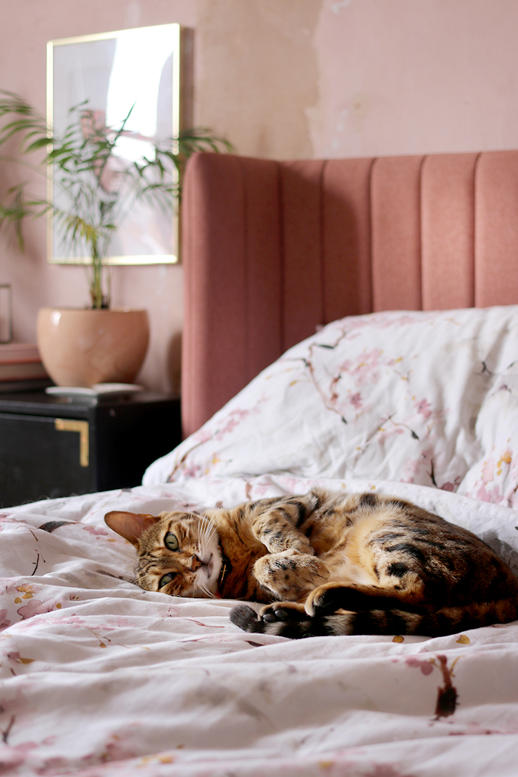
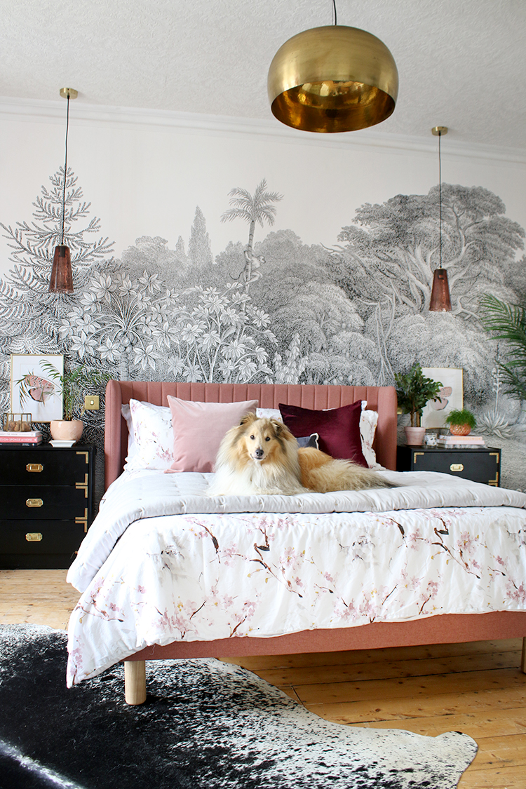
Meisha trying out the new bed before the work was completed.
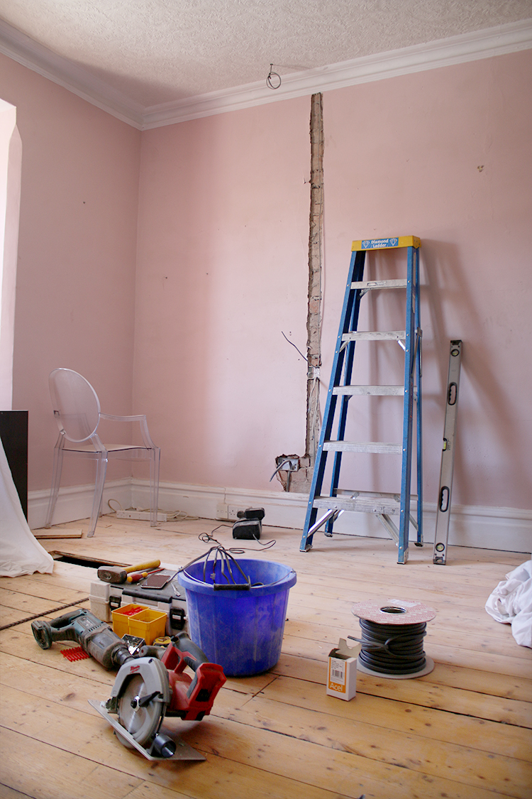
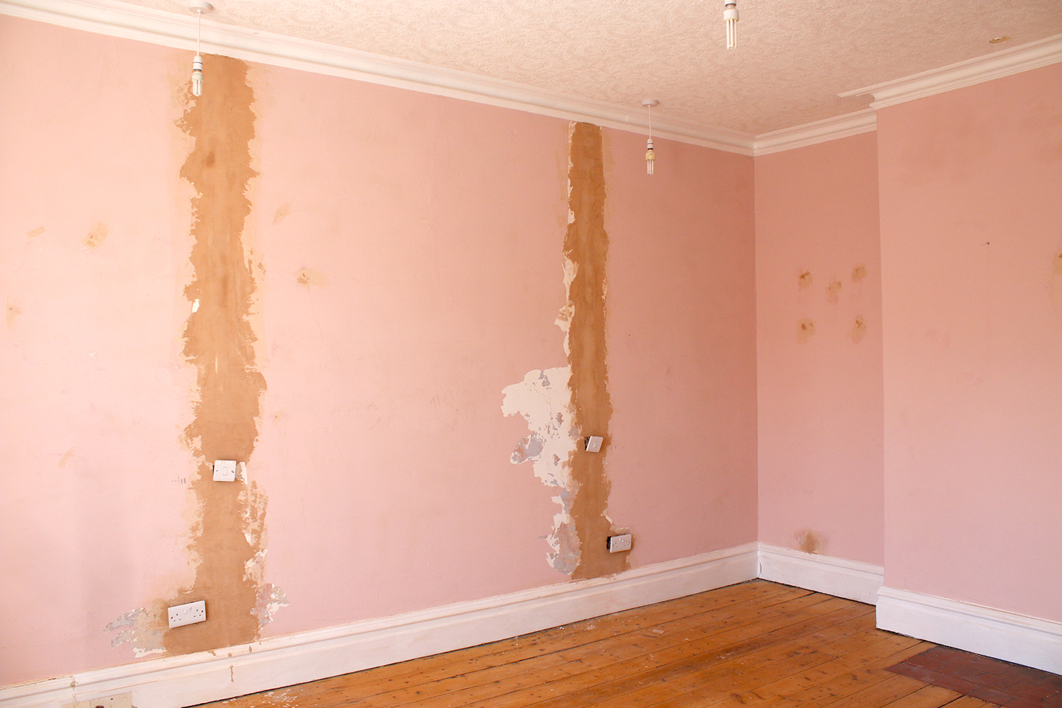
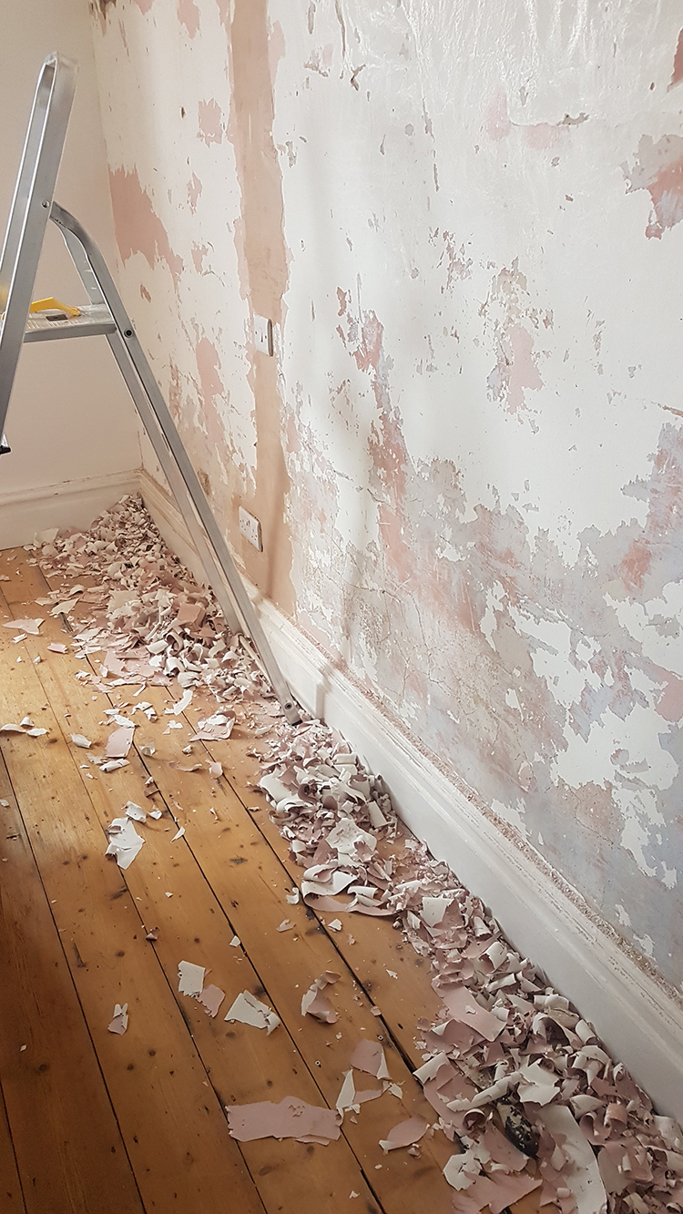
When you last saw the room, we had just finished having the electrics replaced in a few of the rooms. We’ll be completing the re-wiring of the rest of the house once the extension gets underway but at least this meant we could move forward with a few rooms. The bedroom wall behind the bed was the most challenging aspect of the whole makeover. Channels had to be dug into them on two sides for the pendant lights, new switch plates and sockets installed as well. Wayne was able to plaster the holes left behind but after initially using a ‘paste the paper’ lining paper and it being a complete disaster (remind me never to use the stuff again), I ended up tearing it all down off the wall and then we were left with even more remedial work to make the wall sound enough to repaper.
I did a lot of paint and wallpaper scraping over the last week and we ended up knocking out a lot more of the wall where it was loose (well they are nearly 130 years old) and then refilling and patching everywhere. While I didn’t take many pics of the progress I figured I’d share a few so you can see just how far this wall has come!
Then came the sanding down and finally making sure the wall was free of dust, dirt and any remaining peeling paint. The prep work is never pretty or fun but is really necessary because I knew the base for the mural had to be in great shape. Eventually, once this was done, I hung a different lining paper (it was this one and I would highly recommend it) which was a breeze to put up and gave us the smoothest base for finally getting the wall mural up and of course, the rest of the room finished.
So…. (drumroll) here’s what it’s looking like now…
The After
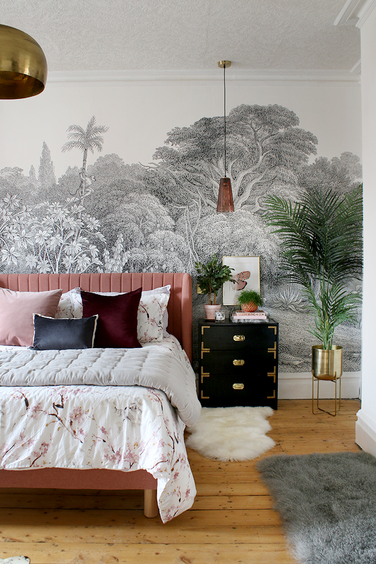
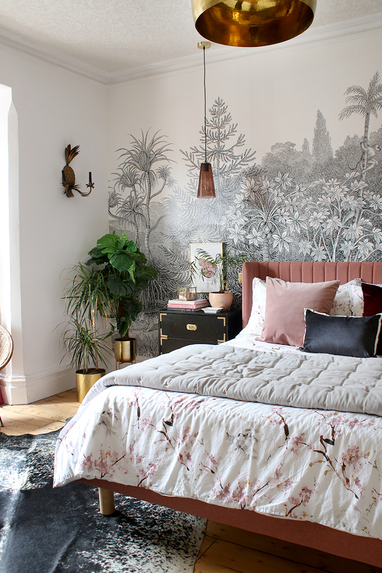
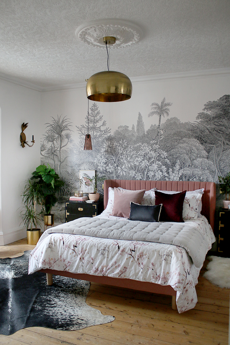
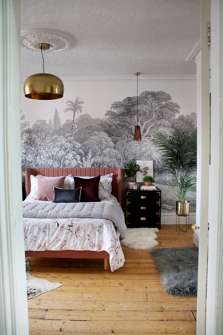
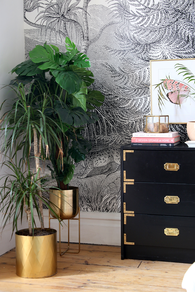
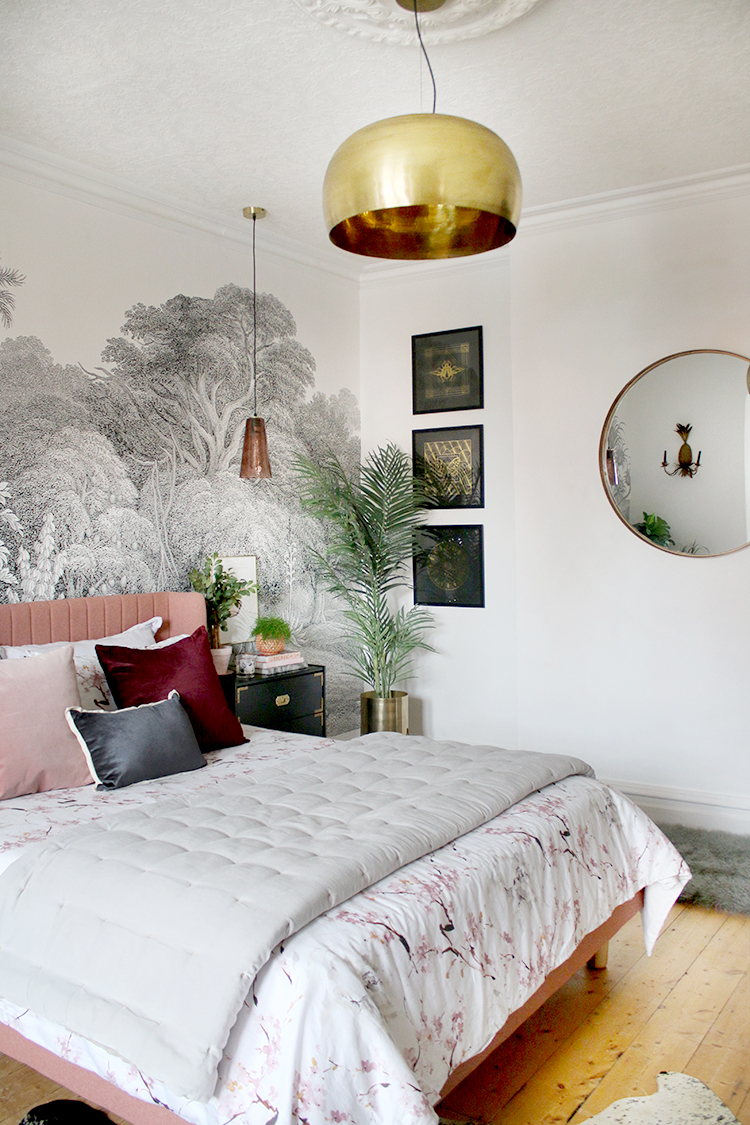
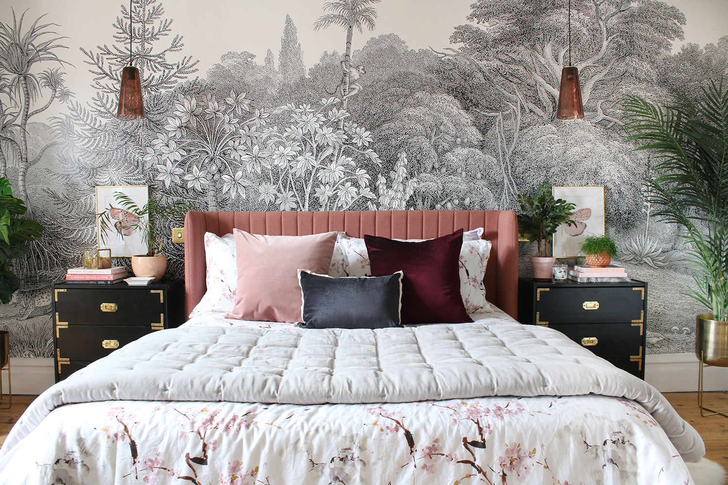
So let’s talk about that wall mural shall we? It’s by Rebel Walls and it’s called Jungle Land. Honestly, the quality is just outstanding (and no, this isn’t sponsored) and I was able to hang it in around 3 hours – super quick, super easy. Talk about wow-factor, though. I adore it and it created exactly the right look for the rest of the room. The space is pretty big and so I knew I needed something that created an instant impact and this certainly does that.
Another change from my original plan is the paint colour. I decided, rather on impulse, to just paint the room white – I figured it’d be a good neutral base for everything else and while I may change the colour in the future, I am quite liking the bright simplicity of it for now.
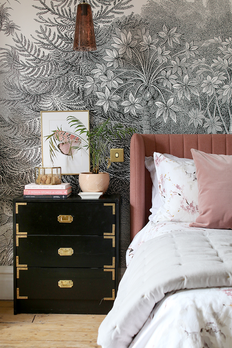
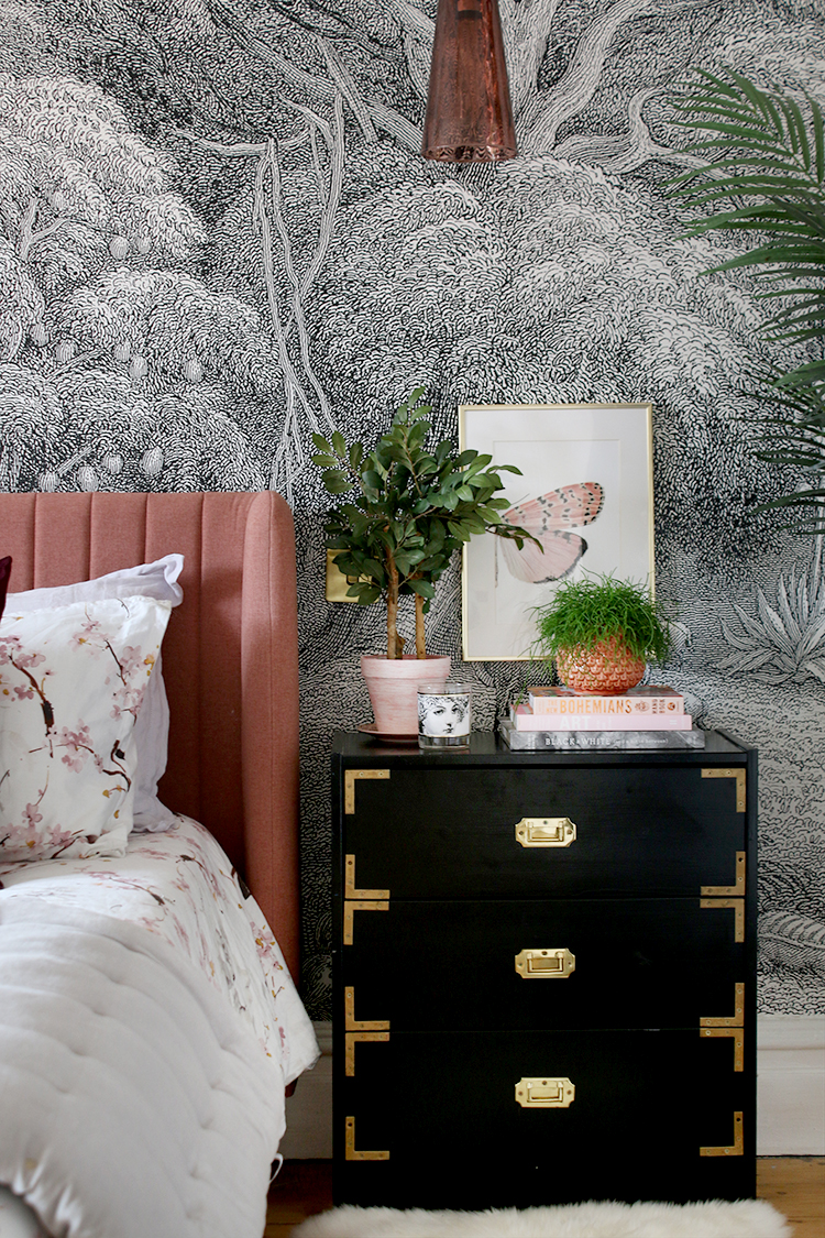
The bedside tables are the same ones I’ve had for the last 5 years (they were an IKEA RAST hack) and at some point, I may look at getting some larger chests on either side of the bed but I actually quite like them here for now. They look sharp against the mural and the black and gold fixtures really stand out.
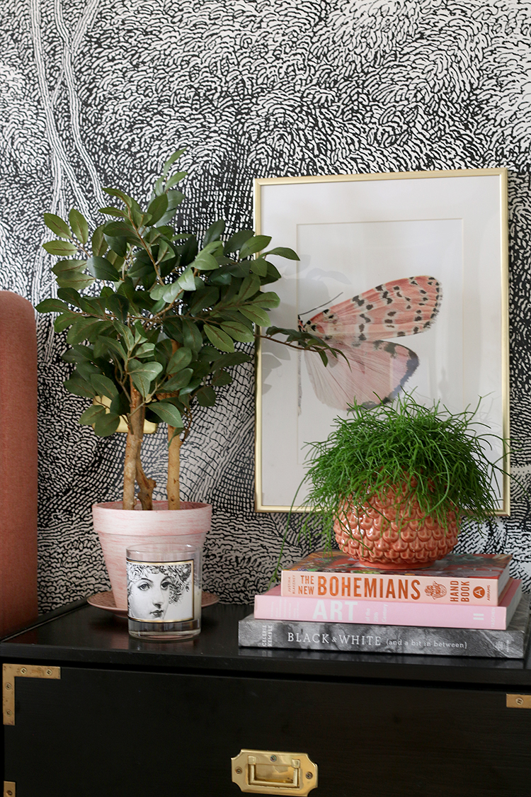
I finished off with a set of butterfly prints I’d picked up locally from Workshop in Shrewsbury and the peach plant pot you see above is also from there. I also picked up that cute faux plant at HomeSense. The candle is from Chase and Wonder. The hanging pendants were purchased on sale from Swoon Editions at half price (!) and they were with me within days which I thought was great. They are a beautiful rose tinted glass and tie in so nicely with the colour of the bed. The brass switch plates create a lovely symmetrical finish in gold and give it a bit of a hotel vibe.
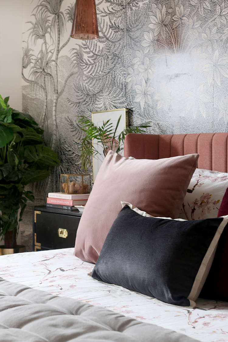
Aside from the mural, the other star of the room is the gorgeous Tilia bed from Made.com, designed by Smith Matthias. I’d been looking for the perfect bed for ages and this gorgeous thing landed in my inbox in a press release. I was immediately drawn to the design – it’s simple but those channels give it an extra depth and I love how it subtly wraps around at the headboard. The rest of the bed is finished in the same fabric – a lovely warm textured material in the perfect rose pink.
I was so grateful when Made agreed to provide the bed for our little makeover. I have loved working with them over the years and the quality of their products is wonderful so I’m always recommending them! As for choosing a pink bed? Well, I knew if I couldn’t have pink walls, I was going to sneak it into the scheme anyway. Thankfully, Wayne loves it too! Whew!
The bedding, throw and dark grey cushion are from the lovely folks at Christy which you may recall were originally intended for our guest bedroom but I fell in love with all of it and so now it graces our own room. The other cushions I’ve had for a little while.
One of the things that I knew would finish off the room perfectly was a large ceiling rose. If there had been one here originally, it’d been removed long before but I knew to reinstate it would be the perfect contrast to the more contemporary light fitting (which you may recall was originally in our old dining room). The lovely folks at Plaster Ceiling Roses had gotten in touch a few months before and were gracious enough to send me this large Athancus Leaf beauty – it’s over 700mm wide so it’s perfect for the size of the space but they have a huge selection in different styles and sizes.
The shipping of such a large fragile piece was effortless and quick and we were able to fix it using screws into the ceiling joists and No More Nails. It was then finished off with some decorator’s caulk and a bit of white paint. I love that it looks like it’s always been there!
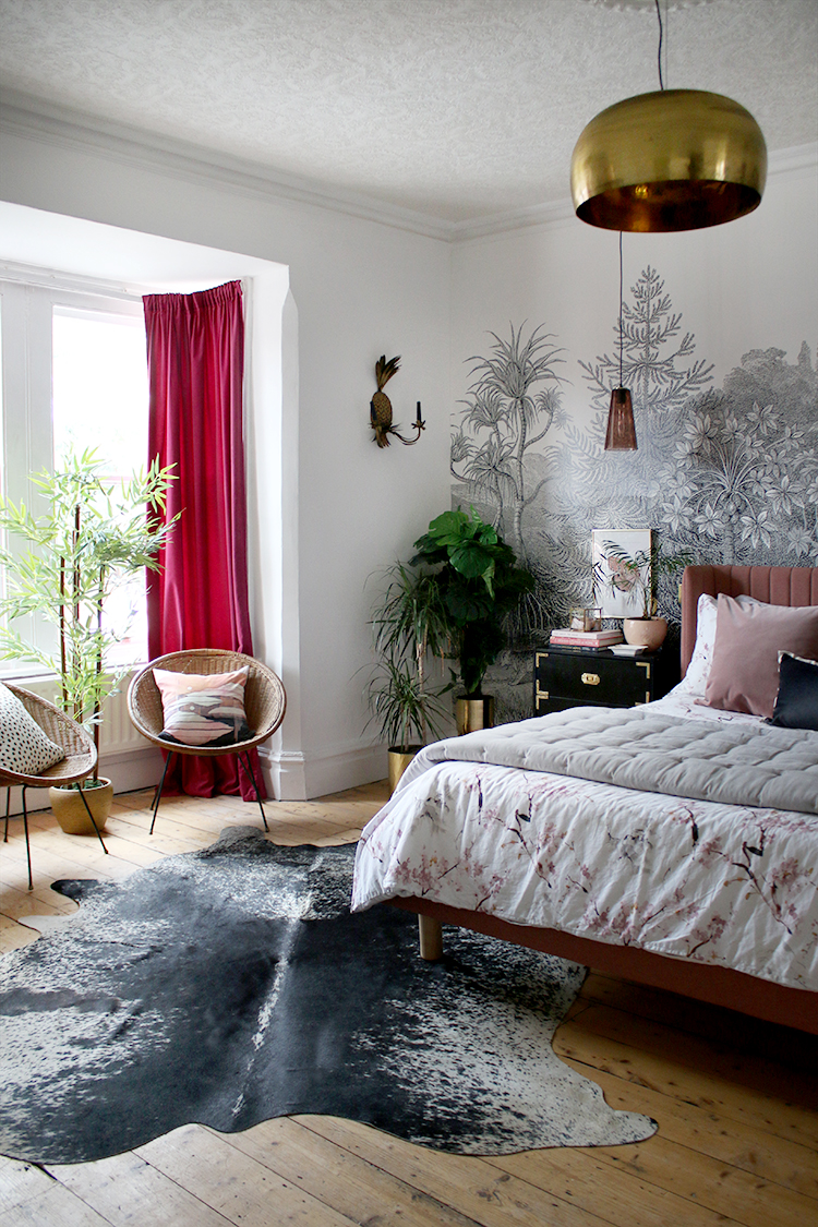
I was of course, able to use a lot of items I already had so you may recognise many of the pieces in here. The cowhide rug (originally in my old dining room and later, it was moved to my old living room – it’s truly versatile!) was a great finishing piece in the large space and I also added a white sheepskin and a Mongolian sheepskin to the other side. I’d initially thought I’d want one big rug in here but as I haven’t found anything I really liked, I think the layered look works pretty well.
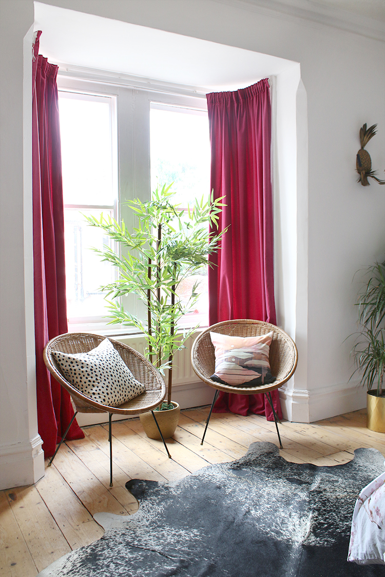
In the bay window, I’ve got my two vintage hoop chairs, my old burgundy curtains (another IKEA hack from years ago) and I added an inexpensive large faux bamboo. I went a little crazy with both faux and real plants in here which tie in nicely with the ‘jungle glam’ theme!
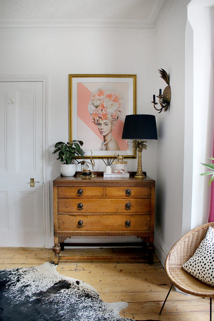
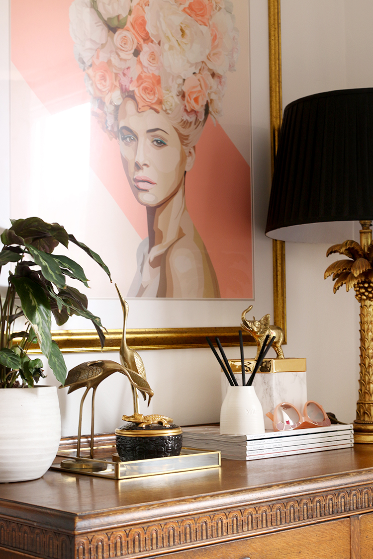
My vintage chest of drawers remains as does my Marie print but the addition of the lamp and some accessories freshened up this corner just a bit. The ceramic room diffuser was a recent gift from Miller Harris who has recently launched a home fragrance collection. It just fills the whole room with a glorious floral scent – it’s so important to think about all your senses when decorating a space, even smell.
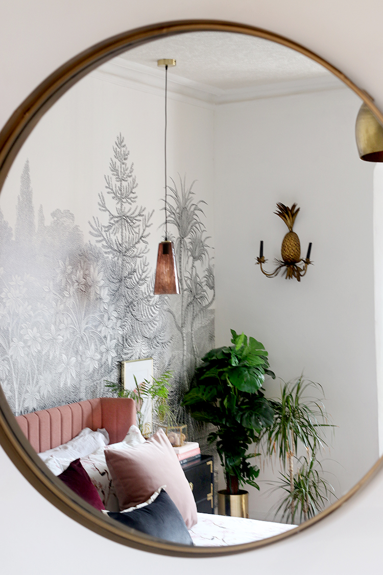
In the alcove to the right in the room, I decided to hang my trio of black and gold prints from The Curious Department and my large round mirror (on the chimney breast) finishes off that side of the room. In the opposite alcove is our 2-door black wardrobe that we had in our old house.
I genuinely couldn’t be happier with how the bedroom has turned out. It finally feels like a room of our own and I have no doubt that once work starts downstairs, we’re going to really appreciate having this lovely finished space to escape all the dust and mayhem going on!
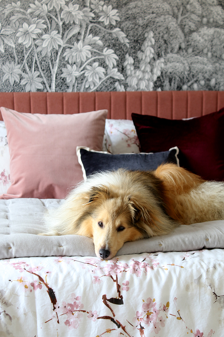
I think Quito approves but I’d love to know what you think about the room makeover! Any favourite part? Would you consider a large wall mural for one of your rooms? Let me know in the comments below!
Sources…
I’ve linked to as many things as I could below and apologies because much of it is years old but I’ve linked to similar where I was able to. An asterisk indicates a gifted item either from this makeover or ones from the past! If I’ve missed anything, just let me know in the comments!
Wall Mural / Bed* / Duvet Cover Set* / Linen Bedding* / Grey Velvet Throw* / Blush Pink Cushion* / Burgundy Velvet Cushion (similar) / Cowhide Rug* / Mongolian Sheepskin Runner* / White Sheepskin Throw* / Bedside Tables (IKEA hack) / Glass Pendant Lights / Main Pendant Light / Ceiling Rose* / Brushed Brass Light Switches / Butterfly Prints / Marie Print / Black and Gold Prints* / Large Round Mirror (similar) / Hoop Chairs (vintage – these are similar) / Chest of Drawers (vintage) / Brass cranes – vintage (similar) / Black and Gold Crocodile Candle* / Reed Diffuser* / Flower Lady Candle* / Pineapple Wall Sconces / Palm Tree Lamp / Peach Plant Pot / Brass Raised Planters* / Faux Monstera / Faux Bamboo / Faux Palm*
Disclaimer: Huge thanks to Made.com and Plaster Ceiling Roses for providing their gorgeous wares for this makeover and of course, all the lovely businesses listed above that have gifted items to me in the past that I’ve been able to use in this space. As always, I only work with brands I really love and think you’ll love too. Thanks for supporting the brands that support Swoon Worthy.










Gorgeous! I love it. I love the mix of old and new and it all works perfectly together. The bed is amazing I have to say!
It’s absolutely stunning hun. Love everything. But especially that mural. x
I LOVE IT! You have such a great eye and fabulous style. Beautiful job! And kudos for sticking through the prep work on that wall!
Super pretty! Fabulous job.
Really lovely. You should be very proud.
It looks great! I was surprised by the white walls, and have to admit, I’m so over white walls after seeing them in almost every interior design book, and room features in magazines and on sites like Apartment Therapy! I think I’d have gone for a light, pinkish grey, but I’m not the one living there! It does look bright and fresh though.
I really like the bed and mural, and having pendants instead of lamps by your bedside, frees up space for styling. The shades are rather lovely too.
It’s a really nice make-over, and you’ll certainly be glad to have a finished room to relax in when the building work is going on.
Wow. It’s fabulous. That mural is winning. I’m after a mural for my tiny bedroom and you’ve convinced me. Also I love the white, the plants work so well against it. Fabulous.
Beautiful! As I knew it would be. That mural😍! You give me such inspiration to just go ahead and try new things.
Oh sweet jesus, now THIS is a bedroom makeover!! Absolutely love everything from the pendant bedside lights to the mural and layered rugs. It’s stunning and the perfect place to hide away while the rest of the house gets finished. Love, love love.
Vic x
http://www.apartmentnumber4.com
It’s gorgeous, I love everything!! The wallpaper is such an amazing statement and the beautiful pink of the bed against it is just pure luxury. Stunning makeover! X
So stunning! I love mural wallpaper for the drama it adds but my husband is always terrified of it. Hoping to do something like this in my dining room. Love all the gold touches too!
Angela at Blush & Pearls
i love it amd i am definetly going to use the lining paper yoi suggested in future a good base make all the difference. it is fun spotting all your wares in new places too like a interiors spotting book game….man i have too much time with toddlers
Beautiful. The mural is stunning and the bed highlights it so well. Love the vintage pieces with the new ones too. xx
We put a Rebel Walls mural in our bedroom recently too (Bellewood) and I adore it, totally worth the cost to have something printed that’s amazing quality, made to measure and looks fabulous. It’s now got me thinking about something similar for our loo under the stairs!
I could hardly wait until something was finished and this bedroom did not disappoint. I love everything you’ve done with one exception – the burgundy curtains. Quite possibly the color is different from what appears in the photos, but everything else in the room is soft and muted while the curtains with the light behind them scream their color. A paler pink would continue the sanctuary feel, I believe. Just one person’s opinion, of course.
Your choice of artwork and accessories is such an inspiration for me. It has gotten me away from my bland and traditional choices.
Can’t wait to see the next reveal.
O….M….Glam!!!! This is Gorg! Ok, Now I want a mural wall. Kimberly, you have outdone yourself. It all came together so seamlessly. I love the pink bed, its classic and a little MCM, maybe I can find in the states. Way to go Girlfriend. ❤️
Hi Kimberly, LOVE it!!! It’s soooo you!!! And the mural is killing me with its gorgeousness!
This is Gorgeous!!!! You’ve done it again – Great Job!!!! I love it all – esp still that little black Ikea-hack nightstand – so good! Beautiful!
So so gorgeous, Kimberly! The bed is an absolute beauty and works so beautifully with the lovely monochrome mural. Love the colours and textures in here! 😍
Great work Kimberly, this feels like a lovely space to be!
I bllloooooodddyyyy love it, you clever thing. I looks amazing. And I love how you used pieces of furniture and artwork from your old home but they look completely different in the new bedroom. Gorgeous!!
Absolutely amazing, loving your style, I have similar ideas and yes when I do one room it seems to loose something (like a rug or decorive item) into the next room I’ve decided to do, some regret along the way. My theme for the last three four years is art deco on a budget, I’m getting there.
So excited for you! It looks terrific
I expect nothing less than fabulous from you – and you never disappoint! What a lovely room – the depth of the colors are perfect for the size of the room as well as the natural light the room receives. And the fur babies approve, too! My Sheltie, Maddie, loved the camera, too and thought she should be in every pic – just like Quito! Such funny little bunnies!
I’m glad Wayne doesn’t mind pink – the XH liked it in our bedroom, too. Real men like pink!
I wish I could support your generous sponsors but US vs. UK is a tad bit far as we say here in New England. They have been very kind to you and know a good thing when they see it!
The ultimate chill out space – this is so beautiful. I love it when you see something and know exactly whose it is – this is undoubtedly and fabulously you!
Gorgeous.
Wow Kimberly, you don’t mess about! Your hard work has paid off – stunning! Mural is of course the star, and timeless – it will take any future changes. For now I’m so glad you got some pink in there, the perfect foil for monochrome. A calming, spacious and stylish sanctuary for you during the building work.
Your bedroom is ALLLLLLL that! It’s one that makes you smile big time when you open the door! Saying …ahhhhhh… welcome home
Warm, clean and stylish, it’s just you. I’d have recognised it even without a caption!
Absolutely gorgeous, darling. The most wonderful blend & you’re so very clever. Quito looks totally at home.
Gorgeous, gorgeous, gorgeous! It must be such a relief to have a room finished – eagerly awaiting the next reveal! x
It looks amazing, both you and Wayne have done a fantastic job there is nothing I don’t like about it. it looks so fresh. Xxx
You really outdid yourself with this one. It’s so so different and stunning! I have to keep scrolling up to look at everything over and over again.
Just amazing..i flippin love this whole design and have total bedroom envy! And bed envy! 😃. Really lovely x
OH MY GOSH!!! it’s perfection!!!
loving every detail! so soft and glamorous, but with an edge! you’ve executed it beautifully.
This is so beautiful, congrats! Lovely combination of old and new pieces make the room seem homey and naturally lived in. Love the mural, and the monochrome allows the colours in the room to really stand out! I admit I have never had to do that much work on a room (yet) but it must be so gratifying to get the results you dreamed of. :-) xo
This is really an amazing interior design for a bedroom. It is spacious and comfy. Thank you for sharing these wonderful ideas! I am excited to incorporate these ideas into my bedroom.
Very nice! I like the makeover of this bedroom. I am so inspired and got some great ideas. Thanks a lot for sharing.
All the messy work with the electrics were worth it. Looks fantastic, Kimberly! I get a luxury boutique hotel vibe, and the faux plants blend in with the real ones so nicely.
P.S.: Sorry it took me 46 years to comment on this! It’s been on my list for a while.
Great makeover… I even liked how you had the dog https://www.saligodesign.com