As things go with almost any renovation project, over the last 8 or so months, my entire focus has been on the extension and then the new kitchen. As a result, I feared (for a while there anyway) that the adjoining dining room may end up being an afterthought at best and at worst, completely unfinished by the time the kitchen went in. To be honest, because the building work and the kitchen has taken so much of my headspace (and of course the budget!), I decided it really wasn’t that big of a deal. I could always add to or make changes in the future. As long as the foundations were in place, I told myself, I’d be happy enough.
Well, because we had some time between the completion of the shell of the building (in May) and the kitchen being manufactured and installed (which will happen this month), it’s allowed me the little bit of breathing space to finally start making a few decisions for the dining room! Hurrah! So I thought I’d share some of my plans for this side of the space with you today.
I may use some affiliate links in this post which means I may earn a small commission from brands if you purchase something through my link as a thank you for the referral. You’ll never pay more by clicking on my links.
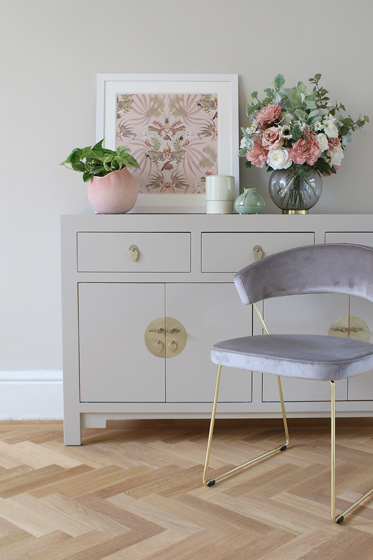
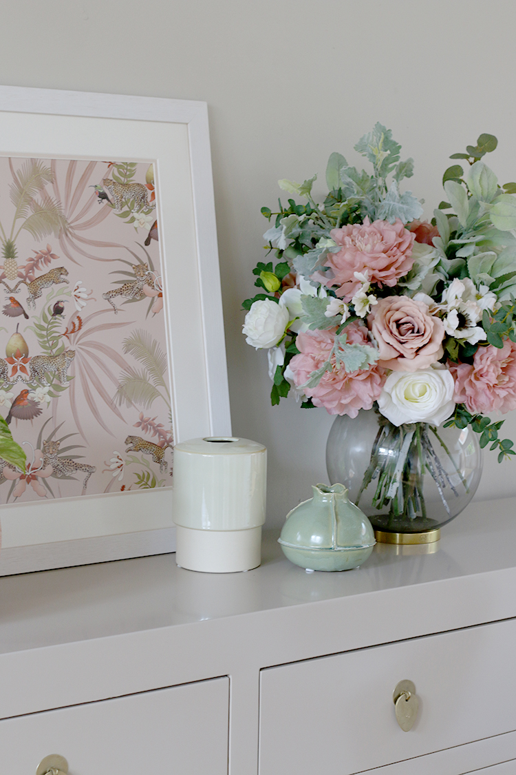
I’ll be honest with you – I was so undecided about so many things for such a long time due to what I’m calling Decision Overwhelm™ but thankfully, things have finally started to come together and I’ve got a pretty firm idea now of what I’ll be doing with it! Above, you’ll see a tiny little sneak peek of some of the items that are going in the room and I can’t even tell you how happy this little selection makes me. Okay, so the rest of the room out of shot is still a bit of a construction zone and I just zhushed up this tiny bit of wall for you but STILL! Haha!
I’ll soon be sharing how we’re getting on with the space as we’ve been doing loads to prepare it before the kitchen arrives. This weekend, we finally finished laying all the flooring so I’m going to share how we DIY’d it. As I shared in my post about the kitchen design, the flooring is engineered Oak parquet from Luxury Flooring who have provided a lovely discount to me and it’s made such a massive difference to the whole space. It’s basically my dream flooring and I couldn’t be more pleased with how it’s come out.
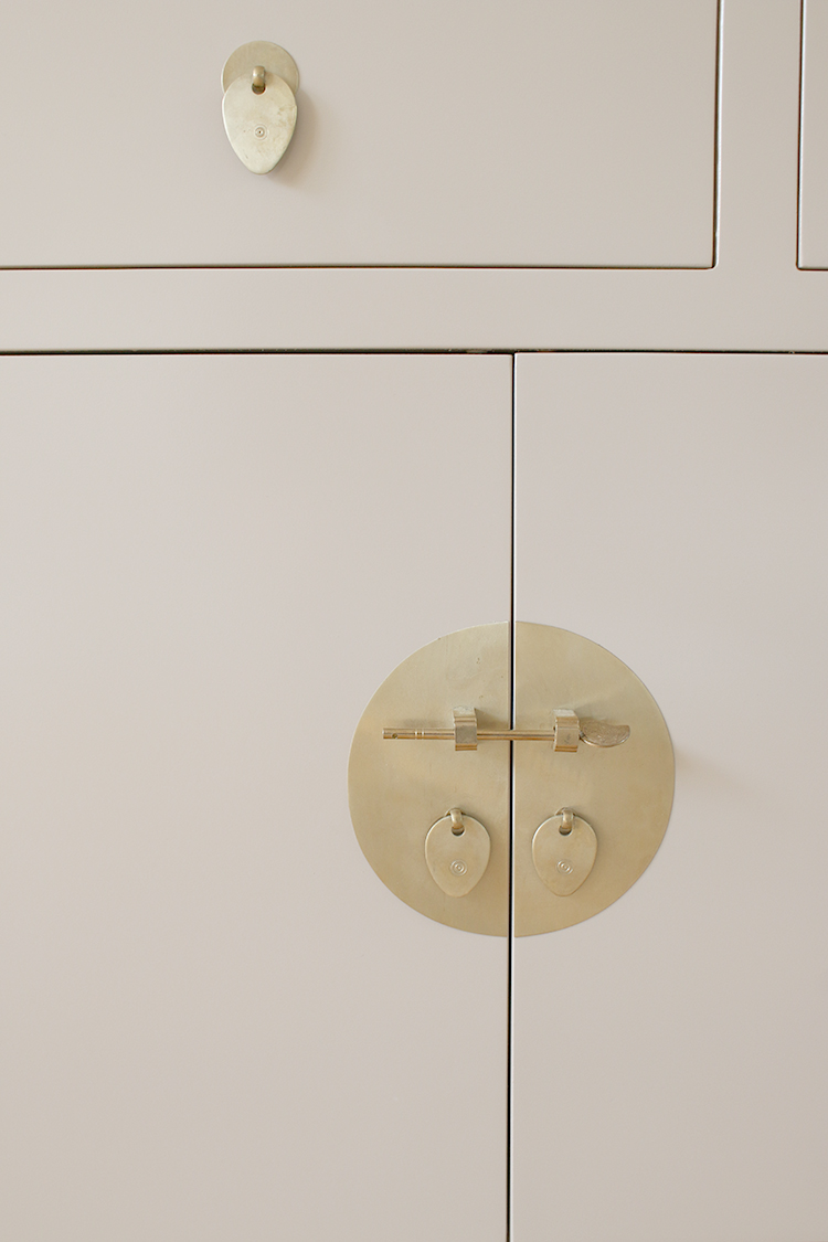
The sideboard is another collaboration with Nine Schools who make really beautiful Chinese-inspired furniture and this is the large sideboard in the colour Oyster. When they sent me a paint sample to check out, I couldn’t get over how perfectly it matched with the paint colour which is Earthborn’s Donkey Ride. As I mentioned previously, I’m working with Earthborn on this project as one of their #claymate ambassadors this year so I’m super excited to be using this colour throughout the entire space – it’s just so warm and lovely and the sideboard is the perfect fit for the space. It’s coming together!!
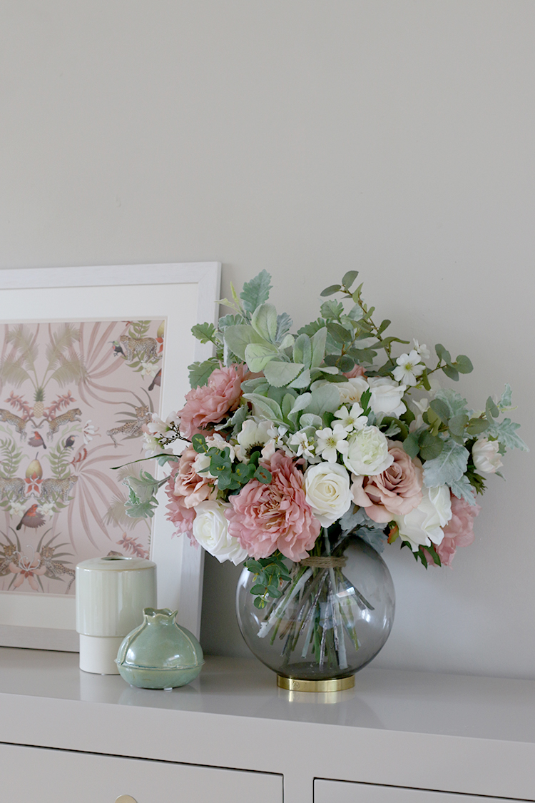
The flowers are another gift from a lovely faux flower company called Honey & Lily which I’ll share more about in the future but how utterly delicious is that display? She created that just for me with all my favourite colours and blooms – she’s a total master and I love how it encompasses all the colours that will be in this space. Yum.
If you follow me on Instagram (if you don’t, please do because I share quite a lot of behind-the-scenes stuff in my Stories!), then you’ll know I finally waved goodbye to my beloved faux bamboo leopard-upholstered Chippendale dining chairs. I had them for 7 years (they’d undergone a few updates in that time) and while it hurt my heart to let them go, I knew it was finally time for something a little different.
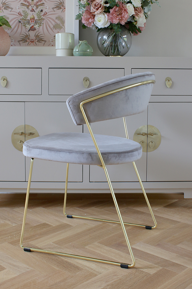
Thanks to the sale of my vintage chairs, I was able to afford to spend a little more on a set of six of these velvet and brass beauties. The chairs are the Connubia by Calligaris New York Velvet Dining Chair from John Lewis. I love their simplicity but have just the most beautiful detailing in the way the metal wraps around the backrest. The colour looks more grey in this picture but they are called ‘sand’ on the website and in certain light, are more of a browny mushroom shade.
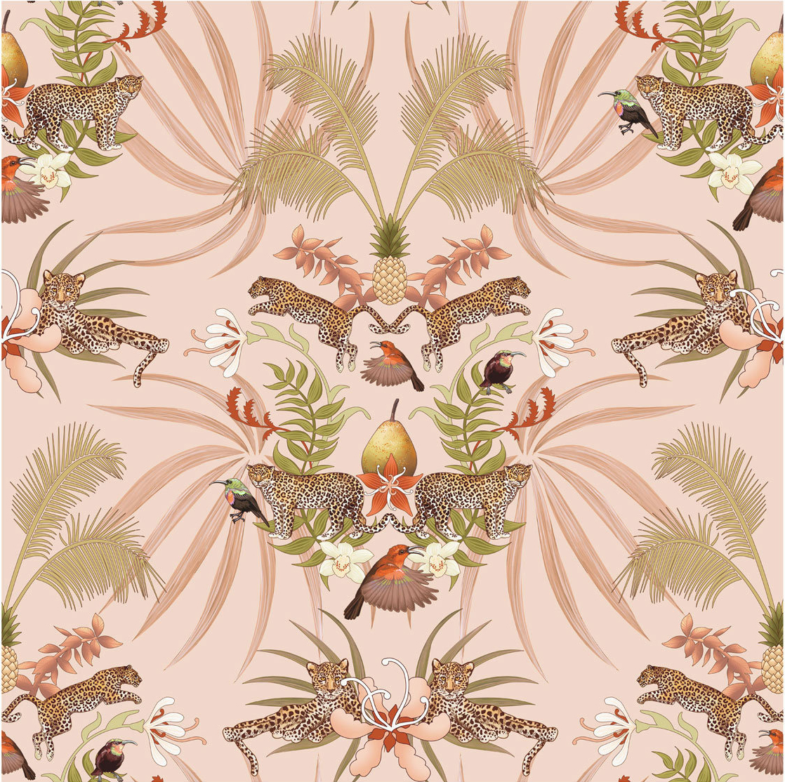
I just needed to show you a closeup of that print as well. I bought this from a seller called Becca Who on Etsy and it was absolutely love at first sight. If you’ve been following my blog for a while now, you’ll know why this print speaks to me! I mean, it’s basically all my favourite things – leopard-spotted kitties, peachy pink shades, pineapples, plants! I kind of feel like if you said to someone, ‘create a print that Kimberly would like’, this is pretty much what the person would come up with. I adore it!
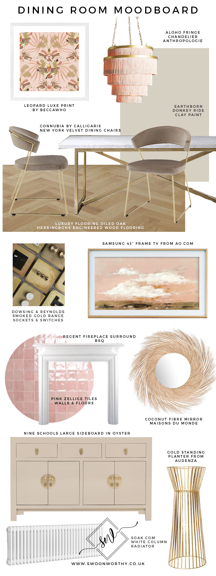
Anyway, here are a few more items that are planned for the space! Some of them are gifted, some are discounted and some I’ve paid for so it’s a bit of a mix!
Leopard Luxe Print / Anthropologie Chandelier / Calligaris Dining Chairs / Earthborn clay paint in Donkey Ride / Engineered Oak Parquet / Dowsing & Reynolds Smoked Gold Sockets & Switches / Samsung Frame TV / Regent Fireplace Surround / Pink Zellige Tiles / Coconut Fibre Mirror / The Nine Schools Sideboard / Gold Standing Planter / White Column Radiator
In the interests of full transparency and of course, to give these guys a bit of a shout out, I wanted to tell you about some of the other brands supporting me on this makeover. Of course, some of my sponsors are cross-overs from the kitchen. So, Earthborn are contributing paint for the whole space, Soak.com have provided radiators in both rooms, Dowsing & Reynolds is providing the sockets and switches throughout both spaces and Luxury Flooring provided a discount for all the flooring which is, again, in both rooms.
For the dining room alone, however, as I mentioned earlier, Nine Schools has provided that beautiful sideboard (so so happy with that as I was stuck for a while on what to get!), The Shutter Store has provided the shutters (I worked with them in my living room too which you can see here) and Honey & Lily have provided that beautiful bouquet of faux flowers.
I’m also working with AO.com who are gifting something I’ve been dreaming (and manifesting!) for a long time now – the Samsung Frame TV! I can’t be more excited about this. Basically, Wayne was insisting on having a television in this room as we used to have one in our old dining room (you can see it here) but I’ve always hated the big black box on the wall. However, the thing was, we did use it all the time so it was super practical for us. I told him the only way I would “allow” a television into this space would be if it were a Samsung Frame TV which would blend in and appear to be artwork when it wasn’t in use. I approached AO about collaborating on this one and I was so happy that they agreed. I’m just excited we’ll finally have one in this room as it’s the perfect compromise between practicality and design. Side note: At some point in time, I’d like another for the living room but one thing at a time for now! Ha!
Going back to the mood board, how about those gorgeous pink Zillege tiles?! We’d originally gone into this project with plans to fully reinstate the fireplace in this room with a wood burner but then as renovation costs were escalating, we realised that spending around £3000 for something we really didn’t need in the space just wasn’t the best use of funds! So we’re going a bit of a cheap n’ cheerful route instead with just tiling the inside and the hearth, putting a surround on it and calling it good! Ha! We could always go for a biofuel fire like we had in our last fireplace so at least that’s an option for the future.
I’m not 100% yet decided on the mirror. I like how textural the one in my moodboard is but I’m also quite drawn to a vintage/antique French style one similar to what I have in the living room. So yeah, massive differences between the two and totally different vibes so hopefully, over the next few weeks, I can decide on that. Side note: I also haven’t decided on the breakfast bar stools either so I have some decisions to be made asap!
But I think that’s probably enough babbling about this space for the time being! I’ll have plenty more to share as we continue getting this space finished so stay tuned but in the meantime, what do you think of the look so far? Hit me up in the comments!















Absolutely stunning!! All of it – the sideboard is just beautiful, especially that particular shade against the gold hardware. In regards to a mirror, although I like the one on your moodboard, I feel like an antique style one will really stand out! Can’t wait to see the full reveal my lovely xx
Ahh thank you darling! Yeah, I feel like I may need a bit of vintage in the space to keep it all from looking too ‘new’ if you know what I mean! Also, I just realised this morning that the mirror from Maisons du Monde is too big for that wall… whomp whomp. So back to the drawing board! LOL! xx
That flooring though! Literally my dream flooring!
Oh Lucy, trust me, it’s my dream flooring too! I’ve wanted it for so many years – I keep going in just to ‘visit’ it LOL! xxx
Haha I love that you visit it! x
It is going to look beautiful. I absolutely love the herringbone flooring and the pale color. I will miss your Chippendale chairs though. I love the sideboard so much that I checked out their website. It doesn’t look like Nine Schools is available in the US though.
Ahh thank you! I’m rather in love with the flooring myself – definitely my dream! Ahh I’m not sure that Nine Schools ships to the US, it might be worth dropping them a line to see if they can! :) xxx
LOVE where this is going! that sideboard is dreamy!
Thank you so much darling!! xxx
Can’t wait for the full reveal. Everything is looking amazing, if your mood board is any indication. I too love the floors SO much. Will these floors be installed in the rest of the living spaces also? Your use of the color pink with gold is so unique and makes your spaces one of a kind. Keep on doing what you do. Your touch is so special.
Ahh thank you so much Pat! And yes, we actually already have the flooring for the living room as well so we can carry it through the entire downstairs – hopefully we can do that over the next couple of months :) It’s always been my dream to have parquet everywhere so when we moved in and saw the hallway, I knew this house was the one! ;) You are so sweet, thank you for your lovely words, that means a lot to me!! xxx
So interesting to see how the design develops (I remember previous posts about choosing a more ‘ornate’ sideboard, and the pink velvet dining chairs!) – it’s a beautiful calming vibe, perfect for dining and ideal backdrop for any/changing accessories. ‘Stylish’, will still look good in years to come. (OMG ‘decision overload’! What should be the most fun part – choosing décor & fine details – comes when you’re most tired, worn out & broke! Glad yours is under control :0)
Ahh thank you Tahira! Yes, I definitely have gone for a more calming vibe in here than I’d initially planned but like you said, I think it just makes it more flexible for the future without being boring! LOL! And isn’t that just always the case?! Totally agree – it should be the fun part but it comes at the worst time! xxx
BTW it’s already looking very GLAM, so maybe going for the gilt French mirror will add the ECLECTIC & BOHO…? Either way will look stunning, love the vibe.
Yeah I’m starting to lean more towards something vintage for the mirror! I think the room is looking a bit too ‘new/glam’ right now and I need something to balance that out a bit! Good call ;) xxx
In my sitting room, which has some similar elements, e.g. marble (fireplace) & wall colour, I’m hoping to find a foxed mirror with either dark metal or mirrored frame. Interesting & vintage looking, but not dominating the other décor. Tx
That sideboard is a knock-out and will remain stylish for years – great eyes find great pieces! And the pink tile…yummy!
I agree with another comment – the mirror should be gilt and antique!
Kisses for Quito!
XO Susan
Ahh thank you Susan! Yep, think you’re right – a vintage piece would work really well in here to balance it all out and that seems to be the consensus too! Quito says hey ;) xxx
I’m my goodness. I knew this would be beautiful but it is even more stunning than I could have imagined. Not that I’m surprised of course. You are a queen at pulling everything together and hunting out the perfect pieces. I am so jealous about your Samsung frame. I’ve also wanted one for all of eternity. In fact I think I may have dreamed it into existence.
Your work is so full of useful information.
I’m loving your dining room so far. The sideboard is soooooo good. xx
The interior cabinets and sideboard look impressive. All a very pastel coloured scheme.
Wheres the Cat? I can’t see it prancing about.