This is going to be just a big mess of a post because there’s a bunch of stuff going on at the moment in my dining room in terms of little changes here and there so bear with the rambling post!
| My favourite shot! |
I was looking at some old pictures of when we first moved in and realised that whilst we’ve not really spent a lot of money at all on this room (not like the kitchen and living rooms which had a budget associated with each over a given time period) we’ve actually made quite a bit of progress just making a lot of little changes as we went.
So I guess I’ll start there and then talk about some of the detail after that!
We’re going to begin with some before and afters. I know I like a good before and after personally and it’s always good to take stock.
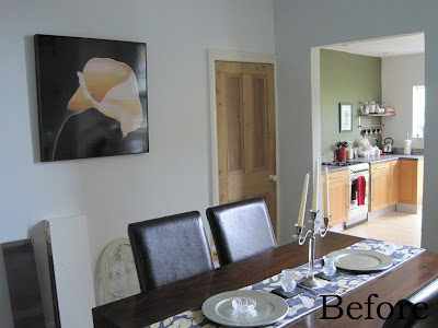
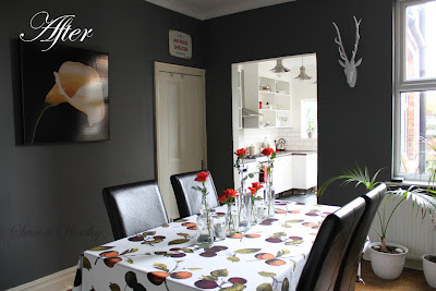
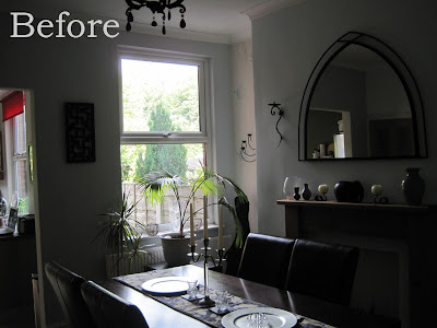
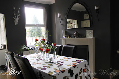
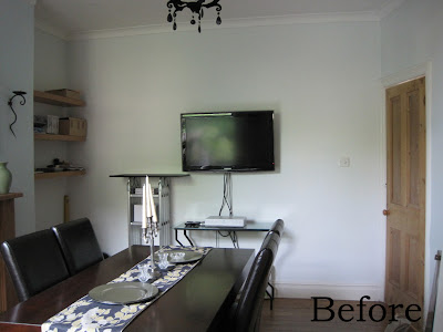
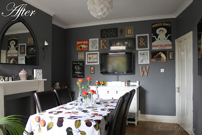
The ‘before’ pictures were taken back in July 2010 when we’d only just moved in and the ‘after’ pictures were just taken this weekend.
So we’ll start with the view into the kitchen…
I love that you can really see the difference the white kitchen now makes! Holy brightness Batman!
This shot is notoriously difficult to take only because the window tends to blow it out but you can see there was wallpaper in the alcove on the left (There was no sign of it anywhere else in the room which begs the question why anyone would use wallpaper only there?).
Wallpaper was painted over (I actually forgot it had been there, you really can’t see it at all with a coat of paint over it) along with all the trim and the mantle and of course, STUFF was added.
So here we see the final before and after of the dining room and I have to say, this is really the biggest change. Having a television in the dining room was W’s idea so my challenge was finding a way to either blend it into the background or work it into the design. My original idea was to use a patterned wallpaper here but once the paint went on, I knew I wanted the whole room in the same colour.
And so, the idea of a gallery wall was born. I think it adds a lot of personality to the room and so what was originally an eyesore has become one of my favourite things about the room. And I have to admit, it’s great having a telly in here because we end up spending a lot more time in this room than just to eat meals. It’s really become the main hub of the whole house.
It’s amazing what some paint and a few accessories will do, dontcha think?
So those of you that may have been following me for a while may have noticed I’ve added a few bits to the gallery wall.
I’ve always really loved vintage advertisements so I’ve added a couple of them to the wall.
| The Martini & Rossi one is my favourite – I’ve always loved it! |
I also got this great vintage ‘Air Raid Shelter’ sign but W suggested putting it above the cellar door instead! I think every room should have a bit of humour, don’t you?
Back to the gallery wall… I also got this wooden sign at a visit to a new interiors shop in Cheadle Hulme called ‘Homebird’ (cute name, no?). Both me and W really like to cook so I thought it was appropriate in the dining room! It’s made from bits of wood and has a bit of a chalkboard look (without the mess). The £29 price tag wasn’t too bad either.
A few weekends ago, I cleared out the only closet in the house (in the guest bedroom) and found these two tiny framed prints that I bought way back in 2001, the first time I went to Prague from the little market traders along the Charles Bridge. I like that they fit the mostly neutral scheme that’s going on.
So here’s how the wall is looking at the moment with those additions and a couple things shifted about. There’s still gaps and holes to fill in and some of the items will inevitably be replaced but at least it’s coming along!
Let’s see… what else. I purchased these lovely little reddy-orange roses from ALDI – 10 for £2. Yes, seriously. Hey, I’m not too proud to buy my flowers at the cheapest place in town. They are lovely, aren’t they? And for 20p each, I’m certainly not gonna argue.
Oh did you notice my new autumn tablecloth? H&M for £20 (although it’s in the sales now for £7.99!). I really love it because the colours just work so well with everything else in the room and it’s a nice thick cotton fabric.
Oh I also had to move the console table from under the window (where I prefer it) to the alcove because W said it was blocking the heat from the rad and it does get awful cold in here. When I moved it over to the corner, I felt it looked too heavy with the table cloth on it so I’ve removed it.
It’s not great there but well, I suppose it’ll do just for the winter. Once it warms up again, I’ll put it back where it was!
The tray, which had been through a rather disastrous paint job has been repainted white for now but I have some plans for it so stay tuned for that. The little gold candle was from a recent trip to IKEA.
I also recently bought these little wine glasses from eBay for a fiver! Probably not surprising considering my obsession with all things gold. I love them, they just look so cute and I think they’ll look lovely on my Christmas table for a bit of added sparkle.
Oh I also got this little heart dish for £4.50 from the same interiors shop in Cheadle Hulme for W because he was always dumping all his change on the console table. So now he’s got somewhere to put it! The dish is a perfect shade of greige.
So as I warned you, apologies that this post is sort of all over the place! It’s been a while since I showed my dining room but I needed to catch y’all up! (“Y’all” is such a good word and I have yet to find a good alternative expression in England so it’s staying in my vocab, dammit.)
I think that’s everything! I think I like that the room has a real eclectic style which is exactly what I was after in this room. The floors obviously are a total mess but that’s a project we’ll be tackling next year. I also need a rug to sit under the dining table. And eventually, I’d like to replace the Parson chairs. Oh and we need a new light fixture in here. I’d also like to change out the mirror that sits above the mantle. Ohhhh and we need some kind of window treatment… So erm… yes. Still plenty to do.
That being said, what do you think of my recent bargain purchases? Any thoughts on the progress so far? Do you have any rooms that have just been worked on slowly and realised some time later how much progress you’ve actually made? Do you buy all your flowers at discount shops? Go on, share in the comments.
PS. You might notice that I’ve started using a watermark on my photos. I’m going to try to remember to do this from now on after reading a couple horror stories on line of people’s blog posts being stolen and passed off as someone else’s. Hope it’s not too distracting or annoying!
PPS. I also realised after a bit of wandering around the blogosphere that I’ve been replying to loads of commenters via email and they’ve been being lost in the ether!! Oh my god, I’m gutted! Here’s the thing – unless you set your blogger profile to receive emails, then you are not able to receive replies to your comments. I feel terrible because I reckon people think I’m well rude, not replying to them in the comment section but I know not everyone will go back to check and see if they’ve received a reply. I try to reply to as many comments as I can so please do go check to ensure you’ve got an email address associated with your profile so I can respond personally :) If you are afraid of loads of spam, I have to say, from my experience, I rarely get any so it’s all good baby.
PPPS. Okay, I’ll shut up now.
I’ve shared here…













I love your little bar set-up on your console table, mine's a vodka please! The gold rimmed glasses are fab and I love the heart shaped dish. <br />Your gallery wall puts me in mind of a french cafe bar. I like the advertising signs and putting the air raid shelter one above the door is inspired.
Wow it looks so good. My faves are the wall colour – really stunning and the art wall which has just worked out so well. Loving all the vintage signs too – love that they are different to the whole shabby chic look but still vintagey (does that make sense!)<br /><br />H&M home is totally my fave – bought a few things this week and that table cloth is so lovely for autumn<br /><br />Rachie xo
i LOVE the vintage ads you've added! and i love that shot where you can see *cue the choir* the heavenly kitchen glowing prettily.<br /><br />that color on the wall is so awesome. i'm still picking paint colors for the main level. am nuts about greys so was really trying to go in that direction, but the place is pretty open, and we're not liking any of the greys swatches in the
Love the gallery wall! Especially all the vintage advertisements! We're on the look out for some ourselves to complete our gallery wall. Thanks for the inspiration :). Your dining room is coming together very nicely.
Sooooo many things to love about this room. Where do I start? First of all, the colour is goooorgeous, so sophisticated and chic for a dining room. The gallery wall is truly awesome, I love the composition of goodies and I'm a real sucker for vintage posters. I'm also nuts about the shape of your mirror over the mantel! I could go on but I am off to Aldi to buy some flowers!
That's such a great wall colour, really like it. The idea of making your tv "disappear" with all the pictures around it is fab, it works well and I too love old adverts.<br /><br />I don't actually put a watermark on any of my photos, I'm probably far too trusting… Maybe I should start – just another thing to add to my list of "things I should really do"…<br />
Ooh what a treat of a post, so much lovely lovely stuff! Cheadle Hulme sounds like a gorgeous shop, I adore the little heart dish and the pieces you've added to the walls – they add so much character! Love the colours on the tablecloth and the gold stem wine glasses are <i>fab</i> and such a great bargain! And £2 for those stunning roses?? I'll be checking out my local Aldi for similar! <
Ooh, love the paint color, the wine glasses, well everything really! Fabulous!
Love this colour and the bar! We were thinking of painting our bedroom an 'almost black' when we move. <br /><br />ps, love your shop description sounds just like my dream shop x
That is an incredible makeover! It is not even the same room, thanks for sharing. Visiting from Blooming Hydrangea's feature on White Laquer, she loves your blog and I can see why!
Gorgeous! I love the beautiful wall color and each and every accent – perfection! You've done an amazing job!!! Thanks so much for sharing! ;) It's nice to "e-meet" you! I'm your newest follower and look forward to seeing more!
Oh wow! I really love your gallery wall! I'm a huge fan of vintage advertisements too and I love how you mixed them with the initials. That framed & in the white frame is such a cool idea and links the K and W in a neat way without putting them next to each other. Each piece is placed perfectly but still looks effortless! I also love your gray walls and those beautiful red flowers.
Well, that is one transformation. It's like night and day. oh the kitchen really pops white now, what a difference that makes. all the vintage advertisement really does make the TV screen go away. what you serving at the bar, I'll be right over, thanks for sharing at Sunday's Best.
Love the wall color and the gallery wall. It turned out fab! Thanks for sharing at Sunday's Best =)
Your gallery wall is great! I like the mix of items, and they camouflage the TV nicely so it's not just a big black box hanging on the wall. I'm thinking of doing that with my new TV in the bedroom.
Am loving this wall colour … Am wondering if it is still available. Do you remember the name a brand?
I do indeed! It's Dulux Night Jewels 3, brilliant paint! They'll mix it for you at the Dulux counter at B&Q or Homebase.<br /><br />http://www.dulux.co.uk/colour/night_jewels_3<br /><br />xxx