Now, as y’all know, I’m not an interior designer nor do I pretend to be. But when a friend asked for some help in the design of her living room, I agreed to give her some ideas.
Natasha lives in a Victorian home that her handy hubby has tirelessly upgraded over the 6 years they’ve lived there. But in terms of decorating the space, Tash is, by her own admission, so indecisive and so scared to make a step in the wrong direction, she ends up not doing anything at all. The other fairly common issue is that she’s on a tight budget and so ends up settling for what she doesn’t really like because she can’t afford what she does.
I’m hoping that with my help, we can finally take some decisive action and give her at least one room that she really likes, within her budget.
At the moment, Tash has a few key pieces that she’d like to keep – namely, her dark chocolate brown leather sofa and chair so these needed to be worked into the scheme. With two children under the age of 4, I wanted to look at saving even more money by reusing some of the other pieces she already had.
To give you an idea of what we are working with, the current room is very similar in size and layout to my own living room except she’s got a fully brick fireplace. Tash thought she could bring some brightness to the room with a red rug but because of the red brick fireplace, dark brown sofas and dark pine framed prints on the wall – well, you can see where this is going, right? The room looked darker still. Painting the walls a pale pink to coordinate with some of the colours in the artwork, unfortunately, didn’t brighten the space despite her best efforts.
Natasha likes warm colours but the room faces East so doesn’t get a lot of natural light during the best part of the day and she wanted something that was fairly modern. She was ready to chuck out the pine bookshelves she currently had but I’ve incorporated them into the scheme by showing her how much they can lift the room by painting them white.
The moodboard I created needed to address the following:
- East-facing Room
- Warm Colours
- Modern
- Bright
- A touch of eclecticism
- Kid-friendly
- TINY budget :)
- Needed to work with existing furniture
It’s amazing how difficult it is to find inspiration for a room that incorporates warm colours but still creates a light, bright environment. I think we tend to relate warmer colours with a cozy environment, something that makes us feel enveloped so looking for these colours in a light bright environment was a bit of a challenge.
And then I saw this image in the latest issue of Lonny and fell a little in love with the colour scheme.
The bright touches of orange and pink looked gorgeous against a white backdrop with a large sprinkling of bright, sparkly and humorous accessories…
The one thing Tash thought she might like to try was wallpaper so the first step was finding a wallpaper that tied in the colour scheme.
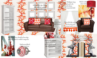
Parrot Flower byAlbany is only £17.99 per roll so it was not only a total bargain but more importantly, it was light, bright and warm – fiery even!
By painting her existing pine bookshelves a bright white colour as well as painting the fireplace white, it would lift the darkness of the current design. It’s amazing how hard it is to convince people that painting brick is not sacrilege!
By using the wallpaper in the alcoves of the fireplace and behind the sofa and a simple warm white in the rest of the room, you can’t help but feel the energy that would be created.
Adding a few carefully selected accessories always helps to set a mood and tie into the scheme. With a few different light sources, you can choose to highlight a vignette, brighten the whole room or create a cozy reading area.
I thought this DIY painted chandelier might be a great place to start…
| via |
As well as this simple floor lamp from Tescos on sale for just £60.
Adding to the practical, this funky retro telephone from Graham and Green would sit rather nicely on the white painted bookshelves.
Adding bright cushions to the dark sofas would help lift the room as well. The ‘kissing rabbits’ from Urban Outfitters is a favourite.
And I have always loved Marimekko’s fabrics as well. The colours in this cushion tie in nicely with the theme.
Because the windows are so tall (and it’s expensive buying curtains for large Victorian windows), I thought maybe she could try something inexpensive like these white ones from Ikea which come in longer lengths but add a bit of whimsy with orange bauble trim.
For an additional element of fun, I thought using white Ikea Ribba frames in a grid pattern behind the sofa filled with pictures of the kids and their colourful artwork might be a great inexpensive option.
 |
| Really sorry I don’t know where this is from but happy to credit if anyone else does? |
Adding to the eclectic element was this fabulous owl lamp from An Angel At My Table. As Tash’s daughter always likes playing with my little white owls in my living room when she comes over, I thought she might like a big one of her own!
| I am, of course, not advocating that this is a toy. Common sense, people. |
I also thought that she can add some bright red or orange baskets to the bottom shelves of the bookcases to hold the kids’ toys and games and swap out the knobs on her pine TV shelf with some lovely red and white stripey ones.
Well, those were the main elements but you can see the whole moodboard here.
We are waiting for a sample of the wallpaper for now and of course as always, this is a bit of a work in progress so there will always be a few changes but once we start the process, I’m hoping she’ll allow me to share some progress photos for you as we go.
So what do you think of the moodboard? Do you think I kept to the brief? Anything major I’ve missed? What would you have done? Any ideas you’d like to pipe in with?
I shared my moodboard here…

















loving the moodboard, the oranges reds & pinks against the white are stunning. i love ecclectic styling & this really works for me
Er, I think you may have missed your calling.This looks great! I love the owl lamp.I think the colours are great too. I am getting back into colour. It is so much more homely.The white frames look so cool. Bobble trim! Love! x
Love it all! The colours, the quirkiness, and the glamour. Gorgeous. Em x
You have mail :-)
i think you are amaaaaaaaaaazing, girl. what a brilliant plan, and i bet your bud is bursting at the seams! tight budgets are good. they really are because you're forced to enter new levels of creativity and put thought into it rather than cash.<br /><br />i cannot imagine living with organge, but when i see this mood board…totally works. juicy sexy color and vibe, like you!<br /><br />
That's a lovely mood board! I love all the reds/ Lucky friend!!! I am in love with that phone!!! <br /><br />Sarahx
Looks good. I like that you brougth in so many different pops of colour, and kept the room really simple. I am creating an electic living room right now for my self and I am being really patient to find the right elements for my space. <br />I think the white curtains with the touch of orange will be FAB! <br /><br />Jodi
That's a fun look/color combo. My living room is gray, blue, cream, and yellow, with a little bit of purple. I'm not totally happy with it yet, and I can't quite figure out what little things I can do to improve the look of it. I guess that's what makes interior decorating fun.
Thanks for all the lovely comments; I was a little nervous sharing this because I wasn't really sure if it was up to some of the gorgeous moodboards I see around blogland but y'all are so flippin LOVELY.<br /><br />Cheers my dears xxx
Beautiful colors! You should share this at http://www.remodelaholic.com/2011/09/good-mood-board-link-up.html
Cool, thanks for the link, Jacqueline!
That wallpaper is a perfect jumping off point to blend light with warm. Yellow might work as an accent color, along with the reds and oranges. You know, a royal blue also might be a counter-point to all the warm colors, like in a pillow or something?
i Really love this glamorous stuff! Some fascinating job you have done. Thanks for sharing this great stuff.<br /><br /><a href="http://www.logoonlinepros.com/pages/Stationary" rel="nofollow">Business Card Design </a> | <a href="http://www.logoonlinepros.com/pages/Banner" rel="nofollow">Banner Design</a>