Ever since my new snazzy TV cabinet was placed in the living room, the little chest of drawers in the opposite alcove has been bothering me. Oh sure it was perfect when the black TV/black cabinet was in there and things were a bit more rustic but since my foray into colour and white and gold in here, it was suddenly looking like the odd one out.
Now, the whole reason we even had the chest of drawers in that spot was because it houses our rather large DVD collection and trying to find a suitably attractive DVD cabinet is just pretty much impossible. The DVDs sit snugly in each drawer, making it easy for us to have a skim and choose our favourites for romantic Saturday night viewing (with cocktails/wine/beer/other assorted adult beverages of course) cozied up on the sofa.
So getting rid of it entirely wasn’t going to be my first choice if for no other reasons than sheer practicality. Rather than selling it or giving it away, I figured I’d have a go at seeing if I can make it blend better in the room. I think in time, a shelving unit of some description will be much better in here but spending more money on furniture that I don’t actually need is not the biggest priority right now and so I’m just making use of what I have until I can both source as well as afford a more suitable option.
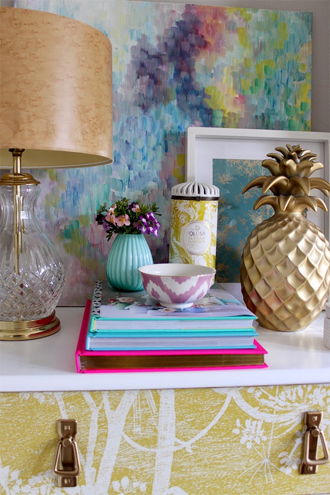
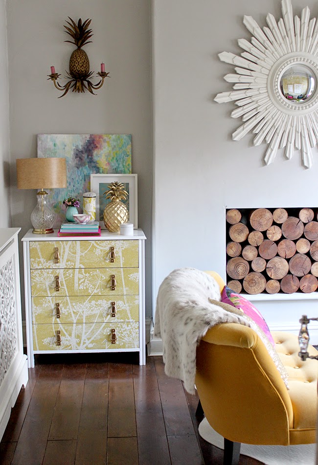
I called this a “sort of” makeover because really, it was just a matter of slapping on some primer, the same white paint I used for the TV cabinet and spray painting the handles gold. I would have preferred different handles for this makeover but because there are holes in the wallpaper where the existing drawer pulls are, a different kind of pull would have meant I would have to put new wallpaper on the drawer fronts. And well, I needed to see if this worked first before I spent even more money on new pulls. Ya see, spending more money on what’s essentially a £40 cheap pine chest of drawers seems a bit overkill. So yeah, this makeover was free. My kind of makeover.
Am I completely convinced? Not yet, no. I don’t hate it but I’m not sure if I love it either. I think after seeing this chest of drawers in black for so long, it feels a bit… I don’t know…. weird to see it like this. I do think it works better in the room as a whole but I’m not convinced the piece itself looks better in white. Of course, I need to take my own advice and live with it for a little while and see how I feel about it in a couple weeks!
A little before and after? Oh, okay…
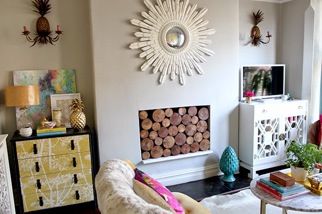
Here’s the before…
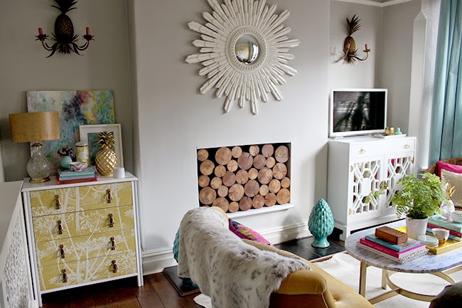
And here’s the after…
I feel like I’m making lots of excuses in this post (!!) but I guess because I see it as a temporary fix. A simple change until I can either find something else that works better and I have the cash to actually purchase said better solution. So for now, it’ll do.
The ironic thing is that this chest of drawers (in it’s original state) was actually featured in Reloved Magazine this month. Alas, it was from the Home for Now book so I didn’t get credited (boo!) but thankfully an eagle eyed friend spotted it and shared with me (yay!) ;) You can see it on my Facebook page.
Anyway, what do you think of the new look? Does it look weird? Think it’ll do for now? Ever give a makeover to a piece of furniture had already been made over? Do share…
Want to see the original makeover of this? Here ya go.
Oh and if you were wondering, no, I still haven’t done anything with the wall that is to the left of the picture above! I know, I know, even the radiator cover is still just in it’s primed state since February. Shocking. I have changed my mind so many times on what to do with that wall and I haven’t been able to find a wallpaper that works well with the existing wallpaper that I’m in love with. Soooo I’ve resigned it to the “when I am in love with an idea, I’ll do it. Until then, it’s staying blank and boring” mindset!




I actually love it, although I do have a tendency to paint things white myself! I have also bought some Montana on your recommendation so will be spraying away soon!
I think it looks great in white!<br /><br />xo julesinflats
Loved it in black. Love it in white. Maybe magenta?
Oooh maybe another makeover is required. Quite like that idea ;) x
I love the white/brass on the dresser. I must confess, that I'm much more partial to white than to black in general, for furniture.
Love, love, love it in white!<br />Denise
I think it looks good, but I almost think you could have simply sprayed the handles gold and it could have been a cool kid again. I'm kind of on Margaret's 'team magenta'… The white is a little too matchy for me, but no one will think it doesn't work.
I'm liking that idea myself. Perhaps another makeover in it's future, I mean, it's already had 3, what's the harm in a 4th, right? ;) xx
I think it looks fabulous. I always love white
Love white…I don't think you are capable of doing any wrong no matter what you do ;) xoxo
The white certainly gives it more balance. But I'm intrigued by the magenta idea.
Yea I think it would look good in megenta go for it. Xx
Hi Kimberley, I do like the white, although the white does make the room look more feminine, and I did like it black as the black seemed to balance the room and it does echo the black of the TV screen as well as the dark floors…love something for free….I did a post on this not too long ago. Happy week! Sharon
Are the mirrors in your dining room and the one above the fireplace the same? Only with the one painted white? I've been looking for a mirror like this… perhaps your eBay tips will come in handy! <br />
Style-wise, yep they are the same although they were purchased from two different places (the gold one in my dining room is from eBay, the white one was from An Angel at my Table) ;) Go for it!! ;) xxx
I really do like the white version, but I think I know what you mean by not being able to get used to the new white version. The black really anchored that corner so it could feel off to you just because your eye is no longer drawn down to that area. Having said that, I think he white is so fresh and light. <br /><br />At running the risk of sounding like a Twilight fan, I'm gonna jump on the
Holy crap, thinking this might need a magenta makeover!!! Stay tuned ;) xxx
I really like what you've done. The black looked too heavy for the rest of that room and made the chest stand out above everything else, whereas now its still a beautiful feature, but fits with the scheme. The gold handles and white frame are much softer.
I like it better now painted white, and especially love the pulls painted gold.
Hey there- I just stumbled on to your blog and have been exploring it:) I absolutely love the painting you did that is on top of the chest of drawers. Would you consider selling it? Your blog and designs are amazing:) Such inspiration in what you do.
Thanks,
Whitney
Hi Whitney – thanks so much! At the moment it’s not for sale BUT (!!) I am looking at selling my work a little later on in the year and I will be selling both originals as well as prints. So if you are interested, please do sign up for emails so you can be notified when I finally ‘open shop’! It’s something I really do want to do! xxx