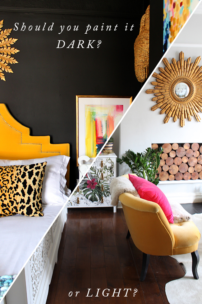
So after my post about why I was going light in the dining room, I had an almost ridiculous amount of people around social media as well as in the comments and on email telling me they were now second-guessing whether or not to actually go for that dark delicious shade they had chosen for their rooms.
Oh dear.
So, of course it was never my intention to have you guys thinking it’s “bad” to go with a dark paint colour in a room that doesn’t get a lot of natural light or that if you don’t have any other dark rooms in your home, that you should abandon the idea. Please realise there were quite a lot of different factors that went into that decision, some of which may not at all apply to you or your own room.
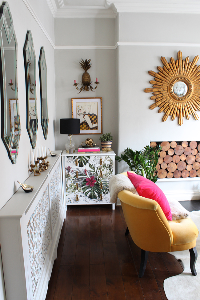
So the question in my mind then became – how do I explain how or when it would be perfectly fine to go ahead with that dark colour on your walls or when you should perhaps consider some other factors before picking up the paint brush? Because I’ll be honest with you – as much as I love dark paint colours and I realise how ridiculously trendy they are right now – I don’t always think every room suits it.* I don’t think the answer to every single situation is dark paint OR light paint. I do think there are times that it’s much better to go for a light colour and bring in drama by other means and still other situations when really, going dark could be your best bet. And then there are always instances where the planets all align perfectly and really, you can just go whatever way you want to because either light or dark, the room will look great.
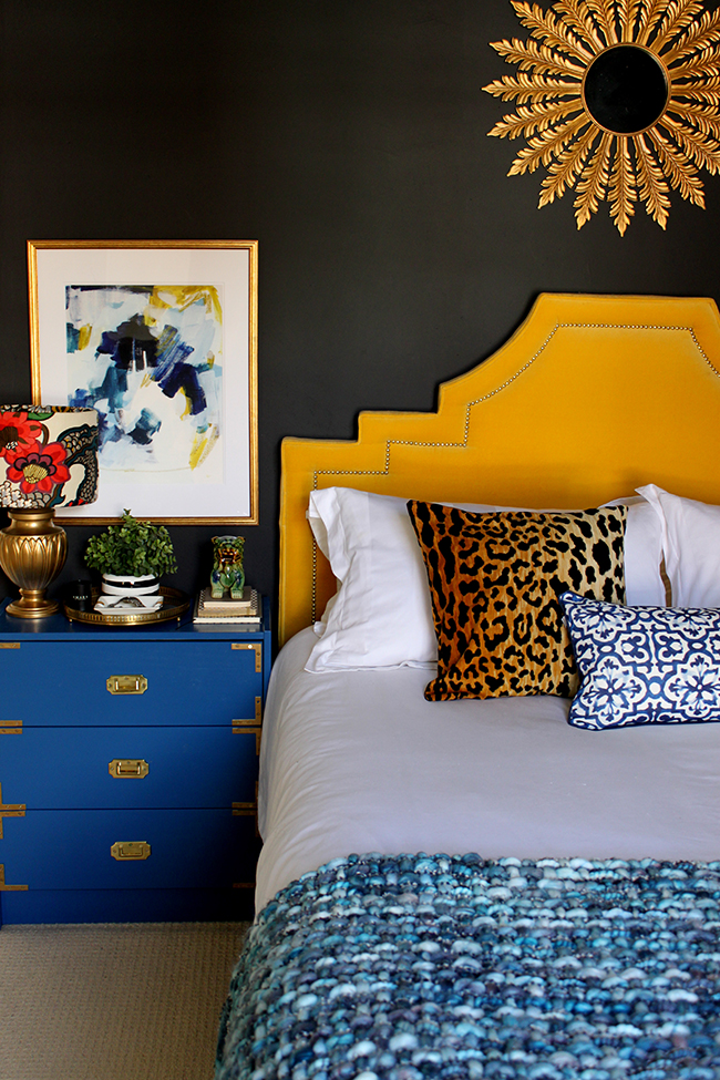
*And yes, I still love you Abigail Ahern, if you are reading this (she’s not). Please don’t hate me for saying that.
Well, guys, I came up with a little solution. A way of understanding how different factors will effect different rooms and in fact, different individuals. Is it absolutely fail-safe? Not necessarily. So ya know, take it all with a pinch of salt because I’m just going off what I know about using paint colours (both light and dark) and my own personal experience. But do I think it might help if you are on the fence about going with a darker colour? I do indeed.
Welcome to the flowchart my friends…
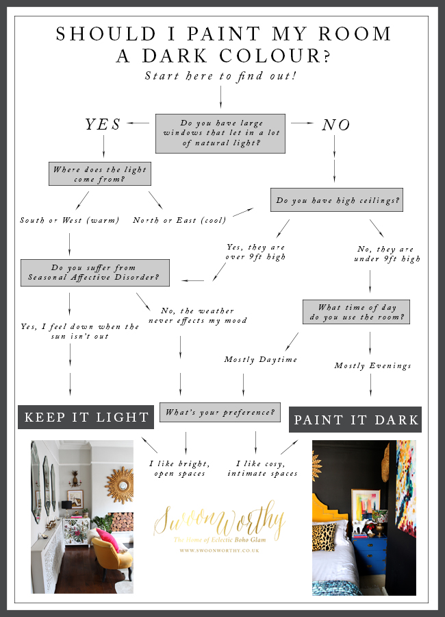
You’ll notice there are certain instances when it simply comes down to preference. Do you want a cosy, dark, intimate space? Do you actually really love light coloured rooms? Then DO THAT. In others it’s more about working with what you have, considering the actual architecture of the room, the light the room gets, the height of your ceilings or how a lack of light actually makes you feel to get your best result. So, if you’ve got a room that doesn’t get a lot of light, sometimes it’s actually better not to fight it – go ahead, embrace your dark side!
In the end, however, whether you find this little flowchart useful or not, it’s really about creating a room that YOU love. And seriously guys, if you desperately want to try a dark paint with all your heart but the chart points you to a light colour, then screw the chart, just try it. I mean, it’s PAINT at the end of the day, not life-saving surgery. If you try it and you hate it, well, just re-paint. No, of course, no one wants to feel they’ve wasted time or money but sometimes it’s better to just go ahead and experiment and then you’ll know for sure either way. And hey, you might end up with something fabulously unexpected that you adore.
I’d love to hear your thoughts on this and whether you think this flowchart might be helpful to make a decision on whether or not to go with a dark paint colour! How do you make a decision? Do you prefer light or dark spaces? Go on, talk to me.












I find it so hard to make the decision! I love both, but the decision for me usually comes down to when the room is used most. Also, I might love a dark room, but I do have to occasionally take other peoples preferences into consideration unfortunately! lol
Perhaps I should have added in there: “Does your family hate the idea?!” Haha! I admit, it took me a while to convince Wayne that we should go dark in the bedroom (only after I promised to repaint it if he hated it did he let me) and now he loves it! xx
What a great chart . I def need to keep it light!
Thanks Becky! And if that’s what you like, then absolutely! ;) xx
I just said it last week and I’m saying it again now. YOU ARE A GENIUS!
Hahaha! Thanks my friend! Mwah! xxx
This is brilliant, and I admit, I was totally shocked when after answering yes to small windows, low ceilings and using the room in the evenings it suggested dark! Maybe this is why I have been struggling with the colour in that room. Originally it was grey with light pink, then I changed the pink to mustard (which I loved, but it was too much for the small room I think), and now I am about to paint it again, this time in a grey-blue colour! I am hoping this will work out this time! But you’re right, the joy of paint is that you can just change it if you want, so why not try something different?! x
The thing is, in a dark room like that, there’s no point in ‘fighting’ it and trying to brighten it up if you fancy a dark colour anyway – sometimes these rooms really suit dark paint to make it feel very cosy ;) Good luck with the new colour! xxx
Great idea Kimberly, think there definitely some struggling with this whole dark/light thing and I’ve been thinking about a post on the dark/light question myself. I think probably because dark is a forceful trend that has peeps thinking that they need to be loving it or they are not ‘on trend’ “WHAT you don’t love AA’s dark side, are you nuts?” As much as I like her style, as I said before, she don’t got the monopoly on colour! And we all ditched Kelly Hoppens beige remember as we will do the dark at some point. Reckon I will share my thoughts on that soon. In meantime well done for speaking out for a lighter side for those needing reassurance! X
I think this is really for those who LIKE the dark colours and are wondering if it might work in their rooms. But if you don’t fancy it and can’t live with it, then of course, keep it light! I never got into the beige thing to be honest and I do really love the dark wall trend (well, I did it before I even knew who AA was about 5 1/2 years ago!) but sure, I can see people feeling like they are forced into it! A bit silly, really, just do what you feel good about! xx
OOhhhhh!! I’m actually at this point now, our dining room is north facing. Not a lot of light… I think it could work Dark as your chart has suggested but… I’m scared I wont be able to see anything/find anything… Now I’ve written that down it seems extreme but I just dont know. Think I need to get some sample and paint some lining paper, pin it up in the room to see.
Kudos for the flow chart btw!
Sue, my dining room is gorgeous Hague Blue by F&B and its my most fave room, dramatic, warm and glam, with rich green velvet curtains and lashings of gold. It’s a room only really used for dining so totally works and it’s west facing but not flooded with light, none of my rooms are. Also have a study in Green Smoke, north facing, cosiest room ever. Go with what you feel, I’d say.
Your room is fab Jane!! Perfect example ;) xxx
Oh Jane I’m off to check out these rooms on your site- thankyou!
Haha! If you go with a dark colour, you really need to layer the lighting (no one wants you bumping into things ;)) as part of the look! Of course, if you don’t fancy doing it, you certainly don’t have to (this is more for people who are on the fence about it) but I do love a dark dining room, they just tend to be so cosy! xx
You need to follow this up with some kind of glam powerpoint presentation, and you need a stick thingy with gems on to point to stuff :)
But seriously, this is brilliant for people that just can’t make decisions or just feel better when there’s a reason behind a decision. I shall just show this to any of my clients from hear on in… saves me a job! Thanks very much! :) xx
Hahaha! Love the idea of a glam pointer with SHINY THINGS ON IT!! Aww pleased you liked it Karen, thank you! xxx
This is such a fab post! Love the chart ;) I think I’m going to stay light – I’m not feeling daring enough ;) x
Ha! Thanks so much! And yes, of course if that’s what you love (nice and light and airy) then there’s absolutely no point in going dark ;) Gotta do you, right? xxx
Brilliant!
Hi Kimberly
I think it all comes down to confidence. Its much harder to visualise a dark colour as an end result when you’re making the step from light to moody and that’s why it’s such a leap of faith.
I recently changed my kitchen (northeast facing) and was convinced I wanted a light colour – but I hated it – and changed it to dark several weeks later – which I love. (https://puttingthelovein.wordpress.com/2016/01/14/kitchen-storage/) Whereas my southwest facing front room has one dark inky wall and that looks great too. You won’t know how the light will hit it until the you’ve got the paint on the wall!
Totally agree, Diane and this is part of why I did the chart – for those that do lack the confidence but are still thinking about it! So pleased you found a combination you loved – the kitchen is looking great! xxx
I think it all comes down to how dark colours make you ‘feel’ because colours effect us psychologically and unless we are aware of what our individual ‘happy’ colours are, then we might be making our lives a little dark and heavy, without really knowing why. In the 1980s I painted our very large lounge with four large windows, a dark Mediterranean blue, a month in, I was so depressed I had to beg my husband to get a painter in to repaint in a much lighter, happier colour. Moving on a few years, I now have a dark lounge, Railings by F&B but somehow it’s not making me depressed, instead I find it cosy, cocooning and intimate. So once again, colour is all about how we feel and we won’t know that until we paint it and live in it for a while. Paint colour and walls is never about trends, it’s about what’s right for the individual. Sharon
Oh please know this chart is really for those who are on the fence as I said in the post rather than those that KNOW they aren’t keen on dark colours in their home because yes of course, if dark colours make you feel a bit gloomy, then there’s really no point in doing it just because it’s trendy (that’s why I included the SAD question in there just in case). xxx
I agree with you saying it comes down to preference. My daughter’s bathroom is painted dreamy Hague Blue by F&b. It’s an inky navy. Not a window in the room. It looks fabulous. She originally painted it bm horizon which is a light grey. It did nothing for the space. A week later the navy was put on and bam the room came to life. Proving your chart theory. On the other hand what confuses me about color is what you said in your last post. About whites looking dirty. Now that is where I need help. I painted all my living spaces bm chantilly lace which is a brilliant white. Some places it is and some spaces I see it looks dingy. Color. Grrrr.
Ahh see that’s it – if a room is already a bit dark, there’s no point in fighting it! Might as well work with what you have and keep it cosy and intimate :) As for the white – consider that the way we see colour is really is about how light is reflected back into your eyes (that’s how we ‘see’ colour, right? https://www.pantone.com/how-do-we-see-color) but if there is a lack of light, the colour will appear more dull. So whites will end up looking a bit duller and dirtier in dim light so you’ll never get that bright white we see in brighter conditions. In those darker spaces, you might want to consider another colour that works better and reflects truer in lower light. I think the colour in my lounge does this well – it doesn’t ‘try’ to be a bright colour, it’s more a soft pale colour which actually works with the light rather than fight it. Hope that makes sense! xxx
I admire the patience it must take to make that flow chart to start with !! For me its light all the way but we are going over to the dark side with the twins bedroom. Will let you know how that one goes. Great post as always xx
Haha! Yeah that took me ages, surprisingly much harder than it looks! ;) I’m surprised for someone who loves white as much as you (obviously, this chart is really for someone who is more on the fence than someone who very confidently loves their white!), you’re going dark! That’s very brave of you ;) Look forward to seeing how it turns out! xx
That is such a good flow chart – I love it (and anything that takes away a lot of agonising and just presents the case clear as day). I think you should make a whole book of decorating decisions flowcarts – I’d buy it!
Aww thank you, so pleased you liked it! Hahaha oh god, this took me far too long to do ONE never mind a book! I’ll leave that to someone else ;) But thank you my dear! xxx
Love the flow chart. I’m a light person but one of these days, I will experiment with dark. x
Thanks Geraldine! I think if you really know what you love (and you clearly do!) then there’s no real reason to change that ;) I would love to see you experiment with dark though – I’m sure it would look amazing! xx
What a fantastic flow chart! It is really helpful too. I have never painted a room dark but always swoon over the designs. The closest I have come is to paint my sons a really lovely bright blue! I thought I was being brave then! However I love it and it has made me think about pushing myself when it comes to other rooms.
I think any time you use a bold colour (whether that’s a bright or a dark), it’s brave! People will always revert to soft neutral colours (not that there’s necessarily anything wrong with that either, it’s just more common) so don’t sell yourself short ;) But it’s great that you loved your son’s room and hopefully it means you can ‘play’ a bit more with the entire scope of colour in the future :) Good luck!! xx
So many people umm and ahh forever over going dark or light; now there’s finally a chart to tell them which way to go! I love it! As someone who suffers from SAD, I can’t do much dark, especially in living areas, but I am really glad I was bold with the dark blue in my little boy’s room as it is gets oodles of natural light during the day, even on a grey day, and the dark colour has turned his room into a really cool space. Sometimes, it’s not easy to convince the other half about wanting to go dark even though you know it’ll work really well (as in my case) so this chart is going to be super helpful in preventing domestics! Kudos to you! x
I think that’s what I realised myself with my dining room – I suffer from SAD as well and having a main living area dark just wasn’t working for me mentally any more! But I still love it in the bedroom (plus it is always bright in there, even on darker days) and I don’t spend as much time in there regardless! It’s all such a fine balancing act! Thank you darling, so happy you liked it though :) xxx
That blue sure did look good in photos, but you’ve got to do what works for you, especially when you spend so much time in it. When we moved into our home, it was late spring/early summer when there was SO much light, and I was convinced I’d want to paint the living room dark as it got a lot of light. But during these grey winter days, I am craving a light bright space, so I’m glad I didn’t (have the time or money to) take the plunge in the summer. Anyway, I know you’ll make the light transformation of your dining room work beautifully. I love the moodboard, it promises fabulousness! xxx
Aww thanks my dear! Yeah, it’s just the fact I’ve had to work in the dining room through the whole of winter (because of the dog) and the lack of light is just doing my head in! Eeek! Can’t wait to get it all bright again :) xxx
You clever cat you ;) Wish I could go darker in some of our rooms but the landlord would have a cow, so I’m sticking to the one black wall for now until we move ;) That said, white is one to watch for too if you’re going light (just to complicate it more) as if you don’t get heaps of light in the room it’ll end up looking grey…it’s all just trial and error isn’t it?!!
I think having one dark wall is a great compromise (plus it can really look awesome)! And totally agree about the white – it’s exactly why I’m going grey in the dining room and why I did grey in the living room :) But yes, there’s so much trial and error in it! Plus don’t even get me started on the subtleties of undertones in colours like grey – ack! ;) xxx
Yes, yes, YES! This is so beyond perfect and for most cases, you hit the nail on the head. I say most cases because as you say, it’s not possible to create a rule book for design. All of these are the very reasons I painted just two of the walls in our living room dark; our living room is quite dark to begin with, so I wanted to add some cosiness without it getting too overwhelming. And I gotta say thank you for including SAD in your chart – it’s amazing how much mental health plays a part of design. It’s not something a lot of people consider! Absolutely ace.
It was SO much harder than I thought doing this chart because there are a million little factors that go into it but I wanted to keep it as simple as possible! But thank you darling and yes, I totally agree that SAD comes into it – I suffer from it myself and having a main living area (the dining room) in a dark colour and spending so much time in there just felt awful. I realised how it was affecting me. The bedroom on the other hand gets an amazing amount of light (even on dark days) and well, I don’t spend as much time in there so it’s fine to stay. But YAY! So happy you liked it!! xx
I am going through this dilemma at the moment. Really struggling. I have a lovely super bright south facing room that could take a dark colour. But is it me? Aarrgghhh! I need to keep at the tester pots. Find the right thing. It’s definitely blue or teal. Just what shade?! Thanks for the info in this post, v helpful!