I know I often have about 10 different projects going on at once and I know I’m plenty guilty of talking about plans and then erm… not really getting around to them (soz) but this time, I actually completed a project that I’d been planning on doing since March! Can I get a hell yeah! HELL YEAH.
You may remember my post explaining why I wanted to change the wallpaper behind my open kitchen shelves. Long story short, since painting my dining room a dark blue, I realised the kitchen really no longer tied into the space. As the kitchen opens on to the dining room, I felt carrying those colours through would make the spaces feel more related.
And so, thinking I would be able to get this project completed whilst working on the bathroom (HA!), I purchased a roll of Designer’s Guild Alexandria wallpaper in the Magenta colourway back in April. Well, here it is the end of June and I’ve only just gotten around to hanging it but hang it I did this afternoon!
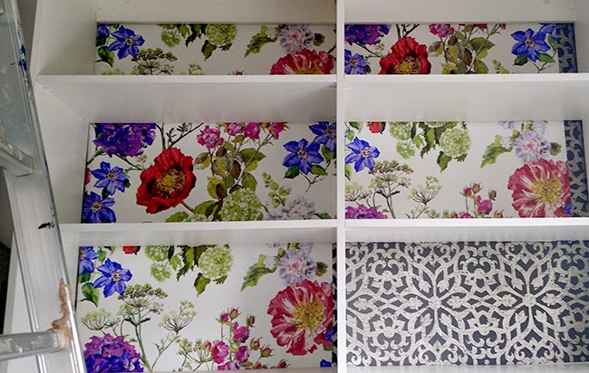
I had an absolute nightmare hanging the previous paper the last time and so was dreading it and putting it off. But this time, instead of trying to squeeze the wallpaper in big sections behind the unit, I decided to cut the paper into opening-sized segments so that the seams met behind the shelves and with the wallpaper being a ‘paste the wall’ product, it was SO easy to use. Oh my god, no bubbles, no tearing, nothing. This stuff goes up like a dream!! (And no, this isn’t a sponsored post, the quality is just outstanding.)
As you can see, I did not remove the existing wallpaper before hanging the new one. I know, I know – I’ll get slated for that one but here’s why I felt it would be okay to do so:
1. The existing wallpaper was in great shape, it wasn’t bubbled, torn, ripped etc. So the surface was sound.
2. I read plenty of articles online that recommended removing it first but then conversely, read plenty of articles that said people had done it when the existing wallpaper was fine and there was no issue whatsoever.
3. The one point I did read was that you should ensure the seams of the old paper do NOT line up with the seams of the new wallpaper. Fine.
4. I really couldn’t be arsed with the soul-destroying task of taking the old wallpaper off first. Yes, I’m a lazy cow.
5. Whomever buys this house from us is going to hate me for doing this. I’m kind of okay with that.
Would I recommend you do the same? Well, it’s up to you really. I’m not going to say you HAVE to remove existing wallpaper that’s in good condition before attempting to hang new stuff because for me, so far, so good. But I suppose you should proceed at your own risk ;)
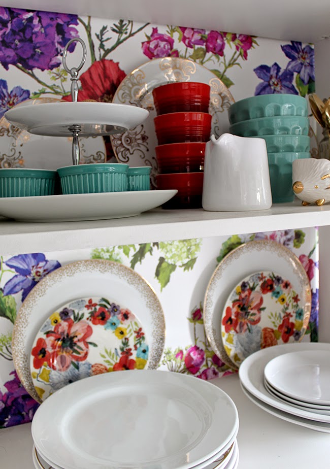
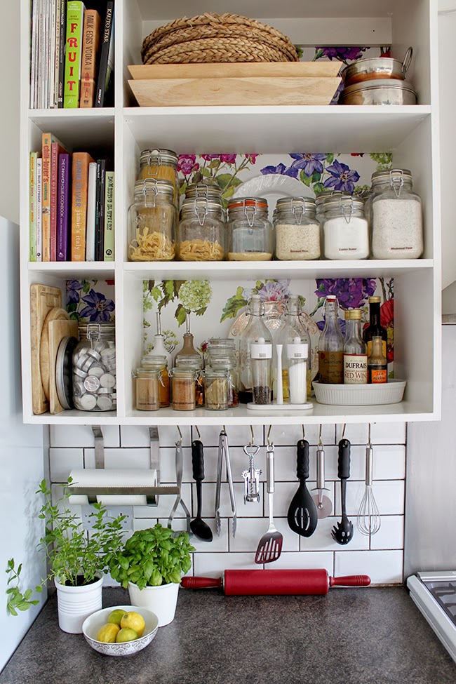
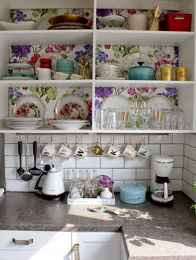
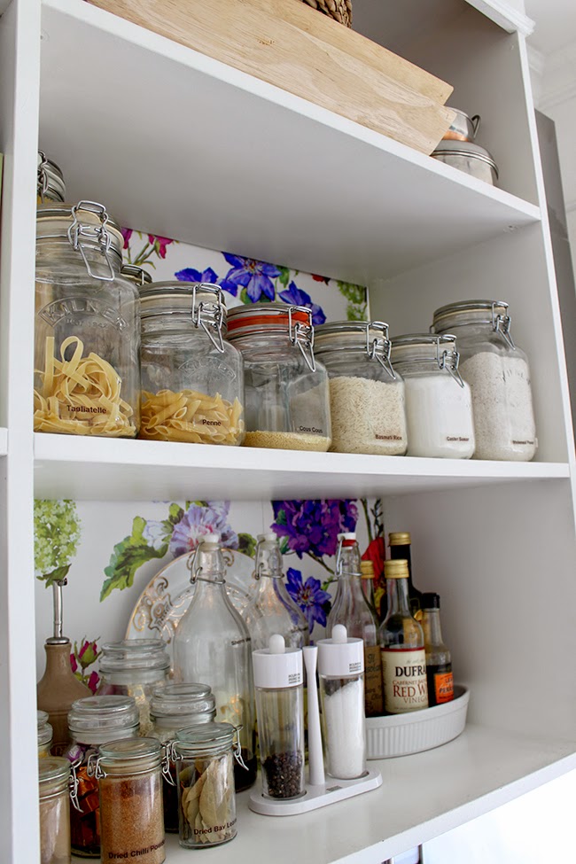
Here’s what it looks like now that I re-filled it with all my stuff… I pretty much love it.
I currently have loads of paper left as well (I’m not even sure I used a half roll for this project!) which means I may need to use it for something else.
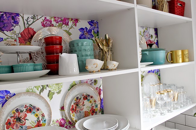
I was worried I’d have to change out all the turquoise-y blue accessories but at the moment, it’s not really bothering me that it doesn’t match the paper perfectly so I may just leave that as is for now.
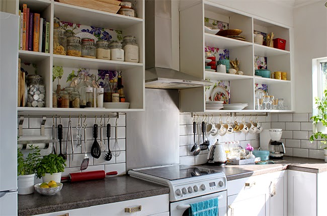
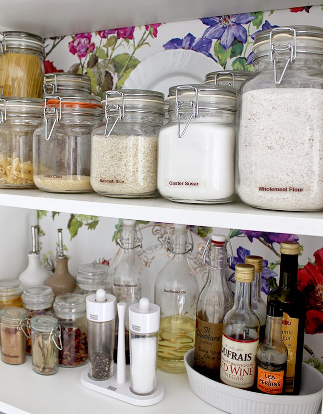
Anyway, a few more gratuitous shots because I love it so freaking much!!!
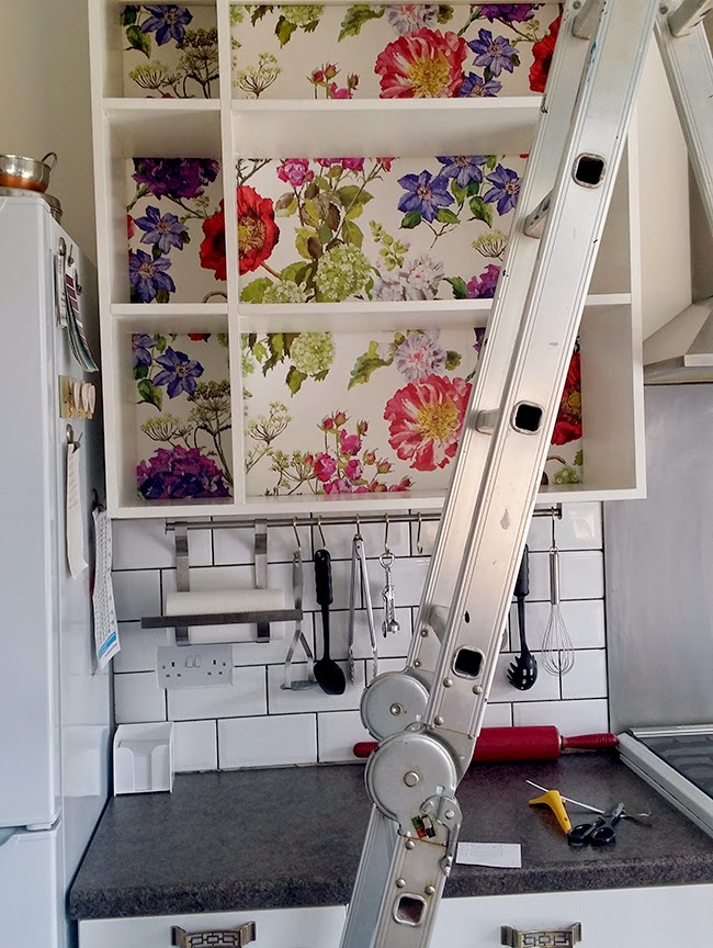
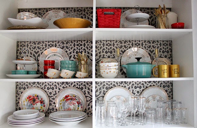
Here’s a reminder of the before…
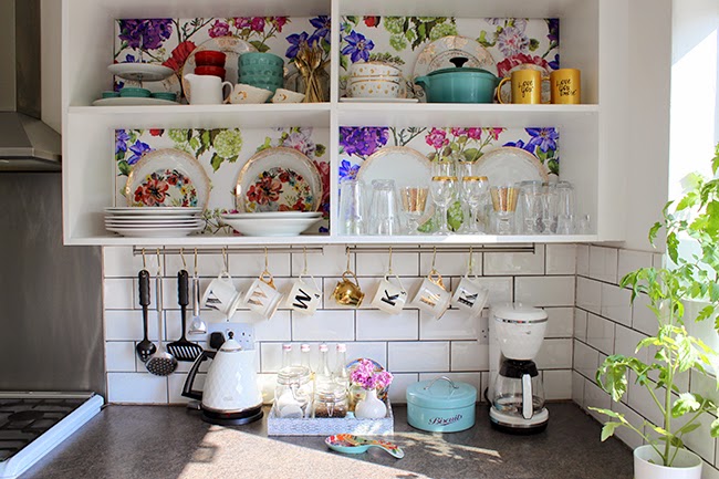
And here’s the after…
While the ‘before’ was perfectly fine, I do have to say I love how bright and colourful it is now! What can I say, I’m a sucker for a colourful palette.
There’s still more to do in the kitchen of course (the countertops being the biggest job) – I mean, we’ve only been working on it on and off for the last 3 years *cough* but all in good time. For now, I’m really happy for this little change and it feels very summery in the kitchen now!
So have you ever wallpapered on top of wallpaper? Which do you prefer, the before or after?
Don’t miss a thing!











I really, really love this wallpaper &, well, everything! Was going to go for something darker & floral for an accent wall in my dining space, but you have me re-thinking now…!
That paper is fantastic! LOVE IT! You are totally inspiring me to bring some florals into my kitchen makeover plan!
Wow it is gorgeous! I liked it before, but I love it now!!
It looks great! It brings another level of interest in your kitchen and matches your dining room to the T. I love how the little twinkles of gold pop against that wallpaper. Girl, your making me wish I had a house of my own! It looks great!
It looks stunning! And PFFFT to removing the old stuff first; I concur there was absolutely no need if the paper underneath was fine. I think the next owners will actually love you a bit- I love peeling off layers of wallpaper because it's basically like travelling back in time. When you come to sell your house, you should definitely market it as "Letting you live like Michael J Fox in
So pretty and fresh. You've totally inspired me to think about wallpapering the back of my kitchen hutch.
Beautiful wallpaper it's soo nice and cheery. Did a great job I wouldn't of removed the old paper either, making more work then needed. I love floral wallpaper in the kitchen I have a whole wall in mine of cath kidson paper. Cheers me up every morning while making my coffee, great start of the day to be greeted with flowers everymorning ha!
Remove the wallpaper? No, no painter that I know of do that if the old one is ok. Remove anything that is loose and fix any bad seems of course, but no more work than that. A very nice and happy look, the gold works so well with the lilacs. I can understand your worries with the turquoise, but isn't just a matter of how much color one likes? it doesn't clash I don't think.
Gorgeous paper. Looks awesome
I adore this sooooo much Kimberly! It looks so fab :)
That paper is nothing short of amazing! Too bad paper wouldn't stick to the side of your fridge. It is so beautiful the rest of that roll would be burning a hole in my pocket. :)
HELL YEAH!!!! Great job and yes I would leave the wallpaper on as well xx
I've been looking to do something like this FOR AGES. I have the same sort of layout in my kitchen and it's driving me mad (As i don't have any wall cupboards.) Totally pinning this for inspiration. THANK YOU!
So incredibly gorgeous!
It looks gorgeous!!! Really pretty and eye-catching! Have to ask where you got that little turquoise casserole dish on the right? Is it Le Creuset? I love it!
Thank you! Actually it's not Le Creuset, it's from Anthony Worrall Thompson's cook range – we got it as a gift and use it all the time! ;) xx
It really does look gorgeous, that is stunning wallpaper!
I absolutely adore your house! It's so colourful but not overwhelming. Great use of old and new, vintage and modern. My style is more classic but I'll be coming back here for more inspirations! And your plates and glasses are exactly what I love:)
I love all things Designers Guild!
This wallpaper is significantly more girly than the last one. I'm surprised Wayne approved! It's a fun, colorful, whimsical touch.
Great kitchen shelving design collection!! Thanks for sharing attractive <a href="http://www.shop4shelves.com/low-cost-shelving.html" rel="nofollow">kitchen shelving</a> design, it is so pretty good designs. I like your color combination of shelving and wallpaper. I was buying shelves from an online website. These shelves are very good and high quality made.
Yep, this is magical. There's something about the scale of this wallpaper that seems really inviting. And I really love how the flower details flow throughout the cubbies. Yep. You got some damn fine negative space, girl. <br /><br />xx